


工作中经常涉及到盒子水平垂直居中,分别有哪些方式,现在盘点一下?
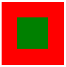
一、absolute + transform 布局
<div class="box">
    <div class="box-sub"></div>
</div>

<style>
.box {
  position:relative;
  width:160px;
  height:160px;
  background:red;
}

.box-sub{
  position:absolute;
  top: 50%;
  left: 50%;
  z-index:9;
  transform:translate(-50%,-50%);
  width:80px;
  height:80px;
  background:green;
}
</style>
二、display:flex 布局
<div class="box">
    <div class="box-sub"></div>
</div>

<style>
.box{
  width:200px;
  height:200px;
  background-color:red;
  color:white;
  font-size:20px;
  font-weight:bold;
  display:flex;
  align-items:center;
  justify-content:center;
}
.box-sub {
  width:100px;
  height:100px;
  background:green;
}
</style>
三、display: grid 布局
<div class="box">
    <div class="box-sub">hello world</div>
</div>

<style>
.box {
  display: grid;
  width:200px;
  height:200px;
  background-color:red;
  color:white;
  font-size:20px;
  font-weight:bold;
}
.box-sub {
  align-self: center;
  justify-self: center;
}
</style>
四、table 布局
<table>
    <tbody>
        <tr>
            <td class="box">
                <div class="sub"></div>
            </td>
        </tr>
    </tbody>
</table>

.box {
  width:200px;
  height:200px;
  text-align: center;
  background:red;
}
.sub {
  display: inline-block;
  background:green;
  width:100px;
  height:100px;
}
虽然还有几种方式可以实现该效果,但存在兼容性,所以这里就不介绍了


 215
215


 被折叠的 条评论
为什么被折叠?
被折叠的 条评论
为什么被折叠?
 到【灌水乐园】发言


