本篇文章详细介绍了弹性盒模型的 align-items 属性
什么是align-items?
align-items 是 设置或检索弹性盒子元素在(Y)轴方向上的对齐方式。其下有四种属性:
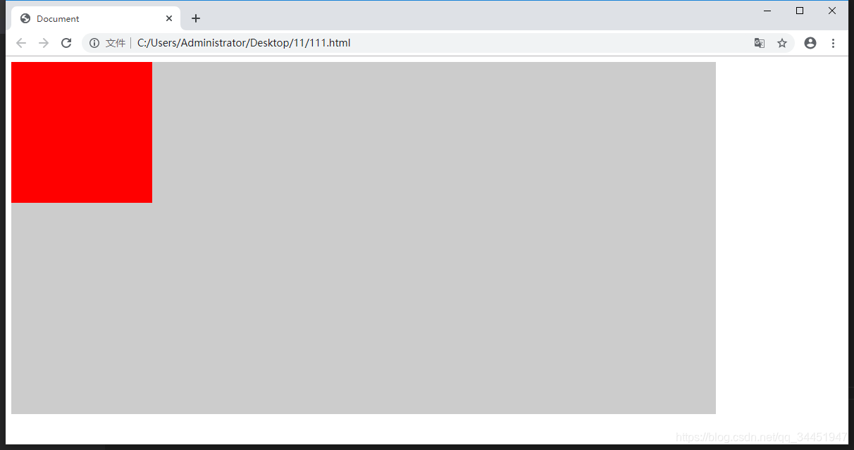
flex-start:弹性盒子元素的(Y)轴起始位置的边界紧靠住该行的侧轴起始边界。
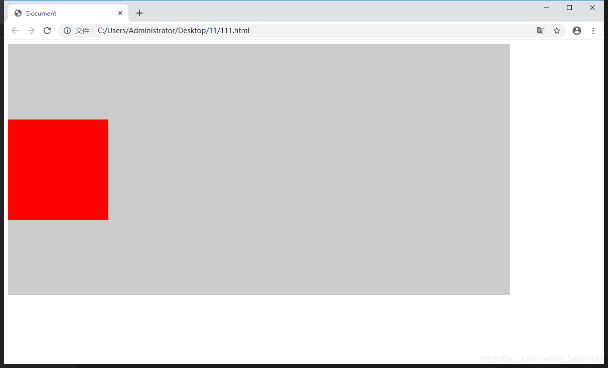
flex-end:弹性盒子元素的(Y)轴起始位置的边界紧靠住该行的侧轴结束边界。
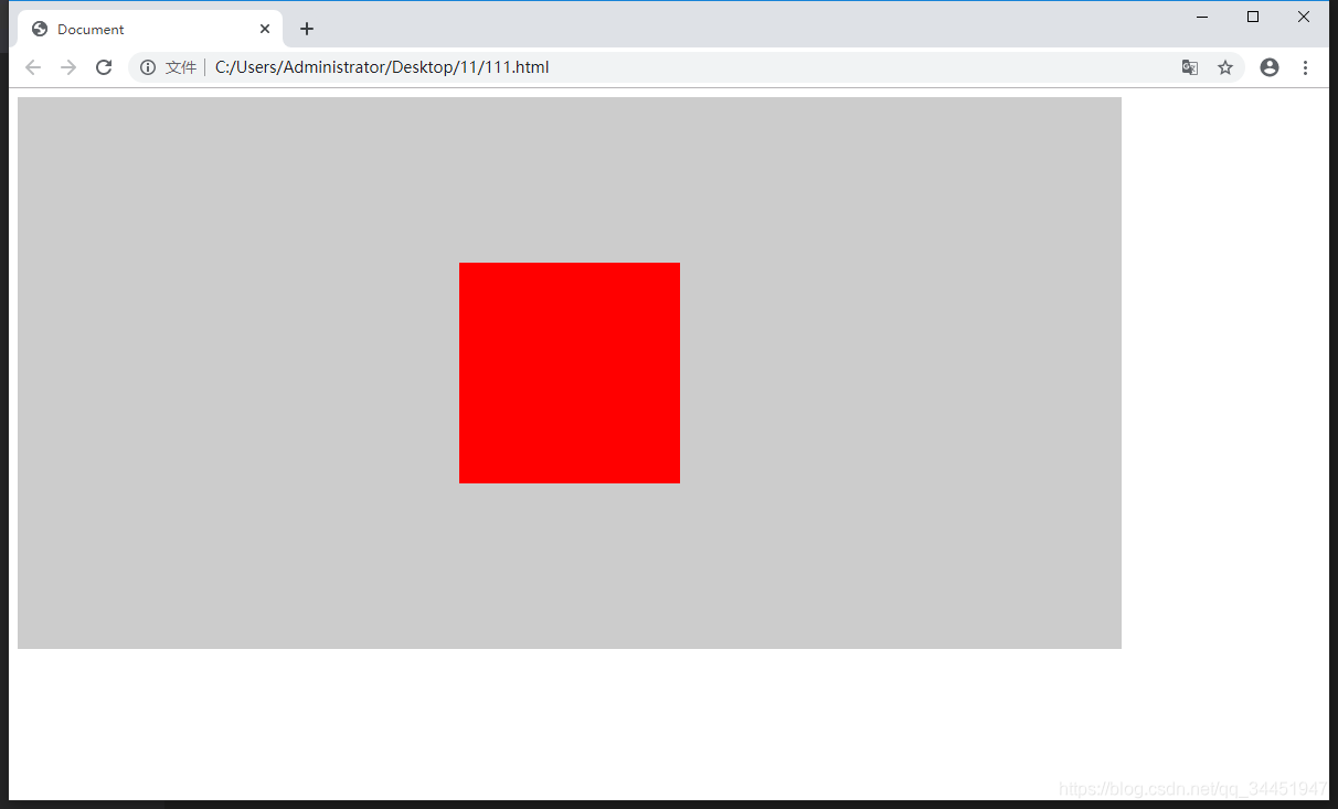
center:弹性盒子元素在该行的(Y)轴上居中放置。(如果该行的尺寸小于弹性盒子元素的尺寸,则会向两个方向溢出相同的长度)。
//第一种属性 flex-start(默认属性)
<!DOCTYPE html>
<html lang="en">
<head>
    <meta charset="UTF-8">
    <meta name="viewport" content="width=device-width, initial-scale=1.0">
    <meta http-equiv="X-UA-Compatible" content="ie=edge">
    <title>Document</title>
    <style>
        .flex-wrap{
            width: 1000px;
            height: 500px;
            background-color: #ccc;
            display: flex;
            align-items:flex-start;
        }
        .box1{
            width: 200px;
            height: 200px;
            background-color: red;
        }
    </style>
</head>
<body>
    <div  class="flex-wrap">
        <div class="box1">

        </div>

    </div>

</body>
</html>
效果演示如下:
//第二种属性 flex-end
<!DOCTYPE html>
<html lang="en">
<head>
    <meta charset="UTF-8">
    <meta name="viewport" content="width=device-width, initial-scale=1.0">
    <meta http-equiv="X-UA-Compatible" content="ie=edge">
    <title>Document</title>
    <style>
        .flex-wrap{
            width: 1000px;
            height: 500px;
            background-color: #ccc;
            display: flex;
            align-items:flex-end;
        }
        .box1{
            width: 200px;
            height: 200px;
            background-color: red;
        }
    </style>
</head>
<body>
    <div  class="flex-wrap">
        <div class="box1">

        </div>

    </div>

</body>
</html>
演示效果如下:

//第三种属性  center  (Y)轴的居中
<!DOCTYPE html>
<html lang="en">
<head>
    <meta charset="UTF-8">
    <meta name="viewport" content="width=device-width, initial-scale=1.0">
    <meta http-equiv="X-UA-Compatible" content="ie=edge">
    <title>Document</title>
    <style>
        .flex-wrap{
            width: 1000px;
            height: 500px;
            background-color: #ccc;
            display: flex;
            align-items:center;
        }
        .box1{
            width: 200px;
            height: 200px;
            background-color: red;
        }
    </style>
</head>
<body>
    <div  class="flex-wrap">
        <div class="box1">

        </div>

    </div>

</body>
</html>
演示效果如下:
//拓展  看到这里是不是就已经找到了子元素垂直居中的方法
和justify-content 一起配合可以得到你想要的东西
<!DOCTYPE html>
<html lang="en">
<head>
    <meta charset="UTF-8">
    <meta name="viewport" content="width=device-width, initial-scale=1.0">
    <meta http-equiv="X-UA-Compatible" content="ie=edge">
    <title>Document</title>
    <style>
        .flex-wrap{
            width: 1000px;
            height: 500px;
            background-color: #ccc;
            display: flex;
            align-items:center;
            justify-content: center;
        }
        .box1{
            width: 200px;
            height: 200px;
            background-color: red;
        }

    </style>
</head>
<body>
    <div  class="flex-wrap">
        <div class="box1">

        </div>


    </div>

</body>
</html>
演示效果如下:


 扫一扫
扫一扫


 被折叠的 条评论
为什么被折叠?
被折叠的 条评论
为什么被折叠?
 到【灌水乐园】发言


