本篇文章详细介绍flex-wrap
flex-wrap是控制盒模型容器下一级子元素的在一行显示的时候是否换行
nowrap(默认值):不换行
wrap:自动换行
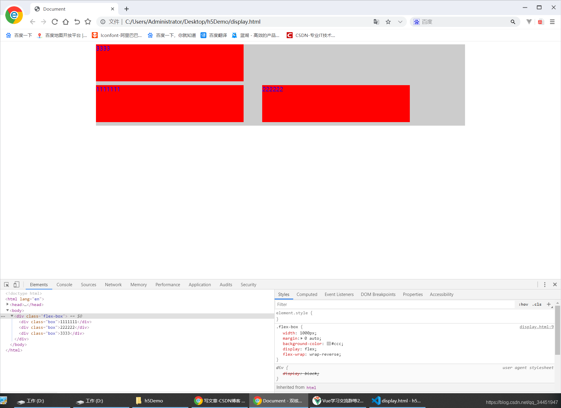
wrap-reverse:换行,第一行在下方。
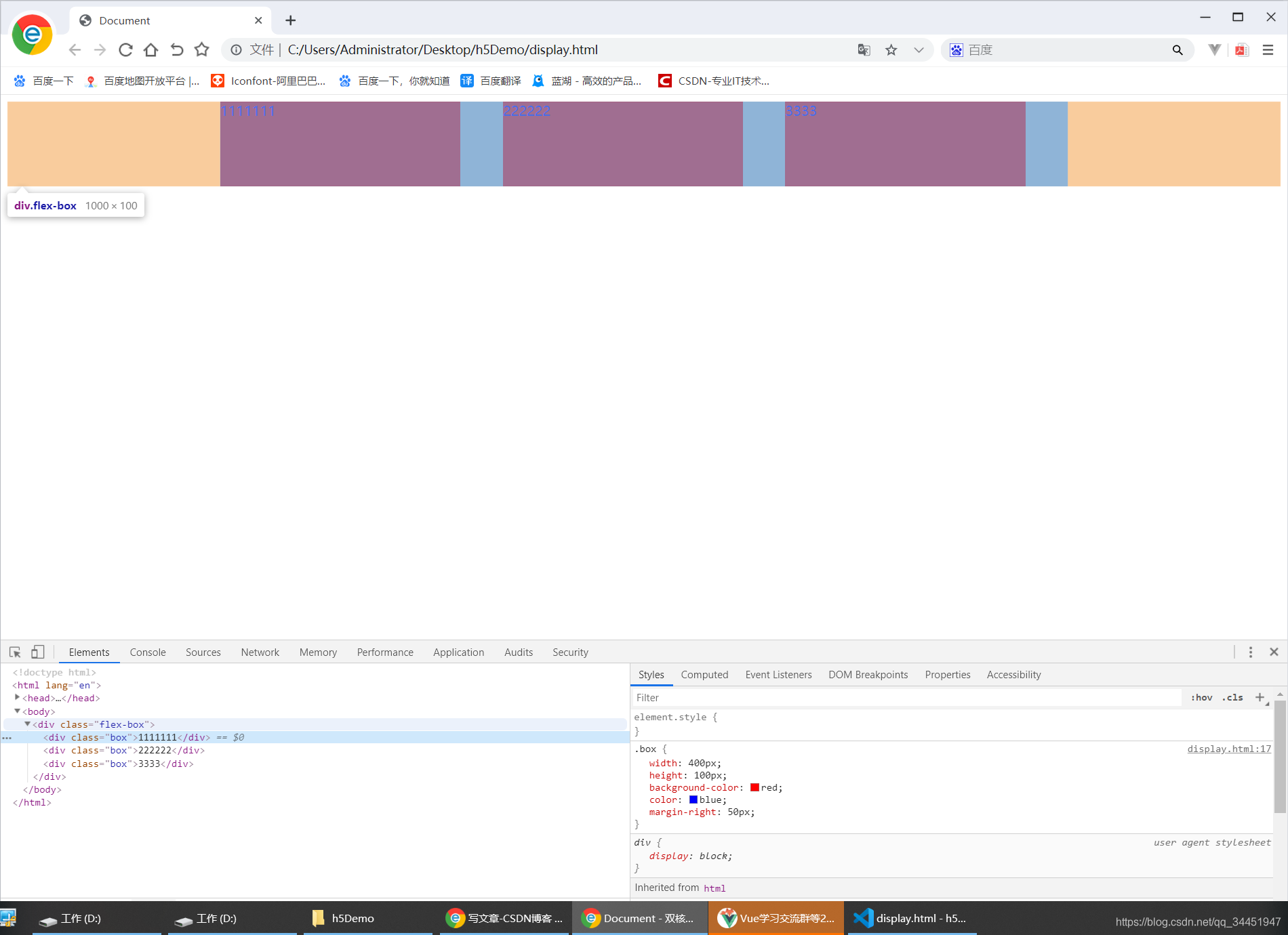
//第一条属性 默认的nowrap 不换行

<!DOCTYPE html>
<html lang="en">
<head>
    <meta charset="UTF-8">
    <meta name="viewport" content="width=device-width, initial-scale=1.0">
    <meta http-equiv="X-UA-Compatible" content="ie=edge">
    <title>Document</title>
    <style>
        .flex-box{
            width: 1000px;
            margin: 0 auto;
            background-color: #ccc;
            display: flex;

        }

        .box{
            width: 400px;
            height: 100px;
            background-color: red;
            color: blue;
            margin-right: 50px;
        }
    </style>
</head>
<body>
    <div class="flex-box">
        <div class="box">1111111</div>
        <div class="box">222222</div>
        <div class="box">3333</div>
    </div>
</body>
</html>

//说明  从代码中可以看出三个三个总宽度是1200px+150px  父元素的宽度是1000  当出现这样的情况 不是会出现子元素溢出父元素  而是三个子元素自动等比例缩放了
效果演示如下:
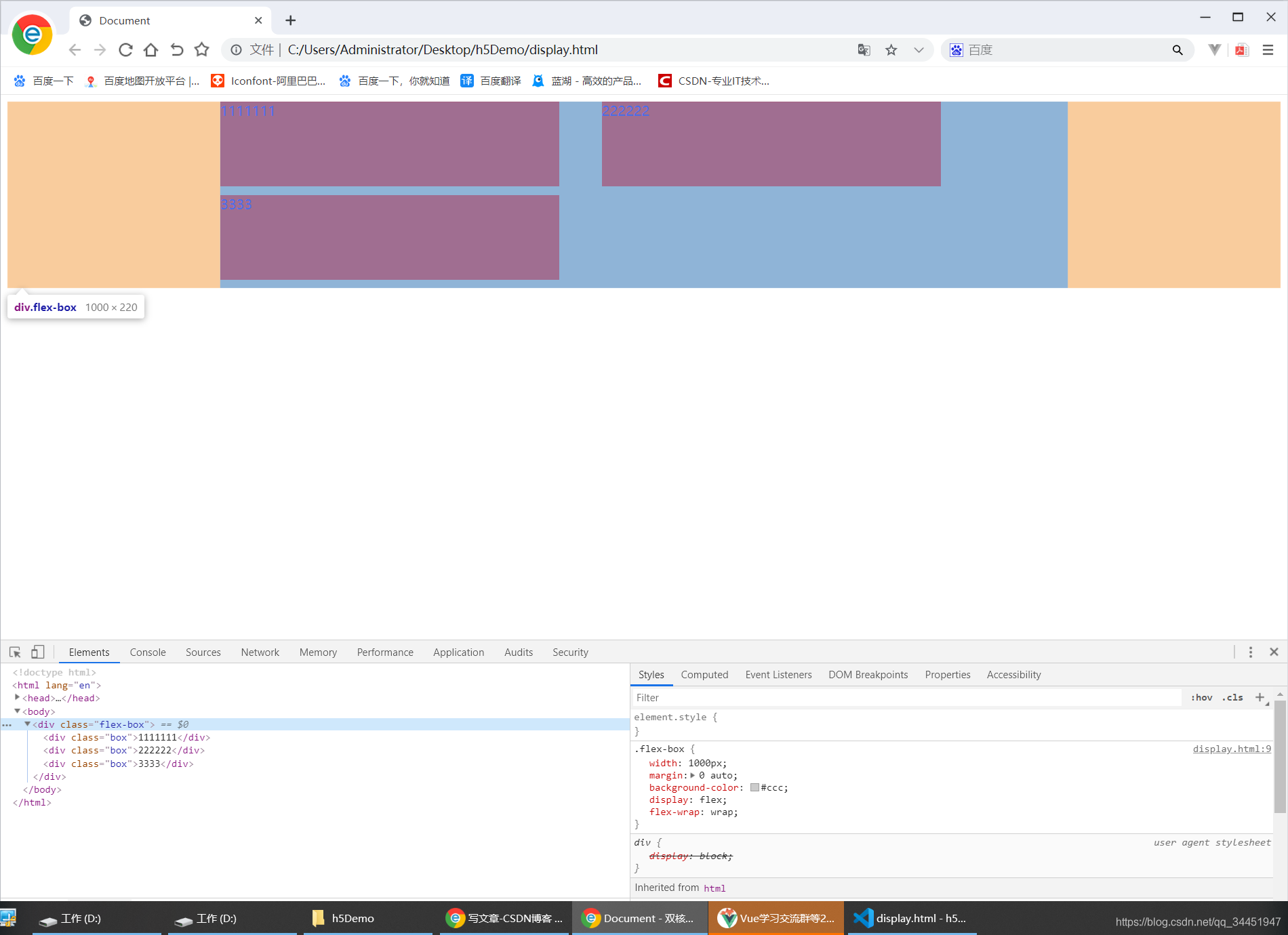
//第二条属性 wrap 换行

<!DOCTYPE html>
<html lang="en">
<head>
    <meta charset="UTF-8">
    <meta name="viewport" content="width=device-width, initial-scale=1.0">
    <meta http-equiv="X-UA-Compatible" content="ie=edge">
    <title>Document</title>
    <style>
        .flex-box{
            width: 1000px;
            margin: 0 auto;
            background-color: #ccc;
            display: flex;
            flex-wrap:wrap;
        }

        .box{
            width: 400px;
            height: 100px;
            background-color: red;
            color: blue;
            margin-right: 50px;
            margin-bottom: 10px;
        }
    </style>
</head>
<body>
    <div class="flex-box">
        <div class="box">1111111</div>
        <div class="box">222222</div>
        <div class="box">3333</div>
    </div>
</body>
</html>
效果演示如下:
//第三条属性wrap-reverse:换行,第一行在下方。

<!DOCTYPE html>
<html lang="en">
<head>
    <meta charset="UTF-8">
    <meta name="viewport" content="width=device-width, initial-scale=1.0">
    <meta http-equiv="X-UA-Compatible" content="ie=edge">
    <title>Document</title>
    <style>
        .flex-box{
            width: 1000px;
            margin: 0 auto;
            background-color: #ccc;
            display: flex;
            flex-wrap: wrap-reverse;

        }

        .box{
            width: 400px;
            height: 100px;
            background-color: red;
            color: blue;
            margin-right: 50px;
            margin-bottom: 10px;
        }
    </style>
</head>
<body>
    <div class="flex-box">
        <div class="box">1111111</div>
        <div class="box">222222</div>
        <div class="box">3333</div>
    </div>
</body>
</html>
效果演示如下:


 6139
6139


 被折叠的 条评论
为什么被折叠?
被折叠的 条评论
为什么被折叠?
 到【灌水乐园】发言


