


 本文详细介绍QTCharts模块,提供易用的图表组件,适用于QWidgets、QGraphicsWidget及QML类型,支持多种图表类型,如直线图、曲线图、柱状图等,以及丰富的轴类型和主题选项。
文章目录
QT Charts:QT图表
原文:
Qt Charts module provides a set of easy to use chart components.
It uses the Qt Graphics View Framework,
therefore charts can be easily integrated to modern user interfaces.
Qt Charts can be used as QWidgets, QGraphicsWidget, or QML types.
Users can easily create impressive graphs by selecting one of the charts themes.

翻译:
QT图表模块提供了一组非常容易去使用的图表组件,
它使用了QT的图形视图框架,
因此图表可以非常容易的集成到现在的用户界面中,
QT图表可以被运用于QWidgets, QGraphicsWidget, QML types,
用户通过选择其中一个图表主题可以轻松创作出令人印象深刻的图表。
Getting Started:入门指南
If you are using the QML,To import Qt Charts QML types,
add the following import statement to your .qml file:

如果你使用的是QML,则去导入Qt Charts QML 类型,
添加一=以下声明到你的.qml文件中。
import QtCharts 2.2
If you intend to use Qt Charts C++ classes in your application,
use the following include and using directives:

如果你打算在你的应用中使用QT图表的c++类,
使用以下include与using指令。
     #include <QtCharts>
     using namespace QtCharts;
 Note: Since Qt Creator 3.0,
 projects created with Qt Quick Application wizard based on the QtQuick 2 template uses QGuiApplication by default.
All such QGuiApplication instances in the project must be replaced with QApplication as the module depends on Qt's Graphics View Framework for rendering.
To link against the Qt Charts module, add this line to your qmake project file:

注:自QT Creator3.0起,
工程创建的基于 QtQuick 2模板的Qt Quick Application向导使用默认的QGui Application,
在工程中所有这样的QGuiApplication实例必须用QApplication替代,因为这个模型依赖于QT的图形视图框架来渲染,
要链接到QT图表组件,请将这一行假如你的qmake项目文件中 (即添加到.pro中)。
QT += charts
Licenses:授权
Qt Charts is available under commercial licenses from The Qt Company.
In addition, it is available under the GNU General Public License, version 3.
See Qt Licensing for further details.

QT图表可以在QT公司获取可用于商业的许可下使用,
此外,它可以在GNU通用公共许可第三版下使用,
有关详细信息请参见Qt许可。
Articles and Guides:指南文章
Qt Charts Overview :QT图表概述
Qt Charts enables creating stylish, interactive, data centric user interfaces.
Qt Charts uses the Graphics View Framework for ease of integration.
The chart components can be used as QWidget or QGraphicsWidget objects or QML types.

QT图表可以创造出新颖、互交的数据中心用户界面,
QT图表为了便于集成使用了图形视图框架,
这个图表组件可以用作QWidget、QGraphicsWidget对象 或者QML类型。
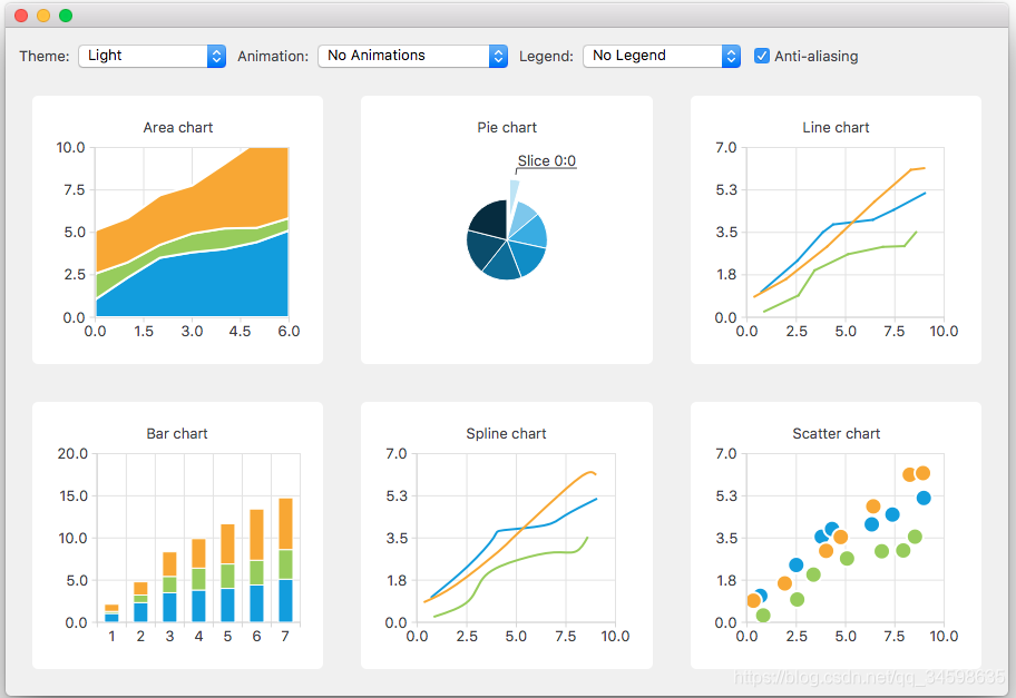
Chart Types:图表类型
The Qt Charts module provides the following chart types:
Each chart type is represented by an QAbstractSeries derived class or AbstractSeries derived type in QML. Charts are created by using an instance of a series class and adding it to a QChart or ChartView instance.
You can combine different types of series in one chart.

这个图表组件提供以下图表类型,
每一个图表类型通过一个QAbstractSeries 派生类或者QML中的 AbstractSeries派生类表示,
图表通过使用一个series的实例被创建,并且增加到QChart 或这ChartView实例中,
你可以在一个图表中组合不同的series类型,
For example:

  QLineSeries* series = new QLineSeries();
  series->add(0, 6);
  series->add(2, 4);
  ...
  chartView->chart()->addSeries(series);
  chartView->chart()->createDefaultAxes();
Or, in QML:

  import QtQuick 2.0
  import QtCharts 2.0

  ChartView {
      width: 400
      height: 300
      theme: ChartView.ChartThemeBrownSand
      antialiasing: true

      PieSeries {
          id: pieSeries
          PieSlice { label: "eaten"; value: 94.9 }
          PieSlice { label: "not yet eaten"; value: 5.1 }
      }
  }
Line and Spline Charts:直线和曲线图
Line and spline charts present data as a series of data points connected by lines.
In a line chart, the data points are connected by straight lines,
whereas in a spline chart they are connected by a spline.
The spline is drawn by using QPainterPath.

直线曲线图以一系列通过线连接的数据点呈现,
在一个直线图中,数据点是通过直线连接的,
然而在一个曲线图中,他们是通过曲线连接的,
这个曲线是通过使用QPainterPath(轨迹)绘制的
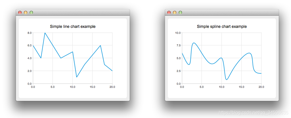
A line chart is implemented by using the QLineSeries class or the LineSeries QML type.
A spline chart is implemented by using the QSplineSeries class that inherits QLineSeries or the SplineSeries type that inherits LineSeries.
For more information, see LineChart Example, SplineChart Example, and Dynamic Spline Example.
For an example of combining a line chart with a bar chart and using a common axis for both, see Line and BarChart Example.

一个直线图通过使用QLineSeries类或者用LineSeries QML类型实现。
一个样条曲线通过使用继承QLineSeries的QSplineSeries类或者继承于LineSeries的SplineSeries类型实现。
更多的信息,请看直线图例子,样条曲线例子,动态样条图表例子。
比如一个例子,将一个直线图表与一个柱形图表使用共轴组合起来,请参见柱形图表例子。
Area and Scatter Charts:面积和散点图
Area charts present data as an area bound by two lines,
whereas scatter charts present data as a collection of points.

区域图将数据由两条线连接的区域表示
然而散点图将数据由一些点来表示
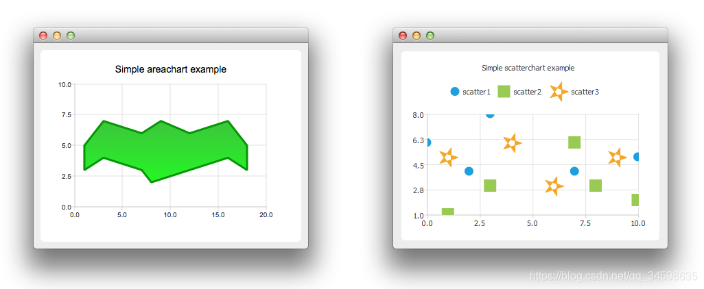
An area chart is implemented by using the QAreaSeries class or the AreaSeries QML type.
By default, the x-axis is used as one boundary and QLineSeries or LineSeries as the other.
However, you can use QLineSeries or LineSeries as both boundaries.
A scatter chart is implemented by using the QScatterSeries class or the ScatterSeries QML type.
For more information, see AreaChart Example, ScatterChart Example, and Scatter Interactions Example.

一个区域图通过使用QAreaSeries类或者是AreaSeries QML类型实现。
默认情况下,x轴被用作一个边界和QLineSeries或者LineSeries座作为另一个边界。
然而,你可以使用QLineSeries或者LineSeries作为两者的边界。
一个散点分布图通过是同QScatterSeries类或者ScatterSeries QML类型来实现。
更多的信息,请看AreaChart Example, ScatterChart Example, and Scatter Interactions Example。
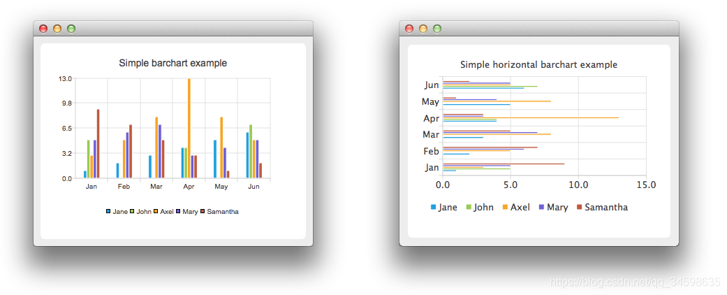
Bar Charts:柱形图
A bar chart presents data as horizontal or vertical bars that are grouped by category.
The QBarSet class and the BarSet QML type represent one set of bars in a bar chart.
The QAbstractBarSeries class is an abstract parent class for all bar series classes, and the AbstractBarSeries type is the parent type of bar series types.
The series type determines how the data is presented.
The QBarSeries class and the BarSeries QML type present data as vertical bars grouped by category.
Similarly, the QHorizontalBarSeries class and the HorizontalBarSeries QML type present data as horizontal bars.

一个柱形图将数据以通过类型分组的水平或者垂直的柱形来呈现。
在柱形图中QBarSet类和BarSet QML类型代表了一组柱形。
QAbstractBarSeries类是所有bar系列类的抽象父类,AbstractBarSeries类型是bar系列类型的父类型。
这个series类型决定了数据的显示方式。
QBarSeries类和BarSeries QML类型以按类别分组的竖条形式显示数据。
类似地,QHorizontalBarSeries类和HorizontalBarSeries QML类型将数据显示为水平条。
The QStackedBarSeries class and the StackedBarSeries type present a series of data as vertically stacked bars, with one bar per category.
The corresponding horizontal class and type are QHorizontalStackedBarSeries andHorizontalStackedBarSeries, respectively.

堆叠柱形图:
QStackedBarSeries类和StackedBarSeries类型以垂直堆叠的条形 和每个类别一个条形显示一系列数据。
相应的水平类和类型分别是QHorizontalStackedBarSeries和horizontalstackedbarseries。

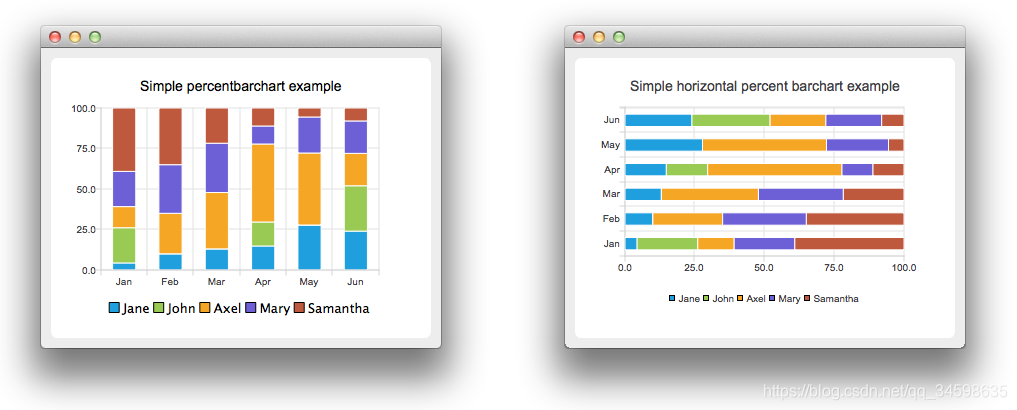
The QPercentBarSeries class and PercentBarSeries QML type present a series of categorized data as a percentage of each category.
The corresponding horizontal class and type are QHorizontalPercentBarSeries and HorizontalPercentBarSeries, respectively.

百分制柱形图:
QPercentBarSeries类和PercentBarSeries QML类型以每个类别的百分比表示一系列分类数据。
相应的,水平类和类型分别是QHorizontalPercentBarSeries和HorizontalPercentBarSeries。
For more information, see BarChart Example, HorizontalBarChart Example, StackedBarChart Example,
HorizontalStackedBarChart Example, PercentBarChart Example, and HorizontalPercentBarChart Example.

有关更多信息,请参见BarChart示例、HorizontalBarChart示例、StackedBarChart示例、
HorizontalStackedBarChart示例、PercentBarChart示例和HorizontalPercentBarChart示例。
Pie Charts:饼图
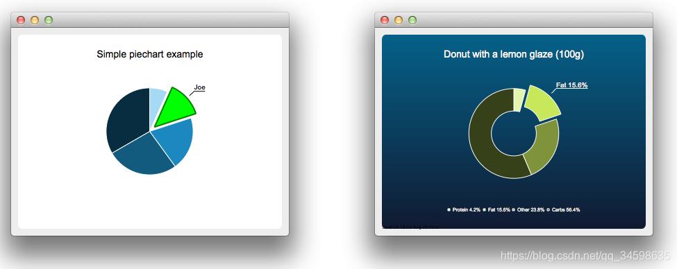
Pie charts present data as a pie that consists of pie slices.
The pie is implemented using the QPieSeries class or the PieSeries QML type and the pie slices are added using the QPieSlice class or the PieSlice QML type.
The pie can be turned into a donut by specifying a hole size between 0.0 and 1.0.

饼图将数据表示表示位一些饼片组成的饼图。
这个饼图的实现使用了QPieSeries类与PieSeries QML类型并且这个饼片的增加也使用了QPieSeries类与PieSeries QML类型。
这个饼图可以通过在0.0与1.0之间指定一个孔洞的大小来变成一个甜甜圈。
For more information, see PieChart Example, Pie Chart Customization Example, DonutChart Example, Donut Chart Breakdown Example, and Nested Donuts Example.

有关更多信息,请参见PieChart Example, Pie Chart Customization Example,
DonutChart Example, Donut Chart Breakdown Example, and Nested Donuts Example.
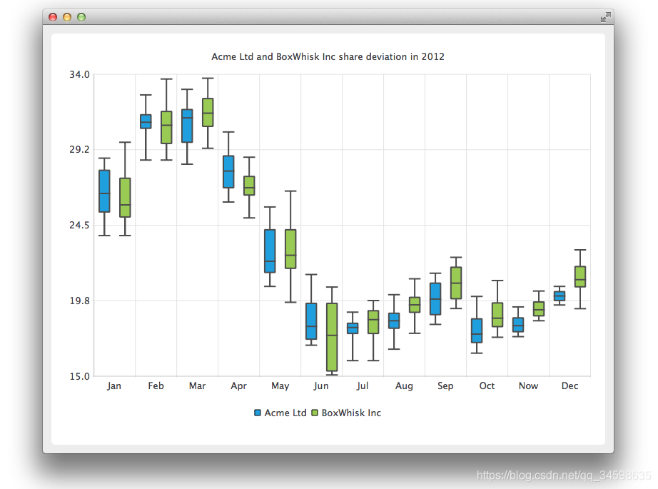
Box-and-Whiskers Charts 箱线图(盒须图)
The box-and-whiskers charts present data as quartiles extended with whiskers that show the variability of the values.
The items in box plot series are grouped by category, similarly to bar sets in bar series.
For each box-and-whiskers item, the lower extreme, lower quartile, median, upper quartile, and upper extreme value are specified.
A box-and-whiskers chart is implemented by using the QBoxPlotSeries and QBoxSet classes or the BoxPlotSeries and BoxSet QML types.

盒须图以晶须扩展的四分位数表示数据,显示值的可变性。
这个盒须图下的所有项目通过类别进行分组,类似于bar series在bar sets中一样。
为每一个盒须图项目的下限、下四分位、中值、上限、下限指定数值。
一个盒须图是通过QBoxPlotSeries与QBoxSet类或者the BoxPlotSeries和BoxSet QML 类型来实现的。
For more information, see Box and Whiskers Example.
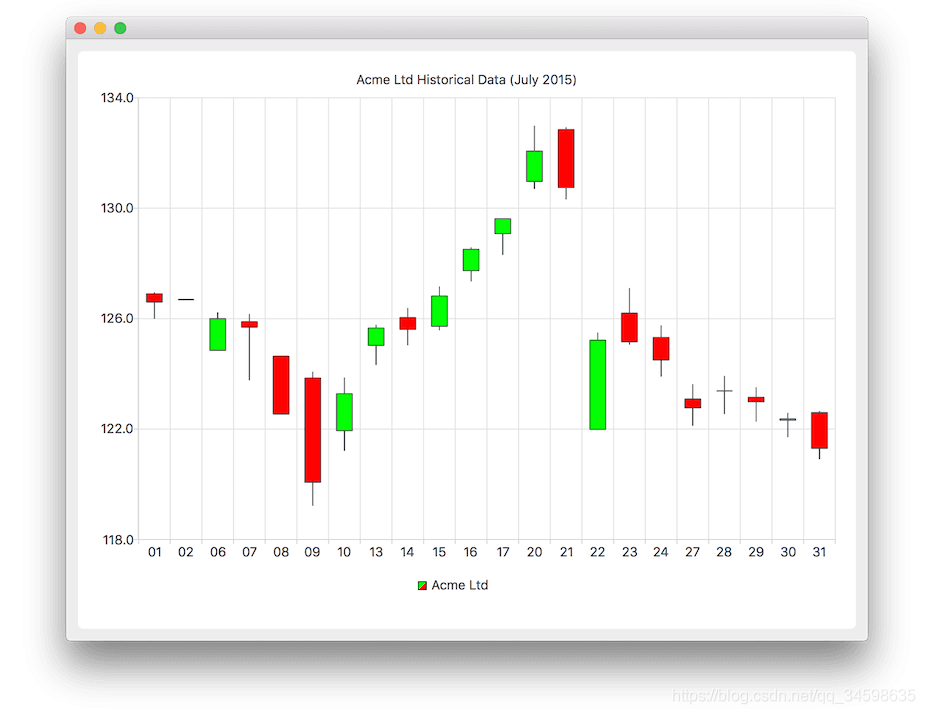
Candlestick Charts:蜡烛图(K线图)
Candlestick charts presents a series of data shown as candlesticks.
A candlestick chart is implemented by using the QCandlestickSeries and QCandlestickSet classes or the CandlestickSeries and CandlestickSet QML types.

烛台图以烛台的形式显示一系列数据。
通过使用QCandlestickSeries和QCandlestickSet类或CandlestickSeries和candleskset QML类型来实现烛台图。
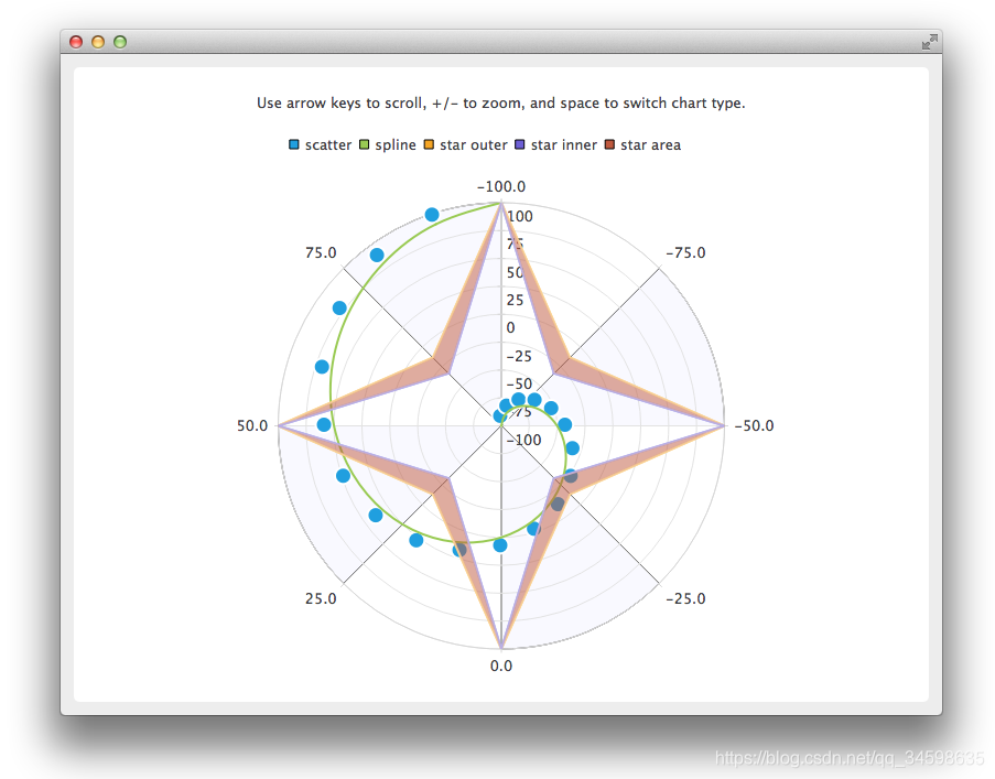
Polar Charts:极性图
Polar charts present data in a circular graph, where the placement of data is based on the angle and distance from the center of the graph, the pole.
The QPolarChart class is a specialization of the QChart class. It supports line, spline, area, and scatter series, as well as all the axis types supported by them. The axis can be used either as a radial or an angular axis. In QML, the corresponding type is PolarChartView.

极坐标图以圆形图的形式表示数据,其数据的位置落点是基于从图形的中心到极点的角度与距离。
QPolarChart类是QChart类的专门化。它支持线、样条、区域和散点级数,以及它们支持的所有轴类型。轴可以用作径向轴,也可以用作角轴。在QML中,对应的类型是PolarChartView。
Axes:轴线
Qt Charts supports the following axis types:
Qt Charts提供了一下轴线类型:
An axis can be set up to show a line with tick marks, grid lines, and shades.
The values on the axis are drawn at the positions of tick marks.
All axis types are specializations of the QAbstractAxis class or the AbstractAxis QML type.

一个轴可以设置为显示一条线,上面有刻度、网格线和阴影。
轴上的值是在刻度处绘制的。
所有轴类型都是QAbstractAxis类或AbstractAxis QML类型的专门化。
Value axis:数值轴
A value axis adds real values to a chart's axis.
It is implemented using the QValueAxis class or the ValueAxis QML type.

值轴向图表轴添加实值。 它是使用QValueAxis类或ValueAxis QML类型实现的。
Category axis:类别轴
A category axis is implemented using the QCategoryAxis class or the CategoryAxis QML type.
It has named ranges and adjustable range widths.

类别轴是使用QCategoryAxis类或CategoryAxis QML类型实现的。 它有命名范围和可调范围宽度。
Bar category axis:柱形分类轴
The bar category axis is similar to a category axis, but the range width is the same for all ranges.
A bar category axis is implemented using the QBarCategoryAxis class or the BarCategoryAxis QML type.

bar类别轴类似于类别轴,而且所有范围的范围宽度都是相同的。 bar类别轴是使用QBarCategoryAxis类或BarCategoryAxis QML类型实现的。
Date-time axis:时间轴
A date-time axis adds dates and times to a chart's axis.
It is implemented using the QDateTimeAxis class or the DateTimeAxis QML type.

日期-时间轴将日期和时间添加到图表的轴中。
它是使用QDateTimeAxis类或DateTimeAxis QML类型实现的。
Logarithmic value axis:对数轴
A logarithmic axis adds a logarithmic scale to a chart's axis.
A logarithmic scale is a nonlinear scale that is based on orders of magnitude, so that each tick mark on the axis is the previous tick mark multiplied by a value.
A logarithmic axis is implemented using the QLogValueAxis class or the LogValueAxis QML type.

对数轴将对数刻度添加到图表的轴上。
对数刻度是基于数量级的非线性刻度,因此轴上的每一个刻度都是之前的刻度乘以一个值。
使用QLogValueAxis类或LogValueAxis QML类型实现对数轴。
Multiple axes can be defined for one chart. The axes can be placed down, up, left, or right of the chart.
Further, the axes can be of different types.
However, mixing axis types that would result in different domains is not supported, such as specifying QValueAxis and QLogValueAxis on the same orientation.

一个图表可以定义多个轴。轴可以放在图表的下、上、左或右。 此外,轴可以是不同类型的。
此外,轴可以是不同类型的。 但是,不支持混合会导致不同域的轴类型,例如在相同方向上指定QValueAxis和QLogValueAxis。
Legend:说明
A legend is a graphical object that displays the legend of a chart. Legend objects cannot be created or deleted, but they can be referenced via the QChart class or the ChartView QML type. The legend state is updated by QChart or ChartView when series change.
A legend can be positioned below or above the chart, as well as to the left or right of it. By default, the legend is attached to the chart view, but it can be detached to a separate graphics item that can be moved around freely.
It is possible to hide either individual markers from the legend or the whole legend.
Legend markers can be modified by using the QLegendMarker base class and the subclasses for each series type: QAreaLegendMarker, QBarLegendMarker, QBoxPlotLegendMarker, QCandlestickLegendMarker, and QXYLegendMarker.
In QML, legend markers can be modified by creating custom legends, as illustrated by the Qml Custom Legend example.

图例是显示图表图例的图形对象。不能创建或删除Legend对象,但是可以通过QChart类或ChartView QML类型引用它们。当系列变更时,图例状态由QChart或ChartView更新。
:图例可以位于图表的下方或上方,也可以位于图表的左侧或右侧。默认情况下,图例附加到图表视图,但它可以被分离到一个单独的图形项,可以自由移动。
可以对图例或整个图例隐藏单个标记。
图例标记可以使用 QLegendMarker基类和每个系列类型的子类进行修改:QAreaLegendMarker、QBarLegendMarker、QBoxPlotLegendMarker、qcandlesklegendmarker和QXYLegendMarker。
在QML中,可以通过创建自定义图例来修改图例标记,如QML自定义图例示例所示。
Interacting with Charts:互动的图表
End users can interact with charts by dynamically adding values to them, drilling down into data, zooming into and out of charts, scrolling charts, and clicking items in charts or hovering the mouse over them.

最终用户可以通过动态地向图表添加值、深入研究数据、放大和缩小图表、滚动图表、单击图表中的项目或将鼠标悬停在图表上来与图表交互。
Drawing Data Dynamically:绘制动态数据
It is possible to add data to charts dynamically and to make the chart view scroll automatically to display the new data.
For more information, see Dynamic Spline Example.

可以动态的向图表添加数据并且图表窗口自动滚动以显示新的数据。
更详细的信息请参看Dynamic Spline Example.
Drilling Down into Data:向下钻取数据
Drilldown effects can be implemented to bar or pie charts, for example.
When users select an item in the chart, a more detailed view of the item is displayed.
This is implemented by deleting the first series and adding another one.
For more information, see StackedBarChart Drilldown Example and PieChart Drilldown Example.

例如,可以将下钻效果实现为条形图或饼图。 当用户在图表中选择一个项目时,将显示该项目的更详细视图。 这是通过删除第一个系列并添加另一个系列来实现的。 更多信息,请看StackedBarChart Drilldown Example and PieChart Drilldown Example.
Zooming and Scrolling:缩放与滚动
Users can use the keyboard for zooming and scrolling. They can scroll charts by using the arrow keys and zoom into or out of charts by using the plus and minus keys. In addition, QRubberBand can be used for selecting the area to zoom into.
On touch devices, gestures can be used for panning and zooming.
For more information, see Zoom Line Example.

用户可以使用键盘进行缩放和滚动。他们可以使用箭头键滚动图表,也可以使用加号和减号键放大或缩小图表。另外,QRubberBand可以用来选择要放大的区域。
在触控设备上,手势可以用于平移和缩放。 有关更多信息,请参见Zoom Line示例。
Clicking and Hovering:点击与悬停
You can connect slots to signals emitted when end users click items in charts or hover the mouse over them. This enables you to add elements, such as callouts, to the charts.
For more information, see Callout Example.

你可以将槽连接到信号上当用户点击图表中的项目或是在他们之上符动时,这使您能够向图表添加元素,例如标注。
有关更多信息,请参见Callout Example。
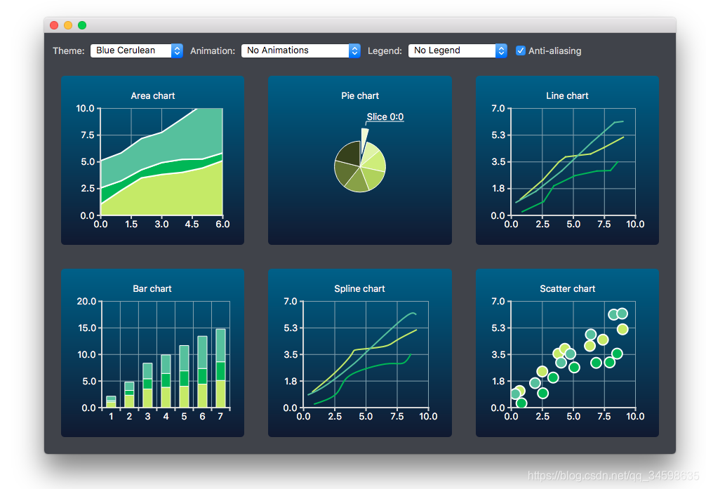
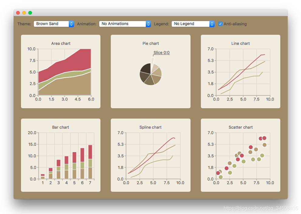
Themes:主题
A theme is a built-in collection of UI s tyle related settings applied to all the visual elements of a chart,
such as colors, pens, brushes, and fonts of series, as well as axes, title, and legend.

Qt Charts comes with the following predefined themes:
Light theme, which is the default theme
Cerulean blue theme
Dark theme
Sand brown theme
Natural color system (NCS) blue theme
High contrast theme
Icy blue theme
Qt theme

The themes can be customized by changing the colors, pens, brushes, and fonts. New themes can be added by modifying the Qt Charts source code.
Note: Changing the theme will overwrite all customization previously applied to the series.
For more information, see the Chart themes example.

主题是一个内置的UI风格相关设置集合,应用于图表的所有视觉元素,如颜色、钢笔、画笔、系列字体以及轴、标题和图例。
Qt图表提供了以下预定义的主题:
Light theme, which is the default theme 轻主题,这是默认主题
Cerulean blue theme	天蓝色的主题
Dark theme	黑暗的主题
Sand brown theme		沙棕色的主题
Natural color system (NCS) blue theme 自然色系(NCS)蓝色主题
High contrast theme 高对比度主题
Icy blue theme	 冰冷的蓝色主题
Qt theme Qt的主题
可以通过更改颜色、钢笔、画笔和字体来定制。可以通过修改Qt图表源代码添加新主题。
注意:更改主题将覆盖以前应用于本系列的所有定制。
Examples:例子
Qt Charts Examples
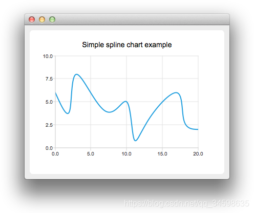
SplineChart Example :曲线图表例子
		The example shows how to create a simple spline chart.
		这个例子展示了如何创作一个简单的曲线图
Running the Example:运行它的例子
To run the example from Qt Creator, open the Welcome mode and select the example from Examples.
For more information, visit Building and Running an Example.

在QT Creator中运行它的例子,打开开始界面并从示例中选择例子。
更多的信息,请参看构建与运行示例。
Creating Spline Charts
To create spline charts we need to put our data into QSplineSeries.
QSplineSeries automatically calculates spline segment control points that are needed to properly draw the spline.

创建一个简单的曲线图例子我们需要去在QSplineSeries中放置我们的数据。
QSplineSeries将自动计算出正确画出曲线需要的样条线段控制点。
 QSplineSeries *series = new QSplineSeries();
 series->setName("spline");
Now let’s add some data points to the series.
现在让我们添加点数据点到这个系列。
  series->append(0, 6);
  series->append(2, 4);
  series->append(3, 8);
  series->append(7, 4);
  series->append(10, 5);
  *series << QPointF(11, 1) << QPointF(13, 3) << QPointF(17, 6) << QPointF(18, 3) << QPointF(20, 2);
The data series has been populated. To display it on a chart we create a QChart object and add the data series to it.
We also set the title and the values range on the y-axis, so that our chart’s visibility is better.
数据列表已经被填充,在我们创建的图表上显示它并且将数据列表添加进去。
我们同样设置标题和在y轴上设置范围值,这样我们的图表可视性更高。
  QChart *chart = new QChart();
  chart->legend()->hide();
  chart->addSeries(series);
  chart->setTitle("Simple spline chart example");
  chart->createDefaultAxes();
  chart->axisY()->setRange(0, 10);
Then we create a QChartView object with QChart as a parameter.
This way we don’t need to create a QGraphicsView scene ourselves.
We also set the Antialiasing on to have the rendered lines look nicer.
然后我们创建一个QChartView对象以QChart为参数。
用这种方式我们就不不需要自己创建一个QGraphicsView场景。
我们还设置了抗锯齿以使渲染的线条看起来更好。
  QChartView *chartView = new QChartView(chart);
  chartView->setRenderHint(QPainter::Antialiasing);
Finally, we set the QChartView as the windows’s central widget.
最后,我们将QChartView设置为windows的中央小部件。
  QMainWindow window;
  window.setCentralWidget(chartView);
  window.resize(400, 300);
  window.show();
Files:
splinechart/splinechart.pro
  QT += charts

  SOURCES += \
      main.cpp

  target.path = $$[QT_INSTALL_EXAMPLES]/charts/splinechart
  INSTALLS += target
splinechart/main.cpp
  /****************************************************************************
  **
  ** Copyright (C) 2016 The Qt Company Ltd.
  ** Contact: https://www.qt.io/licensing/
  **
  ** This file is part of the Qt Charts module of the Qt Toolkit.
  **
  ** $QT_BEGIN_LICENSE:GPL$
  ** Commercial License Usage
  ** Licensees holding valid commercial Qt licenses may use this file in
  ** accordance with the commercial license agreement provided with the
  ** Software or, alternatively, in accordance with the terms contained in
  ** a written agreement between you and The Qt Company. For licensing terms
  ** and conditions see https://www.qt.io/terms-conditions. For further
  ** information use the contact form at https://www.qt.io/contact-us.
  **
  ** GNU General Public License Usage
  ** Alternatively, this file may be used under the terms of the GNU
  ** General Public License version 3 or (at your option) any later version
  ** approved by the KDE Free Qt Foundation. The licenses are as published by
  ** the Free Software Foundation and appearing in the file LICENSE.GPL3
  ** included in the packaging of this file. Please review the following
  ** information to ensure the GNU General Public License requirements will
  ** be met: https://www.gnu.org/licenses/gpl-3.0.html.
  **
  ** $QT_END_LICENSE$
  **
  ****************************************************************************/

  #include <QtWidgets/QApplication>
  #include <QtWidgets/QMainWindow>
  #include <QtCharts/QChartView>
  #include <QtCharts/QSplineSeries>

  QT_CHARTS_USE_NAMESPACE

  int main(int argc, char *argv[])
  {
      QApplication a(argc, argv);

      QSplineSeries *series = new QSplineSeries();
      series->setName("spline");

      series->append(0, 6);
      series->append(2, 4);
      series->append(3, 8);
      series->append(7, 4);
      series->append(10, 5);
      *series << QPointF(11, 1) << QPointF(13, 3) << QPointF(17, 6) << QPointF(18, 3) << QPointF(20, 2);

      QChart *chart = new QChart();
      chart->legend()->hide();
      chart->addSeries(series);
      chart->setTitle("Simple spline chart example");
      chart->createDefaultAxes();
      chart->axisY()->setRange(0, 10);

      QChartView *chartView = new QChartView(chart);
      chartView->setRenderHint(QPainter::Antialiasing);

      QMainWindow window;
      window.setCentralWidget(chartView);
      window.resize(400, 300);
      window.show();

      return a.exec();
  }
API Reference:API说明
QDateTimeAxis:时间轴
QDateTimeAxis Class:时间轴类
The QDateTimeAxis class adds dates and times to a chart's axis. More...
Header:
#include <QDateTimeAxis>
Instantiated By: DateTimeAxis
Inherits:QAbstractAxis
List of all members, including inherited members

QDateTimeAxis类将日期和时间添加到图表的轴中。更多…
实例化:DateTimeAxis
继承于:QAbstractAxis
所有成员的列表,包括继承的成员
Properties:特性
Public Functions:公有函数
QDateTimeAxis(QObject *parent = nullptr)
virtual ~QDateTimeAxis()
QString format() const	//此属性保存从QDateTime对象为轴创建标签时使用的格式字符串。
QDateTime max() const	//此属性保存轴的最大值
QDateTime min() const	//此属性保存轴的最小值
void setFormat(QString format)	//设置日期时间格式
void setMax(QDateTime max)	//设置最大值
void setMin(QDateTime min)	//设置最小值
void setRange(QDateTime min, QDateTime max)//在轴上设置从最小到最大的范围。如果min大于max,则该函数返回时不做任何更改。
void setTickCount(int count)	//设置刻度值
int tickCount() const	//返回轴上的标记数。
Reimplemented Public Functions:重载函数
Signals:信号
    void formatChanged(QString format)
    void maxChanged(QDateTime max)
    void minChanged(QDateTime min)
    void rangeChanged(QDateTime min, QDateTime max)
    void tickCountChanged(int tickCount)

	25 signals inherited from QAbstractAxis
	2 signals inherited from QObject
Detailed Description:详细说明
The QDateTimeAxis class adds dates and times to a chart's axis.
QDateTimeAxis can be set up to show an axis line with tick marks, grid lines, and shades.
The labels can be configured by setting an appropriate DateTime format.
QDateTimeAxis works correctly with dates from 4714 BCE to 287396 CE. For other limitiations related to
QDateTime, see QDateTime documentation.
Note: QDateTimeAxis is disabled on platforms that define qreal as float.

QDateTimeAxis类将日期和时间添加到图表的轴中。
可以设置QDateTimeAxis来显示带有刻度、网格线和阴影的轴线。
这个标签可以通过设置适当的格式来配置。
QDateTimeAxis可以正确地处理从公元前4714年到公元287396年的日期。有关的其他免责声明 参见QDateTime文档。
注意:在将qreal定义为float的平台上禁用QDateTimeAxis。
QDateTimeAxis can be used with any QXYSeries. To add a data point to the series, QDateTime::toMSecsSinceEpoch() is used:
QDateTimeAxis可以用于任何QXYSeries。要向系列中添加数据点,使用QDateTime::toMSecsSinceEpoch():
  QLineSeries *series = new QLineSeries;

  QDateTime xValue;
  xValue.setDate(QDate(2012, 1 , 18));
  xValue.setTime(QTime(9, 34));
  qreal yValue = 12;
  series->append(xValue.toMSecsSinceEpoch(), yValue);

  xValue.setDate(QDate(2013, 5 , 11));
  xValue.setTime(QTime(11, 14));
  qreal yValue = 22;
  series->append(xValue.toMSecsSinceEpoch(), yValue);
The following code snippet illustrates adding the series to the chart and setting up QDateTimeAxis:
下面的代码片段演示了如何将这个系列添加到图表中并设置QDateTimeAxis:
  QChartView *chartView = new QChartView;
  chartView->chart()->addSeries(series);

  // ...
  QDateTimeAxis *axisX = new QDateTimeAxis;
  axisX->setFormat("dd-MM-yyyy h:mm");
  chartView->chart()->setAxisX(axisX, series);


 1118
1118

 被折叠的 条评论
为什么被折叠?
被折叠的 条评论
为什么被折叠?
 到【灌水乐园】发言


