


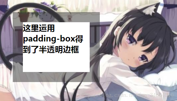
半透明边框
body{
    background: url("02.jpg") no-repeat;
}
.box{
    width: 200px;
    height:150px;
    margin: 40px ;
    border:30px solid hsla(0,0%,20%,.5);
    background: white;
    background-clip: padding-box;/*内边距的外沿把背景裁切掉*/
}
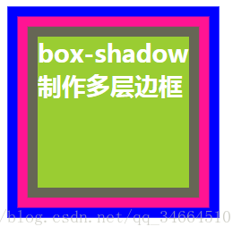
多层边框
1.box-shadow
.box{
    width: 150px;
    height:150px;
    margin: 40px ;
    background: yellowgreen;
    color:white;
    box-shadow:0 0 0 10px #665,0 0 0 20px deeppink,0 0 0 30px blue;
}
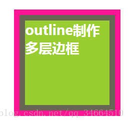
2.outline
.box{
    width: 150px;
    height:150px;
    margin: 40px ;
    background: yellowgreen;
    border:10px solid #665;
    color:white;
    outline: 10px solid deeppink;
}
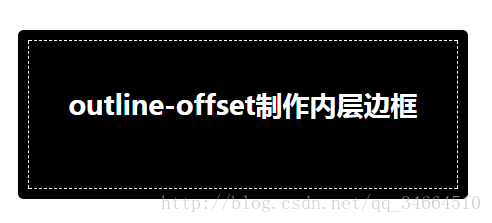
3.outline-offset
.box{
    width: 400px;
    height:150px;
    margin: 40px ;
    background: black;
    border-radius:5px;
    color:white;
    text-align: center;
    outline:1px dashed white;
    outline-offset: -10px ;
}
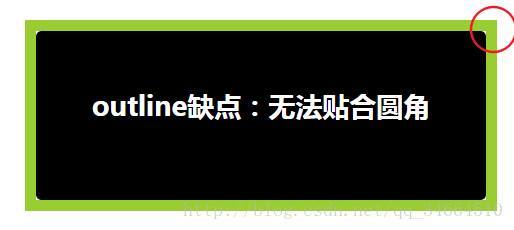
4.缺点
.box{
    width: 400px;
    height:150px;
    margin: 40px ;
    background: black;
    outline:10px solid yellowgreen;
    border-radius:5px;
    color:white;
    text-align: center;
}
灵活的背景定位
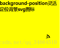
1.background-position
.box{
    width:250px;
    height: 200px;
    background: url("pizza.svg") no-repeat bottom right yellow;
    /*回退方案:不支持background-position属性时,就添加bottom right*/
    background-position: right 40px bottom 40px;
}
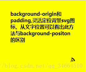
2.background-origin
默认情况下:我们写的left,bottom等属性值是以Padding Box为基准的
可以通过设置padding值,并使图标位置从Content Box开始,
.box{
    width:250px;
    height: 200px;
    background: url("pizza.svg") no-repeat bottom right yellow;
    padding: 40px;
    background-origin: content-box;
}
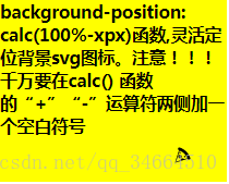
3.calc()函数
注意!!!千万要在calc()函数的“+”“-”运算符两侧加一个空白符号
.box{
    width:250px;
    height: 200px;
    background: url("pizza.svg") no-repeat yellow;
    background-position: calc(100% - 40px) calc(100% - 20px);
}
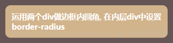
边框内圆角
1.运用两个div
*{
    padding: 0;
    margin: 0;
}
.outter_box{
    width: 400px;
    color: white;
    background: #655;
    padding: .8em;
}
.inner_box{
    background: tan;
    border-radius: .8em;
    padding: 1em;
}
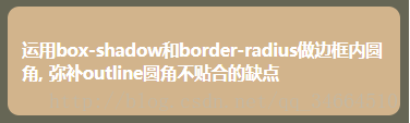
2.box-shadow和border-radius
.box{
    width: 400px;
    color: white;
    background: tan;
    padding: 1em;
    box-shadow: 0 0 0 .6em #665;
    border-radius: .8em;
    outline: .6em solid #666655;
}
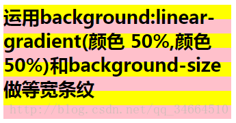
条纹背景
1.等宽双色条纹
.box{
    width: 400px;
    height: 200px;
    background:linear-gradient(yellow  50%,pink 50%);
    background-size: 100% 50px;
}
2.不等宽双色条纹
只需要改变色标的值,但要保证两个颜色百分比依然一致,
.box{
    width: 400px;
    height: 250px;
    background:linear-gradient(yellow 30%,pink 30%);
    background-size: 100% 50px;
}
//或者
.box{
width: 400px;
height: 250px;
background:linear-gradient(yellow 30%,pink 0);
background-size: 100% 50px;
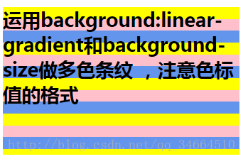
}3.多色条纹
方法(1)
.box{
    width: 400px;
    height: 250px;
    background:linear-gradient(yellow 33.3%,pink 33.3%,pink 66.6%,cornflowerblue 66.6%);
    background-size: 100% 60px;
}
方法(2)
如果某个色标的位置值比整个列表中在它之前的色标的位置值都小,则该色标的位置值就会被设置为它前面所有色标的位置值的最大值
这就意味着,如果我们把第二个色标值设为0,那它总是会被浏览器调整为前一个色标值
.box{
    width: 400px;
    height: 250px;
    background:linear-gradient(yellow 33.3%,pink 0,pink 66.6%,cornflowerblue 0);
    background-size: 100% 60px;
}
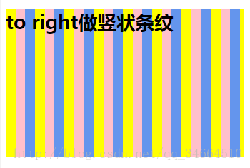
4.竖状条纹
.box{
    width: 400px;
    height: 250px;
    background:linear-gradient(to right ,yellow 33.3%,pink 0,pink 66.6%,cornflowerblue 0%);
    background-size: 30px 100%;
}
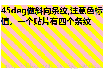
5.斜向条纹
方法(1)
.box{
    width: 400px;
    height: 250px;
    background:linear-gradient(45deg ,yellow 25%,pink 0,pink 50%,yellow 0,yellow 75%,pink 0);
    background-size: 50px 50px;
}
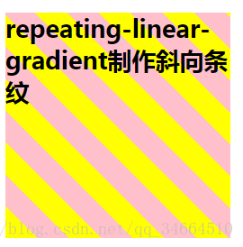
方法(2)
.box{
     width: 300px;
     height:300px;
     background:repeating-linear-gradient(45deg,yellow, yellow 30px,pink 0,pink 60px);
    }
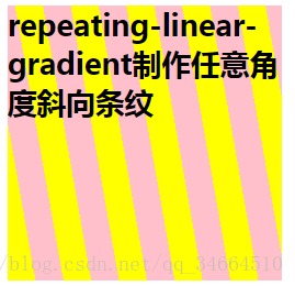
6.任意角度的斜向条纹
.box{
    width: 300px;
    height:300px;
    background:repeating-linear-gradient(80deg,yellow, yellow 30px,pink 0,pink 60px);
    }
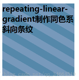
7.灵活的同色系条纹
方法(1)
 .box{
       width: 300px;
       height:300px;
       background:repeating-linear-gradient(30deg,#79b, #79b 30px,#58a 0,#58a 60px);
      }
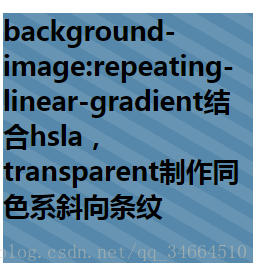
方法(2)
简写语法:两个连续色标具有相同颜色和不同的位置
 .box{
      width: 300px;
      height:300px;
      background: #5588aa;
      background-image:repeating-linear-gradient(30deg, hsla(0,0%,100%,.1),hsla(0,0%,100%,.1) 15px,transparent 0,transparent 30px);
      }
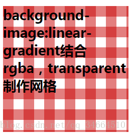
复杂的背景图案
网格
水平和垂直条纹叠加
 .box{
      width: 300px;
      height:300px;
      background: white;
      background-image:linear-gradient(90deg, rgba(200,0,0,.5) 50%, transparent 0),
                       linear-gradient(rgba(200,0,0,.5) 50%, transparent 0);
     background-size: 50px 50px;
      }
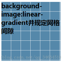
规定网格间隙
 .box{
      width: 300px;
      height:300px;
      background: #58a;
      background-image:linear-gradient(white 1px, transparent 0),
                       linear-gradient( 90deg,white 1px, transparent 0);
      background-size: 50px 50px;
      }
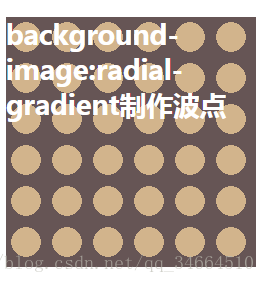
波点
 .box{
      width: 300px;
      height:300px;
      color:white;
      background: #655;
      background-image:radial-gradient(tan 50%, transparent 0);
      background-size: 50px 50px;
     }
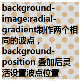
 .box{
         width: 300px;
         height:300px;
         color:black;
         background: gainsboro;
         background-image:radial-gradient(tan 30%, transparent 0),
                            radial-gradient(tan 30%, transparent 0);
         background-size: 50px 50px;
         background-position: 0 0,25px 25px;
      }
棋盘


 223
223


 被折叠的 条评论
为什么被折叠?
被折叠的 条评论
为什么被折叠?
 到【灌水乐园】发言


