


日常开发过程中,我们都会遇到这样一种场景:我们写出的 UI 效果在对接数据之前需要提前进行预览,进而调整 UI 细节和排版问题。我们一般的做法是什么样的?如果存在像 TextView 或者 ImageView 这种基础控件,你是不是还在通过诸如 android:text="xxx" 和 android:src="@drawable/xxx" 的方式来测试和预览UI效果?当然你肯定也会遇到这些“脏数据”给你带来的困扰:测试的时候某些地方出现了本不该出现的数据,事后可能一拍脑门才发现,原来是布局中控件预览数据没有清除导致的。如果是 RecyclerView,在后台接口尚能测试的情况下,你是否又要自己生成“假数据”并手写 Adapter 呢?这时候你不禁会问:有没有一种方法,既能够做到布局时预览数据方便排版,又能够在对接真实数据运行后动态替换和移除这些无关数据呢?
铛铛铛铛!Android 的 Tools attributes 应运而生。老规矩,我们先来看一个效果:
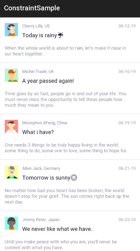
What?你在耍我吗?这么简单的列表拿出来干嘛?哈哈,客观不要着急。这个并不难实现,倘若我说这里并没有写一行 Java 或者 Kotlin 代码就实现了此效果,而只是在布局页面预览,你敢信吗?上图只是冰山一角,下面这张图才是全貌:
下面会带大家一步步实现上述功能,首先,让我们从头说起。
认识 Tools attributes#
Tools attributes 即以 tools 开始的命名空间,举个我们最常见到的例子:
Copy
<?xml version="1.0" encoding="utf-8"?> <android.support.constraint.ConstraintLayout xmlns:android="http://schemas.android.com/apk/res/android" xmlns:tools="http://schemas.android.com/tools" xmlns:app="http://schemas.android.com/apk/res-auto" android:layout_width="match_parent" android:layout_height="match_parent" tools:context=".MainActivity"> </android.support.constraint.ConstraintLayout>
大家肯定平时都会见到 tools:context=".XXXActivity 这个系统默认为我们生成的配置。一般来说,只有根视图才能使用这个属性,它指定了当前布局默认是与哪个 Activity 相关联,使得布局能够获取到绑定 Activity 的一些信息,比如 Theme 等等,而且当你在布局中给子 View 添加 onClick 事件时,相应的方法代码会插入到这个 Activity 中。
Android studio 支持很多在 XML 文件中以 tools 为命名空间的属性,当构建 App 时这些属性会被擦除,对 APK 的大小和运行时行为没有任何影响,这也就是我们文章最初想要的结果。
细说 Tools attributes#
在具体介绍 Tools attributes 之前,我们需要先了解如何引入 Tools 的命名空间并使用,很简单,只需要在 XML 布局文件的根元素中添加即可:
Copy
<RootTag xmlns:android="http://schemas.android.com/apk/res/android" xmlns:tools="http://schemas.android.com/tools" >
这些工具属性大概可以分为以下三类:
Error handling attributes#
即错误和警告处理属性。这类属性常被用来规避被 lint 检查出的一些错误提示以及警告。下面让我们看一些常见的例子:
-
tools:ignore
主要用来忽略一些 lint 产生的警告信息,并支持一些属性,例如:
Copy
<resources xmlns:tools="http://schemas.android.com/tools"> <string name="app_name">ConstraintSample</string> <string name="header_image_string" tools:ignore="MissingTranslation">header image</string> </resources>这个对于 Android studio 升级到 3.0 以上的小伙伴来说应该是很常见了,如果我们项目中涉及到国际化支持,那么编译器就会提示我们为每一种语言做适配,不能“厚此薄彼”,如果我们某些 string 只需要支持一种语言,只需要像上面那样添加
tools:ignore="MissingTranslation即可。相似的例子还可以在使用 ImageView 的时候看到:Copy
<ImageView android:layout_width="wrap_content" android:layout_height="wrap_content" android:src="@drawable/ic_person_off" tools:ignore="contentDescription" /> -
tools:targetApi
这个属性的功能和 Java 代码中的注解 @TargetApi 是一样的:它指定了当前控件或元素支持的 API 级别,属性值可以是 API Code 名或者 API 常数值,它支持一切属性。如:我们都知道,
android:elevation属性是在 API 21 版本以上才支持的,所以我们可以通过以下代码规避 lint 的警告:Copy
<Button android:layout_width="wrap_content" android:layout_height="wrap_content" android:elevation="4dp" tools:targetApi="lollipop"/> -
tools:locale
这个属性主要用在 标签内,用来指定当前资源中默认为哪种语言和区域,进而规避语言拼写的检测,比如你可以指定
values/strings.xml文件的默认语言是西班牙语而不是英语:Copy
<resources xmlns:tools="http://schemas.android.com/tools" tools:locale="es">
Resource shrinking attributes#
即资源压缩属性。关于此类属性的用法我们已经在之前的一篇文章带你领略Android混淆的魅力一文中做过详细讲解,下面再简单说明一下。
我们可以通过 tools:shrinkMode 和 tools:keep 属性来分别指定资源压缩的模式和需要保留的不被压缩的资源 ,还可以通过 tools:discard 属性来指定需要保留的资源,与 keep 功能类似:
Copy
<?xml version="1.0" encoding="utf-8"?> <resources xmlns:tools="http://schemas.android.com/tools" tools:shrinkMode="strict" tools:keep="@layout/activity_video*,@layout/dialog_update_v2" tools:discard="@layout/unused_layout,@drawable/unused_selector" />
下面就到本篇文章的重头戏了,注意,前方高能来袭!
Design-time View Attributes#
这就是我们先前效果图中的重要功臣了,即:布局设计时的控件属性。这类属性主要作用于 View 控件,如上文所说的 tools:context 就是“成员”之一,下面我们来介绍其他重要成员。
在此之前,我们需要先揭开 tools 命名空间的另一层神秘面纱:tools: 可以替换任何以 android: 为前缀的属性,并为其设置样例数据(sample data)。当然,正如我们前面所说,tools 属性只能在布局编辑期间有效,App真正运行后就毫无意义了,所以,我们就可以像下面这样来在运行前预览布局效果:
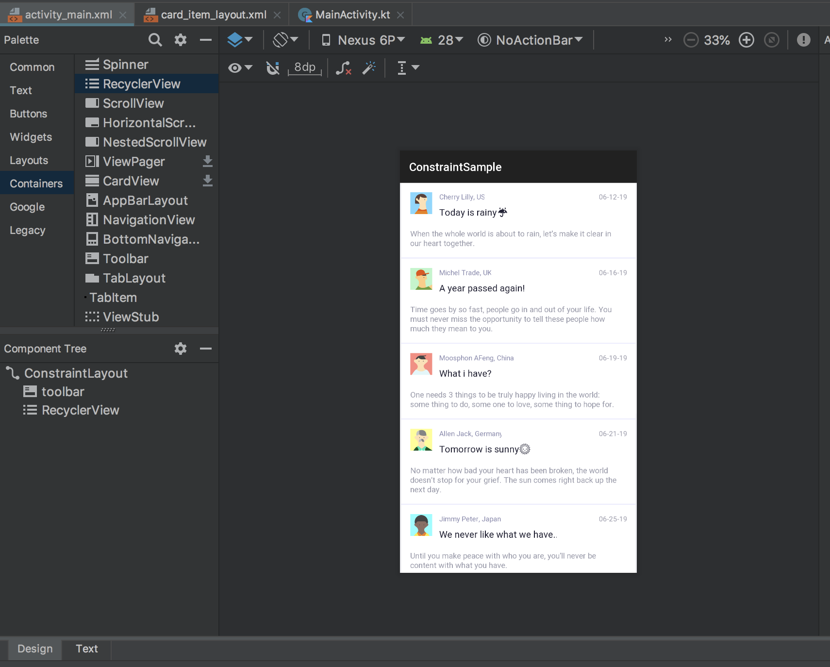
上图对应的布局文件为:
Card_item_layout.xml
Copy
<?xml version="1.0" encoding="utf-8"?> <android.support.constraint.ConstraintLayout xmlns:app="http://schemas.android.com/apk/res-auto" xmlns:tools="http://schemas.android.com/tools" xmlns:android="http://schemas.android.com/apk/res/android" android:background="@android:color/white" android:clickable="true" android:focusable="true" android:foreground="?attr/selectableItemBackground" android:layout_width="match_parent" android:layout_height="wrap_content" android:layout_marginStart="2dp" android:layout_marginEnd="2dp" tools:targetApi="m" tools:ignore="UnusedAttribute"> <ImageView android:id="@+id/card_item_avatar" android:layout_width="38dp" android:layout_height="38dp" app:layout_constraintStart_toStartOf="parent" android:layout_marginStart="16dp" android:layout_marginTop="16dp" app:layout_constraintTop_toTopOf="parent" app:layout_constraintBottom_toBottomOf="parent" android:layout_marginBottom="16dp" app:layout_constraintVertical_bias="0.0" tools:ignore="ContentDescription" tools:srcCompat="@drawable/user_other"/> <TextView android:id="@+id/card_item_username" android:layout_width="wrap_content" android:layout_height="wrap_content" android:layout_marginTop="16dp" app:layout_constraintTop_toTopOf="parent" app:layout_constraintStart_toStartOf="@+id/card_item_title" app:layout_constraintEnd_toEndOf="@+id/card_item_title" app:layout_constraintHorizontal_bias="0.0" android:textSize="12sp" android:textColor="@color/username_text_color" android:layout_marginEnd="16dp" android:paddingEnd="16dp" tools:text="水月沐风" /> <TextView android:id="@+id/card_item_title" android:layout_width="wrap_content" android:layout_height="wrap_content" android:textSize="16sp" android:textColor="@color/title_text_color" app:layout_constraintStart_toEndOf="@+id/card_item_avatar" android:layout_marginStart="12dp" app:layout_constraintTop_toBottomOf="@+id/card_item_username" android:layout_marginTop="8dp" android:maxLines="1" tools:text="今天上海的夜色真美!"/> <TextView android:id="@+id/card_item_content" android:layout_width="0dp" android:layout_height="wrap_content" app:layout_constraintStart_toStartOf="parent" android:layout_marginTop="24dp" app:layout_constraintTop_toBottomOf="@+id/card_item_avatar" app:layout_constraintBottom_toBottomOf="parent" android:layout_marginBottom="16dp" app:layout_constraintVertical_bias="1.0" android:maxLines="3" android:ellipsize="end" android:textColor="@color/content_text_color" android:textStyle="normal" app:layout_constraintEnd_toEndOf="@+id/card_item_bottom_border" android:layout_marginEnd="16dp" android:layout_marginStart="16dp" app:layout_constraintHorizontal_bias="0.0" tools:text="人生若只如初见,何事秋风悲画扇..."/> <ImageView android:id="@+id/card_item_poster" android:layout_width="0dp" android:layout_height="200dp" app:layout_constraintStart_toStartOf="parent" app:layout_constraintTop_toBottomOf="@+id/card_item_content" app:layout_constraintEnd_toEndOf="parent" android:layout_marginEnd="16dp" android:scaleType="centerCrop" android:layout_marginTop="8dp" android:layout_marginStart="16dp" app:layout_constraintBottom_toBottomOf="parent" android:layout_marginBottom="16dp" app:layout_constraintVertical_bias="0.0" tools:ignore="ContentDescription" android:visibility="visible" tools:src="@drawable/shanghai_night"/> <View android:id="@+id/card_item_bottom_border" android:layout_width="0dp" android:layout_height="2dp" app:layout_constraintTop_toBottomOf="@+id/card_item_poster" android:background="#ffededfe" app:layout_constraintEnd_toEndOf="parent" android:layout_marginTop="16dp" app:layout_constraintStart_toStartOf="parent"/> <TextView android:layout_width="wrap_content" android:layout_height="wrap_content" android:id="@+id/card_item_date" android:layout_marginTop="16dp" app:layout_constraintTop_toTopOf="parent" app:layout_constraintEnd_toEndOf="parent" android:layout_marginEnd="16dp" android:textColor="@color/date_text_color" android:textSize="12sp" tools:text="2019-08-10"/> </android.support.constraint.ConstraintLayout>
通过上面代码我们可以发现:通过 对 TextView 使用 tools:text 属性代替 android:text 就可以实现文本具体效果的预览,然而这项设置并不会对我们 App 实际运行效果产生影响。同理,通过将 tools:src 作用于 ImageView 也可以达到预览图片的效果。此外。我们还可以对其他以 android: 为前缀的属性进行预览而不影响实际运行的效果,例如:上面布局代码中的底部分割线 ,我们想将其在 App 实际运行的时候隐藏掉,但我们还是需要知道它的预览效果和所占高度:
Copy
<View android:id="@+id/card_item_bottom_border" android:layout_width="0dp" android:layout_height="2dp" android:visibility="gone" tools:visibility="visible" tools:layout_height="8dp" app:layout_constraintTop_toBottomOf="@+id/card_item_poster" android:background="#ffededfe" app:layout_constraintEnd_toEndOf="parent" android:layout_marginTop="16dp" app:layout_constraintStart_toStartOf="parent"/>
如上所示,通过 tools:visibility 和 tools:layout_height 就可以仅在布局预览情况下改变 View 的状态和高度。虽然上述情况比较少用,但是希望大家也能够知道,tools: 可以替代所有 android: 修饰的属性。
下面再列举一些其他会常用到的属性。
-
tools:layout
这个属性只能用于 fragment 控件中,如果我们的 activity 布局文件中声明了
<fragment>控件,我们就可以通过tools:layout=”@layout/fragment_main”来在当前 activity 布局中预览 fragment 中的布局效果。 -
tools:showIn
这个属性就比较好玩了,它可以指定其他布局文件像 组件一样在当前布局文件中使用和预览 控件的实际效果。例如,我们
card_item_layout.xml作为 showIn 的对象给show_in_layout.xml布局使用,然后我就可以看到show_in_layout.xml中如下效果:

-
tools:menu
这个属性可以给当前布局预览器的 Toolbar 添加多个菜单项,但仅限于布局文件的根节点元素。如:
Copy
<?xml version="1.0" encoding="utf-8"?> <LinearLayout xmlns:android="http://schemas.android.com/apk/res/android" xmlns:tools="http://schemas.android.com/tools" android:orientation="vertical" android:layout_width="match_parent" android:layout_height="match_parent" tools:menu="menu1,menu2" /> -
tools:maxValue | tools:minValue
这两个属性仅用于 ,可以在预览时指定其最大值和最小值:
Copy
<NumberPicker xmlns:android="http://schemas.android.com/apk/res/android" xmlns:tools="http://schemas.android.com/tools" android:id="@+id/numberPicker" android:layout_width="match_parent" android:layout_height="wrap_content" tools:minValue="0" tools:maxValue="10" /> -
tools:listitem | tools:listheader | tools:listfooter | tools:listCount
下面来讲一下列表相关组件的 tools 属性。上面四个属性仅用于 及其子类(如:ListView 和 RecyclerView)。然而,它们内部仍有一些使用限制:
tools:listCount仅用于 RecyclerView;tools:listheader和tools:listfooter仅限于 ListView;至于tools:listitem属性二者皆可用。之前的效果图就是借助于此属性:activity_main.xml:
Copy
<?xml version="1.0" encoding="utf-8"?> <android.support.constraint.ConstraintLayout xmlns:android="http://schemas.android.com/apk/res/android" xmlns:tools="http://schemas.android.com/tools" xmlns:app="http://schemas.android.com/apk/res-auto" android:layout_width="match_parent" android:layout_height="match_parent" tools:context=".MainActivity" android:background="#ffEBEBEF"> <android.support.v7.widget.Toolbar android:id="@+id/toolbar" android:layout_width="0dp" android:layout_height="wrap_content" android:background="?attr/colorPrimary" android:theme="?attr/actionBarTheme" android:minHeight="?attr/actionBarSize" app:layout_constraintStart_toStartOf="parent" app:layout_constraintEnd_toEndOf="parent" android:elevation="1dp" app:title="@string/app_name" app:layout_constraintTop_toTopOf="parent" app:layout_constraintHorizontal_bias="0.0"/> <android.support.v7.widget.RecyclerView android:layout_width="match_parent" android:layout_height="wrap_content" app:layout_constraintStart_toStartOf="parent" app:layout_constraintEnd_toEndOf="parent" app:layout_constraintBottom_toBottomOf="parent" android:scrollbars="vertical" app:layout_constraintTop_toBottomOf="@+id/toolbar" app:layout_constraintHorizontal_bias="0.0" app:layout_constraintVertical_bias="0.0" tools:listitem="@layout/card_item_layout"/> </android.support.constraint.ConstraintLayout>
sample data#
即 样本数据 功能,可以通过 @tools:sample 来使用该属性,也属于 design-time view attributes。但它并非只是一个属性那么简单,更应该算是一个“工具利器”,所以会将其单独拿出来详细介绍。这个工具是本年度 Google 大会上 Android 开发团队特别介绍的一个新推属性。它有什么用呢?用处大了!先前的布局预览使用的数据都是我们直接在布局控件中注明或者在 strings.xml文件中给出的,这一就会产生一些脏数据,不利于我们后期的处理。而有了 sample data,我们就可以对布局预览器中的 “样本数据”进行集中保存和管理了。
一、sample data 的使用#
Android studio 已为我们提供了以下样本数据,我可以直接拿来使用:
| Attribute value | Description of placeholder data |
|---|---|
@tools:sample/full_names | Full names that are randomly generated from the combination of@tools:sample/first_names and @tools:sample/last_names. |
@tools:sample/first_names | Common first names. |
@tools:sample/last_names | Common last names. |
@tools:sample/cities | Names of cities from across the world. |
@tools:sample/us_zipcodes | Randomly generated US zipcodes. |
@tools:sample/us_phones | Randomly generated phone numbers with the following format: (800) 555-xxxx. |
@tools:sample/lorem | Placeholder text that is derived from Latin. |
@tools:sample/date/day_of_week | Randomized dates and times for the specified format. |
@tools:sample/date/ddmmyy | |
@tools:sample/date/mmddyy | |
@tools:sample/date/hhmm | |
@tools:sample/date/hhmmss | |
@tools:sample/avatars | Vector drawables that you can use as profile avatars. |
@tools:sample/backgrounds/scenic | Images that you can use as backgrounds. |
上述表格中不仅有常用文本数据和日期等数据,还提供了一些图片样本数据,那么该如何使用呢?很简单,只需要切换到布局预览界面,并拖动一个 ImageView 到面板上,然后 Android studio 就会弹出如下界面:
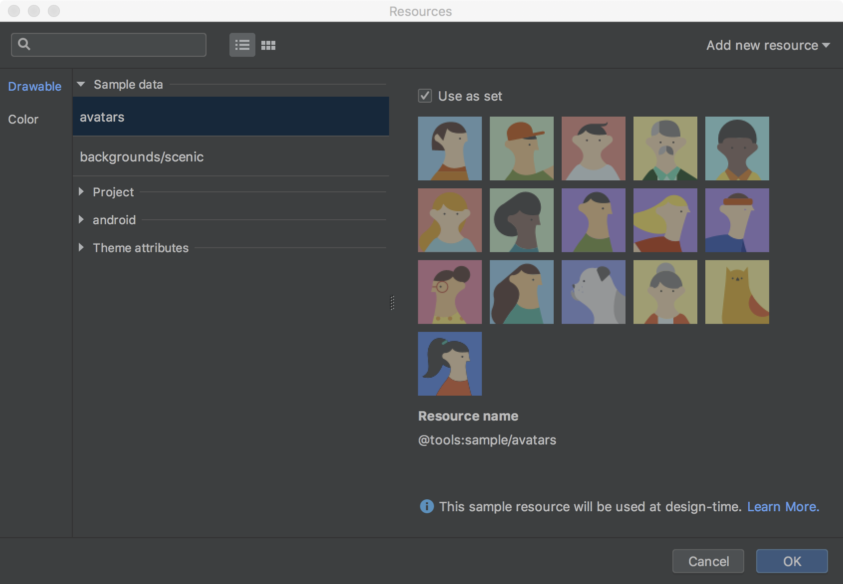
然后选择 avatars 或者 background/scenic 数据源就可以了。当然你也可以通过 xml 代码形式来设置:
Copy
<?xml version="1.0" encoding="utf-8"?> <android.support.constraint.ConstraintLayout xmlns:android="http://schemas.android.com/apk/res/android" xmlns:app="http://schemas.android.com/apk/res-auto" android:background="@android:color/white" xmlns:tools="http://schemas.android.com/tools" android:layout_width="match_parent" android:layout_height="match_parent"> <ImageView android:layout_width="36dp" android:layout_height="36dp" android:id="@+id/imageView" android:layout_marginTop="16dp" app:layout_constraintTop_toTopOf="parent" app:layout_constraintStart_toStartOf="parent" android:layout_marginStart="16dp" tools:srcCompat="@tools:sample/avatars"/> <TextView android:layout_width="0dp" android:layout_height="wrap_content" android:id="@+id/textView" app:layout_constraintStart_toEndOf="@+id/imageView" android:layout_marginStart="8dp" app:layout_constraintEnd_toEndOf="parent" android:layout_marginEnd="16dp" app:layout_constraintTop_toTopOf="parent" tools:text="@tools:sample/lorem/random" tools:maxLines="8" android:ellipsize="end" android:textSize="14sp" android:textColor="@color/title_color" android:layout_marginTop="16dp" app:layout_constraintHorizontal_bias="0.0"/> </android.support.constraint.ConstraintLayout>
同样地,TextView 也可以通过 @tools:sample/lorem/random 来添加样本数据,如此一来,效果如下:

哈哈,还不错吧😄。那么问题来了,如果我们想要用自己的样本数据源呢?
二、自定义 sample data#
如果我们想要是用自己定制化的样例数据,该如何做呢?其实很简单,只需要在 app 目录下创建 sample data directory 就可以了:

接下来,我们就可以在里面定制我们自己的数据了,在刚建好的 sampledata 目录下新建一个 txt 格式的数据文件,如 users,然后在里面创建如下数据:

如此这般,同理创建我们的其他数据: titles、descriptions,然后在上述 card_item_layout.xml 布局文件中替换并使用自己的数据源:
Copy
<TextView android:id="@+id/card_item_username" android:layout_width="wrap_content" android:layout_height="wrap_content" android:layout_marginTop="16dp" app:layout_constraintTop_toTopOf="parent" app:layout_constraintStart_toStartOf="@+id/card_item_title" app:layout_constraintEnd_toEndOf="@+id/card_item_title" app:layout_constraintHorizontal_bias="0.0" android:textSize="12sp" android:textColor="#8989ae" android:layout_marginEnd="16dp" android:paddingEnd="16dp" tools:text="@sample/users" />
这里仅以其中一个 TextView 举例说明,其他同理。
什么?你以为到这里就讲完了?哈哈,少年,看你骨骼惊奇,再教你一招来上天入地:通过自定义 Json 格式的 数据来为控件绑定数据:
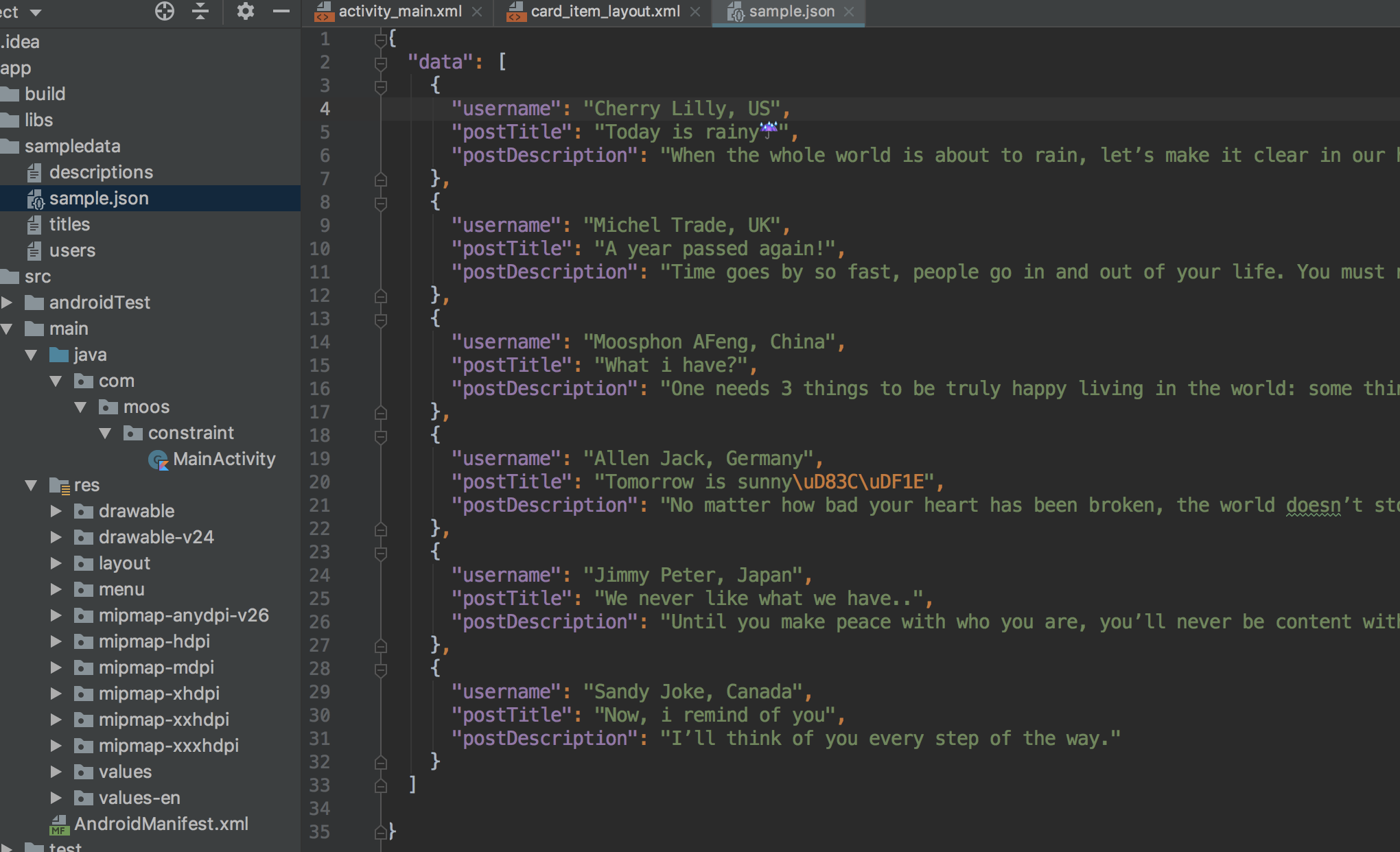
打完收工👋,还是上面的例子,来看看如何通过 json 数据来绑定:
Copy
<TextView android:id="@+id/card_item_username" android:layout_width="wrap_content" android:layout_height="wrap_content" android:layout_marginTop="16dp" app:layout_constraintTop_toTopOf="parent" app:layout_constraintStart_toStartOf="@+id/card_item_title" app:layout_constraintEnd_toEndOf="@+id/card_item_title" app:layout_constraintHorizontal_bias="0.0" android:textSize="12sp" android:textColor="#8989ae" android:layout_marginEnd="16dp" android:paddingEnd="16dp" tools:text="@sample/sample.json/data/username" />
以上操作的时候 Android studio 都会自动提示 sampledata 路径下的数据文件,Json 格式亦会提示到具体字段。


 931
931


 被折叠的 条评论
为什么被折叠?
被折叠的 条评论
为什么被折叠?
 到【灌水乐园】发言


