


CardView继承自FrameLayout类,可以在一个卡片布局中一致性的显示内容。
卡片可以包含圆角和阴影.CardView是一个Layout,可以布局其他View。
CardView被包装为一种布局,并且经常在ListView和RecyclerView的Item布局中,作为一种容器使用。
以后会继续完善,谢谢大家,好吧,也谢谢自己能找时间写下来……
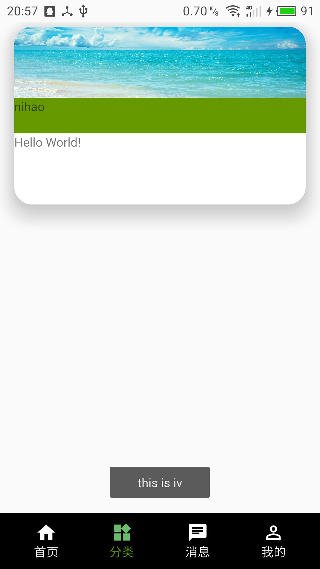
老规矩先贴效果图:
使用步骤:
添加依赖
可以直接在Module中的build.gradle中添加
compile 'com.android.support:cardview-v7:24.0.0'可以在Module Settings中add
布局fragment_fenlei.xml
<LinearLayout xmlns:android="http://schemas.android.com/apk/res/android"
    xmlns:card_view="http://schemas.android.com/apk/res-auto"
    xmlns:tools="http://schemas.android.com/tools"
    android:layout_width="match_parent"
    android:layout_height="match_parent"
    android:orientation="vertical"
    tools:context="com.zhuowang.wangzhe.myapplication2.fragment.FenLeiFragment">

    <android.support.v7.widget.CardView
        android:id="@+id/fenlei_card"
        android:layout_width="match_parent"
        android:layout_height="200dp"
        android:layout_marginBottom="5dp"
        android:layout_marginLeft="@dimen/activity_horizontal_margin"
        android:layout_marginRight="@dimen/activity_horizontal_margin"
        android:layout_marginTop="5dp"
        card_view:cardBackgroundColor="@android:color/white" ---》
        card_view:cardCornerRadius="20dp" ---》
        card_view:cardElevation="24dp" ---》
        android:clickable="false" ---》
        android:foreground="?android:attr/selectableItemBackground"> ---》

        <LinearLayout
            android:layout_width="match_parent"
            android:layout_height="match_parent"
            android:orientation="vertical">
            <ImageView
                android:id="@+id/card_iv"
                android:layout_width="match_parent"
                android:layout_height="80dp"
                android:scaleType="centerCrop"
                android:src="@mipmap/untitled" />
            <TextView
                android:layout_width="match_parent"
                android:text="nihao"
                android:background="@android:color/holo_green_dark"
                android:layout_height="40dp" />

            <TextView
                android:id="@+id/card_tv"
                android:layout_width="wrap_content"
                android:layout_height="wrap_content"
                android:text="Hello World!" />
        </LinearLayout>
    </android.support.v7.widget.CardView>
</LinearLayout>
1、card_view:cardBackgroundColor=”@android:color/white” 设置CardView的背景颜色
在这里有个疑问,设置背景颜色,用android:background不可以吗?!本人亲测,使用background属性是无法设置CardView的背景色的
2、card_view:cardCornerRadius=”20dp” 圆角的半径,即,CardView四个角的弧度
3、card_view:cardElevation=”24dp” 投放的阴影,有点立体的感觉,好吧,其实我想到的是iPhone
4、默认情况,CardView是不可点击的,并且没有任何的触摸反馈效果。
可以使CardView点击产生波纹的效果,有触摸点向外扩散,这个效果需要添加下面两个属性:
android:clickable=”true” –>如果为false,没有效果
android:foreground=”?android:attr/selectableItemBackground”
java中的代码
 CardView cardView= (CardView) view.findViewById(R.id.fenlei_card);
        ImageView iv= (ImageView) view.findViewById(R.id.card_iv);
        iv.setOnClickListener(new View.OnClickListener() {
            @Override
            public void onClick(View view) {
                Toast.makeText(getContext(),"this is iv",Toast.LENGTH_SHORT).show();
            }
        });


 扫一扫
扫一扫
 561
561

 被折叠的 条评论
为什么被折叠?
被折叠的 条评论
为什么被折叠?
 到【灌水乐园】发言


