


matplotlib是一个绘图库,创建的图形可以达到出版的要求。它提供了对图形各个部分进行定制的功能。
首先安装matplotlib包
第一种方法:在cmd窗口下
1.进入CMD窗口下,执行python -m pip install -U pip setuptools进行升级。
2.输入python -m pip install matplotlib进行自动的安装,系统会自动下载安装包
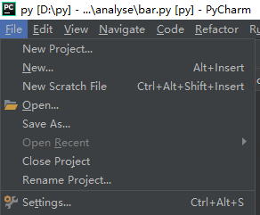
第二种方法:在pycharm环境里面
1.file选项进入到 setting…
2.在project interpreter中点击右侧绿色的加号
3.搜索到matplotlib,点击install package进行安装
最常用总结:
添加X,Y轴标签–plt.xlabel() plt.ylabel()
转换X轴刻度属性–plt.xticks([原始刻度属性列表],[想要替换的刻度属性列表])


1.条形图
条形图表示一组分类数值,比如计数值。垂直条形图 例:
import matplotlib.pyplot as plt
plt.style.use('ggplot')  //使用ggplot样式表来模拟ggplot2风格的图形
customers=['a','b','c','d','e']
customers_index=range(len(customers))
sale_amounts=[127,90,201,111,232]   //这三行为条形图准备数据。xticks函数在设置标签时要求
                                                               索引位置和标签值。
fig = plt.figure()         //创建一个基础图
ax1 = fig.add_subplot(1,1,1)  //(1,1,1)表示创建1行1列的子图,并使用第一个也是唯一一个子图
ax1.bar(customers_index,sale_amounts,align='center',color='darkblue')
                            //customer_index设置条形左侧在X轴上的坐标。sale_amounts设置条形的高度
ax1.xaxis.set_ticks_position('bottom')  //设置刻度线位置在x轴底部
ax1.yaxis.set_ticks_position('left')       //设置刻度线位置在y轴左侧
plt.xticks(customers_index,customers,rotation=0,fontsize='small') //刻度线标签由客户索引值改为
                                              实际的客户名称.,rotation=0表示刻度标签应该是水平的
plt.xlabel('Customer Name')  //添加x轴标签
plt.ylabel('Sale Amount')   //添加y轴标签
plt.title('Sale Amount per Customer')   //添加图形标题
plt.savefig('bar_plot.png',dpi=400,bbox_inches='tight')   //将统计图保存在当前文件夹中。
                                     bbox_inches='tight'表示在保存图形时,图形四周的空白部分去掉
plt.show()            在新窗口显示统计图
效果:
2.直方图
直方图用来表示数值分布。频率分布图 例:

import numpy as np
import matplotlib.pyplot as plt
plt.style.use('ggplot')
mu1,mu2,sigma = 100,130,15
x1 = mu1 + sigma*np.random.randn(10000)
x2 = mu2 + sigma*np.random.randn(10000) //准备数据,np.random.randn()函数返回一组服从
                                         正态分布的随机样本值,x1均值是100,x2均值是130
fig = plt.figure()
ax1 = fig.add_subplot(1,1,1)
n,bins,patches = ax1.hist(x1,bins=50,normed=False,color='darkgreen')
n,bins,patches = ax1.hist(x2,bins=50,normed=False,color='orange',alpha=0.5)
                  //创建两个柱形图,bins=50表示每个变量的值应该被分成50份。第一个暗绿色,第二个橙色。
                   alpha=0.5表示第二个直方图应该是透明的
ax1.xaxis.set_ticks_position('bottom')
ax1.yaxis.set_ticks_position('left')
plt.xlabel('Bins')
plt.ylabel('Number Of Values in Bin')
fig.suptitle('Histogram',fontsize=14,fontweight='bold') //为基础图添加标题,字体大小14,粗体。
ax1.set_title('Two Frequency Distributions')   //为子图添加标题
plt.savefig('histogram.png',dpi=400,bbox_inches='tight')
plt.show()
效果:
3.折线图
折线图中的数值点在一条折线上。通常用来表示数据随着时间发生的变化。例:

from numpy.random import randn
import matplotlib.pyplot as plt
plt.style.use('ggplot')

plot_data1 = randn(50).cumsum()
plot_data2 = randn(50).cumsum()
plot_data3 = randn(50).cumsum()
plot_data4 = randn(50).cumsum()   //准备随机数据

fig = plt.figure()
ax1 = fig.add_subplot(1,1,1)
ax1.plot(plot_data1, marker=r'o', color=u'blue', linestyle='-', label='Blue Solid')
ax1.plot(plot_data2, marker=r'+', color=u'red', linestyle='--', label='Red Dashed')
ax1.plot(plot_data3, marker=r'*', color=u'green', linestyle='-.', label='Green Dash Dot')
ax1.plot(plot_data4, marker=r's', color=u'orange', linestyle=':', label='Orange Dotted')
                                 //设置每条线数据点类型,颜色,线型,label参数保证折线可以正确标记
ax1.xaxis.set_ticks_position('bottom')
ax1.yaxis.set_ticks_position('left')

ax1.set_title('Line Plots: Markers, Colors, and Linestyles')
plt.xlabel('Draw')
plt.ylabel('Random Number')
plt.legend(loc='best')  //根据图中空白部分将图例放在最合适的位置

plt.savefig('line_plot.png', dpi=400, bbox_inches='tight')
plt.show()
效果:
4.散点图
散点图表示两个数值变量之间的相对关系,两个变量位于两个数轴上。例:

import numpy as np
import matplotlib.pyplot as plt
plt.style.use('ggplot')

x = np.arange(start=1., stop=15., step=1.)
y_linear = x + 5. * np.random.randn(14)
y_quadratic = x**2 + 10. * np.random.randn(14)
      //通过随机数使数据与一条直线和一条二次曲线稍稍偏离。
fn_linear = np.poly1d(np.polyfit(x, y_linear, deg=1))
fn_quadratic = np.poly1d(np.polyfit(x, y_quadratic, deg=2))
  //使用numpy的polyfit函数通过两组数据拟合出一条直线和一条二次曲线
    再使用poly1d函数根据直线和二次曲线参数生成一个线性方程和二次方程
fig = plt.figure()
ax1 = fig.add_subplot(1,1,1)
ax1.plot(x, y_linear, 'bo', x, y_quadratic, 'go',\
x, fn_linear(x), 'b-', x, fn_quadratic(x), 'g-', linewidth=2.)
   //创建带有2条回归曲线的散点图,‘bo’表示蓝色圆圈,‘g-’表示绿色实线
ax1.xaxis.set_ticks_position('bottom')
ax1.yaxis.set_ticks_position('left')
ax1.set_title('Scatter Plots with Best Fit Lines')
plt.xlabel('x')
plt.ylabel('f(x)')
plt.xlim((min(x)-1., max(x)+1.))
plt.ylim((min(y_quadratic)-10., max(y_quadratic)+10.))
   //设置了x轴和y轴的范围
plt.savefig('scatter_plot.png', dpi=400, bbox_inches='tight')
plt.show()
效果:
5.箱线图
箱线图可以表示出数据的最小值,第一四分位数,中位数,第三四分位数和最大值。
箱体的下部和上部边缘线分别表示第一四分位数和第三四分位数,中间直线表示中位数,上下两端延申出去的直线表示非离群点的最小值和最大值,直线之外的点表示离群点。例:

import matplotlib.pyplot as plt
import numpy as np
plt.style.use('ggplot')
N = 500
normal = np.random.normal(loc=0.0, scale=1.0, size=N)
lognormal = np.random.lognormal(mean=0.0,sigma=1.0,size=N)
index_value = np.random.random_integers(low=0, high=N-1, size=N)
normal_sample = normal[index_value]
lognormal_sample = lognormal[index_value]
box_plot_data = [normal,normal_sample,lognormal,lognormal_sample]

fig = plt.figure()
ax1 = fig.add_subplot(1,1,1)
box_labels = ['normal', 'normal_sample', 'lognormal', 'lognormal_sample']
    //创建列表box_labels,里面保存着每个箱线图的标签。
ax1.boxplot(box_plot_data, notch=False, sym='.', vert=True, \
whis=1.5, showmeans=True, labels=box_labels)
    //notch=False表示箱体是矩形,sym='.'表示离群点使用圆点,vert=True表示箱体是垂直的.
      whis=1.5设定了直线从第一四分位数和第三四分位数延伸出的范围
      showmeans=True 表示箱体在显示中位数的同时也显示均值
ax1.xaxis.set_ticks_position('bottom')
ax1.yaxis.set_ticks_position('left')
ax1.set_title('Box Plots:Resampling of Two Distributions')
ax1.set_xlabel('Distribution')
ax1.set_ylabel('Value')
plt.savefig('box_plot.png',dpi=400,bbox_inches='tight')
plt.show()
效果:


 3万+
3万+


 被折叠的 条评论
为什么被折叠?
被折叠的 条评论
为什么被折叠?
 到【灌水乐园】发言


