


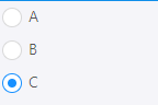
一、组件如图所示:
二、使用方法:
import Radios from '../../components/Radio/index';
import './index.less';

const Template = () => {
  const [value, setValue] = useState(1);
  const onChange = value => {
    console.log(value);
    setValue(value);
  };
  const children = [{
    value: 'a',
    cont: <div>A</div>
  }, {
    value: 'b',
    cont: <div>B</div>
  },
  {
    value: 'c',
    cont: <div>C</div>
  }]
  return (
    <div className='main'>
      <Radios value={value} children={children} onChange={onChange} />
    </div>
  );
};
三、Radios组件:
import React, { Component } from 'react';
import cx from 'classnames';
import './index.less';

function Item({ checked, value, change, children }) {
    return (
        <label className={cx({ 'radio-wrapper': true, 'radio-wrapper-checked': value == checked })}>
            <span className={cx({ 'radio': true, 'radio-checked': value == checked })}>
                <input type="radio" className="radio-input" onClick={change.bind(this, value)} />
                <span className="radio-inner"></span>
            </span>
            {children}
        </label>
    );
}

class Radios extends Component {
    render() {
        const { children, onChange, value } = this.props;
        return (
            <div className="radio-group">
                {
                    children.map((item, index)=>{
                        return <Item key={index} checked={value} value={item.value} children={item.cont} change={onChange}/>
                    })
                }
             </div>
        )
    }
}

export default Radios;
四、样式:
.radio-group {
    box-sizing: border-box;
    margin: 0;
    padding: 0;
    color: rgba(0,0,0,.65);
    font-size: 14px;
    font-variant: tabular-nums;
    list-style: none;
    font-feature-settings: 'tnum';
    display: inline-block;
    line-height: unset;
    .radio-wrapper {
        box-sizing: border-box;
        margin: 0;
        padding: 0;
        color: rgba(0,0,0,.65);
        font-size: 14px;
        font-variant: tabular-nums;
        list-style: none;
        font-feature-settings: 'tnum';
        position: relative;
        display: flex;
        margin-right: 8px;
        white-space: nowrap;
        padding: 6px;
        cursor: pointer;
        .radio {
            box-sizing: border-box;
            margin: 0;
            padding: 0;
            color: rgba(0,0,0,.65);
            font-size: 14px;
            font-variant: tabular-nums;
            line-height: 1.5715;
            list-style: none;
            font-feature-settings: 'tnum';
            position: relative;
            top: 0;
            display: inline-block;
            line-height: 1;
            white-space: nowrap;
            vertical-align: sub;
            outline: none;
            cursor: pointer;
            margin-right: 6px;
            input[type=radio], input[type=checkbox] {
                -webkit-box-sizing: border-box;
                box-sizing: border-box;
                padding: 0;
            }
            .radio-input {
                position: absolute;
                top: 0;
                right: 0;
                bottom: 0;
                left: 0;
                z-index: 1;
                cursor: pointer;
                opacity: 0;
            }
            .radio-inner {
                position: relative;
                top: 0;
                left: 0;
                display: block;
                width: 16px;
                height: 16px;
                background-color: #fff;
                border-color: #d9d9d9;
                border-style: solid;
                border-width: 1px;
                border-radius: 100px;
                -webkit-transition: all .3s;
                transition: all .3s;
            }
            .radio-inner::after {
                position: absolute;
                top: 3px;
                left: 3px;
                display: table;
                width: 8px;
                height: 8px;
                background-color: #1890ff;
                border-top: 0;
                border-left: 0;
                border-radius: 8px;
                -webkit-transform: scale(0);
                transform: scale(0);
                opacity: 0;
                -webkit-transition: all .3s cubic-bezier(.78,.14,.15,.86);
                transition: all .3s cubic-bezier(.78,.14,.15,.86);
                content: ' ';
            }
        }
        .radio-checked .radio-inner {
            border-color: #1890ff;
            &::after{
                position: absolute;
                top: 4px;
                left: 4px;
                display: table;
                width: 8px;
                height: 8px;
                background-color: #1890ff;
                border-top: 0;
                border-left: 0;
                border-radius: 8px;
                -webkit-transform: scale(0);
                transform: scale(0);
                opacity: 0;
                -webkit-transition: all .3s cubic-bezier(.78,.14,.15,.86);
                transition: all .3s cubic-bezier(.78,.14,.15,.86);
                content: ' ';
            }
        }
        .radio-checked .radio-inner::after {
            transform: scale(1);
            opacity: 1;
            transition: all .3s cubic-bezier(.78,.14,.15,.86);
        }
        .radio-checked::after {
            position: absolute;
            top: 0;
            left: 0;
            width: 100%;
            height: 100%;
            border: 1px solid #1890ff;
            border-radius: 50%;
            visibility: hidden;
            -webkit-animation: antRadioEffect .36s ease-in-out;
            animation: antRadioEffect .36s ease-in-out;
            -webkit-animation-fill-mode: both;
            animation-fill-mode: both;
            content: '';
        }
    }
}


 361
361


 被折叠的 条评论
为什么被折叠?
被折叠的 条评论
为什么被折叠?
 到【灌水乐园】发言


