


实现效果如图:
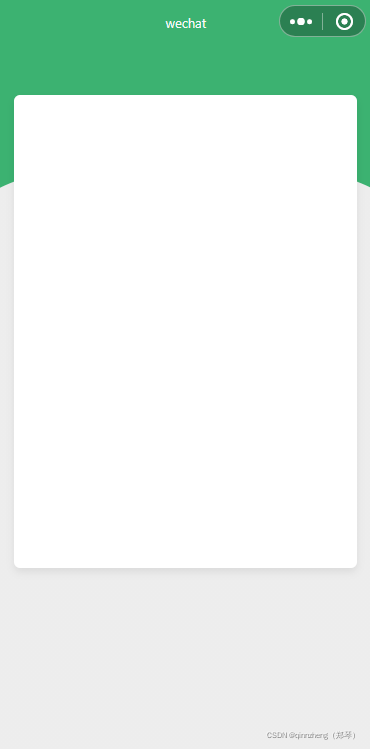
<view>
    <view class="green"></view>
    <view class="card"></view>
</view>
page {
    /* 苹果手机会有拉伸的效果,
       所以下拉效果要是绿色,
       上拉要是灰色 */
    /* background: #EDEDED; */
    background: linear-gradient(#3CB271 0%, #3CB271 200rpx,#EDEDED 201rpx, #EDEDED 100%);
}
.green {
    width: 100%;
    height: 300rpx;
    background: #3CB271;
    position: relative;
    z-index: 1;
}
.green::after {
    content: "";
    position: absolute;
    left: 0;
    right: 0;
    bottom: 0;
    width: 100%;
    height: 72rpx;
    background: url("bg.png") no-repeat left bottom;
    background-size: 100% 72rpx;
    z-index: 2;
}
.card {
    width: 560rpx;
    height: 746rpx;
    background: #FFFFFF;
    box-shadow: 0px 8rpx 16rpx 0px rgba(0,0,0,0.08);
    border-radius: 13rpx;
    margin: -220rpx auto 0;
    position: relative;
    z-index: 3;
}
使用到的弧度:


 6835
6835


 被折叠的 条评论
为什么被折叠?
被折叠的 条评论
为什么被折叠?
 到【灌水乐园】发言


