


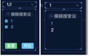
- 单选&&多选
当前组件的样式是可以和el-select 的样式 功能一模一样。 区别在于 我的搜索在 下拉框内部
- 组件API 可 继承于 elementUI 的原组件的API 由于 目前业务没有涉及,只继承了部分API ,
涉及 el-popover 、 el-checkbox
- 拓展一 :根据 选择项 的多少 做分页
- 拓展二 :根据 实现懒加载功能
- 拓展三 :继承全部 element 组件的特性
- 拓展四 :底部按钮的功能样式 再封装 最好支持插槽 并设置相对应的钩子函数 由外部传递进来
- 拓展五 : 根据传递进来的数组结构 判断是否是树形结构 树形结构的重命名等,多选&单选等
- 目前组件功能
- 支持单选,多选, 支持默认选择, 默认搜索,效果与el-select 一样 ,用法也是一样
原代码:
<template>
  <div class="select_search_box box_border">
    <el-popover
      placement="bottom"
      v-model="currentVisible"
      :trigger="trigger"
      :popper-class="className"
    >
      <div class="search_box">
        <!-- 查找框 -->
        <div class="search_box_search">
          <i class="icon"></i>
          <el-input
            class="search_input"
            v-model="currentSearchValue"
            placeholder="模糊搜索设备"
          >
            ></el-input
          >
        </div>
      </div>
      <!-- 显示数组 -->
      <div class="view_box">
        <el-checkbox-group v-model="currentValue" @change="change">
          <div class="emply" v-if="list.length === 0">没有更多数据了</div>
          <!-- 选择 -->
          <div v-else class="check_box" :class="{ radio: type === 'radio' }">
            <el-checkbox
              v-for="item in showList"
              :key="item[value]"
              :label="item[label]"
              :value="item[value]"
            >
              {{ item[label] }}</el-checkbox
            >
          </div>
        </el-checkbox-group>
      </div>
      <!-- 底部 -->
      <div class="footer" v-if="type !== 'radio'">
        <el-button class="left_btn" @click="reset">重置</el-button>
        <el-button class="right_btn" @click="compire">对比</el-button>
      </div>
      <!-- 外部样式 -->
      <div class="show_title" slot="reference">
        <span
          class="title text_overflow"
          :class="{ choose: title !== '请选择' }"
          >{{ title }}</span
        >
        <div class="logo"></div>
      </div>
    </el-popover>
  </div>
</template>
<script>
export default {
  props: {
    // 单选     单选为‘radio’    多选为其他都可    这里可以拓展为 支持选择 至少/至多 有几个下拉的
    type: {
      type: String,
      default: "radio",
    },
    trigger:{
      type:String,
      default:'click'
    },
    // 下拉框类名(弹出层父级为body)    有默认样式     对于某些特殊页面中  可以单独设置样式
    className: {
      type: String,
      default: "search_dev_group",
    },
    // 继承 el-checkbox
    list: {
      type: Array,
      default: [],
    },
    // 继承 el-checkbox  label
    label: {
      type: String,
      default: "label",
    },
    // 继承 el-checkbox  value
    value: {
      type: String,
      default: "value",
    },
    // 双向绑定的数据      单选 为String  , 多选为 Array  支持 undefined null 为初始值
    getValue: {
      type: [String, Array, null, undefined],
    },
    // 用于其他组件  关闭该组件的弹出层
    closeVisible: {
      type: Boolean,
      default: false,
    },
    // 支持默认 的搜索条件
    searchValue: {
      type: String,
      default: "",
    },
  },
  data() {
    return {
      currentVisible: false, // 弹出层布尔值
      currentSearchValue: "", // 搜索条件
      currentValue: [], // 当前选中的值
    };
  },
  computed: {
    // 迷糊搜索    展示列表
    showList() {
      const arr = this.list.filter((item) => {
        let inputValue = new RegExp(
          `(.*)(${this.currentSearchValue.split("").join(")(.*)(")})(.*)`,
          "i"
        );
        return item[this.label].match(inputValue);
      });
      return arr;
    },
    // 在外层展示 选中的label
    title() {
      // 1. 容错处理 如果初始值 为 null undefind  保证名称正确
      if (
        this.currentValue + "" === "null" ||
        this.currentValue + "" === "undefind"
      ) {
        return "请选择";
      }
      // 2. 无值   类型 Array  String
      if (this.currentValue.length === 0) {
        return "请选择";
      }
      // 3.1 有值  单选
      if (this.type === "radio") {
        return this.currentValue[0];
      } else {
        // 3.2 有值  多选
        return this.currentValue.join(";");
      }
    },
  },
  methods: {
    // 对比
    compire() {
      this.currentVisible = false;
    },
    // 重置
    reset(){
      this.currentValue = []
    },
    // 选择发生改变    // 根据选中的值 传递给父组件
    change() {
      // 单选逻辑
      if (this.type === "radio") {
        if (this.currentValue.length >= 2) {
          this.currentValue.shift();
          // 传递给父组件一个 String
          this.$emit("update:getValue", this.currentValue[0]);
        }
        this.currentVisible = false;
      }else{
        // 多选逻辑   传递给父组件一个Array
           this.$emit("update:getValue", this.currentValue);
      }
    },
  },
  watch: {
    // 其他组件关闭这个数据
    closeVisible(val) {
      this.visible = false;
    },
    // 由父组件  传递给子组件的属性  getValue
    getValue: {
      immediate: true,
      handler(val) {
        // 1. 值为空  null undefined ''  []   容错处理 如果初始值 为 null undefind  保证正常的初始化
        if (val + "" === "null" || val + "" === "undefind" || (val + '').length === 0 || (val + '')=== '[]') {
          this.currentValue = []
          return
        }
        // 2. 值非空    复杂数据类型 不能直接给 this.currentValue  这个赋值 []会 造成 死循环  简单数据类型可以
        if (this.type === "radio") {
          // val 为 String
          this.currentValue = this.currentValue.filter(item => item === val)
        } else {
          // val 为 Array  先清空原数组  再进行给值
          this.currentValue = this.currentValue.filter(item=> false)
          val.forEach(item => {
            this.currentValue.push(item)
          });
        }
      },
    },
    // 由父组件  传递给子组件的 searchValue
    searchValue: {
      immediate: true,
      handler(val) {
        this.currentSearchValue = val;
      },
    },
  },
};
</script>

<style lang="less">
.search_dev_group {
  // /deep/.el-checkbox__inner{
  //   display: none;
  // }
  width: 170px !important;
  margin-left: -1px;
  // height: 276px;
  // margin-left: -15px;
  padding: 0;
  padding-bottom: 7px;
  border: 3px solid red;
  border-image-source: url("../../assets/img/common/dropdown_box.png");
  border-image-repeat: round;
  border-image-width: 4;
  border-image-slice: 20 19;
  // 下拉框背景颜色
  background-color: @boxBgColor1;
  // background-color: red;
  font-size: 12px;
  // 移动块
  .popper__arrow {
    border: none;
  }
  .popper__arrow::after {
    background: url("../../assets/img/common/dropdown_triangle.png");
    background-size: 13px 13px;
    left: 2px;
    top: -5px !important;
    width: 13px;
    height: 13px;
    border: none;
  }

  .search_box {
    z-index: 999;
    opacity: 0.6;
    margin-top: 10px;
    padding: 0 10px;
    .search_box_search {
      position: relative;
      i {
        display: block;
        width: 15px;
        height: 15px;
        position: absolute;
        top: 5px;
        left: 10px;
        // color: rgba(255, 255, 255, 0.6);
        background-size: 100% 100%;
        background-image: url(../../assets/img/common/magnifier.png);
        z-index: 999;
      }
      .el-input__inner {
        width: 100%;
        height: 25px;
        margin: 0;
        text-indent: 15px;
      }
    }
  }

  .view_box {
    width: 100%;
    height: 120px;
    font-size: 12px;
    overflow-y: scroll;
    margin-bottom: 5px;
    margin-top: 5px;
    .el-checkbox-group {
      width: 100%;
      height: 100%;
      .check_box {
        width: 100%;
        height: 100%;
        .el-checkbox {
          margin: 0;
          display: flex;
          align-items: center;
          height: 30px;
          width: 100%;
          padding: 0 10px;
          .el-checkbox__label {
            width: 100%;
            overflow: hidden;
            font-size: 12px;
            font-weight: 400;
            padding-left: 16px;
            // border: 1px solid #ededed;
          }
          &:hover {
            // background: @noCheckedBgColor;
            color: #29c5ff;
            background-color: #0d2445;
          }
        }

        &.radio {
          .el-checkbox {
            .el-checkbox__input {
              display: none;
            }
          }
        }
      }
    }
  }

  .footer {
    padding: 0 10px;
    // border: 1px solid #fff;
    display: flex;
    justify-content: space-between;
  }
}
</style>

<style lang="less" scoped>
.select_search_box {
  width: 100%;
  height: 100%;
  position: relative;
}
/deep/.el-input__inner {
  height: 25px;
  font-size: 12px;
  background-color: #0d2445;
  // color: #fff;
  -webkit-text-fill-color: #fff !important;
  margin-top: 10px;
  border: none;
}

/deep/.el-button {
  height: 30px;
  width: 60px;
  font-size: 12px;
  font-weight: 400;
  // margin-top: 30px;
  border: none;
  color: #fff;
  display: flex;
  justify-content: center;
  align-items: center;
}
.left_btn {
  background-color: #2cd47b;
}
.right_btn {
  background-color: #29c5ff;
}

/deep/.el-tree {
  background: rgba(0, 0, 0, 0);
  // color: rgba(255, 255, 255, 0.6);
  color: #fff;

  // opacity: 0.6;
}

/deep/.el-tree--highlight-current
  .el-tree-node.is-current
  > .el-tree-node__content {
  background-color: rgba(0, 0, 0, 0) !important;
}

/deep/.el-tree-node__content:hover {
  background-color: rgba(0, 0, 0, 0);
}
/deep/.el-tree-node.is-checked {
  color: #fff !important;
  .el-checkbox__inner::after {
    border-color: #0d2445;
  }
}
.button_right {
  display: flex;
  justify-content: flex-end;
}
::v-deep .el-tree-node__content .el-checkbox.is-disabled {
  display: none !important;
  // background-color: red;
}
.show_title {
  width: 100%;
  height: 100%;
  display: flex;
  align-items: center;
  justify-content: space-around;
  padding: 0 11px 0 15px;
  .title {
    width: 115px;
    font-size: 12px;
    color: @fontColor1;
  }
  .title.choose {
    color: @fontColor;
  }
  .logo {
    width: 10px;
    height: 5px;
    margin-left: 2px;

    //  background-color: red;
    background: url("../../assets/img/common/down-hover.png") no-repeat;
    background-size: 10px 5px;
  }
}
</style>


 2386
2386


 被折叠的 条评论
为什么被折叠?
被折叠的 条评论
为什么被折叠?
 到【灌水乐园】发言


