


说到数据分析,肯定离不开数据的可视化,毕竟图表比冷冰冰的数字更加直观,老板们只想一眼就能看出趋势和结论。
https://pyecharts.org/#/zh-cn/quickstart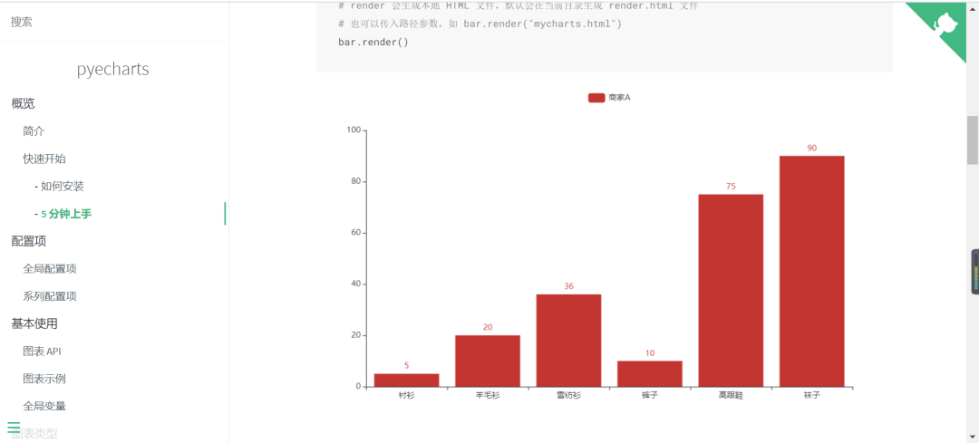
今天我们就聊一聊 pyecharts 中几种常用的图表。
pyecharts的安装
pip install pyecharts

有兴趣的小伙伴们也可以看看我之前的可视化案例
Python实战|腾讯招聘你干什么?python可视化告诉你
Python实战| 9383字手把手教你使用多线程爬取瓜子二手车并且可视化展示!
导入模块
使用到的相关库如下:
from pyecharts.charts import Bar
from pyecharts.charts import Pie
from pyecharts.charts import Line
from pyecharts import options as opts
from pyecharts.charts import EffectScatter
from pyecharts.globals import SymbolType
from pyecharts.charts import Grid
from pyecharts.charts import WordCloud
from pyecharts.charts import Map
数据这里我们以之前瓜子二手车和高校排行数据为例,有兴趣的小伙伴可以参考:
 最低0.47元/天 解锁文章


 3251
3251


 被折叠的 条评论
为什么被折叠?
被折叠的 条评论
为什么被折叠?
 到【灌水乐园】发言


