<!DOCTYPE html>
<html lang="en">
<head>
<meta charset="UTF-8">
<meta http-equiv="X-UA-Compatible" content="IE=edge">
<meta name="viewport" content="width=device-width, initial-scale=1.0">
<title>文字样式</title>
</head>
<style>
body {
background-color: rgb(192, 221, 221);
color: #fff;
font-size: 3rem;
font-weight: bold;
font-family: Microsoft YaHei;
text-align: center;
}
h1 {
text-shadow: -1px -1px 0 #07337f, 1px -1px 0 #07337f, -1px 1px 0 #07337f, 1px 1px 0 #07337f;
}
h2 {
-webkit-text-stroke: 1px crimson;
}
h3 {
-webkit-text-fill-color: transparent;
-webkit-text-stroke: 1px #fff;
}
h4 {
background: linear-gradient(to bottom, #FCF, #000);
-webkit-background-clip: text;
-webkit-text-fill-color: transparent;
}
h5 {
margin: auto;
width: 300px;
height: 300px;
font-size: 60px;
text-align: center;
color: transparent;
-webkit-background-clip: text;
background-image: url('https://img-blog.csdnimg.cn/20201117093711546.png?x-oss-process=image/watermark,type_ZmFuZ3poZW5naGVpdGk,shadow_10,text_aHR0cHM6Ly9ibG9nLmNzZG4ubmV0L3FxXzM3MDI0ODg3,size_10,color_FFFFFF,t_70#');
}
</style>
<body>
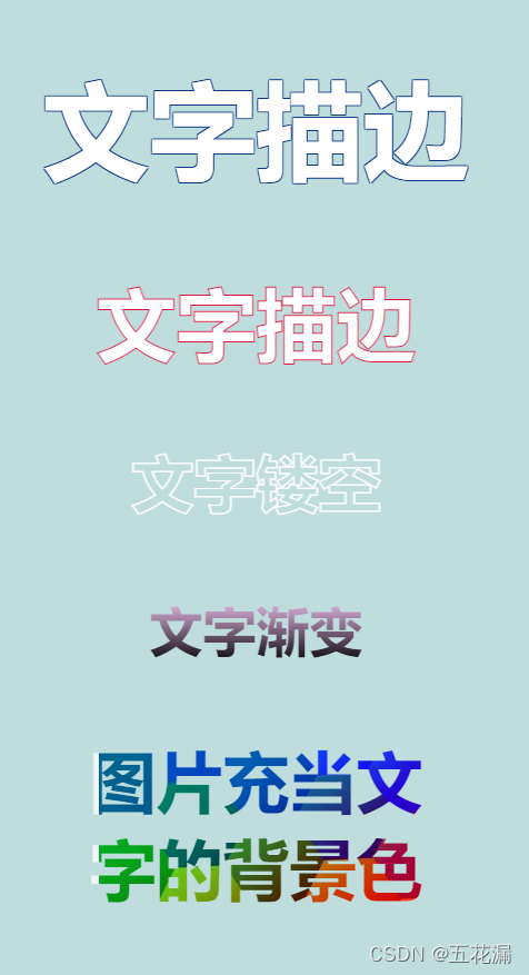
<h1>文字描边</h1>
<h2>文字描边</h2>
<h3>文字镂空</h3>
<h4>文字渐变</h4>
<h5>图片充当文字的背景色</h5>
</body>
</html>
<!DOCTYPE html>
<html lang="en">
<head>
<meta charset="UTF-8">
<meta http-equiv="X-UA-Compatible" content="IE=edge">
<meta name="viewport" content="width=device-width, initial-scale=1.0">
<title>Document</title>
<script src="https://cdn.bootcss.com/jquery/3.2.1/jquery.min.js"></script>
</head>
<style>
@-moz-keyframes loading_text {
0%,
100% {
opacity: 1;
}
26% {
opacity: 0.2;
}
76% {
opacity: 0.6;
}
}
@-webkit-keyframes loading_text {
0%,
100% {
opacity: 1;
}
26% {
opacity: 0.2;
}
76% {
opacity: 0.6;
}
}
@keyframes loading_text {
0%,
100% {
opacity: 1;
}
26% {
opacity: 0.2;
}
76% {
opacity: 0.6;
}
}
.loader_text {
overflow: hidden;
font-size: 3rem;
color: #333;
}
.loader_text span {
-moz-animation: loading_text 1s linear infinite -0.8s;
-webkit-animation: loading_text 1s linear infinite -0.8s;
animation: loading_text 1s linear infinite -0.8s;
float: left;
}
.loader_text .span2 {
-moz-animation: loading_text 1s linear infinite -0.2s;
-webkit-animation: loading_text 1s linear infinite -0.2s;
animation: loading_text 1s linear infinite -0.2s;
}
.loader_text .span3 {
-moz-animation: loading_text 1s linear infinite -0.5s;
-webkit-animation: loading_text 1s linear infinite -0.5s;
animation: loading_text 1s linear infinite -0.5s;
}
.loader_text .span4 {
-moz-animation: loading_text 1s linear infinite -1.1s;
-webkit-animation: loading_text 1s linear infinite -1.1s;
animation: loading_text 1s linear infinite -1.1s;
}
.loader_text .span5 {
-moz-animation: loading_text 1s linear infinite -0.36s;
-webkit-animation: loading_text 1s linear infinite -0.36s;
animation: loading_text 1s linear infinite -0.36s;
}
.loader_text .span6 {
-moz-animation: loading_text 1s linear infinite -0.65s;
-webkit-animation: loading_text 1s linear infinite -0.65s;
animation: loading_text 1s linear infinite -0.65s;
}
.loader_text .span7 {
-moz-animation: loading_text 1s linear infinite -0.93s;
-webkit-animation: loading_text 1s linear infinite -0.93s;
animation: loading_text 1s linear infinite -0.93s;
}
</style>
<body>
<div class="loader_text">
<span>L</span>
<span class="span2">o</span>
<span class="span3">a</span>
<span class="span4">d</span>
<span class="span5">i</span>
<span class="span6">n</span>
<span class="span2">g</span>
<span class="span3">.</span>
<span class="span4">.</span>
<span class="span5">.</span>
</div>
</body>
</html>


 扫一扫
扫一扫


 被折叠的 条评论
为什么被折叠?
被折叠的 条评论
为什么被折叠?
 到【灌水乐园】发言


