


整体流程
数据探索,Exploratory Data Analysis, EDA
- 统计层面分析
- 缺失值处理
- 异常值处理
- Label分析
- 特征分析
详细步骤
1 载入库
- warnings包,忽视警告
- 使用missingno包进行缺失值可视化处理,需安装
pip install missingno
import warnings
warnings.filterwarnings('ignore')
import missingno as msno  # 缺失值可视化处理
2 载入数据
- 数据中使用空格作为各列数据间的分隔符,载入数据时加上
sep参数 - pandas的append用法,可将数据拼接到一起
Train_data = pd.read_csv('used_car_train_20200313.csv', sep=' ')

Train_data.head().append(Train_data.tail())
3 总览数据
- describe()函数直观的看到部分变量的样本值有缺失
- 通过info()函数了解数据每列的type,发现
notRepairedDamage特征的类型为object,此变量表示汽车有尚未修复的损坏,取值为0或1,但是在数据集中有部分样的值为-
Train_data.describe()

Train_data.info()
4 判断数据缺失值
- 通过
isnull().sum()查看每列nan的情况 - 对于nan的处理
- 个数较少,使用填充,如果使用lgb等树模型可以直接空缺,让树自己去优化
- 个数较多,考虑删除这个特征
Train_data.isnull().sum()

Test_data.isnull().sum()
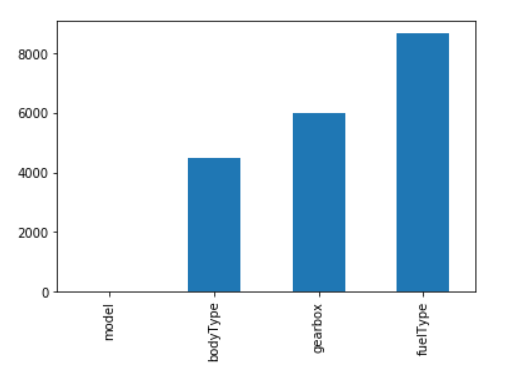
- 查看训练集中有nan值的特征的nan值分布情况
missing = Train_data.isnull().sum()
missing = missing[missing > 0]
missing.sort_values(inplace=True)  # inpalce表示是否用排序后的数据集替换原数据
missing.plot.bar()
- 使用missingno库 ,可视化缺省值
import missingno as msno
msno.matrix(Train_data.sample(250))
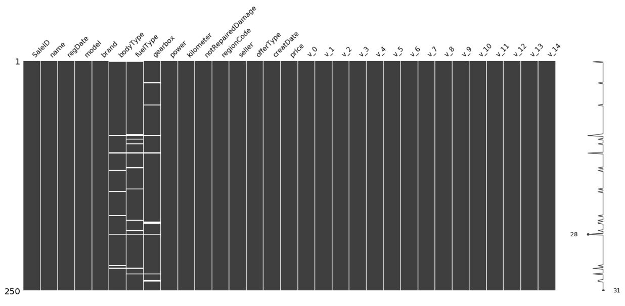
上图中,左边的纵轴从上至下表示第1-250个样本,当一列中出现白色横线时,表示这个样本的这个特征的值有缺失,然后在右侧的纵轴上便会有一个波动,波动越大,说明此条样本缺失的特征越多。在右侧的纵轴上会标出完整性最大的点和最小的点,上图中的28应该表示第28个样本的完整性最小,即缺失的特征最多。
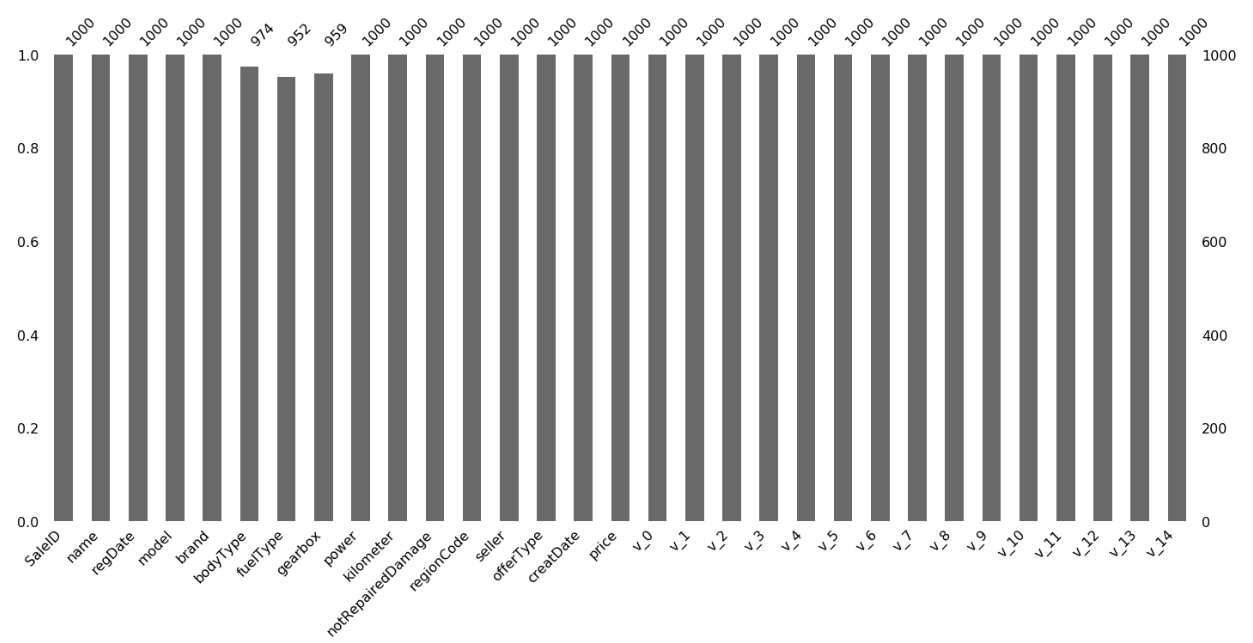
msno.bar(Train_data.sample(1000))
5 判断数据异常值
- 处理notRepairedDamage:
通过显示其中不同的值来观察数据
Train_data['notRepairedDamage'].value_counts()
发现-为缺失值,先换成nan处理
Train_data['notRepairedDamage'].replace('-', np.nan, inplace=True)
value_counts()函数不会统计nan的数量,使用 isnull().sum()函数来查看
Train_data.isnull().sum()
对测试集执行相同的操作
- 删除训练集和测试集中严重倾斜的特征
使用value_counts()函数统计每个特征的取值分布情况,如:【参考 7 查看数据特征 第2点】
Train_data['seller'].value_counts()
输出:
    0    149999
    1         1
    Name: seller, dtype: int64
删除特征seller, offerType
del Train_data['seller']
del Train_data['offerType']
del Test_data['seller']
del Test_data['offerType']
6 了解预测值分布
- 查看预测值基本信息
Train_data['price']
Train_data['price'].value_counts()
- 查看预测值总体分布情况
import scipy.stats as st

y = Train_data['price']
plt.figure(1);plt.title('Johnson SU')
sns.distplot(y, kde=False, fit=st.johnsonsu)  # distplot绘制观测值的单变量分布。
plt.figure(2);plt.title('Normal')
sns.distplot(y, kde=False, fit=st.norm)  # kde参数:是否绘制高斯核密度估计。
plt.figure(3);plt.title('Log Normal')
sns.distplot(y, kde=False, fit=st.lognorm)
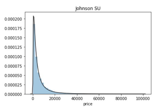
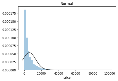
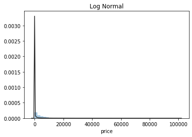
从上图可知,横轴表示样本的各个价格,纵轴表示这一价格对应的样本数量与样本总数的比值。第一个图中的曲线拟合情况最好,所以预测值服从无界约翰逊分布,而不是服从正太分布。关于无界约翰逊分布(JohnsonSUDistribution)一些信息。
- 查看预测值频数情况
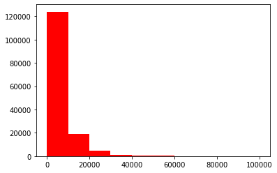
plt.hist(Train_data['price'], orientation='vertical', histtype='bar', color='red')
plt.show()
plt.hist(np.log(Train_data['price']), orientation='vertical', histtype='bar', color='red')
plt.show()
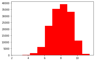
从上图可知:log变换预测值之后的分布较均匀,可以用log变换进行预测(预测问题常用trick)
- 查看偏度(Skewness)和峰度(Kurtosis)
预测值的偏度和峰度:
sns.distplot(Train_data['price']);
print('Skewness: %f' % Train_data['price'].skew())
print('Kurtosis: %f' % Train_data['price'].kurt())
Train_data.skew(), Train_data.kurt()
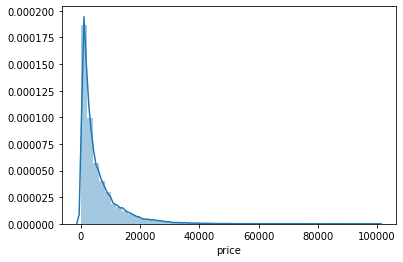
从上图可知:预测值的分布,呈现出右偏,尖顶峰
知识补充: 详细见参考网站
- 用skewness和kurtosis来看数据的分布形态,一般会和正态分布比较,所以把正态分布的skewness和kurtosis都看作0.
- 偏度:描述的是某总体取值分布的对称性
(1)Skewness = 0 ,分布形态与正态分布偏度相同。
(2)Skewness > 0 ,正偏差数值较大,为正偏或右偏。长尾巴拖在右边,数据右端有较多的极端值。
(3)Skewness < 0 ,负偏差数值较大,为负偏或左偏。长尾巴拖在左边,数据左端有较多的极端值。
(4)数值的绝对值越大,表明数据分布越不对称,偏斜程度大。 - 峰度:是数据分布顶的尖锐程度
(1)Kurtosis=0 与正态分布的陡缓程度相同。
(2)Kurtosis>0 比正态分布的高峰更加陡峭——尖顶峰
(3)Kurtosis<0 比正态分布的高峰来得平台——平顶峰
训练集的偏度和峰度:
sns.distplot(Train_data.skew(), color='blue', axlabel='Skewness')
sns.distplot(Train_data.kurt(), color='orange', axlabel='Kurtness')
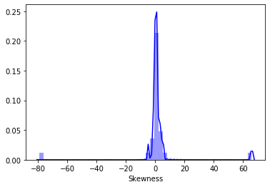
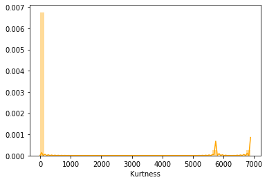
上图中,以偏度图为例,横轴表示数据集中所有特征分布的偏度值,纵轴表示拥有此分布特征分布的偏度值的特征数与总特征数的比值。
7 查看数据特征
- 特征分类
Y_train = Train_data['price']
numeric_features = ['power', 'kilometer', 'v_0', 'v_1', 'v_2', 'v_3', 'v_4', 'v_5', 'v_6', 'v_7', 'v_8', 'v_9', 'v_10', 'v_11', 'v_12', 'v_13','v_14' ]
categorical_features = ['name', 'model', 'brand', 'bodyType', 'fuelType', 'gearbox', 'notRepairedDamage', 'regionCode']
- 查看各个特征的unique分布(特征的各个值出现的次数)
for cat_fea in categorical_features:
    print(cat_fea + '的特征分布如下:')
    print('{}特征有{}个不同的值:'.format(cat_fea, Train_data[cat_fea].nunique()))
    print(Train_data[cat_fea].value_counts())
分别查看训练集和测试集
数字特征(连续)
- 数字特征总览
numeric_features.append('price')
numeric_features
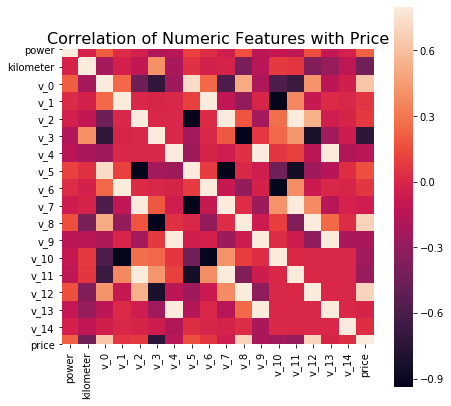
- 相关性分析
计算相关系数
price_numeric = Train_data[numeric_features]
correlation = price_numeric.corr()  # 求相关系数
print(correlation['price'].sort_values(ascending = False), '\n')   # 降序
绘制特征的相关系数矩阵图
f, ax = plt.subplots(figsize=(7,7))
plt.title('Correlation of Numeric Features with Price', y=1, size=16)
sns.heatmap(correlation, square=True, vmax=0.8)  # square:单元格为方格 vmax:右侧色条可见的最大数值
- 查看特征的偏度和峰值
del price_numeric['price']

for col in numeric_features:
    print('{:15}'.format(col),  # {}中的数字表示空格和精度
         'Skewness:{:05.2f}'.format(Train_data[col].skew()),
         ' ',
         'Kurtosis:{:06.2f}'.format(Train_data[col].kurt())\
         )
- 每个数字特征分布
f = pd.melt(Train_data, value_vars=numeric_features)  # 将DataFrame从宽格式转为长格式
g = sns.FacetGrid(f, col="variable",  col_wrap=2, sharex=False, sharey=False)
g = g.map(sns.distplot, "value")
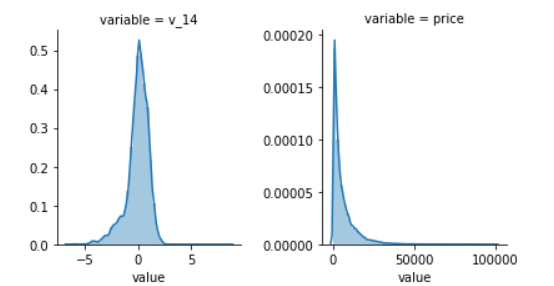
这里的图的含义,和前述都差不多,横轴表示这个特征所有的取值,纵轴表示特征值等这个取值的样本数与总样本数的比值。
- 数字特征之间的关系分析
sns.set()
columns = ['price', 'v_12', 'v_8' , 'v_0', 'power', 'v_5',  'v_2', 'v_6', 'v_1', 'v_14']  # 根据前述计算的相关系数,挑选相关性较大的变量
sns.pairplot(Train_data[columns], size=2, kind='scatter', diag_kind='kde')
plt.show()
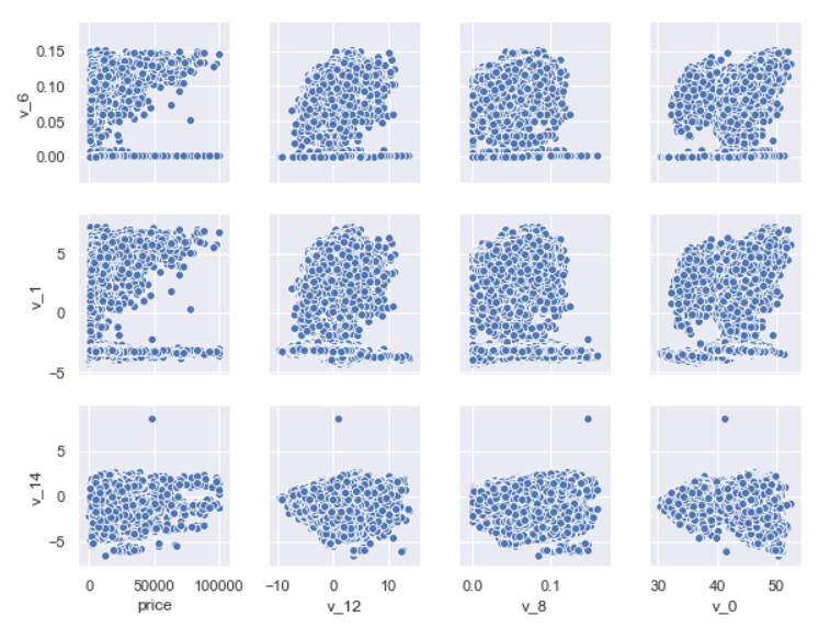
从上图可知:当两个特征之间存在较强的关系,会出现共线性,需要考虑去除共线性。
- 多变量互相回归关系可视化
可以根据前述的相关系数或者特征关系矩阵,来挑选部分特征再次进行回归分析。
fig, ((ax1, ax2), (ax3, ax4), (ax5, ax6), (ax7, ax8), (ax9, ax10)) = plt.subplots(nrows=5, ncols=2, figsize=(24, 20))
# ['v_12', 'v_8' , 'v_0', 'power', 'v_5',  'v_2', 'v_6', 'v_1', 'v_14', 'v_13']
v_12_scatter_plot = pd.concat([Y_train,Train_data['v_12']],axis = 1)
sns.regplot(x='v_12',y = 'price', data = v_12_scatter_plot,scatter= True, fit_reg=True, ax=ax1)

v_8_scatter_plot = pd.concat([Y_train,Train_data['v_8']],axis = 1)
sns.regplot(x='v_8',y = 'price',data = v_8_scatter_plot,scatter= True, fit_reg=True, ax=ax2)

v_0_scatter_plot = pd.concat([Y_train,Train_data['v_0']],axis = 1)
sns.regplot(x='v_0',y = 'price',data = v_0_scatter_plot,scatter= True, fit_reg=True, ax=ax3)

power_scatter_plot = pd.concat([Y_train,Train_data['power']],axis = 1)
sns.regplot(x='power',y = 'price',data = power_scatter_plot,scatter= True, fit_reg=True, ax=ax4)

v_5_scatter_plot = pd.concat([Y_train,Train_data['v_5']],axis = 1)
sns.regplot(x='v_5',y = 'price',data = v_5_scatter_plot,scatter= True, fit_reg=True, ax=ax5)

v_2_scatter_plot = pd.concat([Y_train,Train_data['v_2']],axis = 1)
sns.regplot(x='v_2',y = 'price',data = v_2_scatter_plot,scatter= True, fit_reg=True, ax=ax6)

v_6_scatter_plot = pd.concat([Y_train,Train_data['v_6']],axis = 1)
sns.regplot(x='v_6',y = 'price',data = v_6_scatter_plot,scatter= True, fit_reg=True, ax=ax7)

v_1_scatter_plot = pd.concat([Y_train,Train_data['v_1']],axis = 1)
sns.regplot(x='v_1',y = 'price',data = v_1_scatter_plot,scatter= True, fit_reg=True, ax=ax8)

v_14_scatter_plot = pd.concat([Y_train,Train_data['v_14']],axis = 1)
sns.regplot(x='v_14',y = 'price',data = v_14_scatter_plot,scatter= True, fit_reg=True, ax=ax9)

v_13_scatter_plot = pd.concat([Y_train,Train_data['v_13']],axis = 1)
sns.regplot(x='v_13',y = 'price',data = v_13_scatter_plot,scatter= True, fit_reg=True, ax=ax10)
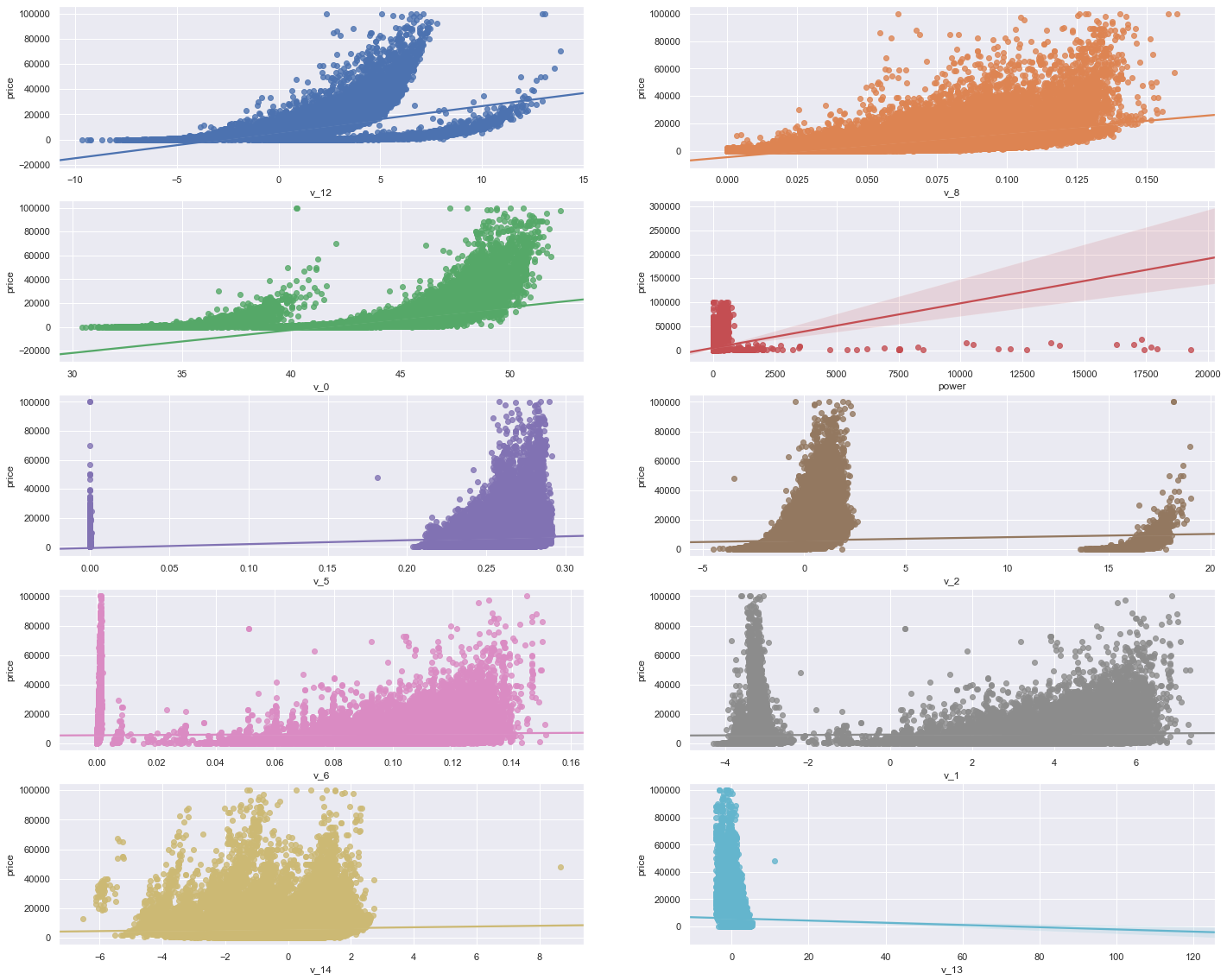
从上图可知:部分解释变量与被解释变量之间没有太大关系,可以考虑删除。
类别特征(离散)
- 查看类别特征的unique分布
for fea in categorical_features:
    print(Train_data[fea].nunique())

categorical_features
- 箱型图可视化特征
# 因为 name和 regionCode的类别太多,这里我们把类别不是特别多的几个特征画一下
categorical_features = ['model',
 'brand',
 'bodyType',
 'fuelType',
 'gearbox',
 'notRepairedDamage']

for c in categorical_features:
    Train_data[c] = Train_data[c].astype('category')
    if Train_data[c].isnull().any():  # 发现空值时,添加MISSING类,并且用”MISSING“来作为nan填充
        Train_data[c] = Train_data[c].cat.add_categories(['MISSING'])
        Train_data[c] = Train_data[c].fillna('MISSING')

def boxplot(x,y,**kwargs):
    sns.boxplot(x=x, y=y)
    x = plt.xticks(rotation=90)

f = pd.melt(Train_data, id_vars=['price'], value_vars = categorical_features)
g = sns.FacetGrid(f, col='variable', col_wrap=2, sharex=False, sharey=False, size=5)
g = g.map(boxplot, 'value', 'price')
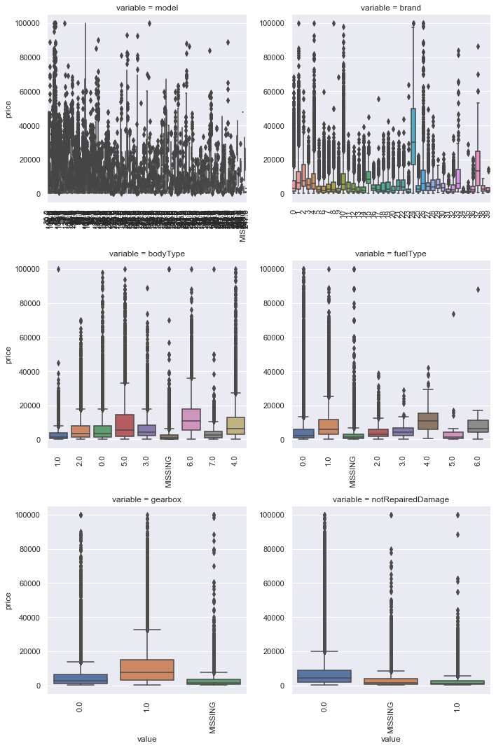
所以,由上图可知,横轴中会出现MISSING这一类。
- 类别特征的小提琴图可视化
catg_list = categorical_features
target = 'price'
for catg in catg_list:
    sns.violinplot(x=catg,y=target, data=Train_data)
    plt.show()
- 类别特征的柱形图可视化
categorical_features = ['model',
 'brand',
 'bodyType',
 'fuelType',
 'gearbox',
 'notRepairedDamage']
def bar_plot(x, y, **kwargs):
    sns.barplot(x=x, y=y)
    x = plt.xticks(rotation=90)

f = pd.melt(Train_data, id_vars=['price'], value_vars=categorical_features)
g = sns.FacetGrid(f, col='variable', col_wrap=2, sharex=False, sharey=False, size=5)
g = g.map(bar_plot, 'value', 'price')
研究预测值与各个类别特征的关系,给出某个特征的每一个类别取值对应的预测值的平均数,以及”置信区间“(黑色的竖线)。
- 类别特征的每个类别频数可视化
def count_plot(x, **kwargs):
    sns.countplot(x=x)
    x = plt.xticks(rotation=90)

f = pd.melt(Train_data, value_vars=categorical_features)
g = sns.FacetGrid(f, col='variable', col_wrap=2, sharex=False, sharey=False, size=5)
g = g.map(count_plot, 'value')
某个特征的每一个类别出现的频数。
8 生成数据报告
需要安装pandas_profiling库,可能出现安装失败的情况。有很多种解决办法,详见官网。
我是用pip安装失败,用conda install -c conda-forge pandas-profiling 就可以了。
import pandas_profiling

pfr = pandas_profiling.ProfileReport(Train_data)
pfr.to_file('./report.html')
导出的效果不错!


 170
170


 被折叠的 条评论
为什么被折叠?
被折叠的 条评论
为什么被折叠?
 到【灌水乐园】发言


