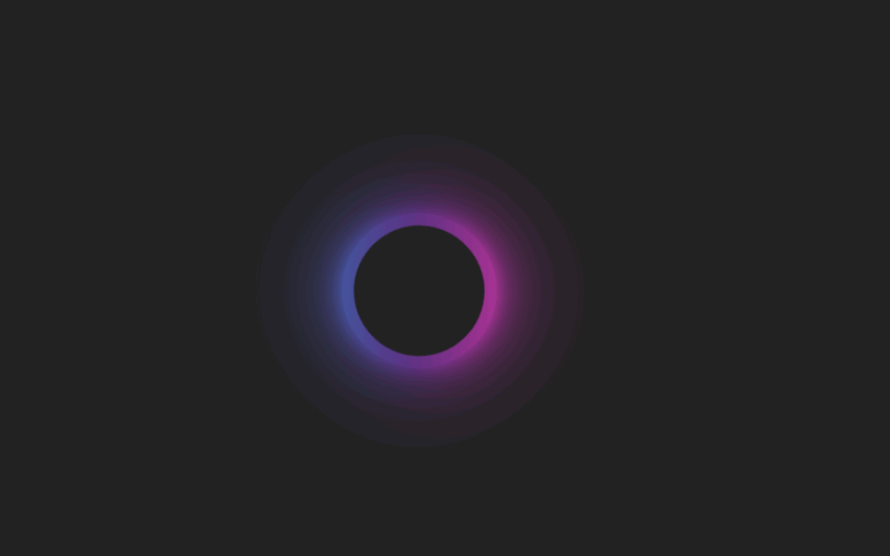
预览
完整代码
<!DOCTYPE html>
<html lang="en">
  <head>
    <meta charset="UTF-8" />
    <meta name="viewport" content="width=device-width, initial-scale=1.0" />
    <meta http-equiv="X-UA-Compatible" content="ie=edge" />
    <title>Document</title>
    <style>
      body {
        display: flex;
        justify-content: center;
        align-items: center;
        height: 100vh;
        background: #222;
      }

      .loader {
        position: relative;
        width: 8em;
        height: 8em;
        background: linear-gradient(
          -225deg,
          #ff3cac 0%,
          #562b7c 52%,
          #2b86c5 100%
        );
        border-radius: 50%;
        animation: spin 0.5s linear infinite;
      }
      .loader span {
        position: absolute;
        width: 100%;
        height: 100%;
        border-radius: inherit;
        background: inherit;
      }
      .loader span:nth-child(1) {
        filter: blur(5px);
      }
      .loader span:nth-child(2) {
        filter: blur(10px);
      }
      .loader span:nth-child(3) {
        filter: blur(25px);
      }
      .loader span:nth-child(4) {
        filter: blur(50px);
      }
      .loader::after {
        position: absolute;
        content: "";
        top: 10px;
        left: 10px;
        right: 10px;
        bottom: 10px;
        background: #222;
        border-radius: inherit;
      }

      @keyframes spin {
        to {
          transform: rotate(1turn);
        }
      }
    </style>
  </head>
  <body>
    <div class="loader">
      <span></span>
      <span></span>
      <span></span>
      <span></span>
    </div>
  </body>
</html>


 234
234


 被折叠的 条评论
为什么被折叠?
被折叠的 条评论
为什么被折叠?
 到【灌水乐园】发言


