


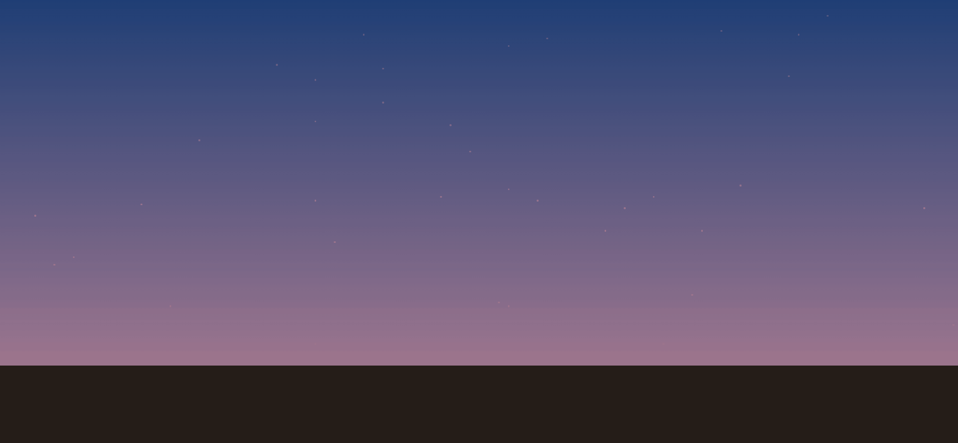
【需求描述】css实现日出日落效果(摘自网友)。
<html lang="en"><head>
    <meta charset="UTF-8">
    <title>Animated Sunrise to Sunset </title>
    <style>
    @-webkit-keyframes sunrise {
        from {
            transform: rotate(-45deg);
        }

        to {
            transform: rotate(315deg);
        }
    }

    @keyframes sunrise {
        from {
            transform: rotate(-45deg);
        }

        to {
            transform: rotate(315deg);
        }
    }

    @-webkit-keyframes moonrise {
        from {
            transform: rotate(0deg);
        }

        to {
            transform: rotate(180deg);
        }
    }

    @keyframes moonrise {
        from {
            transform: rotate(0deg);
        }

        to {
            transform: rotate(180deg);
        }
    }

    @-webkit-keyframes dawn {
        0% {
            opacity: 0;
        }
        10% {
            opacity: 1;
        }
        60% {
            opacity: 0;
        }
    }

    @keyframes dawn {
        0% {
            opacity: 0;
        }
        10% {
            opacity: 1;
        }
        60% {
            opacity: 0;
        }
    }

    @-webkit-keyframes noon {
        0% {
            opacity: 0;
        }
        50% {
            opacity: 1;
        }
        75% {
            opacity: 0;
        }
    }

    @keyframes noon {
        0% {
            opacity: 0;
        }
        50% {
            opacity: 1;
        }
        75% {
            opacity: 0;
        }
    }

    @-webkit-keyframes dusk {
        0% {
            opacity: 0;
        }
        50% {
            opacity: 0;
        }
        70% {
            opacity: 1;
        }
        90% {
            opacity: 0;
        }
    }

    @keyframes dusk {
        0% {
            opacity: 0;
        }
        50% {
            opacity: 0;
        }
        70% {
            opacity: 1;
        }
        90% {
            opacity: 0;
        }
    }

    @-webkit-keyframes midnight {
        0% {
            opacity: 1;
        }
        25% {
            opacity: 0;
        }
        50% {
            opacity: 0;
        }
        80% {
            opacity: 1;
        }
    }

    @keyframes midnight {
        0% {
            opacity: 1;
        }
        25% {
            opacity: 0;
        }
        50% {
            opacity: 0;
        }
        80% {
            opacity: 1;
        }
    }

    body {
        --animation-speed: 24s;
        background-color: rgb(37, 29, 24);
    }

    .sky {
        width: 100vw;
        height: 100vh;
        position: fixed;
        top: 0;
        left: 0;
        max-height: 600px;
        overflow: hidden;
    }

    .sky__phase {
        position: absolute;
        top: 0;
        left: 0;
        height: 100%;
        width: 100%;
        transition: opacity 0.2s;
    }

    .sky__dawn {
        background: linear-gradient(
            0deg,
            rgba(254, 215, 102, 1) 0%,
            rgba(205, 237, 246, 1) 100%
        );
        -webkit-animation: linear dawn infinite var(--animation-speed);
                animation: linear dawn infinite var(--animation-speed);
    }

    .sky__noon {
        background: linear-gradient(
            0deg,
            rgba(205, 237, 246, 1) 0%,
            rgba(36, 123, 160, 1) 100%
        );
        -webkit-animation: linear noon infinite var(--animation-speed);
                animation: linear noon infinite var(--animation-speed);
    }

    .sky__dusk {
        background: linear-gradient(
            0deg,
            rgba(255, 32, 110, 1) 0%,
            rgba(10, 0, 94, 1) 100%
        );
        -webkit-animation: linear dusk infinite var(--animation-speed);
                animation: linear dusk infinite var(--animation-speed);
    }

    .sky__midnight {
        background: linear-gradient(
            0deg,
            rgba(2, 0, 20, 1) 0%,
            rgba(10, 0, 94, 1) 100%
        );
        -webkit-animation: linear midnight infinite var(--animation-speed);
                animation: linear midnight infinite var(--animation-speed);
    }

    .orbit {
        position: relative;
        width: 500px;
        height: 500px;
        margin: 200px auto;
        transform: rotate(-45deg);
        -webkit-animation: linear sunrise infinite var(--animation-speed);
                animation: linear sunrise infinite var(--animation-speed);
    }

    @media (min-width: 768px) {
        .sky {
            min-height: 600px;
        }
        .orbit {
            width: 700px;
            height: 700px;
            margin: 150px auto;
        }
    }

    @media (min-width: 940px) {
        .orbit {
            width: 800px;
            height: 800px;
        }
    }

    @media (min-width: 1200px) {
        body {
            --animation-speed: 28s;
        }
        .orbit {
            width: 1000px;
            height: 1000px;
            margin: 200px auto;
        }
    }

    @media (min-width: 1500px) {
        body {
            --animation-speed: 30s;
        }
        .orbit {
            width: 1300px;
            height: 1300px;
        }
    }

    .sun {
        position: absolute;
        top: -40px;
        left: -40px;
        width: 80px;
        height: 80px;
        background-color: rgb(254, 215, 102);
        border-radius: 50%;
        box-shadow: 0 0 14px 14px rgba(254, 215, 102, 0.2);
    }

    .moon {
        position: absolute;
        bottom: -40px;
        right: -40px;
        width: 80px;
        height: 80px;
        border-radius: 50%;
        background-color: #fff;
        box-shadow: 0 0 7px 7px rgba(255, 255, 255, 0.2);
    }

    #sky__stars > div {
        width: 3px;
        height: 3px;
        background-color: #fff;
        border-radius: 50%;
        position: absolute;
    }
    </style>
    </head>
<body>
    <div class="sky">
        <div class="sky__phase sky__dawn"></div>
        <div class="sky__phase sky__noon"></div>
        <div class="sky__phase sky__dusk"></div>
        <div class="sky__phase sky__midnight">
            <div id="sky__stars"><div style="left: 46%; top: 55%;"></div><div style="left: 21%; top: 40%;"></div><div style="left: 53%; top: 53%;"></div><div style="left: 65%; top: 58%;"></div><div style="left: 49%; top: 43%;"></div><div style="left: 53%; top: 15%;"></div><div style="left: 33%; top: 24%;"></div><div style="left: 99%; top: 89%;"></div><div style="left: 52%; top: 83%;"></div><div style="left: 6%; top: 73%;"></div><div style="left: 8%; top: 71%;"></div><div style="left: 96%; top: 58%;"></div><div style="left: 47%; top: 36%;"></div><div style="left: 40%; top: 21%;"></div><div style="left: 40%; top: 30%;"></div><div style="left: 86%; top: 7%;"></div><div style="left: 38%; top: 12%;"></div><div style="left: 11%; top: 1%;"></div><div style="left: 33%; top: 56%;"></div><div style="left: 83%; top: 12%;"></div><div style="left: 63%; top: 64%;"></div><div style="left: 53%; top: 84%;"></div><div style="left: 50%; top: 2%;"></div><div style="left: 77%; top: 52%;"></div><div style="left: 82%; top: 23%;"></div><div style="left: 29%; top: 20%;"></div><div style="left: 56%; top: 56%;"></div><div style="left: 69%; top: 94%;"></div><div style="left: 15%; top: 57%;"></div><div style="left: 33%; top: 35%;"></div><div style="left: 33%; top: 94%;"></div><div style="left: 57%; top: 13%;"></div><div style="left: 4%; top: 60%;"></div><div style="left: 18%; top: 84%;"></div><div style="left: 68%; top: 55%;"></div><div style="left: 75%; top: 11%;"></div><div style="left: 73%; top: 64%;"></div><div style="left: 72%; top: 81%;"></div><div style="left: 91%; top: 96%;"></div><div style="left: 35%; top: 67%;"></div></div>
        </div>
        <div class="orbit">
            <div class="sun"></div>
            <div class="moon"></div>
        </div>
    </div>
 </body></html>


 1062
1062


 被折叠的 条评论
为什么被折叠?
被折叠的 条评论
为什么被折叠?
 到【灌水乐园】发言


