


一、Android控件架构
开发过程中,当Android原生控件无法满足项目需求时,就需要我们自己自定义View来实现了。
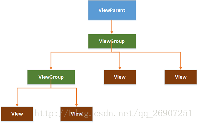
Android中的每个控件都会在界面上占据一个矩形区域,控件大致分成两类,ViewGroup控件和View控件。ViewGroup控件往往作为容器,它可以包含多个View控件,并管理被其包含的子控件。通过ViewGroup,整个界面上的控件形成了一个树形结构,如下图,上层控件负责下层子控件的测量和绘制,并传递交互事件。
Android控件树:
二、自定义View
View类是Android中的一个超类,ViewGroup类也是继承自View类。View中通常有下面这些比较重要的回调方法:
onFinishInflate():从XML加载组件后回调;onSizeChanged():组件大小改变时回调;onMeasure():对组件的大小进行测量;onLayout():对子控件进行排列,确定子控件的位置;onDraw():绘制子控件的内容;onTouchEvent():监听组件的触摸事件;
其中,最常用的是onMeasure()、onLayout()、onDraw()和onTouchEvent()。
通常情况下,自定义控件可以分为下面三类:
- 继承现有控件,对其进行扩展;
- 组合不同的控件来实现新的控件;
- 重写View实现全新的控件;
当我们想要实现一个自定义View时,需要思考它是属于哪一类的自定义控件,并且思考实现这样的控件,需要用到View中的哪些回调方法。
比如,当你只是想改变TextView的外观时,它就是属于第一类,那么你可以新建一个类,继承TextView,并重写onDraw()和onMeasure()等方法。
在实现自定义控件的时候,我们往往需要对控件进行测量、绘制、和布局等操作。
我们可以把自定义控件这个过程想象成画画,当我们画一个东西时,要想:这个东西要画多大,这个东西要怎么画,这个东西要画在哪个位置。
(一)View的测量
Android系统给我们提供了一个专门帮助我们测量View的类,MeasureSpec,它是一个32位的int值,其中高2位为测量的模式,低30位为测量的大小。测量模式又分为EXACTLY、AT_MOST、UNSPECIFIED。
- EXACTLY:
精确值模式,当我们将控件的layout_width属性或layout_height属性指定为具体数值或者match_parent时,就代表着该控件的测量模式是EXACTLY模式。 - AT_MOST:
最大值模式,当控件的layout_width属性或layout_height属性指定为wrap_content时,控件的大小就会随着内容的变化而变化,内容有多大,它就占据多大空间。 - UNSPECIFIED:
不指定测量模式,View想多大就多大,常用于自定义View,
View类默认的onMeasure()方法只支持EXACTLY模式,所以在实现自定义控件的时候,如果没有重写onMeasure()方法,那么在使用的时候必须指定控件的具体数值,而不能指定为wrap_content,否则会出现问题,后面的例子中会具体介绍出现的问题。
(二)View的绘制
既然是画画,那么就需要用到一些工具,比如画布、画笔、颜料等,而在Android中,每一个View都有一个用于绘图的画布,即Canvas,用于绘制图形的画笔是Paint,而颜料则是我们自己定义的一些颜色属性,只要给画笔设置颜色属性,就相当于拥有任意颜色任意数量的画笔了。
Canvas的常用属性:
1)填充颜色
      drawARGB(int a, int r, int g, int b)
      drawColor(int color)
      drawRGB(int r, int g, int b)
      drawColor(int color, PorterDuff.Mode mode)
- 1
- 2
- 3
- 4
2)绘制几何图形
       canvas.drawArc() :绘制一个扇形或者一段弧形
       canvas.drawCircle():绘制一个圆形
       canvas.drawOval():绘制一个椭圆
       canvas.drawLine():绘制一条线
       canvas.drawPoint():绘制一个点
       canvas.drawRect():绘制一个矩形
       canvas.drawRoundRect():绘制一个圆角矩形
       canvas.drawVertices():绘制一个顶点
       cnavas.drawPath():绘制一条路径
- 1
- 2
- 3
- 4
- 5
- 6
- 7
- 8
- 9
3)图片
       canvas.drawBitmap() :绘制位图,装载画布
       canvas.drawPicture():绘制图片
- 1
- 2
4)文本
canvas.drawText():绘制文字
- 1
Paint的常用属性:
Paint.setAntiAlias():抗锯齿
Paint.setStyle():设置画笔风格
Paint.setStrokeWidth():设置画笔宽度
Paint.setColor():设置画笔颜色
Paint.setTextSize():设置画笔绘制文本的文字大小
- 1
- 2
- 3
- 4
- 5
三、实例
介绍了自定义View的分类、流程、常用回调方法以及需要用到的工具,接下来,伟大的画家要开始画画了。
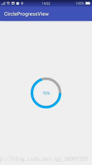
我们要实现的是一个圆形进度条控件,中间的文本显示当前进度值,如图:
按照前面说的思路来做,首先,这样一个控件,好像没有原生控件可以直接利用,并且它不是ViewGroup,所以,它属于第3类自定义控件。
接下来思考可能要用到的回调方法,onDraw()方法是必须的,因为这是一个全新的控件。onMeasure()需要用到吗?现在可能还不知道,等到具体实现的时候或许就知道了。
然后分析应该怎么样绘制这样一个控件。它由一个圆环、一个圆弧、一段文本组成,那么很明显了,需要三个步骤:
- 绘制圆环;
- 绘制圆弧(即已完成进度的部分);
- 绘制文本;
可以动手编码了。新建一个类CircleProgressView 继承自View,实现构造方法,并重写onDraw()、onMeasure()方法,如下:
public class CircleProgressView extends View {

    public CircleProgressView(Context context) {
        super(context);
    }

    public CircleProgressView(Context context, @Nullable AttributeSet attrs) {
        super(context, attrs);
    }

    public CircleProgressView(Context context, @Nullable AttributeSet attrs, int defStyleAttr) {
        super(context, attrs, defStyleAttr);
    }

    @Override
    protected void onMeasure(int widthMeasureSpec, int heightMeasureSpec) {
        super.onMeasure(widthMeasureSpec, heightMeasureSpec);
    }

    @Override
    protected void onDraw(Canvas canvas) {

    }
}
- 1
- 2
- 3
- 4
- 5
- 6
- 7
- 8
- 9
- 10
- 11
- 12
- 13
- 14
- 15
- 16
- 17
- 18
- 19
- 20
- 21
- 22
- 23
- 24
- 25
这个控件拥有一些属性,比如圆环的宽度、圆环的颜色、进度条的颜色、文字大小、文字颜色、当前进度值、控件的宽高等,还需要用到画笔,所以可以在这个类中添加下列属性:
    //圆环的宽度
    private int ringWidth;

    //圆环填充颜色
    private int ringColor;

    //进度条填充颜色
    private int progressColor;

    //文字大小
    private int textSize;

    //文字颜色
    private int textColor;

    //画笔
    private Paint mPaint;

    //当前进度值
    private int progressSize;

    //控件本身的宽度
    private int mWidth;
- 1
- 2
- 3
- 4
- 5
- 6
- 7
- 8
- 9
- 10
- 11
- 12
- 13
- 14
- 15
- 16
- 17
- 18
- 19
- 20
- 21
- 22
- 23
虽然有了这些属性,但是当我们在使用这个控件的时候,该怎么样给这些属性赋值呢?这就需要用到构造方法了。三个构造方法的使用如下:
    /**
    * 当在java代码中直接new一个控件实例的时候,调用此构造方法
    */
    public CircleProgressView(Context context) {
        super(context);
    }

    /**
    * 当在XML文件中直接使用该控件的时候,
    * 并且该控件由自定义属性的时候,调用此构造方法
    */
    public CircleProgressView(Context context, @Nullable AttributeSet attrs) {
        super(context, attrs);
    }

    /**
    * 系统默认只调用前两个构造方法,
    * 此方法通常是我们在前两个构造方法中调用,
    * 用于获取自定义属性的值
    */
    public CircleProgressView(Context context, @Nullable AttributeSet attrs, int defStyleAttr) {
        super(context, attrs, defStyleAttr);
    }
- 1
- 2
- 3
- 4
- 5
- 6
- 7
- 8
- 9
- 10
- 11
- 12
- 13
- 14
- 15
- 16
- 17
- 18
- 19
- 20
- 21
- 22
- 23
要使用自定义属性,需要在res资源目录的values目录下创建一个attrs.xml的属性定义文件,并添加属性代码:
attrs.xml
<?xml version="1.0" encoding="utf-8"?>
<resources>

    <declare-styleable name="CircleProgressView" >
        <attr name="ringWidth" format="dimension"/>
        <attr name="ringColor" format="color" />
        <attr name="progressColor" format="color"/>
        <attr name="textSize" format="dimension"/>
        <attr name="textColor" format="color"/>
        <attr name="progressSize" format="integer" />

    </declare-styleable>

</resources>
- 1
- 2
- 3
- 4
- 5
- 6
- 7
- 8
- 9
- 10
- 11
- 12
- 13
- 14
- 15
自定义属性设置好了,像前面说的,可以在第三个构造方法中获取这些自定义属性的值,由于不需要在java代码中实例化创建该控件,可以在前两个构造方法中调用第三个构造方法。通常也把一些初始化操作放在构造方法中,比如我们这里用到的画笔Paint的初始化,代码如下:
    public CircleProgressView(Context context) {
        this(context,null);
    }

    public CircleProgressView(Context context, @Nullable AttributeSet attrs) {
        this(context, attrs,0);
    }

    public CircleProgressView(Context context, @Nullable AttributeSet attrs, int defStyleAttr) {
        super(context, attrs, defStyleAttr);
        mPaint = new Paint();
        mPaint.setAntiAlias(true);
        //获取属性值
        TypedArray ta = context.obtainStyledAttributes(attrs,R.styleable.CircleProgressView);
        //第二个参数是当我们没有给这个控件对应的属性赋值时采用的默认值
        ringWidth = (int) ta.getDimension(R.styleable.CircleProgressView_ringWidth,20);
        ringColor = ta.getColor(R.styleable.CircleProgressView_ringColor, Color.GRAY);
        progressColor = ta.getColor(R.styleable.CircleProgressView_progressColor,Color.BLUE);
        textSize = (int) ta.getDimension(R.styleable.CircleProgressView_textSize,60);
        textColor = ta.getColor(R.styleable.CircleProgressView_textColor,Color.BLACK);
        progressSize = ta.getInteger(R.styleable.CircleProgressView_progressSize,60);
        //回收TypedArray
        ta.recycle();
    }
- 1
- 2
- 3
- 4
- 5
- 6
- 7
- 8
- 9
- 10
- 11
- 12
- 13
- 14
- 15
- 16
- 17
- 18
- 19
- 20
- 21
- 22
- 23
- 24
控件本身的宽度可以在onMeasure()方法中获取到:
    @Override
    protected void onMeasure(int widthMeasureSpec, int heightMeasureSpec) {
        super.onMeasure(widthMeasureSpec, heightMeasureSpec);
        mWidth = getMeasuredWidth();
    }
- 1
- 2
- 3
- 4
- 5
准备工作做好了,接下来开始画画了。
绘制圆环:
绘制圆环可以看成是绘制一个边框宽度较大的空心圆,首先获取到圆心的坐标和半径,设置画笔的属性后,绘制圆:
        //获取圆心坐标及半径
        float circleX = mWidth / 2;
        float circleY = mWidth / 2;
        float radius = mWidth / 2 - ringWidth / 2;
        //绘制圆环
        mPaint.setStyle(Paint.Style.STROKE);
        mPaint.setStrokeWidth(ringWidth);
        mPaint.setColor(ringColor);
        canvas.drawCircle(circleX,circleY,radius,mPaint);
- 1
- 2
- 3
- 4
- 5
- 6
- 7
- 8
- 9
绘制圆弧:
        //绘制圆弧,填充进度
        //RectF用于构造一个矩形区域,作为传入的椭圆对象
        RectF oval = new RectF(ringWidth / 2,ringWidth / 2,mWidth - ringWidth / 2,mWidth - ringWidth / 2);
        mPaint.setColor(progressColor);
        //drawArc()方法参数:
        //1、圆弧所在的椭圆对象
        //2、圆弧的起始角度
        //3、圆弧的角度
        //4、是否显示半径连线
        //5、绘制时采用的画笔
        canvas.drawArc(oval,0,progressSize * 360 / 100,false,mPaint);
- 1
- 2
- 3
- 4
- 5
- 6
- 7
- 8
- 9
- 10
- 11
绘制文本:
        //绘制文本
        String progressText = progressSize + "%";
        //设置画笔颜色和文字大小
        mPaint.setColor(textColor);
        mPaint.setTextSize(textSize);
        //重置画笔宽度,因为前面绘制圆环和圆弧时用到的画笔宽度不一样
        mPaint.setStrokeWidth(0);
        //构造一个矩形区域,用于放置文本
        Rect bound = new Rect();
        mPaint.getTextBounds(progressText,0,progressText.length(),bound);
        canvas.drawText(progressText,mWidth / 2 - bound.width() / 2,mWidth / 2 + bound.height() / 2,mPaint);
- 1
- 2
- 3
- 4
- 5
- 6
- 7
- 8
- 9
- 10
- 11
由于进度值是动态的,所以我们需要提供一个方法,用于传入进度值progressSize,在CircleProgressView类中添加如下方法:
    /**
     * 获取进度值
     * @return
     */
    public int getProgressSize() {
        return progressSize;
    }

    /**
     * 设置进度值
     * @param progressSize
     */
    public void setProgressSize(int progressSize) {
        this.progressSize = progressSize;
    }
- 1
- 2
- 3
- 4
- 5
- 6
- 7
- 8
- 9
- 10
- 11
- 12
- 13
- 14
- 15
自定义控件的实现工作已经完成了,接下来是如何使用我们的控件。
activity_main.xml:
<?xml version="1.0" encoding="utf-8"?>
<RelativeLayout
    xmlns:android="http://schemas.android.com/apk/res/android"
    xmlns:tools="http://schemas.android.com/tools"
    android:layout_width="match_parent"
    android:layout_height="match_parent"
    xmlns:app="http://schemas.android.com/apk/res-auto"
    >

    <edu.sqchen.circleprogressview.CircleProgressView
        android:id="@+id/circle_progress_view"
        android:layout_width="120dp"
        android:layout_height="120dp"
        android:layout_centerInParent="true"
        app:ringColor="@android:color/darker_gray"
        app:progressColor="@color/blue"
        app:ringWidth="10dp"
        app:textColor="@color/blue"
        />

</RelativeLayout>
- 1
- 2
- 3
- 4
- 5
- 6
- 7
- 8
- 9
- 10
- 11
- 12
- 13
- 14
- 15
- 16
- 17
- 18
- 19
- 20
- 21
- 22
MainActivity.class:
public class MainActivity extends AppCompatActivity {

    //自定义控件
    private CircleProgressView mProgressView;

    //已完成进度
    private int totalProgress;

    @Override
    protected void onCreate(Bundle savedInstanceState) {
        super.onCreate(savedInstanceState);
        setContentView(R.layout.activity_main);
        mProgressView = (CircleProgressView) findViewById(R.id.circle_progress_view);
        //已完成70%
        totalProgress = 70;
        //创建一个子线程,在子线程中做耗时操作
        new Thread(new Runnable() {
            @Override
            public void run() {
                //设置进度值从0开始变化
                mProgressView.setProgressSize(0);
                for(int i = 0; i < totalProgress; i++) {
                    mProgressView.setProgressSize(i + 1);
                    SystemClock.sleep(30);
                    //在子线程中刷新、重绘控件
                    mProgressView.postInvalidate();
                }
            }
        }).start();

    }
}
- 1
- 2
- 3
- 4
- 5
- 6
- 7
- 8
- 9
- 10
- 11
- 12
- 13
- 14
- 15
- 16
- 17
- 18
- 19
- 20
- 21
- 22
- 23
- 24
- 25
- 26
- 27
- 28
- 29
- 30
- 31
- 32
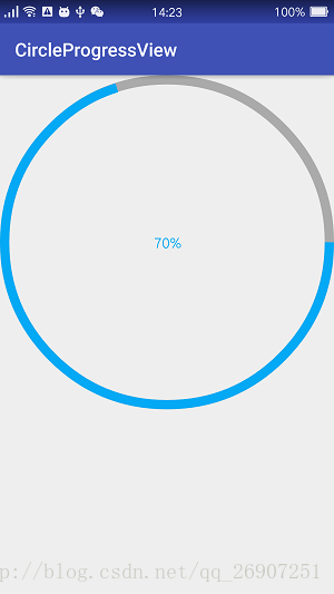
自定义圆形进度条已经实现了,效果如下:
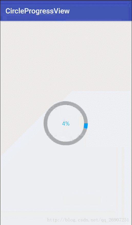
前面我们在activity_main.xml中给控件的宽高设置为具体指,那么假如要设置为wrap_content呢?修改activity_main.xml:
<?xml version="1.0" encoding="utf-8"?>
<RelativeLayout
    xmlns:android="http://schemas.android.com/apk/res/android"
    xmlns:tools="http://schemas.android.com/tools"
    android:layout_width="match_parent"
    android:layout_height="match_parent"
    xmlns:app="http://schemas.android.com/apk/res-auto"
    >

    <edu.sqchen.circleprogressview.CircleProgressView
        android:id="@+id/circle_progress_view"
        android:layout_width="wrap_content"
        android:layout_height="wrap_content"
        android:layout_centerInParent="true"
        app:ringColor="@android:color/darker_gray"
        app:progressColor="@color/blue"
        app:ringWidth="10dp"
        app:textColor="@color/blue"
        />

</RelativeLayout>
- 1
- 2
- 3
- 4
- 5
- 6
- 7
- 8
- 9
- 10
- 11
- 12
- 13
- 14
- 15
- 16
- 17
- 18
- 19
- 20
- 21
- 22
效果:
可以看到,控件的大小占据了整个屏幕,显然不是我们想要的效果。
原因在于,我们虽然重写了onMeasure()方法,但是我们没有对测量模式AT_MOST作处理,它就会变成这样的效果,这也是前面所说的可能出现的问题,解决方式自然是重写onMeasure()方法,在里面对宽高指定为wrap_content时的处理,代码如下:
    @Override
    protected void onMeasure(int widthMeasureSpec, int heightMeasureSpec) {
        setMeasuredDimension(measureWidth(widthMeasureSpec),measureHeight(heightMeasureSpec));
        mWidth = getMeasuredWidth();
    }

    /**
     * 对宽度进行判断
     * @param widthMeasureSpec
     * @return
     */
    private int measureWidth(int widthMeasureSpec) {
        int resultWidth = 0;
        //获取设置的测量模式和大小
        int specMode = MeasureSpec.getMode(widthMeasureSpec);
        int specSize = MeasureSpec.getSize(widthMeasureSpec);

        //如果是精确值模式,则宽度等于用户设置的宽度
        if(specMode == MeasureSpec.EXACTLY) {
            resultWidth = specSize;
        } else {
            //否则,设置默认值为400个像素,如果是最大值模式,则取用户设置的值和默认值中较小的一个
            resultWidth = 400;
            if(specMode == MeasureSpec.AT_MOST) {
                resultWidth = Math.min(resultWidth,specSize);
            }
        }
        return resultWidth;
    }

    /**
     * 对高度进行判断
     * @param heightMeasureSpec
     * @return
     */
    private int measureHeight(int heightMeasureSpec) {
        int resultHeight = 0;
        int specMode = MeasureSpec.getMode(heightMeasureSpec);
        int specSize = MeasureSpec.getSize(heightMeasureSpec);

        if(specMode == MeasureSpec.EXACTLY) {
            resultHeight = specSize;
        } else {
            resultHeight = 400;
            if(specMode == MeasureSpec.AT_MOST) {
                resultHeight = Math.min(resultHeight,specSize);
            }
        }
        return resultHeight;
    }
- 1
- 2
- 3
- 4
- 5
- 6
- 7
- 8
- 9
- 10
- 11
- 12
- 13
- 14
- 15
- 16
- 17
- 18
- 19
- 20
- 21
- 22
- 23
- 24
- 25
- 26
- 27
- 28
- 29
- 30
- 31
- 32
- 33
- 34
- 35
- 36
- 37
- 38
- 39
- 40
- 41
- 42
- 43
- 44
- 45
- 46
- 47
- 48
- 49
- 50
可以看到,我们对传递进来的宽高进行测量模式的判断,如果是精确值模式,则采用用户设置的具体宽度,否则判断是否是最大值模式,则取用户设置的值(即wrap_content)和默认值400像素中较小的那个值。
需要注意的是,java代码中设置的大小单位是像素,而XML文件中设置的大小单位是dp,根据手机分辨率不同而有所差异,可将像素转换成dp,则可自适应不同屏幕,统一大小。
现在再回过头看前面的绘制流程、回调方法、绘制工具,对自定义View的整个过程就比较熟悉了。
CircleProgressView.class完整代码:
package edu.sqchen.circleprogressview;

import android.content.Context;
import android.content.res.TypedArray;
import android.graphics.Canvas;
import android.graphics.Color;
import android.graphics.Paint;
import android.graphics.Rect;
import android.graphics.RectF;
import android.support.annotation.Nullable;
import android.util.AttributeSet;
import android.view.View;

/**
 * Created by Administrator on 2017/6/1.
 */

public class CircleProgressView extends View {

    //圆环的宽度
    private int ringWidth;

    //圆环填充颜色
    private int ringColor;

    //进度条填充颜色
    private int progressColor;

    //文字大小
    private int textSize;

    //文字颜色
    private int textColor;

    //画笔
    private Paint mPaint;

    //当前进度值
    private int progressSize;

    //控件本身的宽度
    private int mWidth;

    /**
     *
     * @param context
     */
    public CircleProgressView(Context context) {
        this(context,null);
    }

    public CircleProgressView(Context context, @Nullable AttributeSet attrs) {
        this(context, attrs,0);
    }

    public CircleProgressView(Context context, @Nullable AttributeSet attrs, int defStyleAttr) {
        super(context, attrs, defStyleAttr);
        mPaint = new Paint();
        mPaint.setAntiAlias(true);
        //获取属性值
        TypedArray ta = context.obtainStyledAttributes(attrs,R.styleable.CircleProgressView);
        //第二个参数是当我们没有给这个控件对应的属性赋值时采用的默认值
        ringWidth = (int) ta.getDimension(R.styleable.CircleProgressView_ringWidth,20);
        ringColor = ta.getColor(R.styleable.CircleProgressView_ringColor, Color.GRAY);
        progressColor = ta.getColor(R.styleable.CircleProgressView_progressColor,Color.BLUE);
        textSize = (int) ta.getDimension(R.styleable.CircleProgressView_textSize,60);
        textColor = ta.getColor(R.styleable.CircleProgressView_textColor,Color.BLACK);
        progressSize = ta.getInteger(R.styleable.CircleProgressView_progressSize,60);
        //回收TypedArray
        ta.recycle();
    }

    @Override
    protected void onMeasure(int widthMeasureSpec, int heightMeasureSpec) {
        setMeasuredDimension(measureWidth(widthMeasureSpec),measureHeight(heightMeasureSpec));
        mWidth = getMeasuredWidth();
    }

    /**
     * 对宽度进行判断
     * @param widthMeasureSpec
     * @return
     */
    private int measureWidth(int widthMeasureSpec) {
        int resultWidth = 0;
        //获取设置的测量模式和大小
        int specMode = MeasureSpec.getMode(widthMeasureSpec);
        int specSize = MeasureSpec.getSize(widthMeasureSpec);

        //如果是精确值模式,则宽度等于用户设置的宽度
        if(specMode == MeasureSpec.EXACTLY) {
            resultWidth = specSize;
        } else {
            //否则,设置默认值为400个像素,如果是最大值模式,则取用户设置的值和默认值中较小的一个
            resultWidth = 400;
            if(specMode == MeasureSpec.AT_MOST) {
                resultWidth = Math.min(resultWidth,specSize);
            }
        }
        return resultWidth;
    }

    /**
     * 对高度进行判断
     * @param heightMeasureSpec
     * @return
     */
    private int measureHeight(int heightMeasureSpec) {
        int resultHeight = 0;
        int specMode = MeasureSpec.getMode(heightMeasureSpec);
        int specSize = MeasureSpec.getSize(heightMeasureSpec);

        if(specMode == MeasureSpec.EXACTLY) {
            resultHeight = specSize;
        } else {
            resultHeight = 400;
            if(specMode == MeasureSpec.AT_MOST) {
                resultHeight = Math.min(resultHeight,specSize);
            }
        }
        return resultHeight;
    }

    @Override
    protected void onDraw(Canvas canvas) {
        //获取圆心坐标及半径
        float circleX = mWidth / 2;
        float circleY = mWidth / 2;
        float radius = mWidth / 2 - ringWidth / 2;
        //绘制圆环
        mPaint.setStyle(Paint.Style.STROKE);
        mPaint.setStrokeWidth(ringWidth);
        mPaint.setColor(ringColor);
        canvas.drawCircle(circleX,circleY,radius,mPaint);

        //绘制圆弧,填充进度
        //RectF用于构造一个矩形区域,作为传入的椭圆对象
        RectF oval = new RectF(ringWidth / 2,ringWidth / 2,mWidth - ringWidth / 2,mWidth - ringWidth / 2);
        mPaint.setColor(progressColor);
        //drawArc()方法参数:
        //1、圆弧所在的椭圆对象
        //2、圆弧的起始角度
        //3、圆弧的角度
        //4、是否显示半径连线
        //5、绘制时采用的画笔
        canvas.drawArc(oval,0,progressSize * 360 / 100,false,mPaint);

        //绘制文本
        String progressText = progressSize + "%";
        //设置画笔颜色和文字大小
        mPaint.setColor(textColor);
        mPaint.setTextSize(textSize);
        //重置画笔宽度,因为前面绘制圆环和圆弧时用到的画笔宽度不一样
        mPaint.setStrokeWidth(0);
        //构造一个矩形区域,用于放置文本
        Rect bound = new Rect();
        mPaint.getTextBounds(progressText,0,progressText.length(),bound);
        canvas.drawText(progressText,mWidth / 2 - bound.width() / 2,mWidth / 2 + bound.height() / 2,mPaint);
    }

    /**
     * 获取进度值
     * @return
     */
    public int getProgressSize() {
        return progressSize;
    }

    /**
     * 设置进度值
     * @param progressSize
     */
    public void setProgressSize(int progressSize) {
        this.progressSize = progressSize;
    }
}
- 1
- 2
- 3
- 4
- 5
- 6
- 7
- 8
- 9
- 10
- 11
- 12
- 13
- 14
- 15
- 16
- 17
- 18
- 19
- 20
- 21
- 22
- 23
- 24
- 25
- 26
- 27
- 28
- 29
- 30
- 31
- 32
- 33
- 34
- 35
- 36
- 37
- 38
- 39
- 40
- 41
- 42
- 43
- 44
- 45
- 46
- 47
- 48
- 49
- 50
- 51
- 52
- 53
- 54
- 55
- 56
- 57
- 58
- 59
- 60
- 61
- 62
- 63
- 64
- 65
- 66
- 67
- 68
- 69
- 70
- 71
- 72
- 73
- 74
- 75
- 76
- 77
- 78
- 79
- 80
- 81
- 82
- 83
- 84
- 85
- 86
- 87
- 88
- 89
- 90
- 91
- 92
- 93
- 94
- 95
- 96
- 97
- 98
- 99
- 100
- 101
- 102
- 103
- 104
- 105
- 106
- 107
- 108
- 109
- 110
- 111
- 112
- 113
- 114
- 115
- 116
- 117
- 118
- 119
- 120
- 121
- 122
- 123
- 124
- 125
- 126
- 127
- 128
- 129
- 130
- 131
- 132
- 133
- 134
- 135
- 136
- 137
- 138
- 139
- 140
- 141
- 142
- 143
- 144
- 145
- 146
- 147
- 148
- 149
- 150
- 151
- 152
- 153
- 154
- 155
- 156
- 157
- 158
- 159
- 160
- 161
- 162
- 163
- 164
- 165
- 166
- 167
- 168
- 169
- 170
- 171
- 172
- 173
- 174
- 175
- 176
- 177
源码下载地址:Github下载


 708
708

 被折叠的 条评论
为什么被折叠?
被折叠的 条评论
为什么被折叠?
 到【灌水乐园】发言


