


代码实现
template
<template v-else>
                <template v-if="index==0">
                    <van-image class="item item-large item-left0 item-top0 item-left" :src="item" fit="contain"></van-image>
                </template>
                <template v-if="index==1">
                    <van-image class="item item-small item-top0 item-right" :src="item" fit="contain"></van-image>
                </template>
                <template v-if="index==2">
                    <van-image class="item item-small item-right item-top11" :src="item" fit="contain"></van-image>
                </template>
                <template v-if="index==3">
                    <van-image class="item item-small item4 item-top0" :src="item" fit="contain"></van-image>
                </template>
                <template v-if="index==4">
                    <template v-if="list.length<6">
                        <van-image class="item item-small item5left item-top0" :src="item" fit="contain"></van-image>
                    </template>
                    <template v-else>
                        <van-image class="item item-small item5 item-top0" :src="item" fit="contain"></van-image>
                    </template>
                </template>
                <template v-if="index==5">
                    <van-image class="item item-large item-right" :src="item" fit="contain"></van-image>
                    <div class="clearfix"></div> <!-- 清除浮动 -->
                </template>
                <template v-else>
                    <van-image class="item item-small item-left" :src="item" fit="contain"></van-image>
                </template>
            </template>
less
@--wh-ratio: 1.46;//宽高比
@--item-small-width: calc((100vw - 32px - 16px) / 3);
@--item-large-width:calc(100vw - ((100vw - 32px - 16px) / 3) - 40px);
@--item-small-height: calc(@--item-small-width * @--wh-ratio);
@--item-large-height: calc(@--item-small-height * 2 + 11px);
@--item4-top:calc(@--item-large-height + 8px);
@--item5-top:calc(@--item-large-height + @--item-small-height + 19px);
.list{
        width: calc(100vw - 32px);
        position: relative;
        &>div{
            margin: 0;
            padding: 0;
        }
        .item{
            width: 100%;
            border-radius:8px;
        }
        .item-large{
            width:@--item-large-width;
            height: @--item-large-height;
            margin-left: 8px;
            margin-top: 8px;
        }
        .item-small{
            margin-top: 8px;
            margin-left: 8px;
            width:@--item-small-width;
            height: @--item-small-height;
        }
        .item-left{
            float: left!important;
        }
        .item-right{
            float: right;
        }
        .item-top0{
            margin-top: 0;
        }
        .item-top11{
            margin-top: 11px;
        }
        .item-left0{
            margin-left: 0;
        }
        .item4{
            position: absolute;
            top: @--item4-top;
            left: -8px;
        }
        .item5{
            position: absolute;
            top: @--item5-top;
            left: -8px;
        }
        .item5left{
            position: absolute;
            top: @--item4-top;
            left: @--item-small-width;
        }
        .clearfix { clear: both;content: "";
            display: table; }
        &:after{
            content: "";
            display: block;
            clear: both;
        }
    }

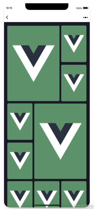
布局核心思路
通过CSS(使用Less预处理器)实现响应式拼图布局,适配不同屏幕宽度。
核心思路是通过Less变量动态计算尺寸,结合浮动与绝对定位实现复杂拼图效果。
1. 定基准然后联动计算

找到效果图特点:
- 3个小图宽度一样
- 大图高度是两个小图高度
@--item-small-width: calc((100vw - 32px - 16px) / 3);
3个小图宽度可以通过屏幕宽度计算得到,可以以小图的宽度为基准,以此实现响应式
- 小图高度基于宽高比动态确定高度
- 大图宽度根据屏幕宽度减去小图宽度计算
- 大图高度是两个小图高度
小图宽度 = (屏幕宽度 - 间距补偿) / 3
小图高度 = 小图宽度 * 宽高比
大图宽度 = 屏幕宽度 - 小图宽度 - 间距补偿
大图高度 = 小图高度 * 2 + 间距补偿
2. 定义动态尺寸计算
使用Less变量基于视口动态计算尺寸,元素直接使用@变量
@--wh-ratio: 1.46;//宽高比 300*440
@--item-small-width: calc((100vw - 32px - 16px) / 3);
@--item-large-width:calc(100vw - ((100vw - 32px - 16px) / 3) - 40px);
@--item-small-height: calc(@--item-small-width * @--wh-ratio);
@--item-large-height: calc(@--item-small-height * 2 + 11px);
@--item4-top:calc(@--item-large-height + 8px);
@--item5-top:calc(@--item-large-height + @--item-small-height + 19px);

//使用
.item-large{
         width:@--item-large-width;
         height: @--item-large-height;
         margin-left: 8px;
         margin-top: 8px;
}
.item-small{
         margin-top: 8px;
         margin-left: 8px;
         width:@--item-small-width;
         height: @--item-small-height;
}
3. 使用calc运算
calc() 函数允许在指定 CSS 属性值时执行计算,能够组合不同的单位进行计算。
@--item-large-width: calc(100vw - @--item-small-width - 48px);
4. 浮动布局
通过左右浮动实现左右吸附布局
.item-left { float: left !important; }
.item-right { float: right; }
配合清除浮动保证布局稳定:
&:after{
         content: "";
         display: block;
         clear: both;
     }
5. 绝对定位特殊元素
对非常规位置元素(如索引3/4)采用绝对定位:
.item4 {
  position: absolute;
  top: calc(@--item-large-height + 8px); // 基于大图底部定位
  left: -8px;
}
.item5{
 position: absolute;
 top: @--item5-top;
left: -8px;
}
动态位置计算:
@--item4-top = 大图高度 + 间距@--item5-top = 大图高度 + 小图高度 + 间隙
清除浮动
绝对定位元素脱离文档流,会影响后面的元素,非常规位置元素(如索引3/4)需要清除浮动。
 <!-- 清除浮动 -->
 <div class="clearfix"></div>
.clearfix {
   clear: both;content: "";
   display: table;
 }
响应式关键技巧
-
边距动态调整
通过组合类实现精细控制:.item-top0 { margin-top: 0; } // 取消上边距 .item-top11 { margin-top: 11px; } // 特殊间距 .item-left0 { margin-left: 0; } // 取消左边距 -
条件渲染适配
模板中根据元素索引动态分配类名:<template v-if="index==0"> <van-image class="item item-large item-left0 item-top0"> </template>实现逻辑:
- 索引0:左上角大图(无外边距)
- 索引1:右上角小图
- 索引3/4:绝对定位特殊位置
布局优势与局限
优势:
- 完美响应视口变化,所有尺寸自动重算
- 通过Less变量维护设计一致性
- 浮动+绝对定位实现复杂拼图效果
局限:
- 绝对定位元素脱离文档流,需谨慎控制
- 边距补偿值需根据实际布局微调
此方案适合分享、图片墙、艺术画廊、生成海报等前端场景,通过调整
@--wh-ratio可适配不同宽高比需求,关键是在动态计算与定位策略间取得平衡。


 扫一扫
扫一扫


 963
963

 被折叠的 条评论
为什么被折叠?
被折叠的 条评论
为什么被折叠?
 到【灌水乐园】发言


