


时间终会改变一个人,或好或坏。只有改变才会活得舒服,然后去熟悉这个世界的游戏规则,不被规则所淘汰。提前祝贺你在优秀这条道路上越走越好。
animation动画进阶
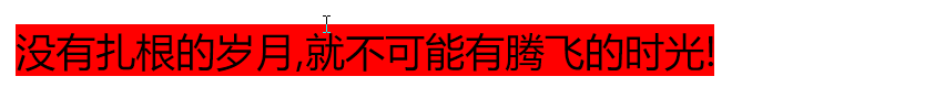
1、打字机效果
2、使用图片 实现奔跑的小熊动画

<!DOCTYPE html>
<html lang="en">
<head>
    <meta charset="UTF-8">
    <title>王子老师CSS进阶</title>
</head>
<style>
    .quxian{
        /*设置字体大小,方便打印机格式弹出*/
        font-size: 10px;
        /*强制将文字一行显示*/
        white-space: nowrap;
        /*超出的部分隐藏*/
        overflow: hidden;
        width: 0;
        background-color: red;
        /*添加动画 以step形式 无限循环*/
        animation: quxian 4s steps(17) infinite;
    }
    @keyframes quxian {
        from{
            width: 0;
        }
        to{
            width: 210px;
        }
    }
    body{
        background-color: #cccccc;
    }
    p{
        margin-left: 800px;
    }
    div[class="xiong"] {
        /*添加绝对定位 奔跑到中间*/
        position: absolute;
        width: 200px;
        height: 100px;
        /*图片大小均分成8份*/
        background: url(../image/xiong.png) no-repeat;
        border: 1px solid transparent;
        /*有多个动画,中间逗号分割*/
        animation: xiong 0.8s steps(8) infinite,zhongjian 3s ease forwards;
    }
    @keyframes xiong {
        from{
            /*设置背景图片的位置*/
            background-position: 0 0;
        }
        to{
            background-position: -1600px 0;
        }
    }
    @keyframes zhongjian {
        0%{
            /*绝对定位*/
            left: 0;
        }
        100%{
            left: 50%;
            /*计算方便直接使用translateX相对自身左移动一半长度*/
            transform: translateX(-50%);
        }
    }
</style>
<body>
    <div class="quxian">
        没有扎根的岁月,就不可能有腾飞的时光!
    </div>
    <br>
    <br>
    <br>
    <p>
        请欣赏奔跑的小熊
    </p>
    <div class="xiong"></div>
</body>
</html>


 145
145


 被折叠的 条评论
为什么被折叠?
被折叠的 条评论
为什么被折叠?
 到【灌水乐园】发言


