


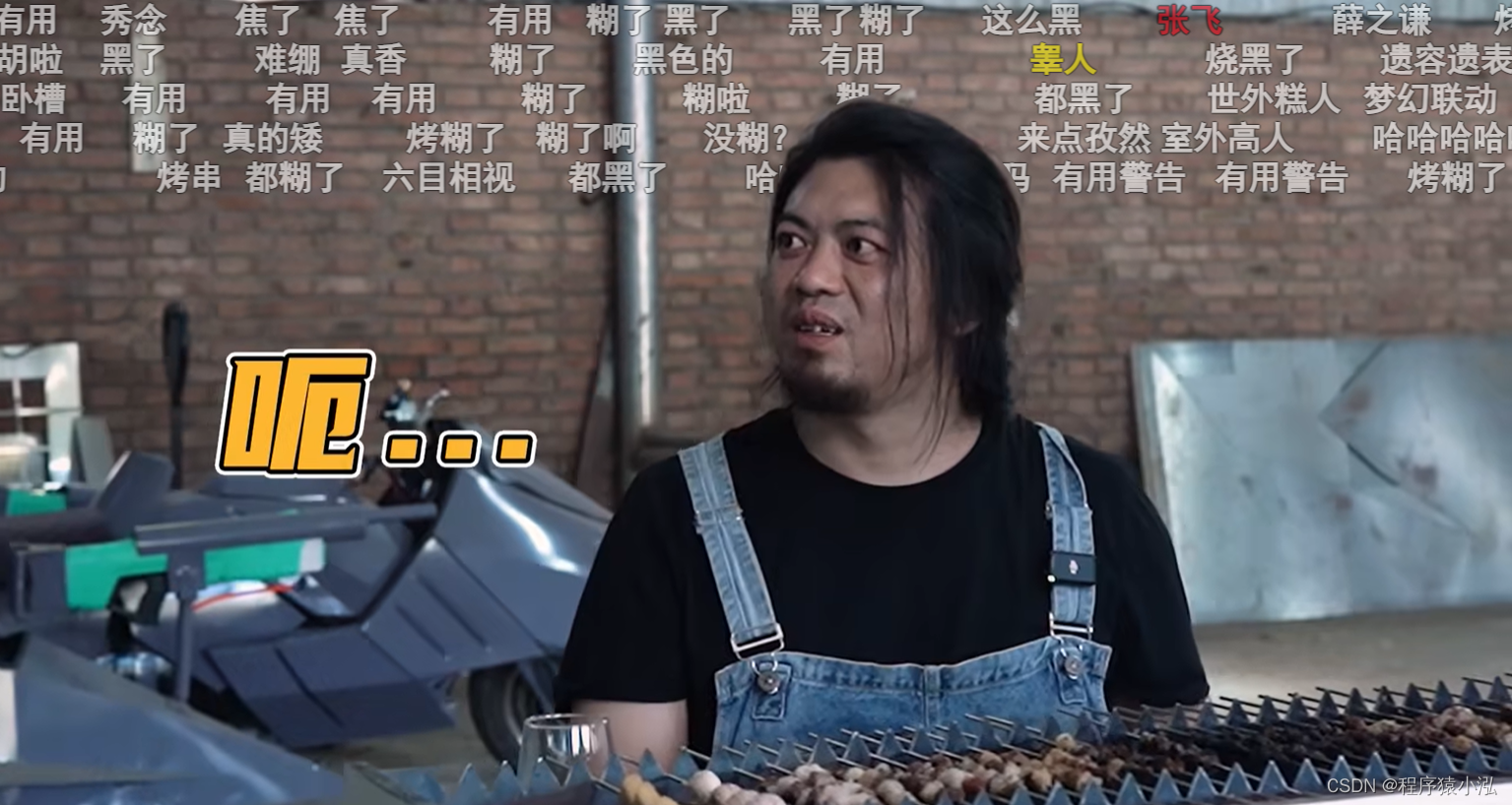
如今各种视频网站,例如b站都有人物遮挡效果
其实是利用了svg图+ css的mask-image属性去实现的。
打开f12可以取得
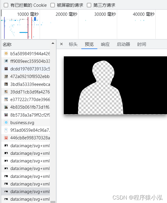
这种图片,就是由AI识别出来然后生成,一张图片也就一两K,一次加载很多张也不会造成很大的负担。
通过在视频不同时的帧引入不同遮罩图,来实现弹幕遮挡的效果。
于是,开始写代码。将svg的存入本地。
再添加一些弹幕特效。
<!DOCTYPE html>
<html lang="en">
<head>
  <meta charset="UTF-8">
  <title>Title</title>
  <style>
    .video {
      width: 668px;
      height: 376px;
      position: relative;
      background-color: black;
      -webkit-mask-image: url("./svg.svg");
      -webkit-mask-size: 668px 376px;
    }
    .bullet {
      position: absolute;
      font-size: 20px;
      color: white;
      animation: ani 5s linear infinite;
    }
    .showBullet {
      position: absolute;
      font-size: 20px;
      color: red;
      animation: show 5s linear infinite;
    }

    @keyframes ani {
      0% {
        transform: translateX(668px);
      }
      100% {
        transform: translateX(-668px);
      }
    }

    @keyframes show {
      0% {
        opacity: 0;
      }
      10% {
        opacity: 1;
      }
      100% {
        opacity: 1;
      }
    }
  </style>
</head>
<body>
<div class="video">
  <div class="bullet" style="left: 100px; top: 120px;">元芳,你怎么看</div>
  <div class="bullet" style="left: 200px; top: 60px;">你难道就是传说中的手工耿</div>
  <div class="bullet" style="left: 500px; top: 60px;">纯手工js弹幕</div>
  <div class="bullet" style="left: 300px; top: 140px;">失踪人口回归</div>
  <div class="bullet" style="left: 400px; top: 100px;">下次一定,梗哥</div>
  <div class="showBullet" style="left: 320px; top: 20px;">完结撒花</div>
  <div class="showBullet" style="left: 340px; top: 50px;">泪目</div>
</div>
</body>
</html>
最终实现的效果
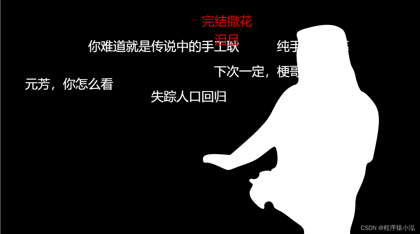
弹幕动画可以自己设定,非常有趣!
写文思路参考: https://juejin.cn/post/7141012605535010823
mask-image属性对应mdn文档:https://developer.mozilla.org/zh-CN/docs/Web/CSS/mask-image


 279
279


 被折叠的 条评论
为什么被折叠?
被折叠的 条评论
为什么被折叠?
 到【灌水乐园】发言


