


效果图:
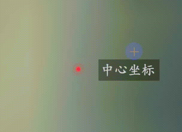
原理是创建div图层,使用Cesium中scene.cartesianToCanvasCoordinates将世界二维或三维坐标转换为屏幕坐标,利用css transform:matrix()来动态计算位置,配合css样式实现波纹点。
function mapCreateDivPoint(cartesian) {
    // 获取元素
    let ctn = document.getElementById("company-address");
    // 判断元素是否存在
    if (!ctn) {
        // 不存在则重新创建元素
        ctn = createDivDom();
        // 绑定到container下
        viewer.cesiumWidget.container.appendChild(ctn);
    }
    // 监听事件
    viewer2d.scene.postRender.addEventListener((scene, time) => {
        // 二维世界坐标转换为屏幕坐标
        let position = scene.cartesianToCanvasCoordinates(
            cartesian,
            new Cesium.Cartesian2()
        );
        // css矩阵
        ctn.style.transform = `matrix(1, 0, 0, 1, ${position.x}, ${position.y})`;
    });
}

function createDivDom() {
    let ctn = document.createElement("div");
    ctn.setAttribute("id", "company-address");
    ctn.classList.add("map-divGraphic");
    ctn.innerHTML = `<div style="color:#f33349;"> <p></p> </div>`;
    ctn.style.transformOrigin = "left bottom 0px";
    return ctn;
}
css样式
.map-divGraphic {
  pointer-events: all;
  display: block;
  transform-origin: left bottom 0px;
  z-index: auto;
  position: absolute;
  left: 0;
  top: 0;
  div {
    width: 10px;
    height: 10px;
    border-radius: 50%;
    border: 1px solid hsla(0, 0%, 100%, 0.5);
    // cursor: pointer;
    color: #0ff;
    background: currentColor;
    z-index: 3;
    left: 50%;
    top: 50%;
    -webkit-transform: translate(-50%, -50%);
    -moz-transform: translate(-50%, -50%);
    -o-transform: translate(-50%, -50%);
    -ms-transform: translate(-50%, -50%);
    transform: translate(-50%, -50%);
    box-shadow: 0 0 2em currentColor, 0 0 0.5em currentColor;
    position: absolute;
    pointer-events: none;
    p {
      position: absolute;
      left: 50%;
      top: 50%;
      width: 0;
      height: 0;
      border-radius: 50%;
      -webkit-transform: translate(-50%, -50%);
      -moz-transform: translate(-50%, -50%);
      -o-transform: translate(-50%, -50%);
      -ms-transform: translate(-50%, -50%);
      transform: translate(-50%, -50%);
      -webkit-animation: animation-point-mapAni 2s ease infinite;
      -moz-animation: animation-point-mapAni 2s ease infinite;
      -o-animation: animation-point-mapAni 2s ease infinite;
      -ms-animation: animation-point-mapAni 2s ease infinite;
      animation: animation-point-mapAni 2s ease infinite;
    }
    p::before,
    p::after {
      border: 1px solid;
      content: "";
      position: absolute;
      width: 100%;
      height: 100%;
      left: 50%;
      top: 50%;
      border-radius: 50%;
      -webkit-transform: translate(-50%, -50%);
      -moz-transform: translate(-50%, -50%);
      -o-transform: translate(-50%, -50%);
      -ms-transform: translate(-50%, -50%);
      transform: translate(-50%, -50%);
    }
  }
  div::before,
  div::after {
    content: "";
    position: absolute;
    width: 100%;
    height: 100%;
    left: 50%;
    top: 50%;
    border-radius: 50%;
    -webkit-transform: translate(-50%, -50%);
    -moz-transform: translate(-50%, -50%);
    -o-transform: translate(-50%, -50%);
    -ms-transform: translate(-50%, -50%);
    transform: translate(-50%, -50%);
    border: 1px solid;
    -webkit-animation: animation-point-mapAni 1s ease infinite;
    -moz-animation: animation-point-mapAni 1s ease infinite;
    -o-animation: animation-point-mapAni 1s ease infinite;
    -ms-animation: animation-point-mapAni 1s ease infinite;
    animation: animation-point-mapAni 1s ease infinite;
  }

  @keyframes animation-point-mapAni {
    0% {
      width: 0;
      height: 0;
      opacity: 1;
      filter: alpha(opacity=1);
    }
    25% {
      width: 120%;
      height: 120%;
      opacity: 0.7;
      filter: alpha(opacity=70);
    }
    50% {
      width: 200%;
      height: 200%;
      opacity: 0.5;
      filter: alpha(opacity=50);
    }
    75% {
      width: 300%;
      height: 300%;
      opacity: 0.2;
      filter: alpha(opacity=20);
    }
    to {
      width: 400%;
      height: 400%;
      opacity: 0;
      filter: alpha(opacity=0);
    }
  }
}
background、box-shadow控制背景色及波纹颜色,如此即可实现图示,同理,弹窗图层也是依赖屏幕坐标实现。


 787
787


 被折叠的 条评论
为什么被折叠?
被折叠的 条评论
为什么被折叠?
 到【灌水乐园】发言


