echarts使用custom类型绘制矩形

echarts中根据坐标点和点的宽高绘制不同大小的矩形
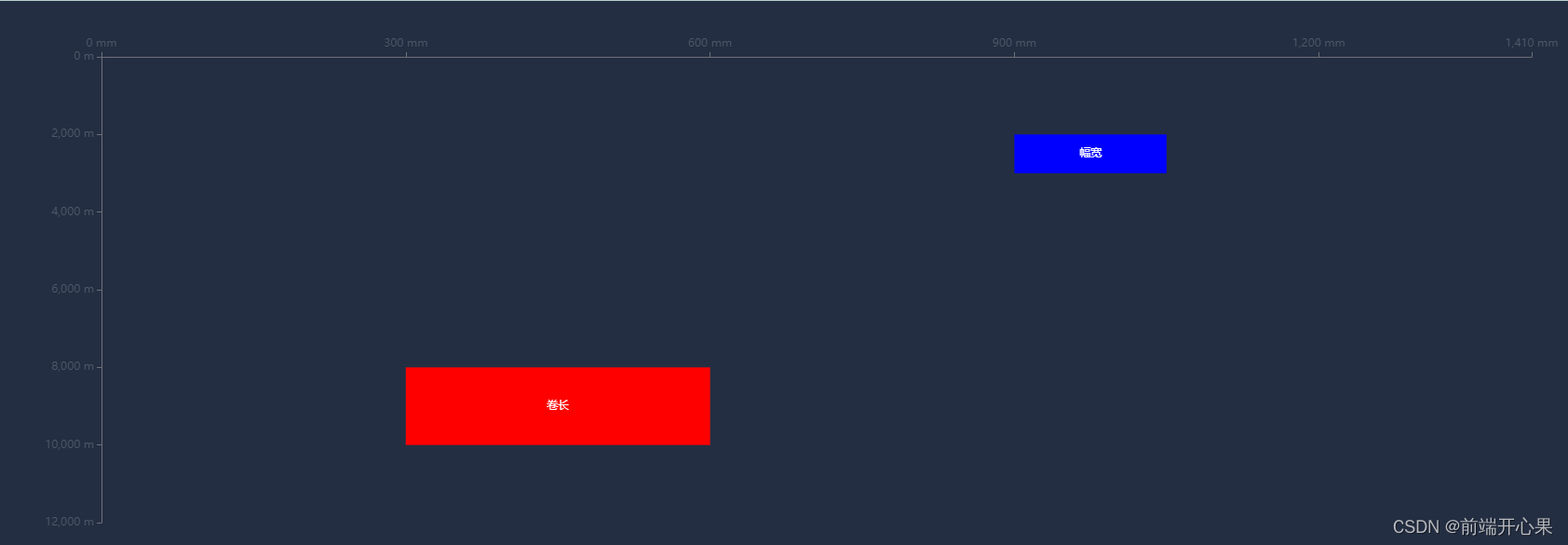
效果图
在这里插入图片描述

<template>
  <div style="height: 100%; width: 100%">
    <BaseChart @emitChart="emitChart" :option="option1" />
  </div>
</template>

<script>
export default {
  data() {
    return {
      echarts: null,
      option1: {},
    };
  },
  mounted() {
    this.setOption1();
  },
  methods: {
    setOption1() {
      const rectangles = [
        {
          x: 300,
          y: 8000,
          width: 300,
          height: 2000,
          name: "卷长",
          itemStyle: {
            borderColor: "red",
            normal: {
              color: "red",
            },
          },
        },
        {
          x: 900,
          y: 2000,
          width: 150,
          height: 1000,
          name: "幅宽",
          itemStyle: {
            borderColor: "green",
            normal: {
              color: "blue",
            },
          },
        },
        // 可以添加更多的矩形...
      ];
      let data = rectangles.map((i) => {
        // 数组里面的值分别代表维度0, 1, 2, 3
        return {
          value: [i.x, i.y, i.width, i.height],
          name: i.name,
          itemStyle: i.itemStyle,
        };
        // 数组里面的值分别代表维度0, 1, 2, 3,这种数据结构没有针对样式颜色
        // return [i.x, i.y, i.width, i.height];
      });

      const option = {
        grid: {
          height: 500,
          // left: "2%",
          // right: "2%",
          // bottom: "2%",
          // containLabel: true,
        },
        xAxis: [
          {
            splitLine: {
              show: false,
            },
            position: "top",
            min: 0,
            max: 1410,
            axisLabel: {
              show: true,
              formatter: "{value} mm",
              textStyle: {
                color: "#4E5969",
              },
            },
          },
        ],
        yAxis: [
          {
            splitLine: {
              show: false,
            },
            inverse: true,
            min: 0,
            max: 12000,
            axisLabel: {
              show: true,
              formatter: "{value} m",
              textStyle: {
                color: "#4E5969",
              },
            },
          },
        ],
        tooltip: {
          formatter: function (params) {
            return (
              params.marker +
              params.name +
              ": " +
              params.value[0] +
              "~" +
              params.value[1] +
              "<br/>" +
              params.marker +
              `name:${params.data.name}`
            );
          },
        },
        series: [
          {
            type: "custom",
            coordinateSystem: "cartesian2d",
            renderItem: (params, api) => {
              // api.coord()将数据组映射到坐标系上,api.value(n),获取第n维度的值
              let start = api.coord([api.value(0), api.value(1)]);
              // api.size()给定数据范围,映射到坐标系上后的像素长度。比如api.size([1, 1])和坐标轴的刻度一样,长度都是1
              // 如果矩形超出了当前坐标系的包围盒,则剪裁这个矩形。
              let rectShape = this.$echarts.graphic.clipRectByRect(
                {
                  x: start[0],
                  y: start[1],
                  width: api.size([1, 1])[0] * api.value(2),
                  height: api.size([1, 1])[1] * api.value(3),
                },
                {
                  x: params.coordSys.x,
                  y: params.coordSys.y,
                  width: params.coordSys.width,
                  height: params.coordSys.height,
                }
              );
              return (
                rectShape && {
                  type: "rect", // 矩形,还可以circle等
                  shape: rectShape,
                  style: api.style({
                    text: `${data[params.dataIndex].name}`, // 文字内容
                  }),
                }
              );
            },
            itemStyle: {
              normal: {
                opacity: 1,
              },
            },
            encode: {
              x: [0, 2], // data 中『维度0』和『维度2』对应到 X 轴
              y: 1, // data 中『维度1』对应到 Y 轴
            },
            data, // data是一个二维数组
          },
        ],
      };

      this.option1 = option;
    },
    emitChart(echarts) {
      this.echarts = echarts;
    },
  },
};
</script>

  • 0
    点赞
  • 1
    收藏
    觉得还不错? 一键收藏
  • 0
    评论
您好!关于您的问题,我可以为您提供一些思路和参考。 首先,您可以使用 ECharts 的自定义系列(custom series)功能来实现数据的上下堆叠效果。具体来说,您可以创建两个自定义系列,分别用于绘制上层数据和下层数据,然后通过设置系列的 z 属性来控制它们的叠放顺序。 其次,您需要对数据进行处理,以便在绘制时能够正确地展示上下堆叠效果。一种常见的做法是将数据按照 x 轴的分类进行分组,然后对每组数据进行累加,从而得到上下堆叠的数据。 最后,您可以使用 ECharts 的图表配置项来设置图表的样式和交互效果,例如设置坐标轴、图例、提示框等。 以下是一个简单的示例代码,供您参考: ```javascript // 数据处理 var data = [ { name: 'A', type: '上层', value: 100 }, { name: 'A', type: '下层', value: 50 }, { name: 'B', type: '上层', value: 80 }, { name: 'B', type: '下层', value: 70 }, { name: 'C', type: '上层', value: 120 }, { name: 'C', type: '下层', value: 90 }, ]; var groups = {}; data.forEach(function(item) { if (!groups[item.name]) { groups[item.name] = { x: item.name, up: 0, down: 0 }; } if (item.type === '上层') { groups[item.name].up += item.value; } else { groups[item.name].down += item.value; } }); var seriesData = []; for (var name in groups) { var group = groups[name]; seriesData.push([ { name: group.x, value: group.up }, { name: group.x, value: group.down }, ]); } // 图表配置 var option = { xAxis: { type: 'category', data: Object.keys(groups) }, yAxis: { type: 'value' }, series: [ { type: 'custom', renderItem: function(params, api) { var x = api.value(0); var y = api.value(1); var height = api.coord([0, y])[1] - api.coord([0, 0])[1]; return { type: 'rect', shape: { x: x - 20, y: api.coord([0, 0])[1], width: 40, height: height } }; }, data: seriesData.map(function(item) { return item[0]; }), z: 2, }, { type: 'custom', renderItem: function(params, api) { var x = api.value(0); var y = api.value(1); var height = api.coord([0, y])[1] - api.coord([0, 0])[1]; return { type: 'rect', shape: { x: x - 20, y: api.coord([0, 0])[1] + height, width: 40, height: -height } }; }, data: seriesData.map(function(item) { return item[1]; }), z: 1, }, ], }; ``` 希望这个回答能够对您有所帮助!

“相关推荐”对你有帮助么?

  • 非常没帮助
  • 没帮助
  • 一般
  • 有帮助
  • 非常有帮助
提交
评论
添加红包

请填写红包祝福语或标题

红包个数最小为10个

红包金额最低5元

当前余额3.43前往充值 >
需支付:10.00
成就一亿技术人!
领取后你会自动成为博主和红包主的粉丝 规则
hope_wisdom
发出的红包
实付
使用余额支付
点击重新获取
扫码支付
钱包余额 0

抵扣说明:

1.余额是钱包充值的虚拟货币,按照1:1的比例进行支付金额的抵扣。
2.余额无法直接购买下载,可以购买VIP、付费专栏及课程。

余额充值