


一,问题描述
当鼠标移动到图片上时,图片下方会有透明的阴影和文字的动画效果,移出图片时同样有退出的动画效果,动画的移入和移出,动作是缓慢的。
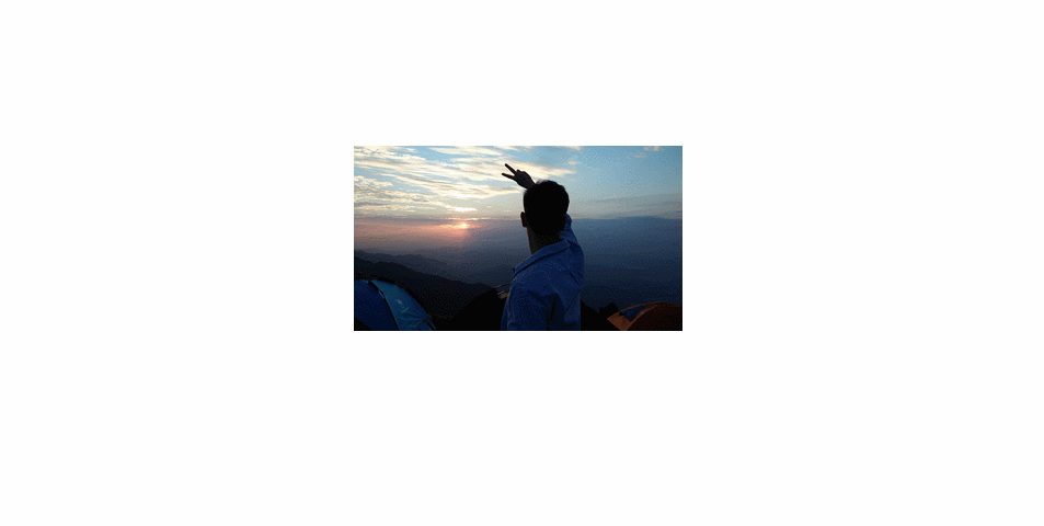
二,效果预览

三,用到的主要事件
- onmourseover:鼠标移入图片时,略过图片触发。
- onmourseout:鼠标移出图片时触发。
- window.setInterval():定时器,每隔多少时间对指定方法 进行调用,主要用于动画的过度效果。
四,详细代码
- 代码结构
- Html代码
<!DOCTYPE html>
<html>
	<head>
		<meta charset="UTF-8">
		<title></title>
	</head>
	<link rel="stylesheet" type="text/css" href="../css/shadow.css"/>
	<script type="text/javascript" src="../js/shadow.js" ></script>
	<body>
		<ul id="nav">
			<li><img src="../../2019-07-30-广告/images/me_background.jpg"/></li>
			<li>阴影</li>
			<li>男孩子一定要努力呀</li>
		</ul>
	</body>
</html>
- Css代码
*{
	padding: 0px;
	margin: 0px;
}
body{
	margin: 0 auto;
	/*text-align: center;*/
}
#nav{
	width: 400px;
	margin: 0 auto;
	text-align: center;
	position: relative;
	overflow: hidden;
}
#nav img{
	width: 400px;
}
#nav li{
	list-style: none;
	width: 100%;
}
#nav li:nth-child(2){
	opacity: .4;
	text-indent: -9999px;
	background-color: gray;
}
#nav li:nth-child(2),#nav li:nth-child(3)
{
	height: 40px;
	line-height: 40px;
	font-size: 26px;
	color: darkorange;
	position: absolute;
	left: 0px;
	bottom: -40px;
}
- JS代码
*{
	padding: 0px;
	margin: 0px;
}
body{
	margin: 0 auto;
	/*text-align: center;*/
}
#nav{
	width: 400px;
	margin: 0 auto;
	text-align: center;
	position: relative;
	overflow: hidden;
}
#nav img{
	width: 400px;
}
#nav li{
	list-style: none;
	width: 100%;
}
#nav li:nth-child(2){
	opacity: .4;
	text-indent: -9999px;
	background-color: gray;
}
#nav li:nth-child(2),#nav li:nth-child(3)
{
	height: 40px;
	line-height: 40px;
	font-size: 26px;
	color: darkorange;
	position: absolute;
	left: 0px;
	bottom: -40px;
}
五,效果演示


 扫一扫
扫一扫


 2820
2820

 被折叠的 条评论
为什么被折叠?
被折叠的 条评论
为什么被折叠?
 到【灌水乐园】发言


