


echart折线图,x轴滑动
在使用echart开发折线图,因为x轴的展示数据太多,想默认展示一段时间的数据
<div id="flowDay" class="index_height index_width" style="width: 1100px; height: 560px"></div>
var dayFlowEcharts = echarts.init(document.getElementById('flowDay'));
    dayFlowEcharts.setOption(optionTemp);
    getDayFlow(dayFlowEcharts, listData.iotMsisdn);
function getDayFlow(dayFlowEcharts, iotMsisdn) {
    $.ajax({
        url: pjUrl + "iot/cardDetail/flowDay",
        dataType: 'json',
        contentType: "application/json",
        type: 'post',
        xhrFields: {
            withCredentials: true
        },
        data: JSON.stringify({"iotMsisdn": iotMsisdn}),
        success: function (data) {
            if (data.status == "200") {
                if (data.data && data.data != null && data.data.length > 0) {
                    var num = 0.000
                    var legendData = []
                    var cateData = []
                    data.data.forEach(item => {
                        legendData.push(item.flow)
                        cateData.push(item.time)
                    });
                    legendData.forEach(item => {
                        num = (num + parseInt(item))
                    });
                    dayFlowEcharts.setOption({
                        title: {text: '总计:' + num + '(MB)'},
                        xAxis: {data: cateData},
                        series: [{data: legendData}]
                    });
                }
            }
        },
        error: function (d) {
            closeIndexPopUp(index_user_load);
            alertErrorMsg("基础信息初始化失败,请重试");
        }
    });
}
/**
* 卡详情 折线图
*/
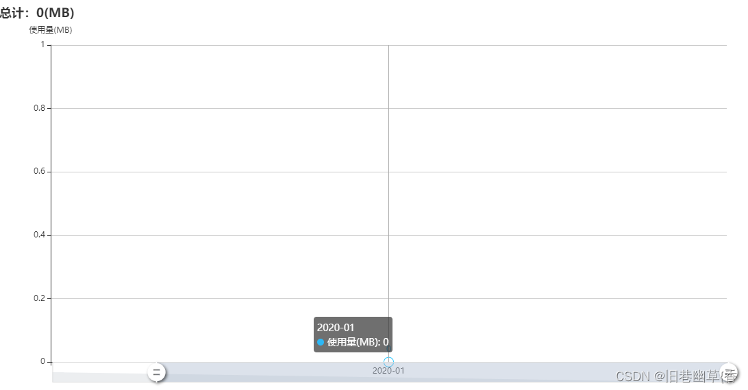
var optionTemp = {
title: {
text: '总计:' + 0 + '(MB)'
},
tooltip: {
trigger: 'axis'
},
color: '#2db7f5',
grid: {
left: '5%',
right: '3%',
bottom: '3%',
containLabel: true
},
xAxis: {
type: 'category',
boundaryGap: true,
data: ['2020-01']
},
yAxis: {
name: '使用量(MB)',
type: 'value',
// axisLine: {
// lineStyle: {
// // 设置y轴颜色
// color: '#c9c9c9'
// }
// },
},
dataZoom: [{
type: 'inside',
start: 40,
end: 100
}, {
start: 0,
end: 10,
handleIcon: 'M10.7,11.9v-1.3H9.3v1.3c-4.9,0.3-8.8,4.4-8.8,9.4c0,5,3.9,9.1,8.8,9.4v1.3h1.3v-1.3c4.9-0.3,8.8-4.4,8.8-9.4C19.5,16.3,15.6,12.2,10.7,11.9z M13.3,24.4H6.7V23h6.6V24.4z M13.3,19.6H6.7v-1.4h6.6V19.6z',
handleSize: '100%',
handleStyle: {
color: '#fff',
shadowBlur: 4,
shadowColor: 'rgba(0, 0, 0, 0.6)',
shadowOffsetX: 2,
shadowOffsetY: 2
}
}],
series: [
{
name: '使用量(MB)',
type: 'line',
stack: '总量',
data: [0],
symbolSize: 8,
itemStyle: {
normal: {
// 拐点上显示数值
label: {
show: true
},
borderColor: '#2db7f5', // 拐点边框颜色
lineStyle: {
width: 5, // 设置线宽
type: 'solid' //'dotted'虚线 'solid'实线
}
}
}
}
]
}


 2146
2146


 被折叠的 条评论
为什么被折叠?
被折叠的 条评论
为什么被折叠?
 到【灌水乐园】发言


