1. 展示效果:
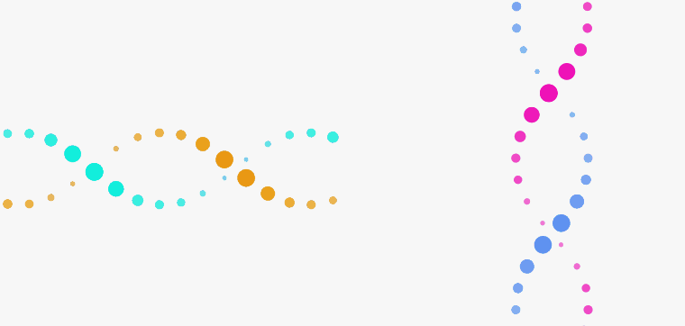
2. 实现原理:
- 创建两个盒子,通过border-radius设置圆角
- 通过@keyframes 控制盒子缩放效果、透明效果、及定位
- 利用animation执行动画 ease-in-out规定动画的速度曲线,infinite循环执行
- 最后通过animation-delay排列动画延时执行顺序
3. 直接上代码:
<!doctype html>
<html>

<head>
  <meta charset="utf-8">
  <title>Css3 动画(一)  螺旋转动</title>

  <style>
    body {
      background: #f7f7f7;
    }

    .mainBox {
      position: relative;
    }

    /* 横向 */
    .spiral1 {
      position: fixed;
      top: 50%;
      left: 50%;
      -webkit-transform: translate(-100%, -50%);
      transform: translate(-100%, -50%);
      width: 50%;
      height: 250px;
      text-align: center;
      overflow: hidden;
    }
    .spiral2 {
      position: fixed;
      top: 50%;
      left: 50%;
      -webkit-transform: translate(10%, -50%) rotate(90deg);
      transform: translate(10%, -50%) rotate(90deg);
      width: 50%;
      height: 250px;
      text-align: center;
      overflow: hidden;
    }
    .spiral2  .spiral_section .node{
      background: #ee0ab5;
    }
    .spiral2 .spiral_section .node.bottom {
      background: #5a8ff1;
    }
    .spiral_section {
      position: relative;
      margin: 0 5px;
      width: 50px;
      height: 250px;
      display: inline-block;
    }

    .spiral_section .node {
      position: absolute;
      top: 0;
      left: 0;
      width: 50px;
      height: 50px;
      border-radius: 100%;
      background: #0aeedb;
      -webkit-animation: 4s topNode ease-in-out infinite;
      animation: 4s topNode ease-in-out infinite;
    }

    @-webkit-keyframes topNode {
      0% {
        -webkit-transform: scale(0.5);
        transform: scale(0.5);
        top: 0;
        z-index: 10;
        opacity: 0.75;
      }

      25% {
        -webkit-transform: scale(1);
        transform: scale(1);
        opacity: 1;
      }

      50% {
        -webkit-transform: scale(0.5);
        transform: scale(0.5);
        top: 200px;
        z-index: 0;
        opacity: 0.75;
      }

      75% {
        -webkit-transform: scale(0.25);
        transform: scale(0.25);
        opacity: 0.5;
      }

      100% {
        -webkit-transform: scale(0.5);
        transform: scale(0.5);
        top: 0;
        opacity: 0.75;
      }
    }

    @keyframes topNode {
      0% {
        -webkit-transform: scale(0.5);
        transform: scale(0.5);
        top: 0;
        z-index: 10;
        opacity: 0.75;
      }

      25% {
        -webkit-transform: scale(1);
        transform: scale(1);
        opacity: 1;
      }

      50% {
        -webkit-transform: scale(0.5);
        transform: scale(0.5);
        top: 200px;
        z-index: 0;
        opacity: 0.75;
      }

      75% {
        -webkit-transform: scale(0.25);
        transform: scale(0.25);
        opacity: 0.5;
      }

      100% {
        -webkit-transform: scale(0.5);
        transform: scale(0.5);
        top: 0;
        opacity: 0.75;
      }
    }

    .spiral_section .node.bottom {
      top: auto;
      bottom: 0;
      background: #e99a07;
      -webkit-animation: 4s bottomNode ease-in-out infinite;
      animation: 4s bottomNode ease-in-out infinite;
    }

    @-webkit-keyframes bottomNode {
      0% {
        -webkit-transform: scale(0.5);
        transform: scale(0.5);
        bottom: 0;
        opacity: 0.75;
      }

      25% {
        -webkit-transform: scale(0.25);
        transform: scale(0.25);
        opacity: 0.5;
      }

      50% {
        -webkit-transform: scale(0.5);
        transform: scale(0.5);
        bottom: 200px;
        opacity: 0.75;
      }

      75% {
        -webkit-transform: scale(1);
        transform: scale(1);
        opacity: 1;
      }

      100% {
        -webkit-transform: scale(0.5);
        transform: scale(0.5);
        bottom: 0;
        opacity: 0.75;
      }
    }

    @keyframes bottomNode {
      0% {
        -webkit-transform: scale(0.5);
        transform: scale(0.5);
        bottom: 0;
        opacity: 0.75;
      }

      25% {
        -webkit-transform: scale(0.25);
        transform: scale(0.25);
        opacity: 0.5;
      }

      50% {
        -webkit-transform: scale(0.5);
        transform: scale(0.5);
        bottom: 200px;
        opacity: 0.75;
      }

      75% {
        -webkit-transform: scale(1);
        transform: scale(1);
        opacity: 1;
      }

      100% {
        -webkit-transform: scale(0.5);
        transform: scale(0.5);
        bottom: 0;
        opacity: 0.75;
      }
    }

  </style>

</head>

<body>
  <div class="mainBox">
    <div class="spiral1" id="spiralBox1"></div>
    <div class="spiral2" id="spiralBox2"></div>
  </div>

  <script type="text/javascript">
    (function () {
      var len = Math.round(document.body.clientWidth / 70); // 根据视图宽度定义元素数量
      var spiralHtml = '';
      for (let i = 0; i < len; i++) {
        spiralHtml += `<div class="spiral_section" >
          <div class="node top" style="animation-delay: ${-(i * 300)}ms"></div>
          <div class="node bottom" style="animation-delay:${-(i * 300)}ms"></div>
        </div>`
      }
      spiralBox1.innerHTML = spiralHtml; // html中id 及 name属性可以直接作为变量使用
      spiralBox2.innerHTML = spiralHtml;
    })();
  </script>


</body>

</html>


 文章展示了如何使用CSS3的@keyframes和animation属性创建一个螺旋转动的动画效果。通过创建两个相对定位的盒子,设置不同的transform和animation属性,以及通过animation-delay控制动画的顺序,实现了盒子在X轴和Y轴上的缩放、透明度变化和位置移动,从而形成螺旋旋转的视觉效果。


 扫一扫
扫一扫


 被折叠的 条评论
为什么被折叠?
被折叠的 条评论
为什么被折叠?
 到【灌水乐园】发言


