


数据读取
pandas读取txt文档,分隔符‘\t’
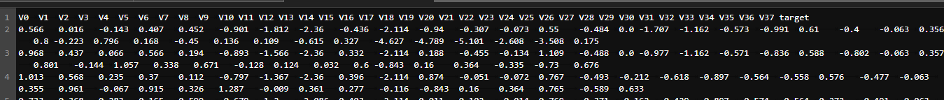
train_data = pd.read_csv(train_data_file, sep='\t', encoding='utf-8')
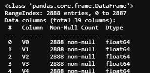
获取数据的摘要
train_data.info()
获取统计信息
train_data.describe()

显示前5条
train_data.head()
train_data.head(10)  # 前十条
可视化数据
使用到的包
import seaborn as sns
from scipy import stats
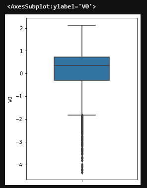
箱型图
fig = plt.figure(figsize=(4,6))		# 控制显示比例
sns.boxplot(train_data['V0'], orient='v', width=0.5)		# 箱型图
pandas中train_data.columns 类型<class ‘pandas.core.indexes.base.Index’>
column = train_data.columns.tolist()[:39]
train_data.columns.values可变为numpy数组
绘制直方图及Q-Q图
(1)绘制39条数据的直方图,并绘制出拟合的标准正态分布
(2)绘制Q-Q图(一种检验样本数据概率分布(例如正态分布)的方法)
'''绘制所有列的数据'''
train_cols = 6
train_rows = round((len(train_data.columns))/3+0.5)	# 取大于该数的最小整数
fig = plt.figure(figsize=(train_cols*4,train_rows*4))
i = 0
for col in train_data.columns.tolist():
    i += 1
    ax = plt.subplot(train_rows, train_cols, i)
    sns.distplot(train_data[col], fit=stats.norm)	# 绘制直方图
    i += 1
    ax = plt.subplot(train_rows, train_cols, i)
    res = stats.probplot(train_data[col], plot=plt)	# 绘制Q-Q图
plt.tight_layout()		# 防止各个图间横纵label重合打架
plt.show()
单个截图

绘制核密度估计(KDE)分布
可看成直方图的加窗平滑
train_cols = 6
train_rows = round((len(train_data.columns))/3+0.5)
fig = plt.figure(figsize=(train_cols*4,train_rows*4))
i = 0
for col in train_data.columns:
    if col == 'target':		# 不绘制该列
        continue
    i += 1
    ax = plt.subplot(train_rows, train_cols, i)
    ax = sns.kdeplot(train_data[col], color='Red', shade=True)
    ax = sns.kdeplot(test_data[col], color='Blue', shade=True)
    ax.set_xlabel(col)
    ax.set_ylabel('Frequency')
    ax = ax.legend(['train', 'test'])
plt.show()
部分截图

线性回归关系图
# 线性回归关系图
plt.figure(figsize=(8, 4), dpi=150)
ax = plt.subplot(1,2,1)
sns.regplot(x='V0', y='target', data=train_data, ax=ax,
            scatter_kws={'marker':'.','s':3,'alpha':0.3},
            line_kws={'color':'k'});
plt.xlabel('V0')
plt.ylabel('target')

ax = plt.subplot(1,2,2)
sns.distplot(train_data['V0'].dropna())
plt.xlabel('V0')
plt.show()

获取异常数据并画图
查看变量的相关性
计算相关系数
pd.set_option('display.max_columns', 10)
pd.set_option('display.max_rows', 10)
data_train1 = train_data.drop(['V5', 'V9', 'V11', 'V17', 'V22', 'V28'], axis=1)	#删除分布不一致数据 即不好的数据
train_corr = data_train1.corr()
train_corr
绘制相关系数热力图
ax = plt.figure(figsize=(20, 16))
ax = sns.heatmap(train_corr, vmax=0.8, square=True, annot=True)


 281
281


 被折叠的 条评论
为什么被折叠?
被折叠的 条评论
为什么被折叠?
 到【灌水乐园】发言


