从小程序基础库版本 1.6.3 开始,小程序支持简洁的组件化编程。所有自定义组件相关特性都需要基础库版本 1.6.3 或更高。
创建自定义组件
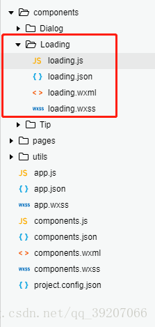
首先我们需要在根目录下创建文件夹components(该文件夹与pages目录同级),然后在components中建立我们自己的组件,然后建立子文件夹以区分不同的组件,
比如我们要建立loading组件,在components中建立Loading文件夹,然后
选中Loading ==》 右键 ==》 新建 ==》Component ==》输入文件名"loading"
到这里会生成四个文件 loading.js、loading.json、loading.wxml、loading.wxss
目录结构如下图(下图中我定义了三个组件Dialog、Loading、Tip)
1、在 loading.json中设置
{
"component":
true
},
2、
在 loading.wxml 中编写组件模板
<!--components/Loading/loading.wxml-->
<
view
class=
'wx_loading_container'
hidden=
"{{!isShow}}">
<
view
class=
'wx-mask'></
view
>
<
view
class=
'wx-loading'>
<
view
class=
'wx-loading-title'>{{ title }}
</
view
>
<
view
class=
'wx-loading-content'>{{ content }}
</
view
>
<
view
class=
'wx-loading-img'>
<
image
class=
'loading-img'
src=
'http://test-img.ilodo.com/websocket/loading.png'></
image
>
</
view
>
</
view
>
</
view
>
3、在loading.wxss文件中编写组件样式(在组件wxss中不应使用ID选择器、属性选择器和标签名选择器)
/* components/Loading/loading.wxss */
.wx-mask{
width:
100%;
height:
100%;
position:
fixed;
top:
0;
left:
0;
z-index:
1000;
background:
#000;
opacity:
0.75;
overflow:
hidden;
}
.wx-loading{
position:
fixed;
z-index:
5000;
width:
80%;
max-width:
600
rpx;
top:
50%;
left:
50%;
-webkit-transform:
translate(
-50%,
-50%
);
transform:
translate(
-50%,
-50%
);
background-color:
#333333;
text-align:
center;
border-radius:
3px;
border:
1px
solid
#4c4c4c;
color:
#f1d657;
overflow:
hidden;
}
.wx-loading-title{
font-size:
18px;
padding:
30px
15px
5px;
}
.wx-loading-content{
padding:
15px
15px
5px;
font-size:
16px;
line-height:
1.3;
word-wrap:
break-word;
word-break:
break-all;
color:
#999999;
}
.wx-loading-img{
width:
100
rpx;
height:
100
rpx;
margin:
20px
auto
50px;
}
.loading-img{
width:
100%;
height:
100%;
animation:
innerRing
1s
linear
infinite;
}
@keyframes
innerRing{
form{
transform:rotate(0deg)
}
to{
transform:rotate(360deg)
}
}
4、在loading.js文件中使用Component()注册组件,并提供组件的属性定义、内部数据和自定义方法。
Component({
options: {
multipleSlots:
true
// 在组件定义时的选项中启用多slot支持
},
/**
* 组件的属性列表
* 用于组件自定义设置
*/
properties: {
// 弹窗标题
title: {
// 属性名
type: String,
// 类型(必填),目前接受的类型包括:String, Number, Boolean, Object, Array, null(表示任意类型)
value:
''
// 属性初始值(可选),如果未指定则会根据类型选择一个
},
// 弹窗内容
content: {
type: String,
value:
''
}
},
/**
* 私有数据,组件的初始数据
* 可用于模版渲染
*/
data: {
// 弹窗显示控制
isShow:
false
},
/**
* 组件的方法列表
* 更新属性和数据的方法与更新页面数据的方法类似
*/
methods: {
/*
* 公有方法
*/
//隐藏弹框
hideLoading() {
this.setData({
isShow: !
this.data.isShow
})
},
//展示弹框
showLoading() {
this.setData({
isShow: !
this.data.isShow
})
}
}
})
至此我们的组件已经创建完成,接下来我们可以使用我们的loading组件了
使用自定义组件
使用已注册的自定义组件前,我们需要在该页面的json文件中进行引用声明。此时需要提供每个自定义组件的标签名和对应的自定义组件文件路径。
如我们在index页面中使用loading组件,
首先需要在index.json文件中引入loading组件,如下所示
{
"usingComponents": {
"loading":
"/components/Loading/loading"
}
}
如引入多个组件时如下所示,我们引入了loading、tip、dialog三个组件
{
"usingComponents": {
"loading":
"/components/Loading/loading",
"tip":
"/components/Tip/tip",
"dialog":
"/components/Dialog/dialog"
}
}
然后我们就可以在页面上使用我们的自定义组件了
如在index.wxml中使用loading组件
<
loading
id=
'loading'
title=
'{{loadingContent}}'>
</
loading
>
(其中title是组件显示的文字,title='{{loadingContent}}'是因为我需要根据不同的场景从js中动态给title赋值,比如‘加载中...’)

最后在js文件中配置和使用组件
在index.js中使用loading组件如下
1,首先定义两个方法来显示和隐藏loading
// Loading组件的显示
showLoading() {
this.loading.showLoading();
},
//Loading组件的隐藏
hideLoading() {
this.loading.hideLoading();
},
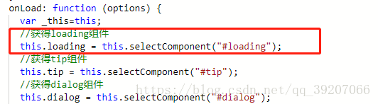
2,在onLoad方法或者onReady方法中index.wxml中的组件
this.loading =
this.selectComponent(
"#loading");
(onLoad和onReady的区别在于触发的时间不同,onLoad监听页面加载,在页面加载之初触发,onReady监听页面初次渲染完成,在页面渲染完成后触发,
根据需要我在onLoad中获取组件
)
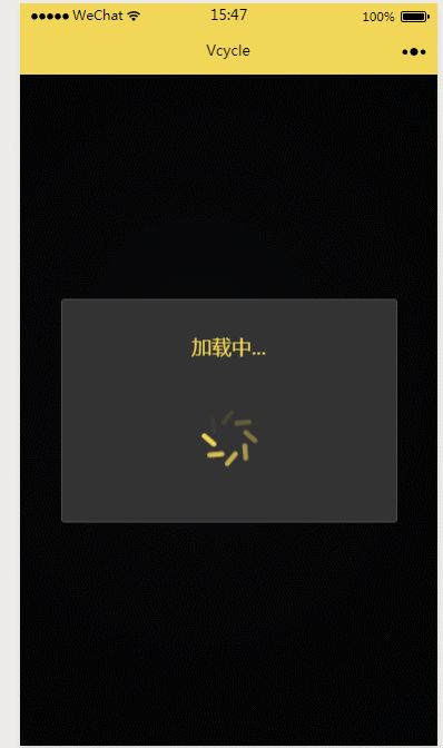
显示组件,页面加载的过程中我可以显示loading动画以给用户更好的使用体验,加载完成隐藏loading动画
首先我们在data中定义 loadingContent:'加载中...' ,然后使用this.showLoading();显示组件,如果根据场景loading动画显示时
的文字说明可以用setData的方式设置
this.setData({
loadingContent:
'请等待课程开始...'
})
this.showLoading();
加载完成,隐藏loading动画时使用this.hideLoading();


 扫一扫
扫一扫
 966
966

 被折叠的 条评论
为什么被折叠?
被折叠的 条评论
为什么被折叠?
 到【灌水乐园】发言


