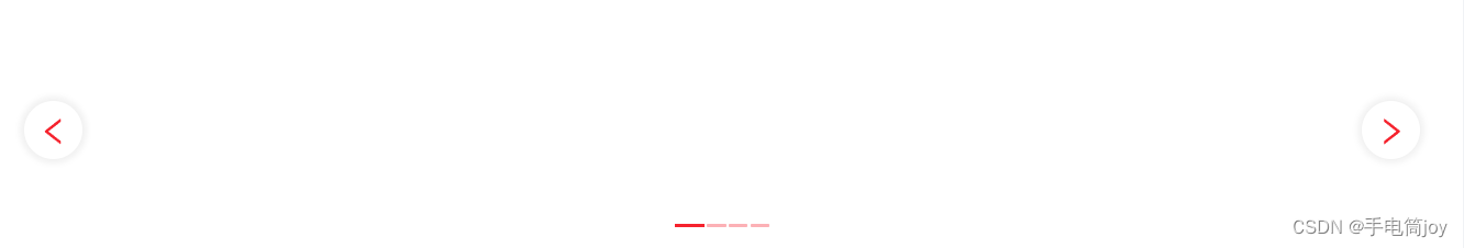
解决需求:更改ant design的a-carousel走马灯组件样式问题

需求样式

问题解决:

html部分:

<a-carousel arrows>
          <div slot="prevArrow" class="custom-slick-arrow" style="left: 10px; z-index: 1">
           // 左箭头
            <div class="circle">
              <a-icon
                type="left"
                style="
                  color: #f5222d;
                  height: 50px;
                  font-size: 25px;
                  text-align: center;
                  display: flex;
                  align-items: center;
                  justify-content: center;
                "
              />
            </div>
          </div>
          <div slot="nextArrow" class="custom-slick-arrow" style="right: 10px">
          // 右箭头
            <div class="circle">
              <a-icon
                type="right"
                style="
                  color: #f5222d;
                  height: 50px;
                  font-size: 25px;
                  text-align: center;
                  display: flex;
                  align-items: center;
                  justify-content: center;
                "
              />
            </div>
          </div>
          <div>
            <h3>
这里是分页1
            </h3>
          </div>
          <div><h3>这里是分页2</h3></div>
          <div><h3>这里是分页3</h3></div>
          <div><h3>这里是分页4</h3></div>
        </a-carousel>

css部分:

// 左右箭头
.ant-carousel >>> .slick-slide {
  text-align: center;
  /* height: 160px; */
  line-height: 160px;
  background: rgb(255, 255, 255);
  overflow: hidden;
}

.ant-carousel >>> .custom-slick-arrow {
  width: 50px;
  height: 50px;
  font-size: 50px;
  color: #fff;
  border: 1px solid rgba(0, 0, 0, 0.05);
  border-radius: 50px;
  opacity: 1;
  box-shadow: 0px 0px 5px 3px rgba(0, 0, 0, 0.05)
}
.ant-carousel >>> .custom-slick-arrow:before {
  display: none;
}
.ant-carousel >>> .custom-slick-arrow:hover {
  opacity: 0.5;
}
// 所有页面下标
.ant-carousel >>> .slick-dots li {
    margin: 24px 1px;
  background: #ffeff0;
}
.ant-carousel >>> .slick-dots li button {
  background: #f5222d;
}
// 当前选中页面的下标
.ant-carousel >>> .slick-dots li.slick-active {
  background: #f5222d;
  opacity: 1;
}
.ant-carousel >>> .slick-slide h3 {
  color: #fff;
}

  • 3
    点赞
  • 1
    收藏
    觉得还不错? 一键收藏
  • 0
    评论
修改 l-carousel走马灯组件的指示器样式,可以通过以下步骤实现: 1. 在 l-carousel 组件设置 indicator-position 属性为 outside(指示器在轮播图外部)或 none(不显示指示器),以隐藏默认的指示器。 2. 在 l-carousel 组件外部添加一个自定义的指示器元素,例如一个 div 元素。 3. 使用 CSS 样式对自定义指示器元素进行样式设置,例如设置背景颜色、圆角、边框等。 4. 在 l-carousel 组件监听 change 事件,根据当前轮播图的索引值,更新自定义指示器元素的样式,例如添加 active 类名。 以下是一个示例代码: ```html <template> <div class="carousel-wrapper"> <l-carousel :indicator-position="indicatorPosition" @change="handleChange"> <l-carousel-item v-for="(item, index) in items" :key="index"> <img :src="item.src" alt=""> </l-carousel-item> </l-carousel> <div class="custom-indicator"> <span v-for="(item, index) in items" :key="index" :class="{ active: currentIndex === index }"></span> </div> </div> </template> <script> export default { data() { return { items: [ { src: 'https://picsum.photos/id/1018/800/400' }, { src: 'https://picsum.photos/id/1015/800/400' }, { src: 'https://picsum.photos/id/1019/800/400' }, ], currentIndex: 0, indicatorPosition: 'none', }; }, methods: { handleChange(index) { this.currentIndex = index; }, }, }; </script> <style> .carousel-wrapper { position: relative; } .custom-indicator { position: absolute; bottom: 20px; left: 50%; transform: translateX(-50%); } .custom-indicator span { display: inline-block; width: 10px; height: 10px; margin-right: 10px; border-radius: 50%; background-color: #ccc; } .custom-indicator span.active { background-color: #333; } </style> ```
评论
添加红包

请填写红包祝福语或标题

红包个数最小为10个

红包金额最低5元

当前余额3.43前往充值 >
需支付:10.00
成就一亿技术人!
领取后你会自动成为博主和红包主的粉丝 规则
hope_wisdom
发出的红包
实付
使用余额支付
点击重新获取
扫码支付
钱包余额 0

抵扣说明:

1.余额是钱包充值的虚拟货币,按照1:1的比例进行支付金额的抵扣。
2.余额无法直接购买下载,可以购买VIP、付费专栏及课程。

余额充值