


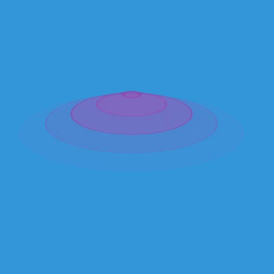
CSS水波纹效果
<!DOCTYPE html>
<html>
	<head>
		<meta charset="utf-8" />
		<title></title>
		<style>
			body{
				margin: 0;
				padding: 0;
				background: #3498db;
			}
			.container{
				position: absolute;
				top: 50%;
				left: 50%;
				transform: translate(-50%,-50%) rotateX(70deg);
			}
			.ripple{
				position: fixed;
				top: 0;
				transform: translateX(-50%);
				width: 20px;
				height: 20px;
				border-radius: 50%;
				animation: ripple 4s linear infinite;
			}
			.r2{
				animation-delay: 0.8s;
			}
			.r3{
				animation-delay: 1.6s;
			}
			.r4{
				animation-delay: 2.4s;
			}
			.r5{
				animation-delay: 3.2s;
			}
			.r6{
				animation-delay: 4s;
			}
			@keyframes ripple{
				from{
					border:4px solid #8e44ad;
					background: #9b59b670;
				}
				to{
					border: 0px solid #8E44AD;
					background: #9b59b670;
					width: 400px;
					height: 400px;
					top: 20px;
					opacity: 0;
				}
			}
		</style>
	</head>
	<body>
		<div class="container">
			<span class="ripple r1"></span>
			<span class="ripple r2"></span>
			<span class="ripple r3"></span>
			<span class="ripple r4"></span>
			<span class="ripple r5"></span>
			<span class="ripple r6"></span>
		</div>
	</body>
</html>
代码源于油管:DarkCode


 6454
6454


 被折叠的 条评论
为什么被折叠?
被折叠的 条评论
为什么被折叠?
 到【灌水乐园】发言


