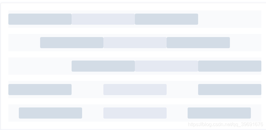
1.基础栅栏
<el-row :gutter="20">
  <el-col :span="6"><div style="backgroud-color:red"></div></el-col>
  <el-col :span="6"><div class="backgroud-color:#e5e9f2;"></div></el-col>
  <el-col :span="6"><div class="backgroud-color:yellow"></div></el-col>
  <el-col :span="6"><div class="backgroud-color:blue"></div></el-col>
</el-row>
gutter: 每个栅栏之间的相互间隔距离,默认为0。
span:24分栏中,每个栅栏占比。
2.分栏偏移
<el-row :gutter="20">
  <el-col :span="6"><div class="grid-content bg-purple"></div></el-col>
  <el-col :span="6" :offset="6"><div class="grid-content bg-purple"></div></el-col>
</el-row>
offset:指定分栏偏移的栏数。
3.对齐方式
<div id="app">
<el-row type="flex" class="row-bg" justify="center">
  <el-col :span="6"><div class="grid-content bg-purple"></div></el-col>
  <el-col :span="6"><div class="grid-content bg-purple-light"></div></el-col>
</el-row>

<el-row type="flex" class="row-bg" justify="space-between">
  <el-col :span="6"><div class="grid-content bg-purple"></div></el-col>
  <el-col :span="6"><div class="grid-content bg-purple-light"></div></el-col>
</el-row>
</div>
将 type 属性赋值为 ‘flex’,可以启用 flex 布局,并可通过 justify 属性来指定 start, center, end, space-between, space-around 其中的值来定义子元素的排版方式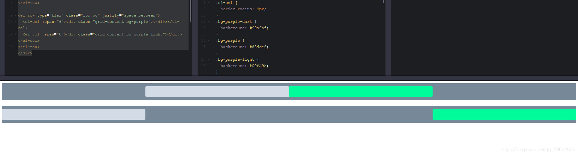
4. 响应式布局


 171
171


 被折叠的 条评论
为什么被折叠?
被折叠的 条评论
为什么被折叠?
 到【灌水乐园】发言


