


一、遮盖特效 : mask:url() 这个属性是添加一个透明照片作为遮罩,是拥有图片的属性的
如代码:
		div{
			width:500px;height:500px;background:url("images/2.jpg") no-repeat;
			background-size:100% 100%;
			border:10px solid red;
			-webkit-mask:url("images/mask.png") no-repeat;    //在谷歌中需要加-webkit-
			-webkit-mask-size:100% 100%;   //右图片的属性
			transition:2s;
		}
		div:hover{
			-webkit-mask-position:100% 0;   // mask-position:   x  y
		}
二、光影,就是利用颜色渐变与一些背景属性实现的
如代码:
     #txt{
		margin:200px 300px;
		font:60px/120px "微软雅黑";
		color:rgba(255,255,255,0.3);
		background:-webkit-linear-gradient (-30deg , rgba(255,255,255,0)100px,rgba(255,255,255,1) 180px,rgba(255,255,255,1)220px.rgba(255,255,255,1)300) no-repeat;    //颜色渐变
		-webkit-background-clip:text;                                                          //使渐变颜色的背景变成文本
如下是没加上面这行代码前
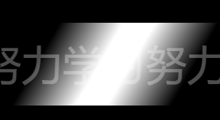
		background-position:-500px 0px;
		/*transition:2s;*/
	}
	/*#txt:hover{
		background-position:700px 0px;
	}*/
	/*setInterval(function(){
			$("#txt").animate({"background-position":"700px 0px"},2000,function(){   //使用animate( 样式 改变 , 时间)
				$(this).animate({"background-position":"-500px 0px"},10)    //然后使用回调函数在,在上面事件发生完后,再往回走
			});
		},4000);*/
		var oDiv = document.getElementById("txt");
		var count = 0;
		var time = null;
		function auto(){
			time = setInterval(function(){
				count +=10;
				if (count>700)
				{
					count = -500;
					clearInterval(time);
				}
				oDiv.style.backgroundPosition = count +"px 0px";
			},10);
		}
		setInterval(auto,4000);

三、实现球体
讲解:球体由18个圆形组成,也就是定义18个园,然后给他们旋转与平移就可以实现
如代码:
 *{margin:0px;padding:0px;}
 body{background:#333;}
.box{
    width:500px;
    height:500px;
    margin:100px auto;
}
.ball{
    width:100%;
	height:100%;
	transform-style:preserve-3d;
	transform:rotateZ(-20deg) rotateX(-20deg) rotateY(0deg);//如果没有这句,则园是这种状态

	animation: ball 20s linear infinite;                          //动画事件与状态控制
}
@keyframes ball{                                                    //动画设置
   0%{transform:rotateZ(-20deg) rotateX(-20deg) rotateY(0deg);}
   100%{transform:rotateZ(-20deg) rotateX(-20deg) rotateY(360deg);}
}
.ball div{
    width:100%;
	height:100%;
	border:1px solid #ccc;
	border-radius:50%;
	position:absolute;
	left:0px;top:0px;
}
.ball div.x1{
transform:rotateY(0deg);
}
.ball div.x2{
transform:rotateY(20deg);
}
.ball div.x3{
transform:rotateY(40deg);
}
.ball div.x4{
transform:rotateY(60deg);
}
.ball div.x5{
transform:rotateY(80deg);
}
.ball div.x6{
transform:rotateY(100deg);
}
.ball div.x7{
transform:rotateY(120deg);
}
.ball div.x8{
transform:rotateY(140deg);
}
.ball div.x9{
transform:rotateY(160deg);
}
		.ball div.y1{
			transform:rotateX(90deg) translateZ(200px) scale(0.6);

//设置了3d以后,球形出来后,回以球形作为坐标轴,往上就是Z轴,只旋转9度与缩小就会明显看到所有的园都只是在设置了90度后位置,一圈圈的向内缩小,而设置了translateZ 就可得到下面形状
		}
		.ball div.y2{
			transform:rotateX(90deg) translateZ(150px) scale(0.8);
		}
		.ball div.y3{
			transform:rotateX(90deg) translateZ(100px) scale(0.92);
		}
		.ball div.y4{
			transform:rotateX(90deg) translateZ(50px) scale(0.98);
		}
		.ball div.y5{
			transform:rotateX(90deg) translateZ(0px);
		}
		.ball div.y6{
			transform:rotateX(90deg) translateZ(-50px) scale(0.98);
		}
		.balL div.y7{
			transform:rotateX(90deg) translateZ(-100px) scale(0.92);
		}
		.ball div.y8{
			transform:rotateX(90deg) translateZ(-150px) scale(0.8);
		}
		.ball div.y9{
			transform:rotateX(90deg) translateZ(-200px) scale(0.6);
}
    </style>
   <body>
  <div class="box">
  <div class="ball">
	    <div class="x1"></div>
		<div class="x2"></div>
		<div class="x3"></div>
		<div class="x4"></div>
		<div class="x5"></div>
		<div class="x6"></div>
		<div class="x7"></div>
		<div class="x8"></div>
		<div class="x9"></div>
		<div class="y1"></div>
		<div class="y2"></div>
		<div class="y3"></div>
		<div class="y4"></div>
		<div class="y5"></div>
		<div class="y6"></div>
		<div class="y7"></div>
		<div class="y8"></div>
		<div class="y9"></div>
四、设置随机颜色的3种方法
1、
      function color1(){
			var colors = [0,1,2,3,4,5,6,7,8,9,"a","b","c","d",
			"e","f"];
			var color = "";
			for (var i=0;i<6;i++ )
			{
				var n = Math.ceil(Math.random()*15);
				color += colors[n];
				if (i == 5)
				{
					return "#"+color;
				}
			}
		}
2、
     function color2(){
			var color = Math.ceil(Math.random()*16777215).toString(16);              16777215转换成16禁制就是ffffff

			while (color.length<6)
			{
				color = "0" + color;                      //值不够6给数的时候,用0替代
			}
			return "#"+color;
		}
3、
function color3(){
return “#”+(function(color){ //return "#” +(function(){})() 这里有一个自执行
return new Array(7-color.length).join(“0”)+color
})((Math.random() * 0x1000000 << 0 ).toString(16))
}


 684
684


 被折叠的 条评论
为什么被折叠?
被折叠的 条评论
为什么被折叠?
 到【灌水乐园】发言


