


基本架子 - PageContainer
由于各个模块都会有头部和下面的内容部分,所以将其封装成小的组件,运用到插槽
pageContainer:页面容器
- 基本结构样式,用到了 el-card 组件
具名插槽提供头部,默认插槽提供内容
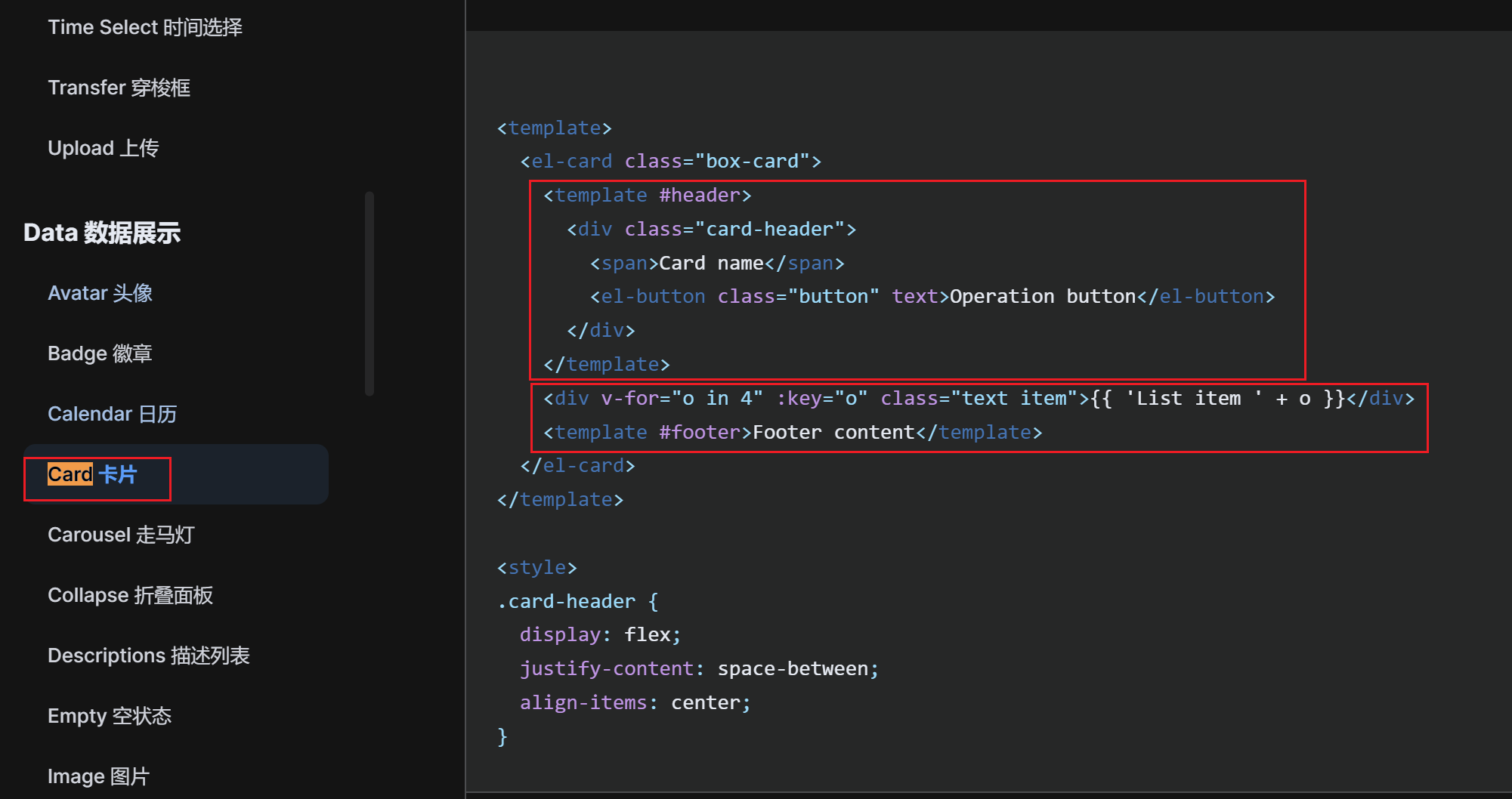
<template>
  <el-card class="page-container">
    <template #header>
      <div class="header">
        <span>文章分类</span>
        <div class="extra">
          <el-button type="primary">添加分类</el-button>
        </div>
      </div>
    </template>
    <!-- 内容部分都是通过默认插槽提供的 -->
     ...
  </el-card>
</template>

<style lang="scss" scoped>
.page-container {
  min-height: 100%;
  box-sizing: border-box;
  .header {
    display: flex;
    align-items: center;
    justify-content: space-between;
  }
}
</style>
- 考虑到多个页面复用,封装成组件
- props 定制标题
- 默认插槽 default 定制内容主体
- 具名插槽 extra 定制头部右侧额外的按钮
<script setup>
defineProps({
  title: {
    required: true,
    type: String
  }
})
</script>

<template>
  <el-card class="page-container">
    <template #header>
      <div class="header">
        <span>{{ title }}</span>
        <div class="extra">
          <!-- 使用具名插槽,定制额外的按钮 -->
          <slot name="extra"></slot>
        </div>
      </div>
    </template>
    <!-- 内容直接使用默认插槽 -->
    <slot></slot>
  </el-card>
</template>

<style lang="scss" scoped>
.page-container {
  min-height: 100%;
  box-sizing: border-box;
  .header {
    display: flex;
    align-items: center;
    justify-content: space-between;
  }
}
</style>
- 页面中直接使用测试 ( unplugin-vue-components 会自动注册)
- 文章分类测试:
<template>
  <page-container title="文章分类">
    <template #extra>
      <el-button type="primary"> 添加分类 </el-button>
    </template>

    主体部分
  </page-container>
</template>
- 文章管理测试:
<template>
  <page-container title="文章管理">
    <template #extra>
      <el-button type="primary">发布文章</el-button>
    </template>

    主体部分
  </page-container>
</template>


 323
323

 被折叠的 条评论
为什么被折叠?
被折叠的 条评论
为什么被折叠?
 到【灌水乐园】发言


