


渐变是css3 image module新增图片类型,使用渐变可以在两种颜色间制造出平滑的渐变效果,用它代替图片,可以加快页面的载入时间,减小带宽应用。同时,因为渐变是浏览器直接生成的,他在页面缩放时效果比图片更好,因此可以更加灵活、便捷地调整页面
浏览器支持两种渐变,线性渐变(linear-gradient),径向渐变(radial-gradient)
线性渐变
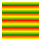
linear-gradient(red,yellow)//默认方向是从上到下
- 1.可以控制方向(top bottom right left)
linear-gradient(to 结束的方向,red,yellow)
#test1{
width: 100px;
height: 100px;
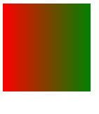
background-image: linear-gradient(to right ,red ,blue);
}
	使用角度控制方向:
	linear-gradient(45deg,red,yellow)
	(y正轴是0度,x正轴是90度)
#test1{
width: 100px;
height: 100px;
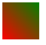
background-image: linear-gradient(45deg ,red ,green);
}
- 2.可以控制颜色范围:
linear-gradient(45deg,red 10%,yellow 20%)
#test1{
width: 100px;
height: 100px;
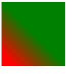
background-image: linear-gradient(45deg ,red 10%,green 50%);
/*10%之前是纯红色,10%-50%是红色到绿色的渐变,50%以后是绿色*/
}
- 3透明度的渐变
 <style type="text/css">
			#test1{
				width: 100px;
				height: 100px;
				background-image: linear-gradient(45deg ,rgba(0,0,0,0),rgba(0,0,0,1));
			}
		</style>
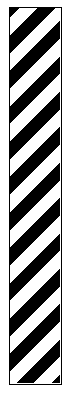
- 4重复渐变
#test1{
				width: 100px;
				height: 100px;
				background-image: repeating-linear-gradient(red 10px,yellow 20px,green 30px);
			}
应用1:发廊灯
<!DOCTYPE html>
<html>
	<head>
		<meta charset="utf-8">
		<title></title>
		<style type="text/css">
			#wrap{
				width: 40px;
				height: 300px;
				border: 1px solid;
				overflow: hidden;
			}
			#wrap > .inner{

				height: 600px;
				background-image: repeating-linear-gradient(135deg,black 0px, black 10px,white 10px,white 20px);
			}

		</style>
	</head>
	<body>
		<div id="wrap">
			<div class="inner">

			</div>
		</div>
		<script type="text/javascript">
			var inner = document.querySelector("#wrap > .inner")
			var flag = 0
			setInterval(function(){
				flag++
				if(flag == 300){
					flag = 0
				}
				inner.style.marginTop = -flag+"px"
			},1000/60)
		</script>
	</body>
</html>
应用2光斑动画:
<!DOCTYPE html>
<html>
	<head>
		<meta charset="utf-8">
		<title></title>
		<style type="text/css">
			html,body{
				height: 100%;
				overflow: hidden;
				background: black;
				text-align: center;
			}
			h1{

				display: inline-block;
				color: rgba(128,128,128,0.3);
				font: bold 50px "微软雅黑";
				background-repeat: no-repeat;
				background-image: linear-gradient(120deg,rgba(255,255,255,0) ,rgba(255,255,255,1) 100px,rgba(255,255,255,0) 200px);
			    -webkit-background-clip: text;
				background-position: 0 0;
			}

		</style>
	</head>

	<body>
		<h1>welcome to my zone</h1>
	</body>
	<script type="text/javascript">
		var h1=document.querySelector("h1")
		var flag=-20
		setInterval(function(){
			flag+=10
			if(flag ==900){
				flag = -20
			}
			h1.style.backgroundPosition = flag+"px"
		},1000/60)
	</script>
</html>

渐变倒影:
<!DOCTYPE html>
<html>
	<head>
		<meta charset="utf-8">
		<title></title>
		<style type="text/css">
			img{
				-webkit-box-reflect: right 0px linear-gradient(-90deg,rgba(0,0,0,0.2),rgba(0,0,0,1));
			}
		</style>
	</head>
	<body>
		<img src="images/head2.png" width="100px" height="100px" >
	</body>
</html>


 3万+
3万+


 被折叠的 条评论
为什么被折叠?
被折叠的 条评论
为什么被折叠?
 到【灌水乐园】发言


