


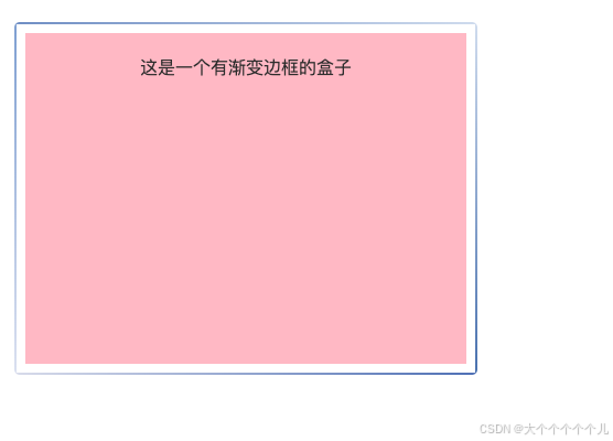
需求:想要一个边框是渐变色的(一组对角是深色,另外一组对角是浅色)
   <style>
	.gradient-border {
		margin-left: 20px;
		margin-top: 40px;
		position: relative;
		width: 400px;
		height: 300px;
		padding: 20px;
		box-sizing: border-box;
		text-align: center;
		font-size: 16px;
		color: #333;
		z-index: 1;
		background-color: pink;
	}

	.gradient-border::before,
	.gradient-border::after {
		content: '';
		position: absolute;
		z-index: -1;
	}

	.gradient-border::before {
		top: -10px;
		left: -10px;
		right: -10px;
		bottom: -10px;
		border-radius: 5px;
		background:
			linear-gradient(to right, #7b99cb, #d5e0f0) top / 100% 2px no-repeat,
			linear-gradient(to right, #dde0ed, #597bbd) bottom / 100% 2px no-repeat,
			linear-gradient(to bottom, #8aa9d7, #dfe4f2) left / 2px 100% no-repeat,
			linear-gradient(to bottom, #d5e0f0, #537cb7) right / 2px 100% no-repeat;
	}
</style>


<div class="gradient-border">这是一个有渐变边框的盒子</div>
还有一个图例,是两个顶角的颜色

<style>
            .box {
				position: relative;
				width: 200px;
				height: 200px;
				background-color: lightpink;
				text-align: center;
				padding: 30px;
				/* 背景颜色可以根据需要更改 */
			}

			.box::after {
				content: '';
				position: absolute;
				width: 50%;
				height: 50%;
				border-style: solid;
				border-width: 0 5px 5px 0;
				/* 设置边框宽度 */
			}

			.box::before {
				content: '';
				position: absolute;
				width: 50%;
				height: 50%;
				border-style: solid;
				border-width: 5px 0 0 5px;
				/* 设置边框宽度 */
			}

			.box::before {
				top: 0;
				left: 0;
				border-color: blue transparent transparent blue;
				/* 左上角蓝色边框 */
			}

			.box::after {
				bottom: 0;
				right: 0;
				border-color: transparent red red transparent;
				/* 右下角红色边框 */
			}
</style>


<div class="box">对角颜色的盒子</div>


 扫一扫
扫一扫


 70
70

 被折叠的 条评论
为什么被折叠?
被折叠的 条评论
为什么被折叠?
 到【灌水乐园】发言


