


3.Matplotlib
Matplotlib是Python提供的数据可视化工具。Matplotlib具有良好的操作系统兼容性,兼容底层图形显示接口。
3.1简单线性图
实例1:导入Matplotlib
#导入Matplotlib

import matplotlib as mpl

import matplotlib.pyplot as plt
Matplotlib中设置颜色,RGBCMYK颜色代码

实例2:
def matplotlib1():

    '''

    简易线性图

    :return:

    '''

    #设置绘图风格

    #plt.style.use('classic')

    plt.style.use('seaborn-whitegrid')

    #生成图形对象

    fig1 = plt.figure()

    #生成坐标对象

    ax1 = plt.axes()

    #生成数据

    data1 = np.linspace(0,10,100)

    #方式1:使用axes对象将数据设置进坐标

    #ax1.plot(data1,np.sin(data1))

    #方式2:直接使用plt的plot方法设置

    #可以执行多次,显示多条线

    #plt.plot(data1,np.cos(data1))

    #plt.plot(data1,np.sin(data1))

    #调整图形颜色和风格

    #使用标准颜色名称

    #plt.plot(data1,np.sin(data1),color='blue')

    #使用缩写颜色代码,rgbcmyk

    #plt.plot(data1,np.sin(data1),color='indigo')

    #使用0~1的灰度值,由黑到白

    #plt.plot(data1,np.sin(data1),color='0')

    #十六进制颜色值,推荐使用这个

    plt.plot(data1,np.sin(data1),color='#FF5533')

    #RGB颜色值,0~1

    #plt.plot(data1,np.sin(data1),color=(1,0.2,0.3))

    #html颜色名称

    # 参考:https://www.w3school.com.cn/tags/html_ref_colornames.asp

    #plt.plot(data1,np.sin(data1),color='Cyan')


    #设置线条风格

    #实线

    #plt.plot(data1,np.cos(data1),linestyle='solid')

    #plt.plot(data1, np.cos(data1),linestyle='-')

    #虚线

    #plt.plot(data1, np.cos(data1), linestyle='dashed')

    #plt.plot(data1, np.cos(data1), linestyle='--')

    #点划线

    #plt.plot(data1, np.cos(data1), linestyle='dashdot')

    #plt.plot(data1, np.cos(data1), linestyle='-.')

    #实点线

    #plt.plot(data1, np.cos(data1), linestyle='dotted')

    #plt.plot(data1, np.cos(data1), linestyle=':')


    #将颜色和样式合并设置,只支持一个字符的颜色简码

    #plt.plot(data1,np.cos(data1),'-g')


    #方式1:设置坐标轴上下限

    # plt.xlim(0,20)

    # plt.ylim(-5,5)

    #方式2:使用axis()设置

    #[xmin,xmax,ymin,ymax]

    #plt.axis([0,20,-5,5])

    #方式3:直接指定显示风格,自动设置坐标轴范围

    #tight:收紧

    #equal:x,y坐标轴长度相等

    #plt.axis('tight')

    plt.axis('equal')


    #设置标签,标题

    #中文乱码设置

    # 设置字体

    plt.rcParams["font.sans-serif"] = ["SimHei"]

    # 该语句解决图像中的“-”负号的乱码问题

    plt.rcParams["axes.unicode_minus"] = False

    plt.title('A Sin Pic')

    plt.xlabel("X值")

    plt.ylabel("Sin(X)值")


    #设置多条线指定每条线图例

    plt.plot(data1, np.cos(data1+0),linestyle='--',label='cos(x)')

    plt.plot(data1,np.cos(data1+2),linestyle='-.',label='cos(x+2)')

    plt.legend()

    print(type(plt))

    print(type(ax1))


    #使用ax.set设置属性

    # ax1.plot(data1,np.cos(data1+4))

    # ax1.set(xlim=(0,20),ylim=(-5,5),xlabel='x值',ylabel='cos(x+4)',title='A simple plot ax1')

    #显示图片

    plt.show()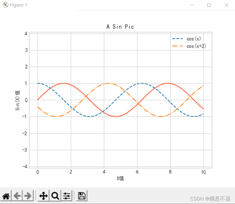
注意:使用plt的函数和ax的函数都有对应方法。
plt类型:<class 'module'>
ax类型:<class 'matplotlib.axes._subplots.AxesSubplot'>
plt.xlabel()方法对应ax.set_xlabel()方法
plt.ylabel()方法对应ax.set_ylabel()方法
plt.xlim()方法对应ax.set_xlim()方法
plt.ylim()方法对应ax.set_ylim()方法
plt.title()方法对应ax.set_title()方法
3.2简单散点图
使用matplotlib绘制散点图,方式1:可以通过plot方法直接绘制;方式2:可以使用scatter方法绘制。
实例1:使用plot方法绘制
def matplotlib2():

    '''

    matplotlib散点图1

    :return:

    '''

    #设置绘图风格

    plt.style.use('seaborn-whitegrid')


    #获取数据

    data1_x = np.linspace(0,40,50)

    data1_y = np.sin(data1_x)

    #绘制图片

    #这里第三个参数是一个字符,表示图形的符号

    #plt.plot(data1_x,data1_y,'o',color='g')


    #绘制多种图形符号

    list_symbel = ['o','.',',','x','+','v','^','<','>','s','d']

    #创建随机种子

    rng = np.random.RandomState(10)

    for i in range(len(list_symbel)):

        plt.plot(rng.randint(1,5),rng.randint(1,10),list_symbel[i],label=list_symbel[i])

    plt.legend()


    #设置图形符号参数

    #markersize:符号大小

    #markerfacecolor:填充景色

    #markeredgecolor:边框色

    #markeredgewidth:边框宽带

    plt.plot(data1_x,data1_y,'-p',color='gray',markersize=8,markerfacecolor='red',markeredgecolor='green',markeredgewidth=1)


    #显示图片

    plt.show()
实例2:使用scatter()方法绘制散点图
def matplotlib3():

    '''

    matplotlib散点图2

    :return:

    '''

    #设置绘图风格

    plt.style.use('seaborn-whitegrid')


    #获取数据

    rng = np.random.RandomState(10)

    data1_x = rng.randint(0,50,size=100)

    data1_y = rng.randint(0,20,size=100)

    #颜色list

    c_list = ['g','b','y','k','tan','r','m','skyblue','cyan','aqua']

    #自定义颜色值列表扩充100

    def list_expand(v_list):

        re_list = []

        for i in range(100):

            re_list.append(v_list[i//10])

        return re_list

    c_list100 = list_expand(c_list)

    #size:图案大小

    sizes = 500 * rng.rand(100)

    #使用scatter创建

    #alpha: 0~1  透明度从透明到不透明

    #plt.scatter(data1_x,data1_y,c=c_list100,s=sizes,alpha=0.2)

    #cmap:将c设置的颜色值均匀映射到cmap的颜色盘中

    plt.scatter(data1_x, np.sin(data1_y),c=rng.rand(100),s=sizes,alpha=0.5,cmap = 'viridis')

    #显示颜色图例

    plt.colorbar();


    #显示图片

    plt.show()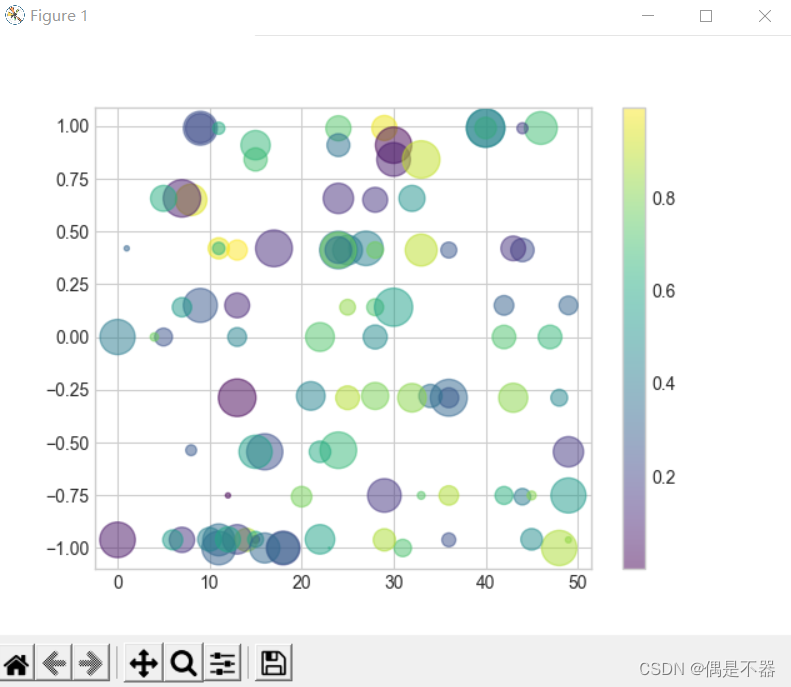
注意:scatter每个点大小,颜色都可以单独设置。当显示大数据集时,plot效率要高于scatter,因为他所有点都是统一设置渲染的。
3.3绘制误差线
当绘制数据图时,有标准数据和实际数据,实际数据可能在标准上下浮动,有一个误差区间,这种情况可以通过误差线显示出来。
实例:
def matplotlib4():

    '''

    matplotlib绘制误差线

    :return:

    '''

    #设置绘图风格

    plt.style.use('seaborn-whitegrid')

    #获取数据

    rng = np.random.RandomState(10)

    data1_x = rng.randint(0,50,size=100)

    #模拟y的误差

    data1_y = np.sin(data1_x) + np.random.randn(100)

    #使用errorbar绘制误差

    #yerr指定y值的误差范围

    #xerr 指定x值的误差范围

    #ecolor 误差线颜色

    #elinewidth 误差线宽

    #capsize 上下误差界限的横线长短

    plt.errorbar(data1_x,data1_y,yerr=0.4,fmt='.',ecolor='cyan',elinewidth=3,capsize=5)


    #显示图片

    plt.show()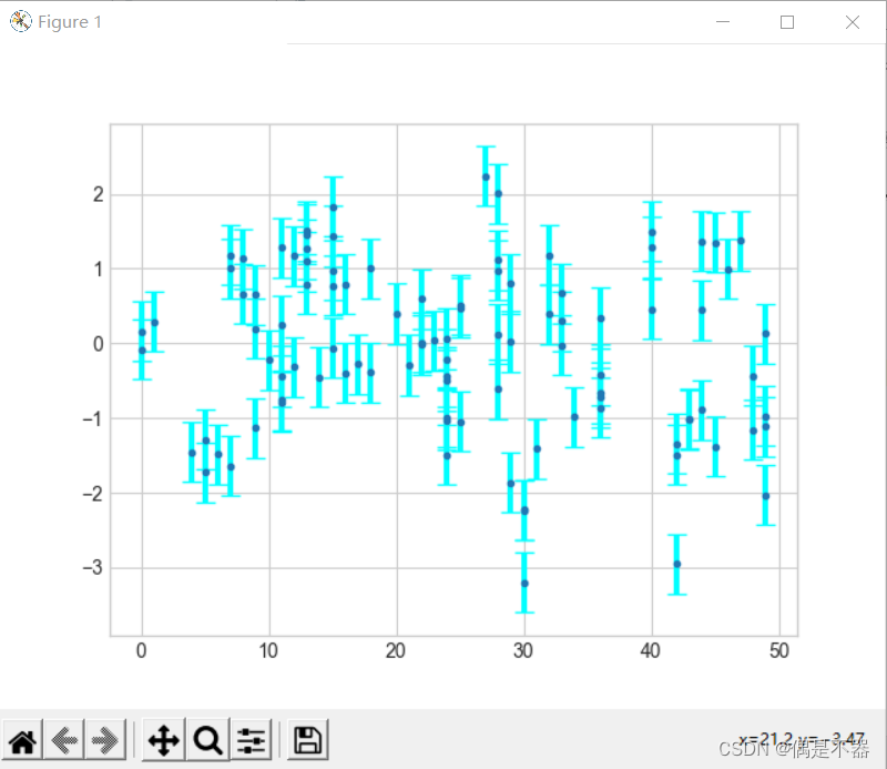
实例2:使用fill_between填充一个区间范围显示误差
def matplotlib5():

    '''

    matplotlib显示连续误差

    绘制一个阴影范围显示误差值波动

    :return:

    '''

    #设置绘图风格

    plt.style.use('seaborn-whitegrid')

    #获取数据

    rng = np.random.RandomState(0)

    data1_x = np.linspace(0,50,100)

    #模拟y的误差

    data1_y = np.sin(data1_x)

    data_er1 = data1_y+rng.randn(100)*2

    data_er2 = data1_y-rng.randn(100)*1.2

    plt.plot(data1_x,data1_y,'.',color='k')

    plt.fill_between(data1_x,data_er1,data_er2,color='gray',alpha=0.5)

    #显示图片

    plt.show()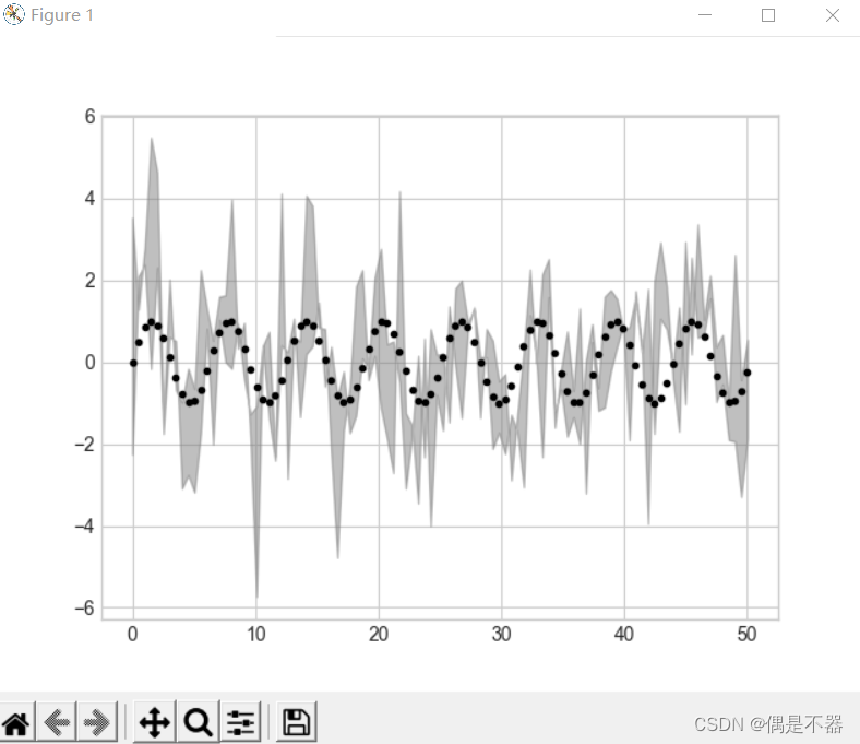
3.5高密图与等高图
实例1:正数为实线,负数为虚线
def matplotlib6():

    '''

    绘制三维函数

    :return:

    '''

    #设置绘图风格

    plt.style.use('seaborn-whitegrid')

    #定义Z值计算func

    def func1(x,y):

        return np.sin(x) + np.cos(x+y) * np.cos(x)

    x = np.linspace(0,5,50)

    y = np.linspace(0,5,40)

    X,Y = np.meshgrid(x,y)

    Z = func1(X,Y)

    #使用coutour,绘制等高线图

    plt.contour(X,Y,Z,colors='black')


    #显示图片

    plt.show()
实例2:使用彩色等高线绘制
#彩色等高线

plt.contour(X,Y,Z,20,cmap='viridis')

plt.colorbar()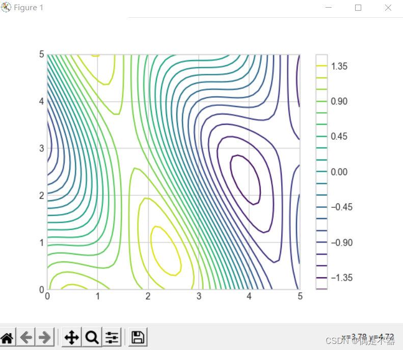
实例3:将等高线空白地方填充
#填充等高线区域

plt.contourf(X,Y,Z,20,cmap='viridis')

plt.colorbar()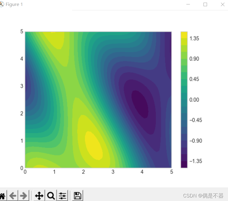
实例4:添加数据说明
#添加数据说明

#绘制同样等高线

v_contour = plt.contour(X,Y,Z,20,colors='k')

#设置数据label

plt.clabel(v_contour,inline=True,fontsize=9)

#填充等高线区域

plt.contourf(X,Y,Z,20,cmap='viridis')

#设置颜色图例条

plt.colorbar()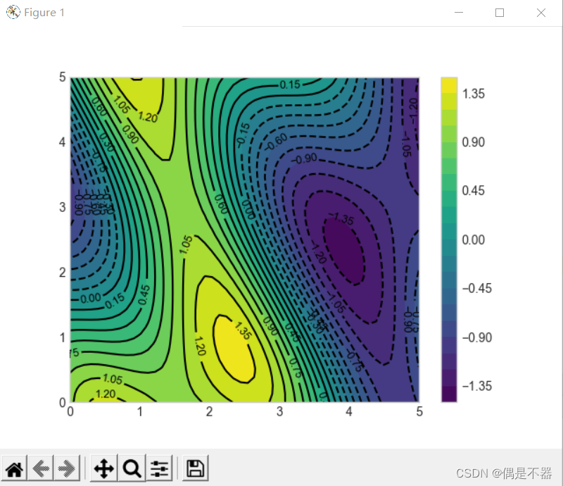
3.6直方图
绘制频率直方图
实例:
def matplotlib7():

    '''

    绘制频率直方图

    :return:

    '''

    #设置绘图风格

    plt.style.use('seaborn-whitegrid')


    #创建数据

    data1 = np.random.randn(1000)

    #绘制频率直方图

    #bins:设置数据分组数量

    #alpha:设置透明度

    #edgecolor设置边框颜色

    #histtype:设置直方图样式,stepfilled,连续显示

    plt.hist(data1,bins=30,alpha=0.5,color='cyan',histtype='bar',edgecolor='black')


    #获取频率直方图的划分区间,及各阶段数量

    counts,bin_edges=np.histogram(data1,bins=30)

    print(counts,bins_values)


    #显示图片

    plt.show()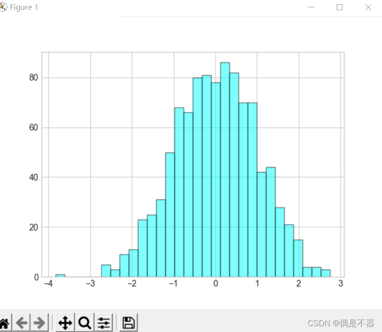
实例2:绘制二维数据频率直方图
def matplotlib8():

    '''

    绘制频率2d直方图

    :return:

    '''

    #设置绘图风格

    plt.style.use('seaborn-whitegrid')

    #创建数据

    data1_x = np.random.randn(1000)

    data1_y = np.random.randn(1000)

    #绘制2d频率直方图

    plt.hist2d(data1_x,data1_y,bins=30,cmap='Blues')

    #设置颜色条形图例

    v_colorbar = plt.colorbar()

    v_colorbar.set_label('counts in bins')


    #显示图片

    plt.show()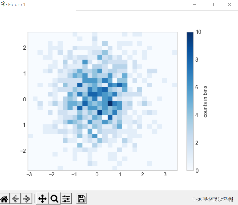
实例3:绘制正六边形样式2d直方图
def matplotlib9():

    '''

    绘制频率2d直方图:正六边形

    :return:

    '''

    #设置绘图风格

    plt.style.use('seaborn-whitegrid')

    #创建数据

    data1_x = np.random.randn(1000)

    data1_y = np.random.randn(1000)

    #绘制2d频率直方图

    #gridsize:设置数据划分区间数量

    #edgecolors:设置边框

    plt.hexbin(data1_x,data1_y,gridsize=25,cmap='Blues',edgecolors='black')

    #设置颜色条形图例

    v_colorbar = plt.colorbar()

    v_colorbar.set_label('counts in bins')


    #显示图片

    plt.show()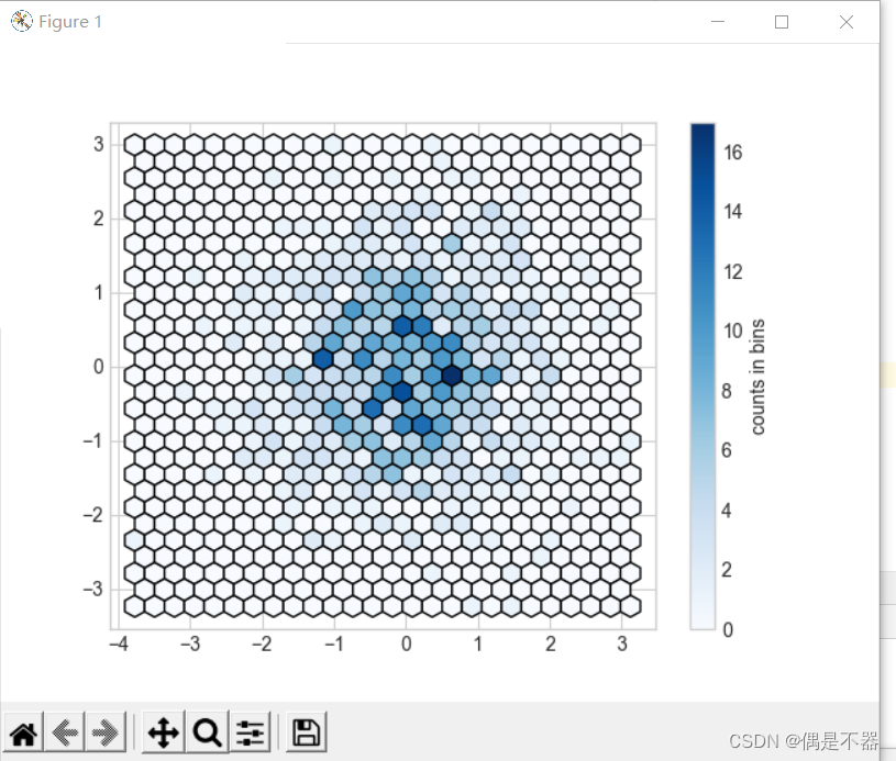
3.7自定义图例
Matplotlib可以自定义图例位置和艺术风格。上面例子使用plt.legend()方法创建过图例。
实例:
def matplotlib10():

    '''

    自定义图例

    :return:

    '''

    #设置绘图风格

    plt.style.use('seaborn-whitegrid')

    #创建数据

    data1 = np.linspace(0,20,1000)

    plt.plot(data1,np.cos(data1),linestyle='-',label='cos(x)')

    plt.plot(data1,np.sin(data1),linestyle='-.',label='sin(x)')

    #设置图例

    #loc: 设置位置,

    # best

    # upper right

    # upper left

    # lower left

    # lower right

    # right

    # center left

    # center right

    # lower center

    # upper center

    # center

    #frameon:是否图例有背景

    #ncol:设置标签列数

    #fancybox:设置图例边框是否圆角

    #framealpha:设置图例背景透明度

    #shadow:是否添加阴影

    #borderpad:文字和边框间距

    plt.legend(frameon=True,loc='upper right',\

               ncol=1,\

               fancybox=True,\

               framealpha=0.7,\

               shadow=True,\

               borderpad=1\

               )

    #显示图片

    plt.show()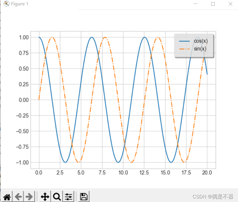
实例2:设置部分图例
def matplotlib11():

    '''

    自定义图例2

    :return:

    '''

    #设置绘图风格

    plt.style.use('seaborn-whitegrid')

    #创建数据

    data1 = np.linspace(0,20,1000)

    lines = []

    for i in range(4):

        lines += plt.plot(data1,np.cos(data1+i),linestyle='-')

    #只设置部分线的图例

    plt.legend(lines[:2],['line1','line2'])

    plt.show()
实例3:设置多个图例
def matplotlib12():

    '''

    自定义图例3

    :return:

    '''

    #设置绘图风格

    plt.style.use('seaborn-whitegrid')

    #创建数据

    data1 = np.linspace(0,20,1000)

    lines = []

    #获取坐标对象

    ax =plt.axes()

    for i in range(4):

        lines += ax.plot(data1,np.cos(data1+i),linestyle='-')

    #设置多个图例

    ax.legend(lines[:2],['line1','line2'],loc='upper right',frameon=True)

    from matplotlib.legend import Legend

    leg1 = Legend(ax,lines[2:],['line3','line4'],loc='lower right',frameon=True)

    ax.add_artist(leg1)

    #显示图片

    plt.show()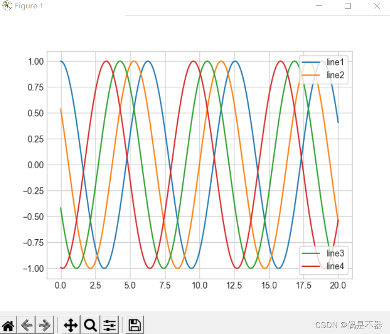
实例4:创建一个带图标大小的图例
def matplotlib13():

    '''

    自定义图例4

    :return:

    '''

    #设置绘图风格

    plt.style.use('seaborn-whitegrid')

    #获取数据

    rng = np.random.RandomState(10)

    data1_x = rng.randint(0,50,size=100)

    data1_y = rng.randint(0,50,size=100)

    #size:图案大小

    sizes = 500 * np.abs(rng.randn(100))

    #使用scatter创建散点图

    plt.scatter(data1_x, data1_y,c=sizes,s=sizes,alpha=0.5,cmap = 'Blues')

    #显示颜色图例

    #颜色变化,表示size大小

    plt.colorbar(label='sizes color bar')

    #自定义图例

    #创建带label的空图例

    for l_size in [100,500,800,1200]:

        plt.scatter([],[],c='k',alpha=0.3,s=l_size,label=str(l_size)+'km$^2$')

    plt.legend(scatterpoints=1,frameon=True,framealpha=0.1,labelspacing=2,title='label list',loc='upper left')

    #显示图片

    plt.show()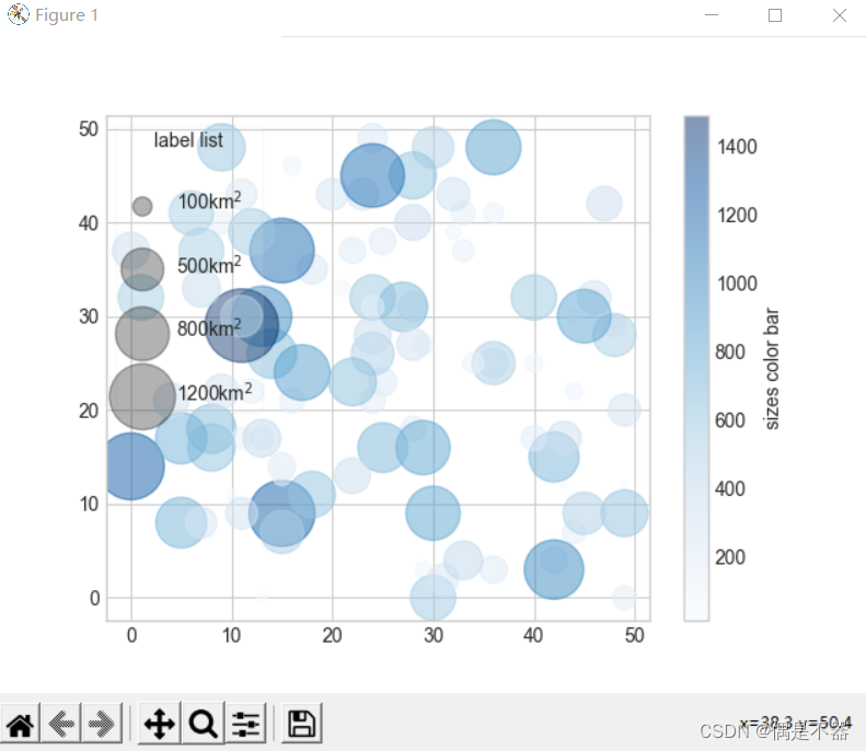
实例:关于colorbar的设置
1.使用顺序的配色,使用cmap=’viridis’,’binary’;
2.使用互逆的配色,使用‘RdBu’,’PuOr’
3.使用定性的配色,使用‘rainbow’,‘jet’
def matplotlib14():

    '''

    颜色条配置

    :return:

    '''

    fig,ax = plt.subplots(6,figsize=(6,1))

    norm = mpl.colors.Normalize(vmin=1, vmax=5)

    #cool颜色条

    lv_cmap = mpl.cm.cool

    #orientation:设置colorbar方向,horizontal

    fig.colorbar(mpl.cm.ScalarMappable(norm=norm, cmap=lv_cmap),\

                 cax=ax[0],\

                 orientation='horizontal',\

                 label='Cool colorbar')

    #jet颜色条

    lv_cmap1 = mpl.cm.jet

    fig.colorbar(mpl.cm.ScalarMappable(norm=norm,cmap=lv_cmap1),\

        cax=ax[1],\

        orientation ='horizontal',\

        label='Jet colorbar')

    #viridis颜色条

    lv_cmap2 = mpl.cm.viridis

    fig.colorbar(mpl.cm.ScalarMappable(norm=norm,cmap=lv_cmap2),\

        cax=ax[2],\

        orientation ='horizontal',\

        label='Viridis colorbar')

    #cubehelix颜色条

    lv_cmap3 = mpl.cm.cubehelix

    fig.colorbar(mpl.cm.ScalarMappable(norm=norm,cmap=lv_cmap3),\

        cax=ax[3],\

        orientation ='horizontal',\

        label='Cubehelix colorbar')

    #RdBu颜色条

    lv_cmap4 = mpl.cm.RdBu

    fig.colorbar(mpl.cm.ScalarMappable(norm=norm,cmap=lv_cmap4),\

        cax=ax[4],\

        orientation ='horizontal',\

        label='RdBu colorbar')

    #RdBu颜色条

    lv_cmap5 = mpl.cm.RdBu

    bounds=[-1,3,5,8,12]

    norm1 = mpl.colors.BoundaryNorm(bounds,lv_cmap5.N,extend='both')

    fig.colorbar(mpl.cm.ScalarMappable(norm=norm1,cmap=lv_cmap5),\

        cax=ax[5],\

        orientation ='horizontal',\

        label='Boundary colorbar')

    #显示图片

    plt.show()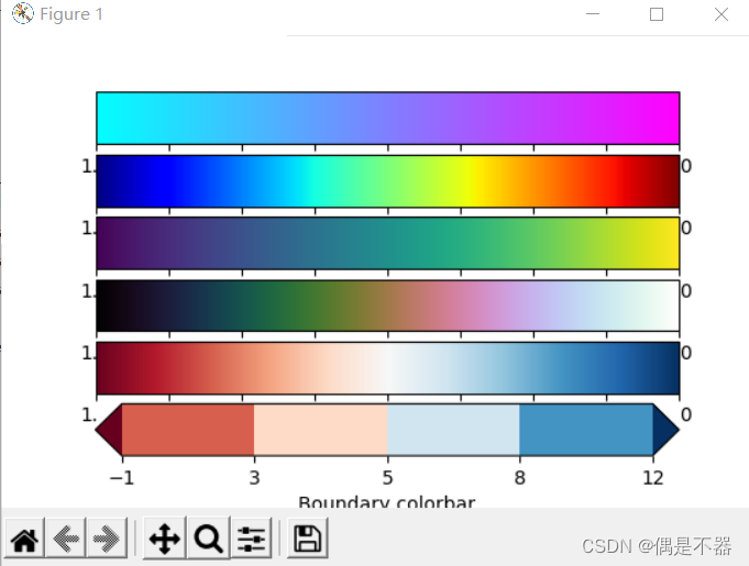
3.8多子图
创建坐标轴的基本方法plt.axes方法。
实例:通过add_axes方法创建多个图形
def matplotlib15():

    '''

    绘制多子图

    :return:

    '''

    fig =plt.figure()

    #[bottom,left,width,height]

    #设置左下角为0,右上角为1

    #bottom指定左下角位置,left指定左上角位置。

    #width指定长度,height指定高度

    ax1 = fig.add_axes([0.1,0.6,0.8,0.3],xticklabels=[],ylim=(-1.2,1.2))

    ax2 = fig.add_axes([0.1,0.1,0.8,0.4],ylim=(-1.5,1.5))

    data1 = np.linspace(0,10)

    ax1.plot(np.sin(data1))

    ax2.plot(np.cos(data1))


    #显示图片

    plt.show()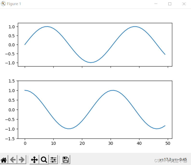
实例:subplot创建多子图
def matplotlib16():

    '''

    subplot创建多个子图

    :return:

    '''

    fig = plt.figure()

    #调整间距

    fig.subplots_adjust(hspace=0.4,wspace=0.4)

    for i in range(1,7):

        #方式1:

        #plt.subplot(2,3,i)

        #plt.text(0.5,0.5,'subplot'+str(i),fontsize=10,ha='center')


        #方式2:

        ax = plt.subplot(2,3,i)

        data1 = np.sin(np.random.randn(20))

        ax.plot(data1,label='label'+str(i))

    #显示图片

    plt.show()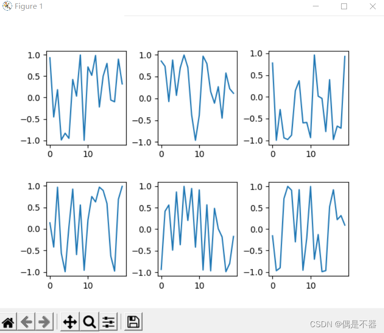
实例:使用subplots创建多子图
def matplotlib17():

    '''

    subplots创建多子图

    :return:

    '''

    #两行三列

    fig,axs=plt.subplots(2,3,sharex='col',sharey='row')

    #返回axs是一个坐标轴数组

    for i in range(2):

        for j in range(3):

            axs[i,j].text(0.5,0.5,str((i,j)),fontsize=10,ha='center')

    #显示图片

    plt.show()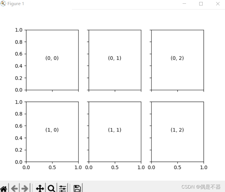
实例:使用GridSpec实现多子图
def matplotlib17():

    '''

    使用GridSpec创建不规则子图

    :return:

    '''

    rng = np.random.RandomState(10)

    grids = plt.GridSpec(2,3,wspace=0.4,hspace=0.3)

    ax1 = plt.subplot(grids[0,0])

    data1 = rng.randn(100)

    data2 = rng.randn(100)

    ax1.plot(np.sin(data1),label='sin(x)')

    ax2 = plt.subplot(grids[0,1:])

    ax2.plot(np.cos(data1),label='cos(x)')

    ax3 = plt.subplot(grids[1,:])

    ax3.scatter(data1,data2,c=rng.randn(100),s=rng.randn(100)*100,cmap='cubehelix')


    #显示图片

    plt.show()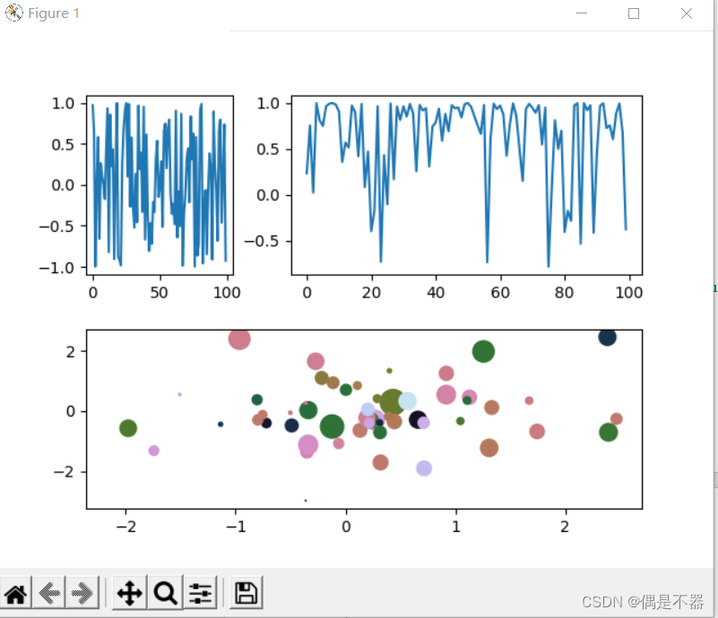
3.9文字注释
通过在图型中添加必要文字说明,提高图的直观性。
更多文字注释参考:
https://matplotlib.org/stable/gallery/text_labels_and_annotations/annotation_demo.html#sphx-glr-gallery-text-labels-and-annotations-annotation-demo-py
实例:
def matplotlib18():

    '''

    使用plt.text,ax.text方法添加注释

    :return:

    '''

    data1 = np.linspace(0,20,100)

    fig = plt.figure()

    ax = plt.axes()


    ax.plot(data1,np.sin(data1),'-')


    #设置文字标签

    dict_style = dict(size=10, color='blue')

    ax.text(data1[1],np.sin(data1[1]),'test 1',**dict_style)

    ax.text(data1[40],np.sin(data1[40]),'test 40',**dict_style)

    #设置坐标轴标题

    ax.set(title='a test title',ylabel='a sin value')


    #坐标变化

    #ax.transData,以数据为基准

    ax.text(10,0.5,"trans Data",transform=ax.transData)

    #ax.transAxes,以坐标轴为单位,范围0~1

    ax.text(0.2,0.5,"trans Axes",transform=ax.transAxes)

    #ax.transFigure 以图形为基准

    ax.text(0.5,0.5,'trans Figure',transform=fig.transFigure)


    #添加箭头

    ax.annotate('annotate1',\

                xy=(1.6,0.9),\

                xytext=(0.1,0.1),\

                arrowprops=dict(facecolor='black', shrink=0.05))

    #带盒子箭头说明

    ax.annotate('annotate2',\

                xy=(9,0.3),\

                xytext=(4,0.1),\

                bbox=dict(boxstyle="round", fc="0.8"),\

                arrowprops=dict(arrowstyle="->",\

                                connectionstyle="angle,angleA=0,angleB=90,rad=10"))

    #显示图片

    plt.show()
3.10自定义坐标轴
Matplotlib通过plt.figure()获取图片对象,plt.axes()获取坐标轴对象。通过多子图可以知道,一个figure对象包含一个或多个axes对象。
实例:
def matplotlib19():

    '''

    坐标轴设置

    :return:

    '''

    #设置绘图风格

    plt.style.use('seaborn-whitegrid')

    fig = plt.figure()

    ax = plt.axes()

    ax.plot(np.random.rand(100))

    #设置对数刻度

    #ax.set(xscale='log',yscale='log')


    #坐标轴formatter对象

    # 坐标轴locator对象

    #主要locator

    print(ax.xaxis.get_major_locator)

    #次要locator

    print(ax.xaxis.get_minor_locator)


    #设置隐藏坐标轴刻度

    #x轴

    # ax.xaxis.set_major_locator(plt.NullLocator())

    # ax.xaxis.set_major_formatter(plt.NullFormatter())

    #y轴

    # ax.yaxis.set_major_locator(plt.NullLocator())

    # ax.yaxis.set_major_formatter(plt.NullFormatter())


    #增减刻度数量 #最大刻度数量

    #ax.xaxis.set_major_locator(plt.MaxNLocator(3))


    #设置倍数刻度,按10的倍数

    #ax.xaxis.set_major_locator(plt.MultipleLocator(10))


    #设置线性刻度,10个刻度线性分布

    #ax.xaxis.set_major_locator(plt.LinearLocator(10))


    #设置固定刻度

    ax.xaxis.set_major_locator(plt.FixedLocator([10,20,30,50,100]))

    #设置固定格式

    ax.xaxis.set_major_formatter(plt.FixedFormatter(['10%','20%','30%','50%','max 100%']))


    #显示图片

    plt.show()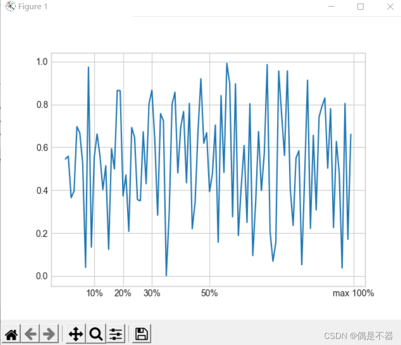
3.11自定义配置文件及样式表
Matplot可以自定义配置文件及样式表,调整原有默认显示样式。
实例:
def matplotlib20():

    '''

    设置样式,手动配置图形

    :return:

    '''

    #获取可用样式

    print(plt.style.available[:])

    #设置使用样式

    plt.style.use('seaborn-whitegrid')

    ax = plt.axes()

    data = np.random.randn(1000)

    ax.hist(data)

    #设置背景

    ax.set_facecolor('#E5E5E5')

    ax.set_axisbelow(True)

    #设置网格线

    ax.grid(color='gray',linestyle='dotted')


    #查看默认配置

    #print(plt.rcParams)

    #设置配置

    # plt.rc('axes',facecolor='#E5E5E5',edgecolor='none',axisbelow=True,grid='True')

    # plt.rc('grid',color='gray',linestyle='solid')

    # plt.rc('xtick',direction='out',color='gray')

    # plt.rc('ytick',direction='out',color='gray')

    #显示图片

    plt.show()
3.12三维图
使用Matplotlib中mplot3d工具箱绘制三维图。
实例1:创建3维线性图
def matplotlib21():

    '''

    创建三维图

    :return:

    '''

    #设置使用样式

    plt.style.use('seaborn-whitegrid')

    #绘制三维坐标

    fig = plt.figure()

    ax = plt.axes(projection='3d')

    #获取数据

    xline = np.linspace(0,20,1000)

    yline = np.sin(xline)

    zline = np.cos(xline)

    ax.plot3D(xline,yline,zline,'gray')


    #显示图片

    plt.show()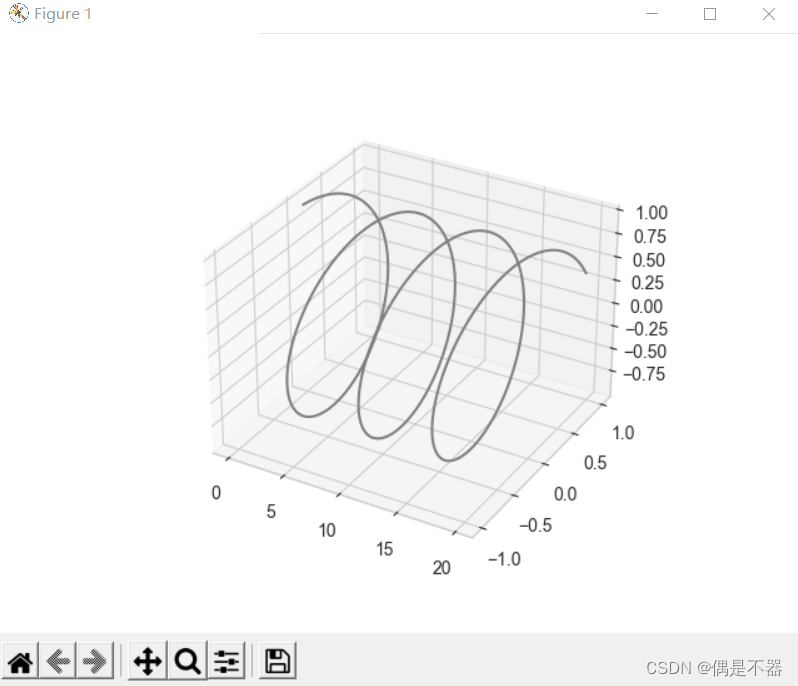
实例2:创建3维散点图
def matplotlib22():

    '''

    创建三维图

    :return:

    '''

    #设置使用样式

    plt.style.use('seaborn-whitegrid')

    #绘制三维坐标

    fig = plt.figure()

    ax = plt.axes(projection='3d')

    #获取数据

    xdata= np.random.randint(0,100,size=100)

    ydata = np.random.randint(0,50,size=100)

    zdata = np.random.randint(0,30,size=100)

    ax.scatter3D(xdata,ydata,zdata,c=zdata,cmap='cubehelix')


    #显示图片

    plt.show()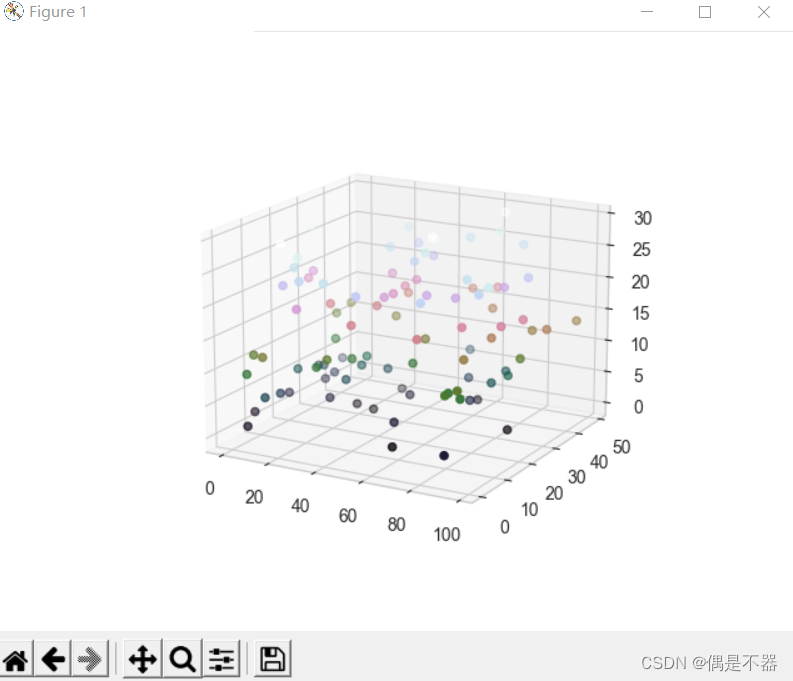
实例3:绘制3维等高线图
def matplotlib23():

    '''

    创建三维图

    :return:

    '''

    #设置使用样式

    plt.style.use('seaborn-whitegrid')

    #绘制三维坐标

    fig = plt.figure()

    ax = plt.axes(projection='3d')

    #获取数据

    xdata= np.linspace(-10,10,30)

    ydata = np.linspace(-10,10,30)

    def f(x,y):

        return  np.cos(np.sqrt(x**2+y**2))

    X,Y = np.meshgrid(xdata,ydata)

    Z = f(X,Y)

    #绘制等高线图

    #ax.contour3D(X,Y,Z,50,cmap='binary')

    #绘制线框图

    #ax.plot_wireframe(X,Y,Z,color='k')

    #绘制曲面图

    ax.plot_surface(X,Y,Z,rstride=1,cstride=1,cmap='viridis')

    #显示图片

    plt.show()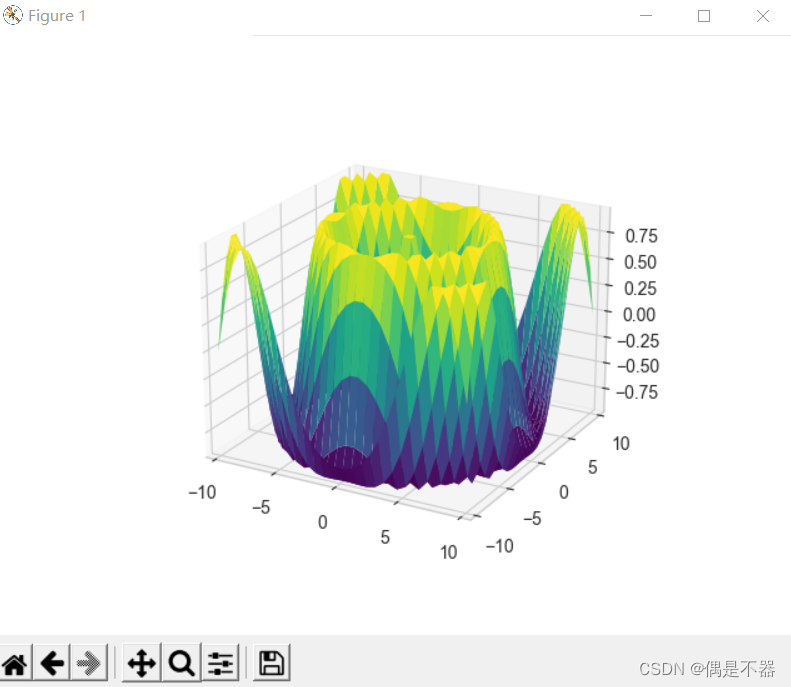
3.13地理图
Matplotlib可以使用Basemap工具箱绘制地图数据。
实例1:绘制地球
def matplotlib24():

    '''

    绘制地图

    :return:

    '''

    #需要使用pip install basemap

    from mpl_toolkits.basemap import Basemap

    plt.figure(figsize=(8,5))

    #lat_0:经度

    #lon_0:维度

    map1 = Basemap(projection='ortho',resolution=None,lat_0=30,lon_0=-100)

    map1.bluemarble(scale=0.5,alpha=0.8)

    #选择经纬点

    x,y = map1(-112,47.3)

    plt.plot(x,y,'ok',markersize=8)

    plt.text(x,y,'A Marker',fontsize=12)

    #显示图片

    plt.show()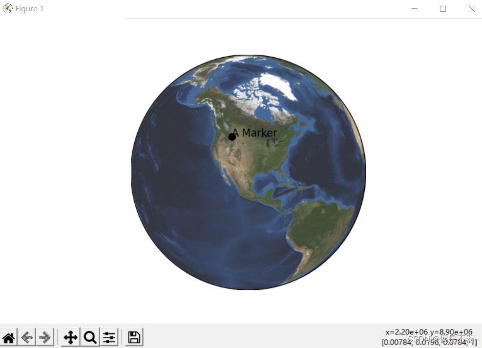
实例:地图投影,将三维地球转换为平面
def matplotlib25():

    '''

    绘制地球投影

    :return:

    '''

    #需要使用pip install basemap

    from mpl_toolkits.basemap import Basemap

    #圆柱投影,将经线,纬线映射为竖直线和水平线

    map1 = Basemap(projection='cyl',resolution=None,lat_0=30,lon_0=-10)]

    # 伪圆柱投影

    #所有经线为椭圆形投影

    #其他伪圆柱投影

    #projection='sinu'

    #projection='robin'

    #map1 = Basemap(projection='moll',resolution=None,lat_0=30,lon_0=-10)

    map1.shadedrelief(scale=0.6)


    #如同实例1,使用projection='ortho',正射投影

    #只能显示地球一半区域

    #projection='gnom',球心投影

    #projection='stere' 球极投影


    #圆锥投影,将地球投影成圆锥体

    #projection='lcc' 兰伯特等角圆锥

    #projection='eqdc' 等距圆锥

    #projection='aea' 阿尔波斯等积圆锥

    #显示图片

    plt.show()
实例:BaseMap中的函数
def matplotlib26():

    '''

    绘制使用函数

    :return:

    '''

    from mpl_toolkits.basemap import Basemap

    #圆柱投影,将经线,纬线映射为竖直线和水平线

    map1 = Basemap(projection='ortho',resolution=None,lat_0=40,lon_0=95)

    #绘制投影背景

    #map1.shadedrelief(scale=0.8)

    #绘制经线

    map1.drawparallels(np.linspace(-90,90,13),color='white')

    #绘制纬线

    map1.drawmeridians(np.linspace(-180,180,13),color='white')

    #绘制边界水体

    #map1.drawcoastlines()

    #绘制大陆海岸线

    #map1.drawlsmask()

    #绘制地图边界

    #map1.drawmapboundary()

    #绘制河流

    #map1.drawrivers()

    #填充大陆和湖泊颜色

    #map1.fillcontinents(color='gray',lake_color='blue')

    #政治国家边界线

    #map1.drawcountries()

    #绘制美国州界线

    #map1.drawstates()

    #绘制美国县界线

    #map1.drawcounties()

    #绘制两点之间圆

    #map1.drawgreatcircle(lon1=10,lat1=20,lon2=30,lat2=30)

    #绘制地形晕宣图

    map1.etopo()

    #显示图片

    plt.show()


 4107
4107


 被折叠的 条评论
为什么被折叠?
被折叠的 条评论
为什么被折叠?
 到【灌水乐园】发言


