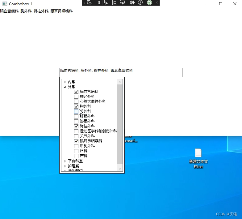
WPF中,Combobox下拉框为Treeview(两层,可多选)

 效果如下:

xaml代码如下:

<Window x:Class="Combobox_Checkbox.Combobox_1"
        xmlns="http://schemas.microsoft.com/winfx/2006/xaml/presentation"
        xmlns:x="http://schemas.microsoft.com/winfx/2006/xaml"
        xmlns:d="http://schemas.microsoft.com/expression/blend/2008"
        xmlns:mc="http://schemas.openxmlformats.org/markup-compatibility/2006"
        xmlns:local="clr-namespace:Combobox_Checkbox"
        mc:Ignorable="d"
        Title="Combobox_1" Height="450" Width="800">
    <Grid>

        <ComboBox Name="MyComboBox" Width="200" Height="30" Grid.Row="2">
            <ComboBox.Style>
                <Style TargetType="ComboBox">
                    <Setter Property="IsEditable" Value="True" />
                    <Setter Property="Template">
                        <Setter.Value>
                            <ControlTemplate TargetType="ComboBox">
                                <Grid>
                                    <ToggleButton Name="ToggleButton" Grid.Column="2" Focusable="False" IsChecked="{Binding Path=IsDropDownOpen,Mode=TwoWay,RelativeSource={RelativeSource TemplatedParent}}" />
                                    <ContentPresenter Name="ContentSite" Margin="3,3,23,3" VerticalAlignment="Center" HorizontalAlignment="Left" IsHitTestVisible="False" Content="{TemplateBinding SelectionBoxItem}" />
                                    <TextBox Name="PART_EditableTextBox" Visibility="Visible"  IsHitTestVisible="False" Focusable="False" Text="{Binding Path=SelectedValue, RelativeSource={RelativeSource Mode=FindAncestor, AncestorType={x:Type ComboBox}}, Mode=TwoWay}" />
                                    <Popup Name="Popup" Placement="Bottom" IsOpen="{TemplateBinding IsDropDownOpen}" AllowsTransparency="True" Focusable="False" PopupAnimation="Slide">
                                        <Border Background="White" BorderThickness="1" BorderBrush="Black">
                                            <Border CornerRadius="4" Padding="5">
                                                <StackPanel>
                                                    <!--<Button Content="Confirm" Click="ConfirmButton_Click" />-->
                                                    <TreeView Width="200" Height="300" ItemsSource="{Binding Departments}">
                                                        <TreeView.ItemTemplate>
                                                            <HierarchicalDataTemplate ItemsSource="{Binding SubDepartments}">
                                                                <TextBlock Text="{Binding Name}" />
                                                                <HierarchicalDataTemplate.ItemTemplate>
                                                                    <DataTemplate>
                                                                        <CheckBox IsChecked="{Binding IsSelected,Mode=TwoWay}" Content="{Binding Name}" Unchecked="ConfirmButton_Click" Checked="ConfirmButton_Click" />
                                                                    </DataTemplate>
                                                                </HierarchicalDataTemplate.ItemTemplate>
                                                            </HierarchicalDataTemplate>
                                                        </TreeView.ItemTemplate>
                                                    </TreeView>
                                                </StackPanel>
                                            </Border>
                                        </Border>
                                    </Popup>
                                </Grid>
                                <ControlTemplate.Triggers>
                                    <Trigger Property="HasItems" Value="False">
                                        <Setter TargetName="Popup" Property="MinHeight" Value="95" />
                                    </Trigger>
                                    <Trigger Property="IsEnabled" Value="False">
                                        <Setter Property="Foreground" Value="#888" />
                                    </Trigger>
                                    <Trigger Property="IsGrouping" Value="True">
                                        <Setter Property="ScrollViewer.CanContentScroll" Value="False" />
                                    </Trigger>
                                    <Trigger SourceName="Popup" Property="Popup.AllowsTransparency" Value="True">
                                        <Setter TargetName="Popup" Property="Margin" Value="0,-1,0,0" />
                                    </Trigger>
                                </ControlTemplate.Triggers>
                            </ControlTemplate>
                        </Setter.Value>
                    </Setter>
                </Style>
            </ComboBox.Style>
        </ComboBox>

        <TextBlock Text="{Binding ElementName=MyComboBox,Path=Text}" Background="White" Height="50" VerticalAlignment="Top"/>

    </Grid>
</Window>
wAAACH5BAEKAAAALAAAAAABAAEAAAICRAEAOw==

窗体代码:

public partial class Combobox_1 : Window
{
    public ObservableCollection<Department> Departments { get; set; }
    public ObservableCollection<SubDepartment> SelectedSubDepartments { get; set; }

    public Combobox_1()
    {
        InitializeComponent();

        Departments = new ObservableCollection<Department>();
        SelectedSubDepartments = new ObservableCollection<SubDepartment>();
        LoadData();
        DataContext = this;
    }


    private void LoadData()
    {
        // 从数据库或其他数据源中获取部门数据
        SQLHelper db = new SQLHelper();
        string sql = string.Format(@"SELECT * FROM Dispute_Department where ID in (select max(ID) from Dispute_Department group by name1 ) ORDER BY ID ");
        DataSet departmentData = db.GetDataSet(sql);

        // 构建Department和SubDepartment对象
        foreach (DataRow row in departmentData.Tables[0].Rows)
        {
            var departmentName = row["depart"].ToString();
            var subDepartmentName = row["name1"].ToString();

            var department = Departments.FirstOrDefault(d => d.Name == departmentName);
            if (department == null)
            {
                department = new Department
                {
                    Name = departmentName,
                    SubDepartments = new ObservableCollection<SubDepartment>()
                };
                Departments.Add(department);
            }

            var subDepartment = new SubDepartment
            {
                Name = subDepartmentName,
                IsSelected = false
            };
            department.SubDepartments.Add(subDepartment);
        }
    }


    private void ConfirmButton_Click(object sender, RoutedEventArgs e)
    {
        SelectedSubDepartments.Clear();

        // 遍历所有子部门,将选中的子部门添加到SelectedSubDepartments集合中
        foreach (var department in Departments)
        {
            foreach (var subDepartment in department.SubDepartments)
            {
                if (subDepartment.IsSelected)
                {
                    SelectedSubDepartments.Add(subDepartment);
                }
            }
        }

        // 更新Combobox的显示内容
        MyComboBox.Text = string.Join(", ", SelectedSubDepartments.Select(sd => sd.Name));

        // 关闭下拉框
        //MyComboBox.IsDropDownOpen = false;
    }

}

public class Department
{
    public string Name { get; set; }
    public ObservableCollection<SubDepartment> SubDepartments { get; set; }
}

public class SubDepartment
{
    public string Name { get; set; }
    public bool IsSelected { get; set; }
}
    
wAAACH5BAEKAAAALAAAAAABAAEAAAICRAEAOw==

  • 12
    点赞
  • 7
    收藏
    觉得还不错? 一键收藏
  • 打赏
    打赏
  • 0
    评论
你可以使用ComboBox的样式来更改下拉框的背景颜色。以下是一个示例,将ComboBox下拉框背景颜色设置为灰色: ```xml <ComboBox> <ComboBox.Resources> <Style TargetType="{x:Type ComboBox}"> <Setter Property="Template"> <Setter.Value> <ControlTemplate TargetType="{x:Type ComboBox}"> <Grid> <ToggleButton Name="ToggleButton" ClickMode="Press" Focusable="False" IsChecked="{Binding Path=IsDropDownOpen,Mode=TwoWay,RelativeSource={RelativeSource TemplatedParent}}" Grid.Column="2" Grid.Row="0" Style="{StaticResource ComboBoxToggleButton}" Background="Gray"/> <ContentPresenter Name="ContentSite" IsHitTestVisible="False" Content="{TemplateBinding SelectionBoxItem}" ContentTemplate="{TemplateBinding SelectionBoxItemTemplate}" ContentTemplateSelector="{TemplateBinding ItemTemplateSelector}" Margin="3,3,23,3" VerticalAlignment="Center" HorizontalAlignment="Left" /> <TextBox x:Name="PART_EditableTextBox" Style="{x:Null}" Template="{StaticResource ComboBoxTextBox}" HorizontalAlignment="Left" VerticalAlignment="Bottom" Margin="3,3,23,3" Focusable="True" Background="Transparent" Visibility="Hidden" IsReadOnly="{TemplateBinding IsReadOnly}"/> <Popup Name="Popup" Placement="Bottom" IsOpen="{TemplateBinding IsDropDownOpen}" AllowsTransparency="True" Focusable="False" PopupAnimation="Slide"> <Grid Name="DropDown" SnapsToDevicePixels="True" MinWidth="{TemplateBinding ActualWidth}" MaxHeight="{TemplateBinding MaxDropDownHeight}"> <Border x:Name="DropDownBorder" Background="White" BorderThickness="1" BorderBrush="Black"/> <ScrollViewer Margin="4,6,4,6" SnapsToDevicePixels="True"> <StackPanel IsItemsHost="True" /> </ScrollViewer> </Grid> </Popup> </Grid> <ControlTemplate.Triggers> <Trigger Property="IsEnabled" Value="False"> <Setter TargetName="PART_EditableTextBox" Property="Foreground" Value="DimGray"/> </Trigger> <Trigger Property="IsGrouping" Value="True"> <Setter Property="ScrollViewer.CanContentScroll" Value="False"/> </Trigger> <Trigger SourceName="Popup" Property="Popup.AllowsTransparency" Value="True"> <Setter TargetName="DropDownBorder" Property="CornerRadius" Value="4"/> <Setter TargetName="DropDownBorder" Property="Margin" Value="0,2,0,0"/> </Trigger> <Trigger Property="IsEditable" Value="True"> <Setter Property="IsTabStop" Value="False"/> <Setter TargetName="PART_EditableTextBox" Property="Visibility" Value="Visible"/> <Setter TargetName="ContentSite" Property="Visibility" Value="Hidden"/> </Trigger> </ControlTemplate.Triggers> </ControlTemplate> </Setter.Value> </Setter> </Style> </ComboBox.Resources> <ComboBoxItem>Item 1</ComboBoxItem> <ComboBoxItem>Item 2</ComboBoxItem> <ComboBoxItem>Item 3</ComboBoxItem> </ComboBox> ``` 在这个示例,我们将ComboBox的模板更改为一个包含ToggleButton、ContentPresenter、TextBox和Popup的Grid。ToggleButton用于展开和收起下拉框,ContentPresenter用于显示当前选择的项,TextBox用于允许用户编辑文本,Popup用于显示下拉框的项。 我们可以使用Background属性将ToggleButton的背景颜色设置为灰色。在这个示例,我们还更改了其他控件的样式和模板,以便它们与ToggleButton的颜色相匹配。 请注意,这只是一个示例,你可以根据你的需要自定义ComboBox的外观和行为。

“相关推荐”对你有帮助么?

  • 非常没帮助
  • 没帮助
  • 一般
  • 有帮助
  • 非常有帮助
提交
评论
添加红包

请填写红包祝福语或标题

红包个数最小为10个

红包金额最低5元

当前余额3.43前往充值 >
需支付:10.00
成就一亿技术人!
领取后你会自动成为博主和红包主的粉丝 规则
hope_wisdom
发出的红包

打赏作者

亮猿

你的鼓励将是我创作的最大动力

¥1 ¥2 ¥4 ¥6 ¥10 ¥20
扫码支付:¥1
获取中
扫码支付

您的余额不足,请更换扫码支付或充值

打赏作者

实付
使用余额支付
点击重新获取
扫码支付
钱包余额 0

抵扣说明:

1.余额是钱包充值的虚拟货币,按照1:1的比例进行支付金额的抵扣。
2.余额无法直接购买下载,可以购买VIP、付费专栏及课程。

余额充值