


1.input文本内容替换
- -webkit-text-security:通过用形状替换字符,仅影响那些字段不是的type=password
-
可选值:none (无),circle (圆圈),disc (圆形),square (正方形)
-
代码:
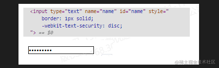
<style> input { -webkit-text-security: circle; } </style> <input type="text" name="name" id="name" /> -
结果:
-
2. 使用currentColor
- currentColor 可以说是css的一个变量,会被解析为 clolor 的一个值,所以下面我们就可以给跟,color同样值使用currentColor
.text{
    color: #3397ff;
    border: 1px solid currentColor;
}
3.使用 inherit
-inherit会继承来着父元素的对应值
css .box{ font-size: 20px; color: #3397ff; background: #333333; border: 1px solid currentColor; .text{ line-height: 2em; margin-top: 2em; width: 20em; color:inherit; background:inherit; border:inherit; } }
4.css文字渐变动画
- 设置渐变背景
- 用
webkit-background-clip: text以div的文字作为裁剪区域向外裁剪 - 用
-webkit-text-fill-color把文字变透明
<style>
	.list {
        background-image: linear-gradient(to right, red, orange, yellow, green, yellow, orange, red, orange, yellow, green, yellow, orange, red);
        -webkit-background-clip: text;
        -webkit-text-fill-color: transparent;
        -webkit-background-size: 200% 100%;
        animation: bgp 5s infinite linear;
    }
	@keyframes bgp {
		0%  { background-position: 0 0;}
		100% { background-position: -100% 0;}
	}
</style>
	<div class="list">
		<span class="list-item">今天又是元气满满的一天</span>
		<span class="list-item">让眼睛休息一下把</span>
		<span class="list-item">小姐姐今天好漂漂哟~</span>
		<span class="list-item">明天要放假了真开心</span>
		<span class="list-item">每天进步一点点</span>
	</div>
5.通过 box-reflect 设置倒影
- 通过
-webkit-box-reflect设置倒影,并添加倒影渐变色 - 详情
<style>
.reflect{
	width:950px;
	margin:0 auto;
	-webkit-box-reflect:below 0 -webkit-linear-gradient(transparent,transparent 50%,rgba(255,255,255,.3));
	text-transform:uppercase;
	}
</style>
</head>
<body>
<div class="reflect">你看到倒影了么?</div>
</body>

6.虚化黑色
 .text{
	fade-out(black, 0.95) /* black的变种,1是全黑,0是全透明无色 */
 }
7.伪类清除浮动
.clearfix:after{
     content: '';
     display: block; /*或者 table*/
     clear: both;
 }
 .clearfix{
     zoom: 1; /* IE 兼容*/
 }
8.:checked修改radio、checkbox样式
<style>
	.tabList{
		position: relative;
		display: inline-block;
	}
	input[type='radio']{
		width:100%;
		height:100%;
		position: absolute;
		top:0;
		left:0;
		opacity: 0;
		z-index:9;
	}
	.tabDiv{
		width:100px;
		height:40px;
		position: relative;
		z-index:1;
		border:1px solid;
		line-height:40px;
    	text-align: center;
	}
	input[type='radio']:checked + .tabDiv{
		background: red;
		border:1px solid red;
	}

</style>
<body>
	<div class='tabList'>
		<input type='radio' name='tab' />
		<div class='tabDiv'>one</div>
	</div>
	<div class='tabList'>
		<input type='radio' name='tab' />
		<div class='tabDiv'>two</div>
	</div>
</body>


 2501
2501


 被折叠的 条评论
为什么被折叠?
被折叠的 条评论
为什么被折叠?
 到【灌水乐园】发言


