


本文地址:https://blog.csdn.net/qq_40785165/article/details/117339107,转载需附上此地址
大家好,我是小黑,一个还没秃头的程序员~~~
每一个不曾起舞的日子,都是对生命的辜负!
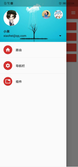
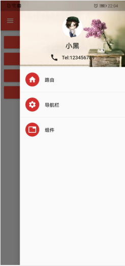
今天分享的内容是Flutter如何实现抽屉侧边栏效果,源码地址:https://gitee.com/fjjxxy/flutter-study.git,效果如下:
Scaffold组件侧边栏参数如下:
| 参数 | 说明 |
|---|---|
| drawer | 左侧边栏 |
| endDrawer | 右侧边栏 |
实现侧边栏只需要在Scaffold组件中添加drawer/endDrawer参数即可,参数的值是Drawer组件,在Drawer组件中添加侧边栏头部以及其他布局即可,Drawer组件的头部有两种实现方案:
- 使用UserAccountsDrawerHeader实现头部
- 使用DrawerHeader实现头部
UserAccountsDrawerHeader具有固定的模板,DrawerHeader可以自定义布局,文章开头效果图左边为前者,右边为后者
(一)UserAccountsDrawerHeader组件的参数如下:
| 参数 | 说明 |
|---|---|
| decoration | 头部的样式,比如边框、背景图等 |
| margin | 外间距 |
| currentAccountPicture | 放置在左上角的组件,一般都是用户头像 |
| otherAccountsPictures | 放置在右上角的表示其他账户的组件 |
| currentAccountPictureSize | 左上角组件的边长,默认是边长72的正方形 |
| otherAccountsPicturesSize | 右上角组件的边长,默认是边长40的正方形 |
| accountName | 表示当前账户名称的组件 |
| accountEmail | 表示当前账户邮箱的组件,放置于accountName组件的下方 |
| onDetailsPressed | 当名称组件与邮箱组件被点击时的监听,添加这个参数后会有个箭头显示 |
| arrowColor | 箭头的颜色 |
(二)DrawerHeader头部组件的参数如下:
| 参数 | 说明 |
|---|---|
| decoration | 头部的样式,比如边框、背景图等 |
| margin | 外间距 |
| padding | 内间距 |
| duration | 如果decoration 发生变化时的动画时长 |
| curve | 如果decoration 发生变化时的动画曲线 |
| child | 头部子组件,可自定义 |
介绍完头部,底下的列表就都是一样的布局了,由多个ListTile组成,对ListTile不了解的同学可以去看我之前的博客了解一下ListView的相关知识:Flutter学习日记之初识ListView组件
,完整代码如下:
import 'package:flutter/material.dart';
import 'package:flutter_study/NavigationBarPage.dart';
import 'SecondPage.dart';

class MainPage extends StatelessWidget {
  var imageUrl = "https://avatar.csdnimg.cn/D/6/7/3_qq_40785165_1608817824.jpg";
  var imageUrl1 = "https://ss3.bdstatic.com/70cFv8Sh_Q1YnxGkpoWK1HF6hhy/it/u=3686156064,2328177349&fm=26&gp=0.jpg";
  var imageUrl2 = "https://ss2.bdstatic.com/70cFvnSh_Q1YnxGkpoWK1HF6hhy/it/u=2306696130,3636777462&fm=26&gp=0.jpg";
  var imageUrl3 = "https://ss3.bdstatic.com/70cFv8Sh_Q1YnxGkpoWK1HF6hhy/it/u=3898438129,1463014098&fm=26&gp=0.jpg";
  var imageUrl4 = "https://ss0.bdstatic.com/70cFuHSh_Q1YnxGkpoWK1HF6hhy/it/u=1763004641,1180461983&fm=26&gp=0.jpg";

  @override
  Widget build(BuildContext context) {
    return Scaffold(
      appBar: AppBar(title: Text("Flutter练习记录")),
      body: Container(
        child: Padding(
          padding: EdgeInsets.all(10),
          child: ListView(
            children: [
              RaisedButton(
                onPressed: () {
                  Navigator.of(context)
                      .push(MaterialPageRoute(builder: (context) {
                    return SecondPage(
                      arguments: {"id": 1},
                    );
                  }));
                },
                child: Text(
                  "路由",
                  style: TextStyle(color: Colors.white),
                ),
                color: Colors.red,
              ),
              RaisedButton(
                onPressed: () {
                  Navigator.pushNamed(context, "/tabs",
                      arguments: {"index": 2});
                },
                child: Text(
                  "导航栏",
                  style: TextStyle(color: Colors.white),
                ),
                color: Colors.red,
              ),
              RaisedButton(
                onPressed: () {
                  Navigator.pushNamed(context, "/component");
                },
                child: Text(
                  "组件",
                  style: TextStyle(color: Colors.white),
                ),
                color: Colors.red,
              ),
              RaisedButton(
                onPressed: () {
                  Navigator.pushNamed(context, "/appbarPage");
                },
                child: Text(
                  "自定义AppBar",
                  style: TextStyle(color: Colors.white),
                ),
                color: Colors.red,
              )
            ],
          ),
        ),
      ),
      drawer: Drawer(
        child: Column(
          children: [
            buildUserAccountsDrawerHeader(),
            buildListTile(context, Icons.home, "路由", "/second"),
            Divider(),
            buildListTile(context, Icons.settings, "导航栏", "/tabs"),
            Divider(),
            buildListTile(context, Icons.tab, "组件", "/component"),
          ],
        ),
      ),
      endDrawer: Drawer(
        child: Column(
          children: [
            buildDrawerHeader(),
            buildListTile(context, Icons.home, "路由", "/second"),
            Divider(),
            buildListTile(context, Icons.settings, "导航栏", "/tabs"),
            Divider(),
            buildListTile(context, Icons.tab, "组件", "/component"),
          ],
        ),
      ),
    );
  }

  UserAccountsDrawerHeader buildUserAccountsDrawerHeader() {
    return UserAccountsDrawerHeader(
      arrowColor: Colors.black,
      onDetailsPressed: () {},
      currentAccountPictureSize: Size.square(72),
      otherAccountsPicturesSize: Size.square(40),
      accountName: Text("小黑", style: TextStyle(color: Colors.black)),
      accountEmail: Text(
        "xiaohei@qq.com",
        style: TextStyle(color: Colors.black),
      ),
      //头像
      currentAccountPicture: CircleAvatar(
        backgroundImage: NetworkImage(imageUrl),
      ),
      decoration: BoxDecoration(
          image: DecorationImage(
              image: NetworkImage(imageUrl3), fit: BoxFit.cover)),
      //右上角的其他图标
      otherAccountsPictures: [
        CircleAvatar(
          backgroundImage: NetworkImage(imageUrl1),
        ),
        CircleAvatar(
          backgroundImage: NetworkImage(imageUrl2),
        )
      ],
    );
  }

  Widget buildDrawerHeader() {
    return Row(children: [
      Expanded(
          child: DrawerHeader(
        child: Container(
          child: Center(
            child: Column(
              children: [
                CircleAvatar(
                  radius: 30,
                  backgroundImage: NetworkImage(imageUrl),
                ),
                SizedBox(height: 10,),
                Text(
                  "小黑",
                  style: TextStyle(fontSize: 20),
                ),
                SizedBox(height: 10,),
                Row(
                  mainAxisAlignment: MainAxisAlignment.center,
                  children: [Icon(Icons.call),SizedBox(width: 10,) ,Text("Tel:123456789")],
                )
              ],
            ),
          ),
        ),
        decoration: BoxDecoration(
          color: Colors.white,
          image: DecorationImage(
              image: NetworkImage(this.imageUrl4), fit: BoxFit.cover),
        ),
      )),
    ]);
  }

  ListTile buildListTile(
      BuildContext context, IconData icon, String text, String route) {
    return ListTile(
      leading: CircleAvatar(
        child: Icon(icon),
      ),
      title: Text(text),
      onTap: () {
        Navigator.of(context).pop();
        Navigator.pushNamed(context, route);
      },
    );
  }
}
在侧边栏的列表中,实现跳转依靠的是ListTiled的onTab点击事件监听,在Drawer组件中使用Column组件放置头部以及列表布局,其他布局结构都比较简单,以下是一些注意事项:
- 为了使DrawerHeader充满头部,需要使用Expanded这样的组件,使得宽高充满
- DrawerHeader中自定义布局时,宽高别超出限制,否则会报错,目前暂未找到设置头部高度的方法,小伙伴们有建议的欢迎评论区指教!
图片用的是网络图片,使用NetworkImage加载,头像使用的是CircleAvatar,其他组件也是一些较为简单的常见组件,更多请看上述代码!
到此为止,Flutter侧边栏效果就介绍完了,多写才能熟能生巧,感兴趣的小伙伴可以下载源码看一下,希望大家可以点个star,支持一下小白的flutter学习经历,最后,希望喜欢我文章的朋友们可以帮忙点赞、收藏、评论,也可以关注一下,如果有问题可以在评论区提出,后面我会持续更新Flutter的学习记录,与大家分享,谢谢大家的支持与阅读!


 943
943


 被折叠的 条评论
为什么被折叠?
被折叠的 条评论
为什么被折叠?
 到【灌水乐园】发言


