


CSS3 animation-fill-mode详解
定义
animation-fill-mode 属性规定当动画不播放时(当动画完成时,或当动画有一个延迟未开始播放时),要应用到元素的样式。
默认情况下,CSS 动画在第一个关键帧播放完之前不会影响元素,在最后一个关键帧完成后停止影响元素。animation-fill-mode 属性可重写该行为。
语法
animation-fill-mode: none|forwards|backwards|both|initial|inherit;
详解
假设有如下这样一个动画例子:
<!DOCTYPE html>
<html lang="en">
  <head>
    <meta charset="UTF-8" />
    <meta http-equiv="X-UA-Compatible" content="IE=edge" />
    <meta name="viewport" content="width=device-width, initial-scale=1.0" />
    <title>Document</title>
    <style>
      .box {
        width: 200px;
        height: 200px;
        background-color: red;
        transform: translateY(0);
      }
      .box.on {
        animation: move 1s;
      }

      @keyframes move {
        from {
          transform: translateY(-50px);
        }
        to {
          transform: translateY(50px);
        }
      }
    </style>
  </head>
  <body>
    <div class="box"></div>
  </body>
</html>
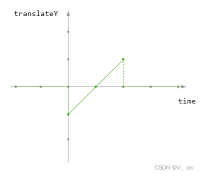
使用图片来表示 translateY 的值与时间的关系(注意看绿色的部分):
- 横轴为表示 时间,为 0 时表示动画开始的时间,也就是向 box 加上 on 类名的时间,横轴一格表示 0.5s
- 纵轴表示translateY的值,为 0 时表示 translateY 的值为 0,纵轴一格表示 50px
animation-fill-mode: none;
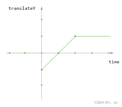
意思就是说在动画开始之前或动画完成之后,none都不应用动画中的初始值。animation-fill-mode: forwards;
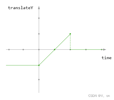
意思就是说在动画开始之前,forwards不应用动画中的初始值,在动画结束之后,停留在动画最后一帧。animation-fill-mode: backwards;
意思就是说在动画完成之后,backwards不应用动画中的结束值,在动画开始之前,应用动画中的初始值。animation-fill-mode: both;
意思就是说在动画开始之前以及结束之后,both都应用动画中的初始值和结束值。
属性
- none
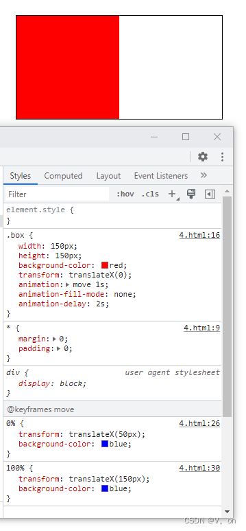
默认值。动画在动画执行之前和之后不会应用任何样式到目标元素。即与 @Keyframes 内的关键帧定义无关。
<!DOCTYPE html>
<html lang="en">
<head>
    <meta charset="UTF-8">
    <meta http-equiv="X-UA-Compatible" content="IE=edge">
    <meta name="viewport" content="width=device-width, initial-scale=1.0">
    <title>Document</title>
    <style>
        * { margin: 0; padding: 0; }
        body {
            width: 300px;
            height: 150px;
            border: 1px solid #000;
            margin: 50px 0 0 100px;
        }
        .box {
            width: 150px;
            height: 150px;
            background-color: red;
            transform: translateX(0);
            animation: move 1s;
            animation-fill-mode: none;
            animation-delay: 2s;
        }
        @keyframes move {
            from {
                transform: translateX(50px);
                background-color: blue;
            }
            to  {
                transform: translateX(150px);
                background-color: blue;
            }
        }
    </style>
</head>
<body>
    <div class="box"></div>
</body>
</html>
当元素未播放动画或已经播放完成后的元素的样式都如下:
- forwards
在动画结束后(由animation-iteration-count决定),动画将应用该属性值。
修改上个例子中的animation-fill-mode: forwards;,那么在动画结束后的效果如下所示,在动画未开始前的效果依然如上图,只是改变了动画结束后的效果。
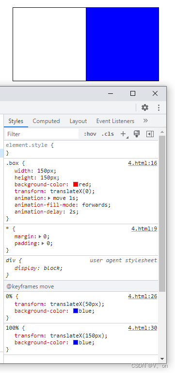
也就是说,它只设置动画结束后的属性值,而不设置延迟动画期间的。
- backwards
动画将应用在animation-delay定义期间启动动画的第一次迭代的关键帧中定义的属性值。这些都是 from 关键帧中的值(当animation-direction为normal或alternate时)或 to 关键帧中的值(当animation-direction为reverse或alternate-reverse时)。
下面使用一个例子分别使用animation-direction的几个属性来查看它们的区别:
<!DOCTYPE html>
<html lang="en">
<head>
    <meta charset="UTF-8">
    <meta http-equiv="X-UA-Compatible" content="IE=edge">
    <meta name="viewport" content="width=device-width, initial-scale=1.0">
    <title>Document</title>
    <style>
        * { margin: 0; padding: 0; }
        body {
            width: 300px;
            height: 790px;
            border: 1px solid #000;
            margin: 50px 0 0 100px;
        }
        .box {
            width: 150px;
            height: 150px;
            background-color: red;
            transform: translateX(0);
            margin-bottom: 10px;
        }
        .box1 { animation: move 4s 3s backwards 2 normal; }
        .box2 { animation: move 4s 3s backwards 2 alternate; }
        .box3 { animation: move 4s 3s backwards 2 reverse; }
        .box4 { animation: move 4s 3s backwards 2 alternate-reverse; }

        @keyframes move {
            from {
                transform: translateX(50px);
                background-color: blue;
            }
            to  {
                transform: translateX(150px);
                background-color: blue;
            }
        }
    </style>
</head>
<body>
    <div class="box box1"></div>
    <div class="box box2"></div>
    <div class="box box3"></div>
    <div class="box box4"></div>
    <div class="box box5"></div>
</body>
</html>
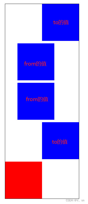
动画未开始前是如下效果:
结束动画后:
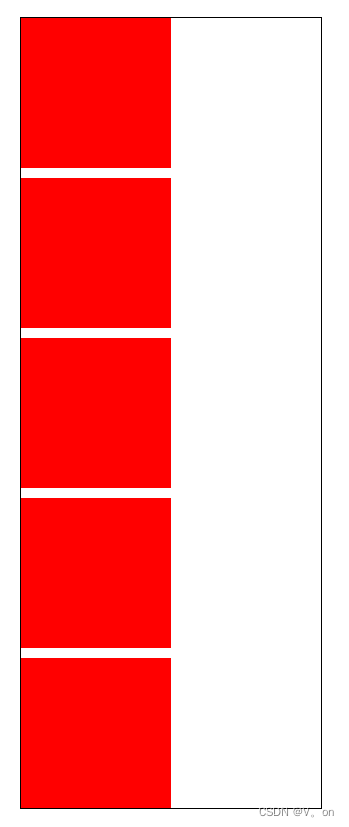
也就是说,它只设置动画在延迟期间第一次迭代的关键帧的属性值,而不设置结束动画后的,与forwards相反。


 扫一扫
扫一扫


 3239
3239

 被折叠的 条评论
为什么被折叠?
被折叠的 条评论
为什么被折叠?
 到【灌水乐园】发言


