


background详解
属性定义及使用说明
background 是 CSS 中的一个复合属性,用于设置元素的背景样式,包括颜色、图像、位置、大小、重复方式等。它可以简化为单独的背景属性,也可以一次性设置多个背景属性值。以下是 background 属性的一些详细说明:
语法
这条语句设置了背景颜色为红色(#f00),背景图片为 image.jpg,图片不重复显示(no-repeat),图片居中显示(center),图片大小按容器尺寸进行缩放以完全覆盖(cover),背景图像固定不动(fixed)。
background: background-color background-image background-repeat background-position/background-size background-attachment;
background: #f00 url("image.jpg") no-repeat center/cover fixed;
| 属性 | 描述 |
|---|---|
| background-color | 背景颜色 |
| background-image | 背景图像 |
| background-position | 背景位置 |
| background-size | 背景尺寸 |
| background-repeat | 背景重复 |
| background-attachment | 背景附着 |
| background-clip | 背景剪裁,不常用 |
| background-origin | 背景原点,不常用 |
属性详解
-
background-color
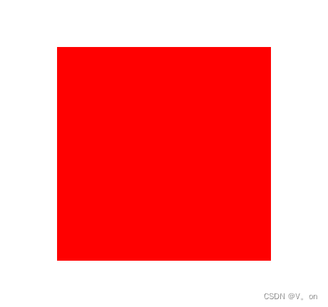
语法:默认transparentbackground-color: color;设置元素的背景颜色,比如
background-color: red;将背景色设为红色。属性的值为颜色值或关键字transparent二者选其一。.container { width: 200px; height: 200px; background-color: red; }效果如下:
-
background-image
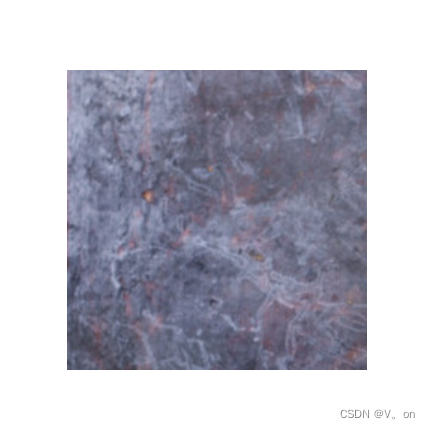
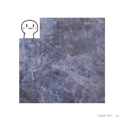
可以设置一个或多个背景图像,例如background-image: url("example.jpg");将背景设置为 example.jpg 图像。.container { width: 200px; height: 200px; background-image: url('https://fc4tn.baidu.com/it/u=2258281299,305481422&fm=202'); }效果如下:
设置多个背景图:.container { width: 200px; height: 200px; background-image: url('https://gimg2.baidu.com/image_search/src=http%3A%2F%2Fc-ssl.duitang.com%2Fuploads%2Fitem%2F202002%2F24%2F20200224214726_ucqck.thumb.400_0.gif&refer=http%3A%2F%2Fc-ssl.duitang.com&app=2002&size=f9999,10000&q=a80&n=0&g=0n&fmt=auto?sec=1715412527&t=8b74772e8fa35ed288e50453a1eeb908'),url('https://fc4tn.baidu.com/it/u=2258281299,305481422&fm=202'); background-repeat: no-repeat; }效果如下:
在绘制时,图像以 z 方向堆叠的方式进行。先指定的图像会在之后指定的图像上面绘制。因此指定的第一个图像“最接近用户”。然后元素的边框 border 会在它们之上被绘制,而background-color会在它们之下绘制。所以一般情况下都会指定background-color属性,如果图像无法被加载—例如,在网络连接断开的情况下—背景色就会被绘制。 -
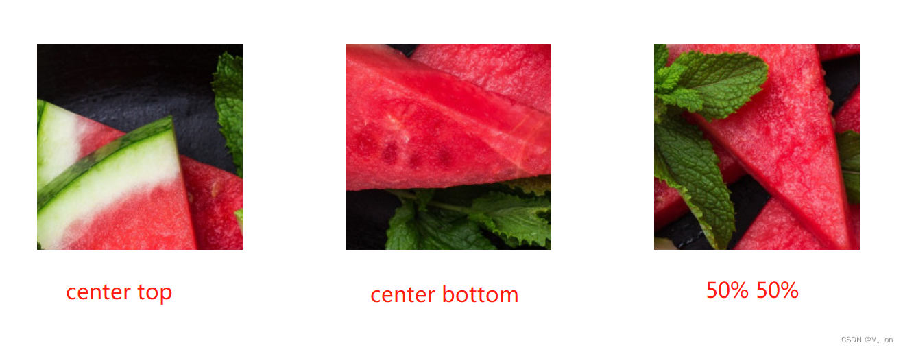
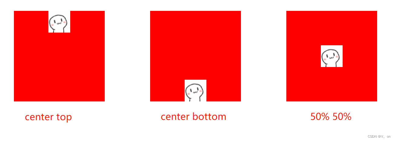
background-position
语法:background-position: x-axis y-axis;定义背景图像的位置,可以有
top、right、bottom、left、center这五个值,也可以是百分比,也可以是具体的像素,可以单一使用,也可以两两组合使用,如background-position: center top;表示将图像放在元素的垂直顶部并水平居中。.container { width: 200px; height: 200px; margin: 50px; background-image: url('https://gimg2.baidu.com/image_search/src=http%3A%2F%2Fc-ssl.duitang.com%2Fuploads%2Fitem%2F202002%2F24%2F20200224214726_ucqck.thumb.400_0.gif&refer=http%3A%2F%2Fc-ssl.duitang.com&app=2002&size=f9999,10000&q=a80&n=0&g=0n&fmt=auto?sec=1715412527&t=8b74772e8fa35ed288e50453a1eeb908'); background-color: red; background-repeat: no-repeat; } .container1 { background-position: center top; } .container2 { background-position: center bottom; } .container3 { background-position: 50% 50%; }效果如下:
.container {
    width: 200px;
    height: 200px;
    margin: 50px;
    background: red
        url('https://gimg2.baidu.com/image_search/src=http%3A%2F%2Fc-ssl.duitang.com%2Fuploads%2Fitem%2F202002%2F24%2F20200224214726_ucqck.thumb.400_0.gif&refer=http%3A%2F%2Fc-ssl.duitang.com&app=2002&size=f9999,10000&q=a80&n=0&g=0n&fmt=auto?sec=1715412527&t=8b74772e8fa35ed288e50453a1eeb908');

    background-repeat: no-repeat;
}
.container1 {
    background-position: center top;
}
.container2 {
    background-position: center bottom;
}
.container3 {
    background-position: 50% 50%;
}
如果换成一张小图:
-
background-size
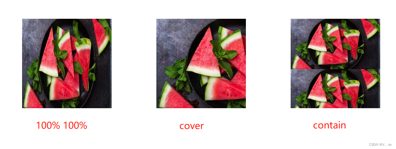
语法:属性值 描述 length 指定背景图片大小,不能为负值。 percentage 指定背景图片相对背景区的百分比。背景区由background-origin设置,默认为盒模型的内容区与内边距,也可设置为只有内容区,或者还包括边框。如果attachment 为fixed,背景区为浏览器可视区(即视口),不包括滚动条。不能为负值。 auto 以背景图片的比例缩放背景图片。 cover 缩放背景图片以完全覆盖背景区,可能背景图片部分看不见。和 contain 值相反,cover 值尽可能大的缩放背景图像并保持图像的宽高比例(图像不会被压扁)。该背景图以它的全部宽或者高覆盖所在容器。当容器和背景图大小不同时,背景图的 左/右 或者 上/下 部分会被裁剪。 contain 缩放背景图片以完全装入背景区,可能背景区部分空白。contain 尽可能的缩放背景并保持图像的宽高比例(图像不会被压缩)。该背景图会填充所在的容器。当背景图和容器的大小的不同时,容器的空白区域(上/下或者左/右)会显示由 background-color 设置的背景颜色。 background-size: size | cover | contain;设定背景图像的大小,如
background-size: 100% 100%;表示图像填充整个元素区域;background-size: cover;表示保持图像纵横比缩放至完全覆盖背景区域;background-size: contain;表示保持图像纵横比缩放至内容适合背景区域。
图片可以保有其原有的尺寸,或者拉伸到新的尺寸,或者在保持其原有比例的同时缩放到元素的可用空间的尺寸。.container { width: 200px; height: 200px; margin: 50px; background-image: url('https://fc4tn.baidu.com/it/u=2258281299,305481422&fm=202'); } .container1 { background-size: 100% 100%; } .container2 { background-size: cover; } .container3 { background-size: contain; }效果如下:
-
background-repeat属性 描述 repeat 图像会按需重复来覆盖整个背景图片所在的区域。最后一个图像会被裁剪,如果它的大小不合适的话。 no-repeat 图像不会被重复 (因为背景图像所在的区域将可能没有完全被覆盖). 那个没有被重复的背景图像的位置是由background-position属性来决定。 space 图像会尽可能得重复,但是不会裁剪。第一个和最后一个图像会被固定在元素 (element) 的相应的边上,同时空白会均匀地分布在图像之间。background-position属性会被忽视,除非只有一个图像能被无裁剪地显示。只在一种情况下裁剪会发生,那就是图像太大了以至于没有足够的空间来完整显示一个图像。 round 随着允许的空间在尺寸上的增长,被重复的图像将会伸展 (没有空隙), 直到有足够的空间来添加一个图像。当下一个图像被添加后,所有的当前的图像会被压缩来腾出空间。例如,一个图像原始大小是 260px, 重复三次之后,可能会被伸展到 300px, 直到另一个图像被加进来。这样他们就可能被压缩到 225px.译者注:关键是浏览器怎么计算什么时候应该添加一个图像进来,而不是继续伸展。 语法:
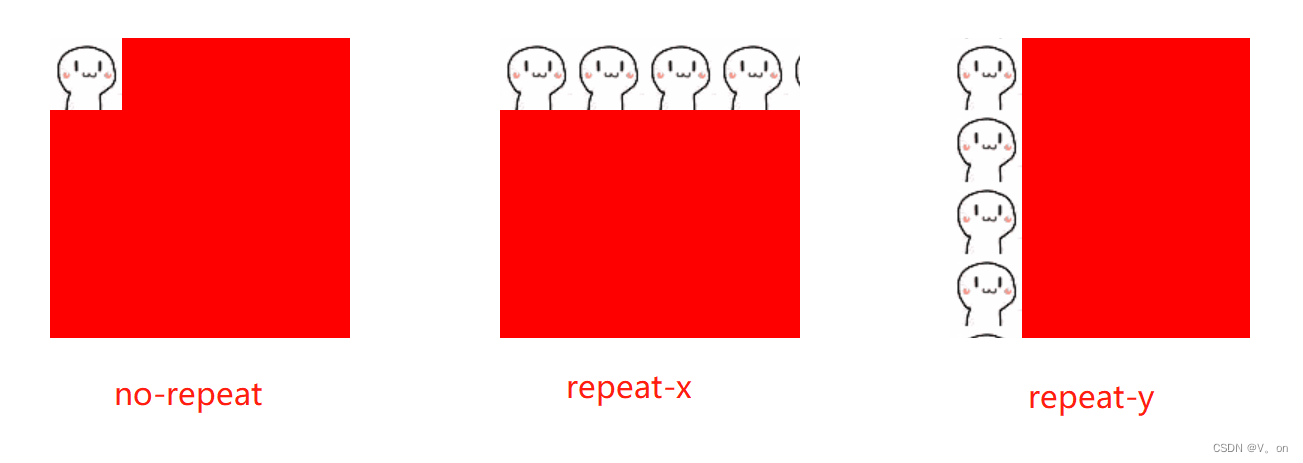
background-repeat: repeat | no-repeat | repeat-x | repeat-y | space | round;控制背景图像是否重复,如
background-repeat: no-repeat;表示背景图像不重复显示。.container { width: 200px; height: 200px; background-image: url('https://fc4tn.baidu.com/it/u=2258281299,305481422&fm=202'); background-repeat: repeat; }此时图片大小是大于容器大小的,设置重复也不会有任何效果,且默认值就是
repeat。效果同直接设置背景图片一样,效果如下:
让我们换一张小的的图片(48*48),设置同样的css,得到如下的效果:
其他属性:.container { width: 200px; height: 200px; margin: 50px; background-color: red; background-image: url('https://gimg2.baidu.com/image_search/src=http%3A%2F%2Fc-ssl.duitang.com%2Fuploads%2Fitem%2F202002%2F24%2F20200224214726_ucqck.thumb.400_0.gif&refer=http%3A%2F%2Fc-ssl.duitang.com&app=2002&size=f9999,10000&q=a80&n=0&g=0n&fmt=auto?sec=1715412527&t=8b74772e8fa35ed288e50453a1eeb908'); } .container1 { background-repeat: no-repeat; } .container2 { background-repeat: repeat-x; } .container3 { background-repeat: repeat-y; }效果如下:
-
background-attachment
语法:background-attachment: scroll | fixed | local;指定背景相对于视口还是元素内容进行滚动,如
background-attachment: fixed;表示背景图像固定不动,不会随着内容滚动。.container { width: 200px; height: 200px; overflow-x: hidden; } p { width: 200px; background-image: url('https://fc4tn.baidu.com/it/u=2258281299,305481422&fm=202'); background-attachment: scroll; }<div class="container"> <p> There were doors all round the hall, but they were all locked; and when Alice had been all the way down one side and up the other, trying every door, she walked sadly down the middle, wondering how she was ever to get out again.There were doors all round the hall, but they were all locked; and when Alice had been all the way down one side and up the other, trying every door, she walked sadly down the middle, wondering how she was ever to get out again. </p> </div>效果如下:

.container {
	width: 200px;
	height: 200px;
	overflow-x: hidden;
}
p {
	width: 200px;
	background-image: url('https://fc4tn.baidu.com/it/u=2258281299,305481422&fm=202');
	background-attachment: fixed;
}
-
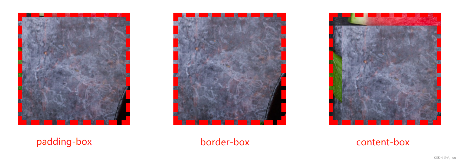
background-clip属性 描述 padding-box 背景图像绘制到内边距(padding)外沿。不会绘制到边框处。 border-box 背景图像绘制到边框处 content-box 背景图像绘制到内边距(padding)外沿。不会绘制到内边距。 text 背景图像绘制到文字中。文字渐变常用到它。 定义背景绘制的范围,语法:初始值为
border-boxbackground-clip: border-box | padding-box | content-box;.container { width: 200px; height: 200px; margin: 50px; background-color: red; padding: 20px; border: 10px dashed red; background-image: url('https://fc4tn.baidu.com/it/u=2258281299,305481422&fm=202'); } .container1 { background-clip: padding-box; } .container2 { background-clip: border-box; } .container3 { background-clip: content-box; }效果如下:

注意,如果没有设置背景图片(background-image)或背景颜色(background-color),那么这个属性只有在边框( border)被设置为非固实(soild)、透明或半透明时才能看到视觉效果(与 border-style 或 border-image 有关),否则,本属性产生的样式变化会被边框覆盖。
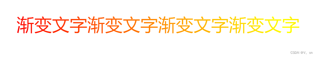
渐变文字:
.container {
    background: linear-gradient(60deg, red, yellow, red, yellow, red);
    background-clip: text;
    -webkit-background-clip: text;
    -webkit-text-fill-color: transparent;
    font-size: 40px;
    margin: 50px;
}
效果如下:
-
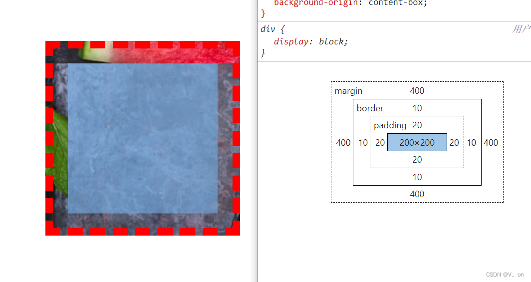
background-origin属性 描述 padding-box 背景图像的原点位置以 padding为起始border-box 背景图像的原点位置以 border为起始content-box 背景图像的原点位置以 content为起始确定背景图像的原点位置的背景相对区域,语法:初始值为
padding-boxbackground-origin: border-box | padding-box | content-box;注意,当使用 background-attachment 为 fixed 时,该属性将被忽略不起作用。
.container {
    width: 200px;
    height: 200px;
    margin: 50px;
    background-color: red;
    padding: 20px;
    border: 10px dashed red;
    background-image: url('https://fc4tn.baidu.com/it/u=2258281299,305481422&fm=202');
}
.container1 {
    background-origin: padding-box;
}
.container2 {
    background-origin: border-box;
}
.container3 {
    background-origin: content-box;
}
效果如下:
盒模型如下:


 238
238


 被折叠的 条评论
为什么被折叠?
被折叠的 条评论
为什么被折叠?
 到【灌水乐园】发言


