


 本文介绍如何为Android中的TextView自定义属性,实现不同状态下的背景切换。通过创建attrs.xml定义属性,利用TypedArray获取属性值,并在自定义View中实现状态改变时背景的更新。
有些应用场景需要我们给现有的控件增加一些属性,优雅的实现预期效果,本文简单描述自定义属性的基本使用方法。
例子:给TextView增加一个 “选中” 和 “未选中” 显示不同的背景的属性
一、写属性
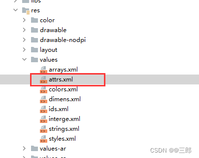
- 在values下新建一个名为attrs的xml文件。
2.在attrs.xml中定义自己的属性
<?xml version="1.0" encoding="utf-8"?>
<resources>
    <declare-styleable name="img_attr">
        <attr name="before" format="reference"/><!--未选中状态-->
        <attr name="after" format="reference"/><!--选中状态-->
    </declare-styleable>
</resources>
二、拿到属性实现功能
直接上代码:用代码说
package com.myApp.view;

import android.annotation.SuppressLint;
import android.content.Context;
import android.content.res.TypedArray;
import android.graphics.drawable.Drawable;
import android.util.AttributeSet;
import android.widget.TextView;
import androidx.annotation.Nullable;
import androidx.core.content.ContextCompat;

import com.android.launcher3.R;


@SuppressLint("AppCompatCustomView")
public class MyTextView extends TextView {

    public ColorViewL2(Context context) {
        this(context, null);
    }

    public ColorViewL2(Context context, @Nullable AttributeSet attrs) {
        this(context, attrs, 0);
    }

    protected int id_n = 0;
    protected int id_p = 0;
    public ColorViewL2(Context context, @Nullable AttributeSet attrs, int defStyleAttr) {
        super(context, attrs, defStyleAttr);
        //1. 获取属性(本教程的关键所在)
        TypedArray typedArray=context.obtainStyledAttributes(attrs, R.styleable.img_attr);
        id_n = typedArray.getResourceId(R.styleable.img_attr_before, 0);//R.styleable.父名_子名
        id_p = typedArray.getResourceId(R.styleable.img_attr_after, 0);//R.styleable.父名_子名
        setSelect(context,false);
    }


    //2。复写TextView设置背景的方法
    @Override
    public void setBackground(Drawable background) {
        super.setBackground(background);
    }

    //3. 对外public这个View动态设置背景
    public void setSelect(Context context,boolean isSelect){
        if (isSelect){
            if (id_p!=0)setBackground(ContextCompat.getDrawable(context,id_p));
        }else {
            if (id_n!=0)setBackground(ContextCompat.getDrawable(context,id_n));
        }
    }

}
三、使用方法
1. 在你的布局头部加上这样一句代码:xmlns:myattrs=“http://schemas.android.com/apk/res-auto”
2.在你的布局文件中就可以使用myattrs拿到你的定义的属性
<?xml version="1.0" encoding="utf-8"?>
<RelativeLayout xmlns:android="http://schemas.android.com/apk/res/android"
    android:layout_width="match_parent"
    android:layout_height="match_parent"
    xmlns:myattrs="http://schemas.android.com/apk/res-auto"
    android:background="@drawable/__l2__ms_pedal_switch_bg">

<com.myApp.view.MyTextView
                    android:id="@+id/colorView1"
                    android:layout_width="wrap_content"
                    android:layout_height="wrap_content"
                    android:layout_gravity="center"
                    myattrs:before="@drawable/img_1"
                    myattrs:after="@drawable/img_2" />

<com.myApp.view.MyTextView
                    android:id="@+id/colorView2"
                    android:layout_width="wrap_content"
                    android:layout_height="wrap_content"
                    android:layout_gravity="center"
                    myattrs:before="@drawable/img_3"
                    myattrs:after="@drawable/img_4" />

</RelativeLayout>
四、最终效果
MyTextView ms=(MyTextView)findViewById(R.id.colorView1);

//选中
ms.setSelect(context,true);

//不选中
ms.setSelect(context,false);
不需要你写很多setBackgrund的逻辑


 扫一扫
扫一扫


 1万+
1万+

 被折叠的 条评论
为什么被折叠?
被折叠的 条评论
为什么被折叠?
 到【灌水乐园】发言


