


目录
1 数据相关
2 时间序列中的模型(Patterns)
任何时间序列都能够被分解成下面几个部分:
B
a
s
e
L
e
v
e
l
+
T
r
e
n
d
+
S
e
a
s
o
n
a
l
i
t
y
+
E
r
r
o
r
Base Level + Trend + Seasonality + Error
BaseLevel+Trend+Seasonality+Error
Additive time series:
V
a
l
u
e
=
B
a
s
e
L
e
v
e
l
+
T
r
e
n
d
+
S
e
a
s
o
n
a
l
i
t
y
+
E
r
r
o
r
Value = Base Level + Trend + Seasonality + Error
Value=BaseLevel+Trend+Seasonality+Error
Multiplicative Time Series:
V
a
l
u
e
=
B
a
s
e
L
e
v
e
l
∗
T
r
e
n
d
∗
S
e
a
s
o
n
a
l
i
t
y
∗
E
r
r
o
r
Value = Base Level * Trend * Seasonality * Error
Value=BaseLevel∗Trend∗Seasonality∗Error
3 如何分解时间序列中的各个成分
我们可以将一个时间序列看成是由base level,trend,seasonal index,the residual 这些成分组成的Additive time series 或 Multiplicative Time Series,从而使用传统的分解方法。
我们可以使用statsmodels 库里的seasonal_decompose() 函数来进行分解。
from statsmodels.tsa.seasonal import seasonal_decompose
from dateutil.parser import parse

# Import Data
df = pd.read_csv('https://raw.githubusercontent.com/selva86/datasets/master/a10.csv', parse_dates=['date'], index_col='date')

# Multiplicative Decomposition
result_mul = seasonal_decompose(df['value'], model='multiplicative', extrapolate_trend='freq')

# Additive Decomposition
result_add = seasonal_decompose(df['value'], model='additive', extrapolate_trend='freq')

# Plot
plt.rcParams.update({'figure.figsize': (10,10)})
result_mul.plot().suptitle('Multiplicative Decompose', fontsize=22)
result_add.plot().suptitle('Additive Decompose', fontsize=22)
plt.show()
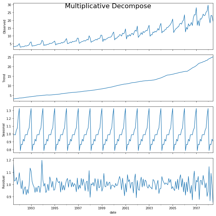
# Extract the Components ----
# Actual Values = Product of (Seasonal * Trend * Resid)
df_reconstructed = pd.concat([result_mul.seasonal, result_mul.trend, result_mul.resid, result_mul.observed], axis=1)
df_reconstructed.columns = ['seas', 'trend', 'resid', 'actual_values']
df_reconstructed.head()
[output]:
ADF Statistic: 3.1451856893067434
p-value: 1.0
Critial Values:
   1%, -3.465620397124192
Critial Values:
   5%, -2.8770397560752436
Critial Values:
   10%, -2.5750324547306476

KPSS Statistic: 1.313675
p-value: 0.010000
Critial Values:
   10%, 0.347
Critial Values:
   5%, 0.463
Critial Values:
   2.5%, 0.574
Critial Values:
   1%, 0.739
4 平稳与不平稳时间序列
4.1 这些数据有什么明显的特点?
4.2 为什么要在预测前把序列变成平稳的?
最简单的原因是:平稳序列的预测更简单,而且预测结果更可靠。
一个重要原因是:自回归预测模型是一种线性模型,它会用到序列自身作为预测因子(Predictors),也就是自变量。我们知道,线性回归当自变量彼此之间没有相关关系的时候,表现最好。因此,我们需要让序列中的每个因素相互独立。
4.3 如何对平稳性进行测试
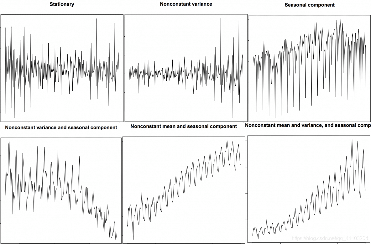
第一种方法:可视化。平稳序列就像之前的图片中展示的那样;非平稳序列同样。
第二种方法:将序列且分成2 或多个相邻的序列,然后计算每个序列的统计量,比如均值、方差,自相关系数。如果每段的这些统计量差别很大,那么这个序列很可能是非平稳的。
第三种方法:ADH Test
4.4 白噪音和平稳序列的区别
- 相同:关于时间的函数,均值和方差都不会随时间变化。
- 不同:关于0 均值的完全随机的波动。
5 如何去掉时间序列中的趋势
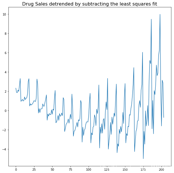
- 用观测数据减去拟合的趋势线。拟合的趋势线可能包含一个线性回归的模型,该模型的一个自变量是时间戳数据。更复杂的趋势,我们可以考虑加入二次项。
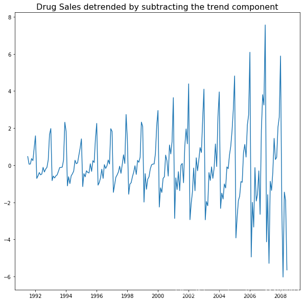
- 第2节中,用观测数据减去分解的时间序列中的趋势部分。
- 减去均值。
- 应用滤波器。比如Baxter-King filter(statsmodels.tsa.filters.bkfilter)
前两种方法如下所示。
# Using scipy: Subtract the line of best fit
from scipy import signal
df = pd.read_csv('https://raw.githubusercontent.com/selva86/datasets/master/a10.csv', parse_dates=['date'])
detrended = signal.detrend(df.value.values)
plt.plot(detrended)
plt.title('Drug Sales detrended by subtracting the least squares fit', fontsize=16)
# Using statmodels: Subtracting the Trend Component.
from statsmodels.tsa.seasonal import seasonal_decompose
df = pd.read_csv('https://raw.githubusercontent.com/selva86/datasets/master/a10.csv', parse_dates=['date'], index_col='date')
result_mul = seasonal_decompose(df['value'], model='multiplicative', extrapolate_trend='freq')
detrended = df.value.values - result_mul.trend
plt.plot(detrended)
plt.title('Drug Sales detrended by subtracting the trend component', fontsize=16)
6 如何去掉时间序列中的季节
- 用和季节长度一致的窗口进行滑动平均。
- 用观测数据减去前一季节数据。
- Divide the series by the seasonal index obtained from STL decomposition
# Subtracting the Trend Component.
df = pd.read_csv('https://raw.githubusercontent.com/selva86/datasets/master/a10.csv', parse_dates=['date'], index_col='date')
# Time Series Decomposition
result_mul = seasonal_decompose(df['value'], model='multiplicative', extrapolate_trend='freq')
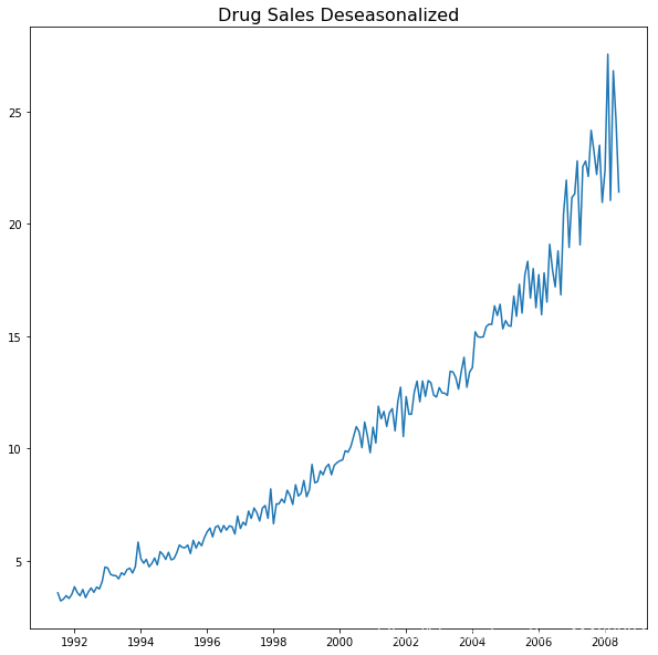
# Deseasonalize
deseasonalized = df.value.values / result_mul.seasonal
# Plot
plt.plot(deseasonalized)
plt.title('Drug Sales Deseasonalized', fontsize=16)
plt.plot()
6.1 怎么测试序列中的季节性?
如果我们想要对季节性更精准的检测,那么就是用Autocorrelation Function (ACF) plot。当ACF 中有很强的季节性模式,ACF plot 通常会表现出明显的按照季节规律的峰值。
比如在我们的数据(Drug Sales)中,我们能够发现每年的季节性,12th,24th,36th……
7 缺失值的处理
如果数据测量值本身为0,这种情况只需要填充0。
如果是数据缺失的情况,对于平稳序列,那么一般可以填充均值;对于非平稳序列,我们不应该用均值,比较简单粗暴的办法是填充前一个观测值。
有几种比较有效的办法:
- 向后填充法
- 线性插值法??
- 二次插值法??
- 最近邻均值法
- 季节均值法
为了评估缺失值的填充效果,我在时间序列中手动加入缺失值,用以上几种方法对其进行填充,然后计算填充后的序列与原序列的均方误差。
# # Generate dataset
from scipy.interpolate import interp1d
from sklearn.metrics import mean_squared_error
df_orig = pd.read_csv(r'D:\jupyter files\data_practice_python\a10.csv', parse_dates=['date'], index_col='date')
df = pd.read_csv(r'D:\jupyter files\data_practice_python\a10_missings.csv', parse_dates=['date'], index_col='date')

fig, axes = plt.subplots(7, 1, sharex=True, figsize=(10, 12))
plt.rcParams.update({'xtick.bottom' : False})

## 1. Actual -------------------------------
df_orig.plot(title='Actual', ax=axes[0], label='Actual', color='red', style=".-")
df.plot(title='Actual', ax=axes[0], label='Actual', color='green', style=".-")
axes[0].legend(["Missing Data", "Available Data"])

## 2. Forward Fill --------------------------
df_ffill = df.ffill()
error = np.round(mean_squared_error(df_orig['value'], df_ffill['value']), 2)
df_ffill['value'].plot(title='Forward Fill (MSE: ' + str(error) +")", ax=axes[1], label='Forward Fill', style=".-")

## 3. Backward Fill -------------------------
df_bfill = df.bfill()
error = np.round(mean_squared_error(df_orig['value'], df_bfill['value']), 2)
df_bfill['value'].plot(title="Backward Fill (MSE: " + str(error) +")", ax=axes[2], label='Back Fill', color='firebrick', style=".-")

## 4. Linear Interpolation ------------------
df['rownum'] = np.arange(df.shape[0])
df_nona = df.dropna(subset = ['value'])
f = interp1d(df_nona['rownum'], df_nona['value'])
df['linear_fill'] = f(df['rownum'])
error = np.round(mean_squared_error(df_orig['value'], df['linear_fill']), 2)
df['linear_fill'].plot(title="Linear Fill (MSE: " + str(error) +")", ax=axes[3], label='Cubic Fill', color='brown', style=".-")

## 5. Cubic Interpolation --------------------
f2 = interp1d(df_nona['rownum'], df_nona['value'], kind='cubic')
df['cubic_fill'] = f2(df['rownum'])
error = np.round(mean_squared_error(df_orig['value'], df['cubic_fill']), 2)
df['cubic_fill'].plot(title="Cubic Fill (MSE: " + str(error) +")", ax=axes[4], label='Cubic Fill', color='red', style=".-")

# Interpolation References:
# https://docs.scipy.org/doc/scipy/reference/tutorial/interpolate.html
# https://docs.scipy.org/doc/scipy/reference/interpolate.html

# ## 6. Mean of 'n' Nearest Past Neighbors ------
# def knn_mean(ts, n):
#     out = np.copy(ts)
#     for i, val in enumerate(ts):
#         if np.isnan(val):
#             n_by_2 = np.ceil(n/2)
#             lower = np.max([0, int(i-n_by_2)])
#             upper = np.min([len(ts)+1, int(i+n_by_2)])
#             ts_near = np.concatenate([ts[lower:i], ts[i:upper]])
#             out[i] = np.nanmean(ts_near)
#     return out

# df['knn_mean'] = knn_mean(df.value.values, 8)
# error = np.round(mean_squared_error(df_orig['value'], df['knn_mean']), 2)
# df['knn_mean'].plot(title="KNN Mean (MSE: " + str(error) +")", ax=axes[5], label='KNN Mean', color='tomato', alpha=0.5, style=".-")

## 7. Seasonal Mean ----------------------------
def seasonal_mean(ts, n, lr=0.7):
    """
    Compute the mean of corresponding seasonal periods
    ts: 1D array-like of the time series
    n: Seasonal window length of the time series
    """
    out = np.copy(ts)
    for i, val in enumerate(ts):
        if np.isnan(val):
            ts_seas = ts[i-1::-n]  # previous seasons only
            if np.isnan(np.nanmean(ts_seas)):
                ts_seas = np.concatenate([ts[i-1::-n], ts[i::n]])  # previous and forward
            out[i] = np.nanmean(ts_seas) * lr
    return out

df['seasonal_mean'] = seasonal_mean(df.value, n=12, lr=1.25)
error = np.round(mean_squared_error(df_orig['value'], df['seasonal_mean']), 2)
df['seasonal_mean'].plot(title="Seasonal Mean (MSE: " + str(error) +")", ax=axes[6], label='Seasonal Mean', color='blue', alpha=0.5, style=".-")
8 自相关和偏自相关函数
8.1 概念
详见 https://blog.csdn.net/qq_41103204/article/details/105810742
from statsmodels.tsa.stattools import acf, pacf
from statsmodels.graphics.tsaplots import plot_acf, plot_pacf

df = pd.read_csv('https://raw.githubusercontent.com/selva86/datasets/master/a10.csv')

# Calculate ACF and PACF upto 50 lags
# acf_50 = acf(df.value, nlags=50)
# pacf_50 = pacf(df.value, nlags=50)

# Draw Plot
fig, axes = plt.subplots(1,2,figsize=(16,3), dpi= 100)
plot_acf(df.value.tolist(), lags=50, ax=axes[0])
plot_pacf(df.value.tolist(), lags=50, ax=axes[1])
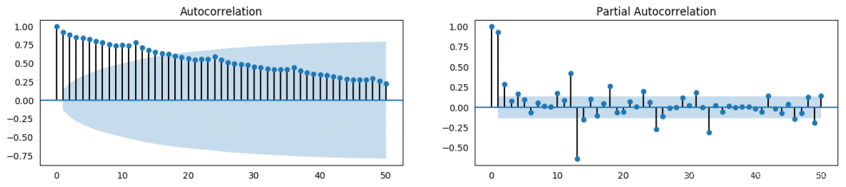
8.2 如何计算偏自相关系数?
序列滞后 k k k 处的偏自相关系数是 y y y 的自回归方程的滞后系数。 y y y 的自回归方程是指 y y y 以自己的滞后作为预测因子的线性回归。
举个例子,如果 y t y_{t} yt 为当前序列, y t − 1 y_{t-1} yt−1 即为滞后期为1 的 y y y 值,那么滞后期为 3 处 y t − 3 y_{t-3} yt−3 的偏自相关系数是下面方程中的 α 3 \alpha_{3} α3 。
y t = α 0 + α 1 y t − 1 + α 2 y t − 2 + α 3 y t − 3 y_{t} = \alpha_{0} + \alpha_{1} y_{t-1} + \alpha_{2} y_{t-2} + \alpha_{3} y_{t-3} yt=α0+α1yt−1+α2yt−2+α3yt−3
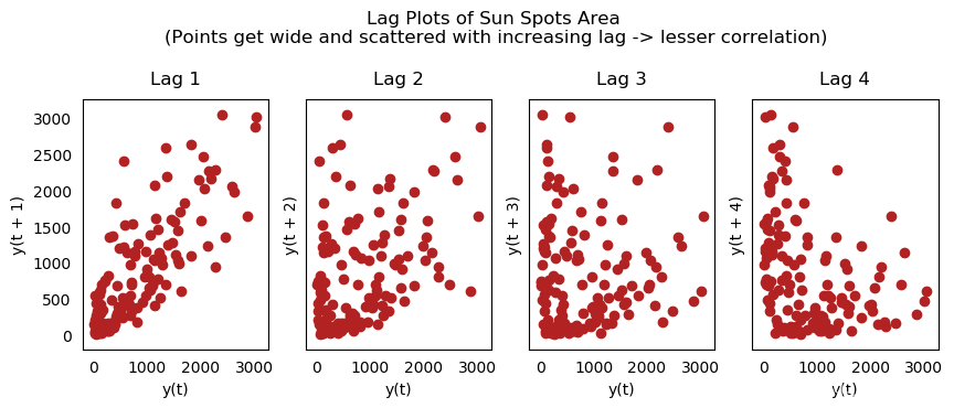
8.3 滞后图
滞后图是时间序列与自身滞后的分布图,通常用来检验自相关性。如果序列中出现下图中的模式,那么说明该序列具有自相关性。如果没有出现这些模型,该序列很可能为随机白噪声。
在下面太阳黑子区的例子中,随着滞后期的增长,图中的点越来越分散。
from pandas.plotting import lag_plot
plt.rcParams.update({'ytick.left' : False, 'axes.titlepad':10})

# Import
ss = pd.read_csv('https://raw.githubusercontent.com/selva86/datasets/master/sunspotarea.csv')
a10 = pd.read_csv('https://raw.githubusercontent.com/selva86/datasets/master/a10.csv')

# Plot
fig, axes = plt.subplots(1, 4, figsize=(10,3), sharex=True, sharey=True, dpi=100)
for i, ax in enumerate(axes.flatten()[:4]):
    lag_plot(ss.value, lag=i+1, ax=ax, c='firebrick')
    ax.set_title('Lag ' + str(i+1))

fig.suptitle('Lag Plots of Sun Spots Area \n(Points get wide and scattered with increasing lag -> lesser correlation)\n', y=1.15)

fig, axes = plt.subplots(1, 4, figsize=(10,3), sharex=True, sharey=True, dpi=100)
for i, ax in enumerate(axes.flatten()[:4]):
    lag_plot(a10.value, lag=i+1, ax=ax, c='firebrick')
    ax.set_title('Lag ' + str(i+1))

fig.suptitle('Lag Plots of Drug Sales', y=1.05)
plt.show()
9 如何评估时间序列的可预测性?
一个时间序列的模式越有规律,就越容易预测。可以用近似熵来量化时间序列的规律性和波动的不可预测性。近似熵越高,意味着预测难度越大。
另一个选择是样本熵。样本熵与近似熵类似,但在不同的复杂度上更具有一致性,即使是小型时间序列。例如,相比于“有规律”的时间序列,一个数据点较少的随机时间序列的近似熵较低,但一个较长的随机时间序列却有较高的近似熵。因此,样本熵更适于解决该问题。
10 为什么要对时间序列做平滑处理?如果操作?
对时间序列做平滑处理有以下几个用处:
- 减少噪声影响,从而得到过滤掉噪声的、更加真实的序列。
- 平滑处理后的序列可用作特征,更好地解释序列本身。
- 可以更好地观察序列本身的趋势。
那么如果进行平滑处理呢?现讨论以下几种方法:
- 取移动平均线
- 做 LOESS 平滑(局部回归)
- 做 LOWESS 平滑(局部加权回归)
移动平均是指对一个滚动的窗口计算其平均值,该窗口的宽度固定不变。但你必须谨慎选择窗口宽度,因为窗口过宽会导致序列平滑过度。例如,如果窗口宽度等于季节长度,就会消除掉季节因素的作用。
LOESS 是 Localized regression 的缩写,该方法会在每个点的局部近邻点做多次回归拟合。此处可以使用 statsmodels 包,你可以使用参数 frac 控制平滑程度,即决定周围多少个点参与回归模型的拟合。
11 如何用格兰杰因果关系检验判断一个序列能否预测另一个?
该检验基于一个假设,即 X 导致了 Y 的发生,那么基于 Y 的先前值与 X 的先前值得到的 Y 的预测值,要优于仅根据 Y 本身得到的预测值。
statsmodels 包提供了便捷的检验方法。它可以接受一个二维数组,其中第一列为值,第二列为预测因子。
零假设为:第二列的序列与第一列不存在格兰杰因果关系。如果 P 值小于显著性水平 0.05,就可以拒绝零假设,从而知道 X 的滞后是起作用的。
第二个参数 maxlag 表示该检验中涉及了 Y 的多少个滞后期。
from statsmodels.tsa.stattools import grangercausalitytests
df = pd.read_csv('https://raw.githubusercontent.com/selva86/datasets/master/a10.csv', parse_dates=['date'])
df['month'] = df.date.dt.month
grangercausalitytests(df[['value', 'month']], maxlag=2)
参考资料:
https://www.machinelearningplus.com/time-series/time-series-analysis-python/


 被折叠的 条评论
为什么被折叠?
被折叠的 条评论
为什么被折叠?
 到【灌水乐园】发言


