


样式资源代码
<Style x:Key="CheckBoxColor" TargetType="{x:Type CheckBox}">
<Setter Property="Template">
<Setter.Value>
<ControlTemplate TargetType="{x:Type CheckBox}">
<Border x:Name="ForegroundPanel" CornerRadius="2" BorderBrush="#d4d5d5" Padding="0" Margin="0,0,32,1">
<StackPanel Orientation="Horizontal">
<Border x:Name="CheckFlag" VerticalAlignment="Center" CornerRadius="2" Margin="2,0,0,0" BorderThickness="1" Width="15" Height="15">
<Path x:Name="CheckMark" StrokeThickness="3" Stroke="White"></Path>
</Border>
<TextBlock x:Name="tbContent" VerticalAlignment="Center" Margin="2,0" Text="{TemplateBinding Content}" FontSize="18"/>
</StackPanel>
</Border>
<ControlTemplate.Triggers>
<Trigger Property="IsChecked" Value="True">
<Setter TargetName="CheckFlag" Property="Background" Value="#559800"></Setter>
</Trigger>
<Trigger Property="IsChecked" Value="False">
<Setter TargetName="CheckFlag" Property="Background" Value="#F64708"></Setter>
</Trigger>
</ControlTemplate.Triggers>
</ControlTemplate>
</Setter.Value>
</Setter>
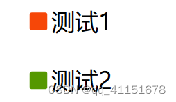
</Style>主界面Checkbox控件对样式引用代码:
<CheckBox Content="测试1" Style="{StaticResource CheckBoxColor}"/>
<CheckBox Content="测试2" IsChecked="True" Style="{StaticResource CheckBoxColor}"/>
运行界面


 1949
1949


 被折叠的 条评论
为什么被折叠?
被折叠的 条评论
为什么被折叠?
 到【灌水乐园】发言


