C# WPF下自定义ComboBox背景、边线、颜色等代码实现

本文介绍了一个自定义WPF ComboBox样式的实例,详细展示了如何通过XAML实现ComboBox的外观定制,包括下拉按钮、项样式及弹出窗口等。
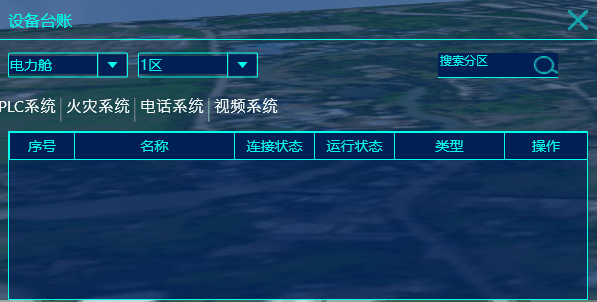
整体效果如下


xaml中类型代码:

<!--Combox右侧下拉按钮-->
        <Style TargetType="ToggleButton" x:Key="ComboxStyleBtn">
            <Setter Property="Template">
                <Setter.Value>
                    <ControlTemplate>
                        <!--下拉按钮内部背景色-->
                        <Border x:Name="Back" Background="#001f55" BorderThickness="1" BorderBrush="Transparent">
                            <!--下拉按钮内边框-->
                            <Path Name="PathFill" Fill="#03ffea"  Width="10" Height="6" StrokeThickness="0" Data="M5,0 L10,10 L0,10 z" RenderTransformOrigin="0.5,0.5" Stretch="Fill">
                                <Path.RenderTransform>
                                    <TransformGroup>
                                        <ScaleTransform/>
                                        <SkewTransform/>
                                        <RotateTransform Angle="180"/>
                                        <TranslateTransform/>
                                    </TransformGroup>
                                </Path.RenderTransform>
                            </Path>
                        </Border>
                        <ControlTemplate.Triggers>
                            <Trigger Property="IsMouseOver" Value="True">
                                <Setter TargetName="PathFill" Property="Fill" Value="White"></Setter>
                                <Setter TargetName="Back" Property="Background" Value="#00CA4F"></Setter>
                                <Setter TargetName="Back" Property="BorderBrush" Value="#59CA4F"></Setter>
                            </Trigger>
                        </ControlTemplate.Triggers>
                    </ControlTemplate>
                </Setter.Value>
            </Setter>
        </Style>
        <!--Combox-->
        <Style TargetType="ComboBox" x:Key="ComboBoxStyle">
            <Setter Property="ItemContainerStyle">
                <Setter.Value>
                    <!--ComBoxItem-->
                    <Style TargetType="ComboBoxItem">
                        <Setter Property="MinHeight" Value="22"></Setter>
                        <Setter Property="MinWidth" Value="60"></Setter>
                        <Setter Property="Template">
                            <Setter.Value>
                                <ControlTemplate TargetType="ComboBoxItem">
                                    <Border Name="Back" Background="Transparent"  BorderThickness="0,0,0,0" BorderBrush="#81D779" >
                                        <ContentPresenter ContentSource="{Binding Source}" VerticalAlignment="Center" HorizontalAlignment="Left" Margin="10,0,0,0" ></ContentPresenter>
                                    </Border>
                                    <ControlTemplate.Triggers>
                                        <Trigger Property="IsMouseOver" Value="True">
                                            <Setter TargetName="Back" Property="Background" Value="LightGray"></Setter>
                                        </Trigger>
                                        <!--下拉框背景色-->
                                        <Trigger Property="IsHighlighted" Value="True">
                                            <Setter TargetName="Back" Property="Background" Value="#ff0000"></Setter>
                                        </Trigger>
                                    </ControlTemplate.Triggers>
                                </ControlTemplate>
                            </Setter.Value>
                        </Setter>
                    </Style>
                </Setter.Value>
            </Setter>
            <Setter Property="Template">
                <Setter.Value>
                    <ControlTemplate TargetType="ComboBox">
                        <Grid>
                            <Grid.ColumnDefinitions>
                                <ColumnDefinition Width="0.7*"/>
                                <ColumnDefinition Width="0.3*" MaxWidth="30"/>
                            </Grid.ColumnDefinitions>
                            <!--文字区域背景和边线样式-->
                            <TextBox Background="#001f55" VerticalAlignment="Center"  Grid.Column="0" Foreground="#03ffea" BorderBrush="#03ffea" BorderThickness="0" IsReadOnly="{TemplateBinding IsReadOnly}" Text="{TemplateBinding Text}"></TextBox>
                            <Border  Grid.Column="0" BorderThickness="1" BorderBrush="#03ffea" CornerRadius="1,0,0,1">

                            </Border>
                            <!--右侧下拉button设置-->
                            <Border Grid.Column="1" BorderThickness="0,1,1,1" BorderBrush="#03ffea" CornerRadius="0,1,1,0">
                                <ToggleButton BorderThickness="3" BorderBrush="#03ffea" Style="{StaticResource ComboxStyleBtn}" IsChecked="{Binding Path=IsDropDownOpen, Mode=TwoWay, RelativeSource={RelativeSource TemplatedParent}}" ClickMode="Press"></ToggleButton>
                            </Border>
                            <!--弹出popup整体设置-->
                            <Popup IsOpen="{TemplateBinding IsDropDownOpen}" Placement="Bottom" x:Name="Popup" Focusable="False" AllowsTransparency="True" PopupAnimation="Slide" >
                                <!--弹出popup边框-->
                                <Border CornerRadius="1" BorderBrush="#03ffea" BorderThickness="1,0,1,1" MaxHeight="{TemplateBinding MaxDropDownHeight}" MinWidth="{TemplateBinding ActualWidth}" x:Name="DropDown" SnapsToDevicePixels="True">
                                    <Border.Effect>
                                        <DropShadowEffect Color="Black" BlurRadius="2" ShadowDepth="0" Opacity="1"/>
                                    </Border.Effect>
                                    <!--下拉幕布边界背景设置 MaxHeight="{TemplateBinding MaxDropDownHeight}"-->
                                    <ScrollViewer Margin="0,0,0,0"   SnapsToDevicePixels="True" HorizontalScrollBarVisibility="Auto" VerticalScrollBarVisibility="Auto" BorderBrush="#17acae" BorderThickness="2" >
                                        <!-- StackPanel 用于显示子级,方法是将 IsItemsHost 设置为 True -->
                                        <StackPanel IsItemsHost="True" KeyboardNavigation.DirectionalNavigation="Contained" Background="#001f55" />
                                    </ScrollViewer>
                                </Border>
                            </Popup>
                        </Grid>
                    </ControlTemplate>
                </Setter.Value>
            </Setter>
        </Style>


C# WPF自定义 `ComboBox` 控件并设置字体颜色(Foreground)为白色,可以通过多种方式实现。以下是几种常用的方法: ### 方法一:直接在 XAML 中设置 Foreground 属性 可以在 XAML 中直接对 `ComboBox` 设置 `Foreground="White"` 属性,这样会应用到整个控件的文本颜色上: ```xml <ComboBox Foreground="White"> <ComboBoxItem Content="Item 1" /> <ComboBoxItem Content="Item 2" /> <ComboBoxItem Content="Item 3" /> </ComboBox> ``` ### 方法二:通过样式(Style)统一设置 如果希望在整个应用程序中统一设置 `ComboBox` 的字体颜色,可以使用 `Style` 来定义默认外观。可以将以下代码放在 `App.xaml` 或某个窗口的资源中: ```xml <Style TargetType="ComboBox"> <Setter Property="Foreground" Value="White" /> </Style> ``` ### 方法三:自定义控件并重写默认样式 如果需要更深层次的自定义,比如创建一个继承自 `ComboBox` 的自定义控件,并为其定义默认样式,可以按照以下步骤操作: #### 1. 创建自定义 ComboBox 类 ```csharp public class CustomComboBox : ComboBox { static CustomComboBox() { DefaultStyleKeyProperty.OverrideMetadata(typeof(CustomComboBox), new FrameworkPropertyMetadata(typeof(CustomComboBox))); } } ``` #### 2. 在 XAML 中定义默认样式 在 `Generic.xaml` 文件中定义该控件的默认样式,并设置 `Foreground="White"`: ```xml <Style TargetType="{x:Type local:CustomComboBox}"> <Setter Property="Foreground" Value="White" /> <Setter Property="Template"> <Setter.Value> <ControlTemplate TargetType="{x:Type local:CustomComboBox}"> <!-- 自定义模板内容 --> <Border Background="{TemplateBinding Background}" BorderBrush="{TemplateBinding BorderBrush}" BorderThickness="{TemplateBinding BorderThickness}"> <ContentPresenter /> </Border> </ControlTemplate> </Setter.Value> </Setter> </Style> ``` ### 方法四:通过绑定动态设置 Foreground 如果希望字体颜色根据某些条件动态变化,可以使用数据绑定: ```xml <ComboBox Foreground="{Binding SelectedItemColor, RelativeSource={RelativeSource Self}}" /> ``` 并在后台代码实现 `SelectedItemColor` 属性,返回 `SolidColorBrush` 类型的值,例如 `Brushes.White`。 ### 注意事项 - 如果 `ComboBoxItem` 的 `Foreground` 没有生效,可能是因为 `ComboBoxItem` 的默认样式覆盖了父控件的设置。此时需要显式地为 `ComboBoxItem` 设置 `Foreground`,或在样式中使用 `ItemContainerStyle`。 - 使用 `ControlTemplate` 可以完全自定义控件的外观行为,但需要熟悉 WPF 的模板机制。 通过上述方法之一,可以轻松实现自定义 `ComboBox` 并将其字体颜色设置为白色。
评论 4
添加红包

请填写红包祝福语或标题

红包个数最小为10个

红包金额最低5元

当前余额3.43前往充值 >
需支付:10.00
成就一亿技术人!
领取后你会自动成为博主和红包主的粉丝 规则
hope_wisdom
发出的红包

打赏作者

凡梦_

你的鼓励将是我创作的最大动力

¥1 ¥2 ¥4 ¥6 ¥10 ¥20
扫码支付:¥1
获取中
扫码支付

您的余额不足,请更换扫码支付或充值

打赏作者

实付
使用余额支付
点击重新获取
扫码支付
钱包余额 0

抵扣说明:

1.余额是钱包充值的虚拟货币,按照1:1的比例进行支付金额的抵扣。
2.余额无法直接购买下载,可以购买VIP、付费专栏及课程。

余额充值