


本文首发于“生信补给站”公众号,https://mp.weixin.qq.com/s/zdSit97SOEpbnR18ARzixw
更多关于R语言,ggplot2绘图,生信分析的内容,敬请关注小号。
ggstatsplot是ggplot2包的扩展包,可以同时输出美观的图片和统计分析结果,对于经常做统计分析或者生信人来说非常有用。
一 准备数据
比奇小说网 m.biqi.orggapminder 数据集包含1952到2007年间(5年间隔)的142个国家的life expectancy, GDP per capita, 和 population信息
#载入绘图R包
library(ggstatsplot)
#载入gapminder 数据集
library(gapminder)
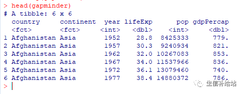
head(gapminder)
二 ggbetweenstats 绘图
1 基本绘图展示
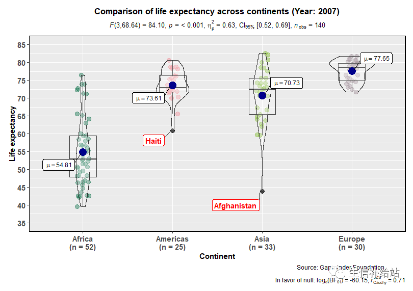
显示2007年每个continent的预期寿命分布情况,并统计一下不同大陆之间平均预期寿命的是否有差异?差异是否显著?
#设置种子方便复现
set.seed(123)
# Oceania数据太少,去掉后分析
ggstatsplot::ggbetweenstats(
  data = dplyr::filter(
    .data = gapminder::gapminder,
    year == 2007, continent != "Oceania"
 ),
  x = continent,
  y = lifeExp,
  nboot = 10,
  messages = FALSE
)
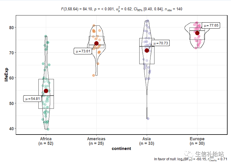
可以看到图中展示出了2007年每个continent的预期寿命分布的箱线图,点图和小提琴图,均值,样本数;并且图形最上方给出了模型的一些统计量信息(整体)。
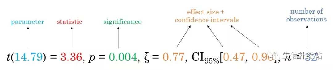
统计信息意义如下图所示:
注:该函数根据分组变量中的个数自动决定是选择独立样本t检验(2组)还是单因素方差分析(3组或更多组)
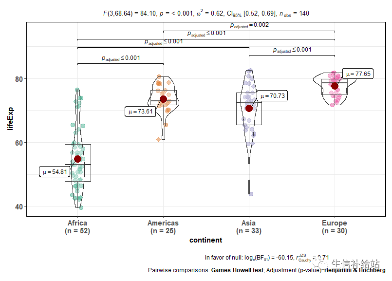
2 添加统计值
上方给出了整体的检验P值,下面两两之间比较,并添加检验统计量
set.seed(123)
ggstatsplot::ggbetweenstats(
data = dplyr::filter(
.data = gapminder::gapminder,year == 2007, continent != "Oceania"),
x = continent,y = lifeExp,
nboot = 10,
messages = FALSE,
effsize.type = "unbiased", # type of effect size (unbiased = omega)
partial = FALSE, # partial omega or omega?
pairwise.comparisons = TRUE, # display results from pairwise comparisons
pairwise.display = "significant", # display only significant pairwise comparisons
pairwise.annotation = "p.value", # annotate the pairwise comparisons using p-values
p.adjust.method = "fdr", # adjust p-values for multiple tests using this method
)
3 图形美化
#添加标题和说明,x轴和y轴标签,标记,离群值,更改主题以及调色板。
set.seed(123)
# plot
gapminder %>% # dataframe to use
ggstatsplot::ggbetweenstats(
data = dplyr::filter(.data = ., year == 2007, continent != "Oceania"),
x = continent, # grouping/independent variable
y = lifeExp, # dependent variables
xlab = "Continent", # label for the x-axis
ylab = "Life expectancy", # label for the y-axis
plot.type = "boxviolin", # type of plot ,"box", "violin", or "boxviolin"
type = "parametric", # type of statistical test , p (parametric), np ( nonparametric), r(robust), bf (Bayes Factor).
effsize.type = "biased", # type of effect size
nboot = 10, # number of bootstrap samples used
bf.message = TRUE, # display bayes factor in favor of null hypothesis
outlier.tagging = TRUE, # whether outliers should be flagged
outlier.coef = 1.5, # coefficient for Tukey's rule
outlier.label = country, # label to attach to outlier values
outlier.label.color = "red", # outlier point label color
mean.plotting = TRUE, # whether the mean is to be displayed
mean.color = "darkblue", # color for mean
messages = FALSE, # turn off messages
ggtheme = ggplot2::theme_gray(), # a different theme
package = "yarrr", # package from which color palette is to be taken
palette = "info2", # choosing a different color palette
title = "Comparison of life expectancy across continents (Year: 2007)",
caption = "Source: Gapminder Foundation"
) + # modifying the plot further
ggplot2::scale_y_continuous(
limits = c(35, 85),
breaks = seq(from = 35, to = 85, by = 5)
)
三 其他绘图函数
| Function | Plot | Description |
|---|---|---|
ggbetweenstats | violin plots | for comparisons between groups/conditions |
ggwithinstats | violin plots | for comparisons within groups/conditions |
gghistostats | histograms | for distribution about numeric variable |
ggdotplotstats | dot plots/charts | for distribution about labeled numeric variable |
ggpiestats | pie charts | for categorical data |
ggbarstats | bar charts | for categorical data |
ggscatterstats | scatterplots | for correlations between two variables |
ggcorrmat | correlation matrices | for correlations between multiple variables |
ggcoefstats | dot-and-whisker plots | for regression models |
四 更多请参照官方文档
https://indrajeetpatil.github.io/ggstatsplot/index.html
◆ ◆ ◆ ◆ ◆
R|生存分析(1):生存分析介绍以及绘制KM曲线
Nomogram(诺莫图) | Logistic、Cox生存分析结果可视化
Forest plot(森林图) | Cox生存分析可视化
maftools|TCGA肿瘤突变数据的汇总,分析和可视化
maftools | 从头开始绘制发表级oncoplot(瀑布图)
ggalluvial|炫酷桑基图(Sankey),你也可以秀
ggplot2|详解八大基本绘图要素
ggplot2|ggpubr进行“paper”组图合并
pheatmap|暴雨暂歇,“热图”来袭!!!
ggplot2-plotly|让你的火山图“活”过来
ggplot2| 绘制KEGG气泡图
ggplot2|绘制GO富集柱形图
绘图系列|R-corrplot相关图
绘图系列|R-VennDiagram包绘制韦恩图
R|clusterProfiler-富集分析
【觉得不错,右下角点个“在看”,期待您的转发,谢谢!】


 被折叠的 条评论
为什么被折叠?
被折叠的 条评论
为什么被折叠?
 到【灌水乐园】发言


