


椭圆旋转功能展示
transform-style: preserve-3d;(
主要css代码)
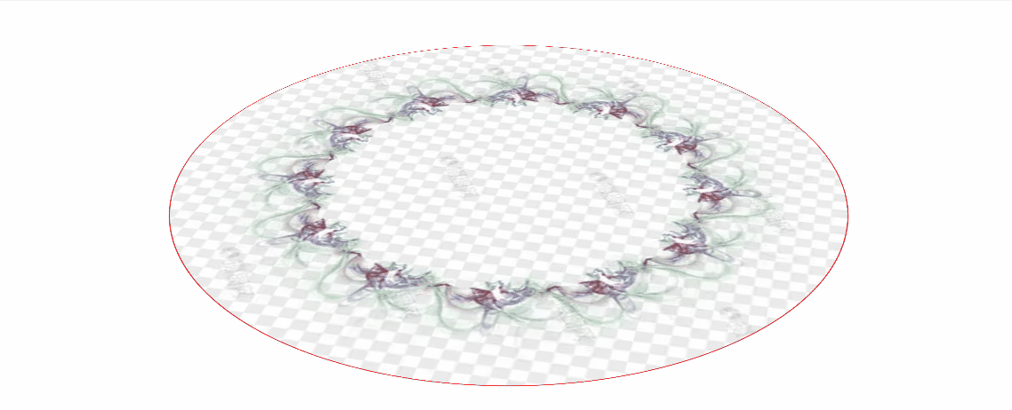
gif示例(背景图可插入透明以此实现边框线的旋转)
导致的无法点击遮挡问题可以参考我的另一个文章 穿透属性-----------------------css穿透属性
<!DOCTYPE html>
<html>
<head>
<style>
.container {
width: 1000px;
height: 1000px;
perspective: 1000px;
}
.ellipse {
width: 500px;
height: 500px;
background-color: #ff0000;
position: relative;
top: 20%;
left: 50%;
border-radius: 50%;
border: 1px solid red;
transform-style: preserve-3d;
animation: rotate 5s infinite linear;
background-image: url(https://img1.baidu.com/it/u=1967782925,2927226899&fm=253&fmt=auto&app=138&f=JPG?w=500&h=500);
background-size: 100% 100%;
}
@keyframes rotate {
from {
transform: translate(-50%, -50%) rotateX(45deg) rotate(0deg);
}
to {
transform: translate(-50%, -50%) rotateX(45deg) rotate(360deg);
}
}
</style>
</head>
<body>
<div class="container">
<div class="ellipse"></div>
</div>
</body>
</html>


 1399
1399

 被折叠的 条评论
为什么被折叠?
被折叠的 条评论
为什么被折叠?
 到【灌水乐园】发言


