


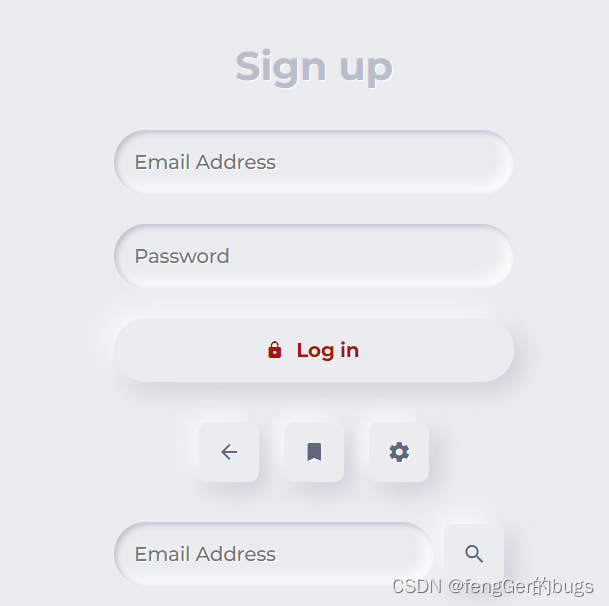
1、先看效果:
2、主要实现原理:
利用 box-shadow 实现浮雕风格的按钮。
3、具体实现代码
HTML
	<form>
  <div class="segment">
    <h1>Sign up</h1>
  </div>
  <label>
    <input type="text" placeholder="Email Address" />
  </label>
  <label>
    <input type="password" placeholder="Password" />
  </label>
  <button class="red" type="button"><i class="icon ion-md-lock"></i> Log in</button>
  <div class="segment">
    <button class="unit" type="button"><i class="icon ion-md-arrow-back"></i></button>
    <button class="unit" type="button"><i class="icon ion-md-bookmark"></i></button>
    <button class="unit" type="button"><i class="icon ion-md-settings"></i></button>
  </div>
  <div class="input-group">
    <label>
      <input type="text" placeholder="Email Address" />
    </label>
    <button class="unit" type="button"><i class="icon ion-md-search"></i></button>
  </div>
</form>
SCSS
$ruler: 16px;
$color-red: #ae1100;
$color-bg: #ebecf0;
$color-shadow: #babecc;
$color-white: #fff;

body,
html {
  background-color: $color-bg;
}

body,
p,
input,
select,
textarea,
button {
  font-family: "Montserrat", sans-serif;
  letter-spacing: -0.2px;
  font-size: $ruler;
}

div,
p {
  color: $color-shadow;
  text-shadow: 1px 1px 1px $color-white;
}

form {
  width: $ruler * 20;
  margin: 0 auto;
}

.segment {
  padding: $ruler * 2 0;
  text-align: center;
}

button,
input {
  border: 0;
  outline: 0;
  font-size: $ruler;
  border-radius: $ruler * 20;
  padding: $ruler;
  background-color: $color-bg;
  text-shadow: 1px 1px 0 $color-white;
}

label {
  display: block;
  margin-bottom: $ruler * 1.5;
  width: 100%;
}

input {
  margin-right: $ruler/2;
  box-shadow: inset 2px 2px 5px $color-shadow, inset -5px -5px 10px $color-white;
  width: 100%;
  box-sizing: border-box;
  transition: all 0.2s ease-in-out;
  appearance: none;
  -webkit-appearance: none;

  &:focus {
    box-shadow: inset 1px 1px 2px $color-shadow,
      inset -1px -1px 2px $color-white;
  }
}

button {
  color: #61677c;
  font-weight: bold;
  box-shadow: -5px -5px 20px $color-white, 5px 5px 20px $color-shadow;
  transition: all 0.2s ease-in-out;
  cursor: pointer;
  font-weight: 600;

  &:hover {
    box-shadow: -2px -2px 5px $color-white, 2px 2px 5px $color-shadow;
  }

  &:active {
    box-shadow: inset 1px 1px 2px $color-shadow,
      inset -1px -1px 2px $color-white;
  }

  .icon {
    margin-right: $ruler/2;
  }

  &.unit {
    border-radius: $ruler/2;
    line-height: 0;
    width: $ruler * 3;
    height: $ruler * 3;
    display: inline-flex;
    justify-content: center;
    align-items: center;
    margin: 0 $ruler/2;
    font-size: $ruler * 1.2;

    .icon {
      margin-right: 0;
    }
  }

  &.red {
    display: block;
    width: 100%;
    color: $color-red;
  }
}

.input-group {
  display: flex;
  align-items: center;
  justify-content: flex-start;

  label {
    margin: 0;
    flex: 1;
  }
}
4、实现主要关键点
box-shadow 与颜色的合理搭配
5、最后贴下自己的微信小程序,喜欢可以扫码查看


 769
769


 被折叠的 条评论
为什么被折叠?
被折叠的 条评论
为什么被折叠?
 到【灌水乐园】发言


