


描述:在开发小程序过程中,发现一些不错的案例,平时使用也比较多,稍微总结了下经验,以下内容可以直接复制使用,希望对大家有所帮助,废话不多说直接上干货!
一、展示类的样式
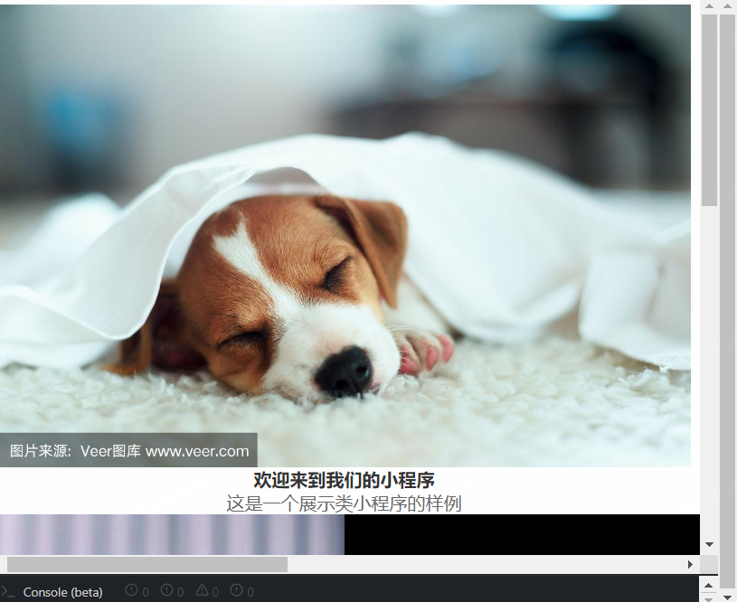
(一)样式图
展示效果样式图
(二)代码部分
2.1:wxml样式代码:
<!-- index.wxml -->
<view class="container">
  <image class="header-image" src="https://t7.baidu.com/it/u=4162611394,4275913936&fm=193&f=GIF"></image>
  <text class="title">欢迎来到我们的小程序</text>
  <view class="description">
    <text>这是一个展示类小程序的样例</text>
  </view>
  <view class="feature-list">
    <view class="feature-item">
      <image src="https://t7.baidu.com/it/u=1831997705,836992814&fm=193&f=GIF"></image>
      <text>功能介绍1</text>
    </view>
    <view class="feature-item">
      <image src="https://t7.baidu.com/it/u=2582370511,530426427&fm=193&f=GIF"></image>
      <text>功能介绍2</text>
    </view>
  </view>
</view>
2.2:wxss样式代码
/* index.wxss */
.container {
  display: flex;
  flex-direction: column;
  align-items: center;
  justify-content: center;
  padding: 20rpx;
}

.header-image {
  width: 100%;
  height: 200rpx;
  object-fit: cover;
  border-radius: 10rpx;
  margin-bottom: 20rpx;
}

.title {
  font-size: 24rpx;
  font-weight: bold;
  color: #333;
  margin-bottom: 10rpx;
}

.description {
  text-align: center;
  color: #666;
  margin-bottom: 20rpx;
}

.feature-list {
  display: flex;
  justify-content: space-around;
  width: 100%;
}

.feature-item {
  text-align: center;
}

.feature-item image {
  width: 120rpx;
  height: 120rpx;
  border-radius: 50%;
  margin-bottom: 10rpx;
}

.feature-item text {
  font-size: 14rpx;
  color: #666;
}


 1221
1221


 被折叠的 条评论
为什么被折叠?
被折叠的 条评论
为什么被折叠?
 到【灌水乐园】发言


