'''
Descripttion:
version:
Author: LiQiang
Date: 2020-12-26 15:17:21
LastEditTime: 2020-12-26 16:38:02
'''
# coding=utf-8
# matplotlib背景透明示例图
# python 3.5
import numpy as np
import matplotlib.pyplot as plt
from pylab import mpl
import scipy.stats as stats
# 设置中文字体
mpl.rcParams['font.sans-serif'] = ['SimHei']
def autolabel(rects):
# attach some text labels
for rect in rects:
height = rect.get_height()
# 设置标注文字及位置
ax.text(rect.get_x() + rect.get_width() / 2, 0.03 + height, '%.4f' % height, ha='center', va='bottom')
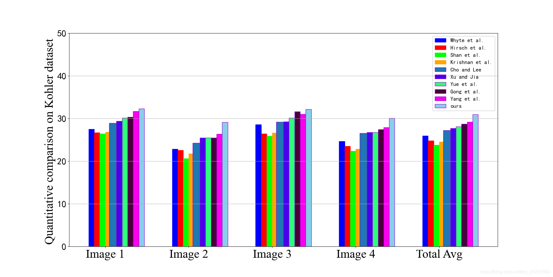
# 数据
testData = [[27.5475 , 22.8696 , 28.6112, 24.7065,25.9337],
[26.7232, 22.5867, 26.4155, 23.5364, 24.8155],
[26.4253, 20.5950, 25.8819, 22.3954, 23.8244],
[26.8654, 21.7551, 26.6443, 22.8701, 24.5337],
[28.9093, 24.2727, 29.1973, 26.6064, 27.2464],
[29.4054, 25.4793, 29.3040, 26.7601, 27.7372],
[30.1340, 25.4749, 30.1777, 26.7661, 28.1158],
[30.3572, 25.5210, 31.6577, 27.4804, 28.7541],
[31.7060, 26.3540, 31.0048, 27.9150, 29.2249],
[32.3040, 29.1350, 32.2028, 30.1054, 30.9368]#ours
]
N = 5
width = 0.5
ind = np.arange(width, width * 15 * N, width * 15) # 调整类间距
fig, ax = plt.subplots()
rectsTest1 = ax.bar(ind, (testData[0][0],testData[0][1], testData[0][2], testData[0][3],testData[0][4]), width, color=(0, 0, 1, 1),
edgecolor=(0, 0, 1, 1))
rectsTest2 = ax.bar(ind + width, (testData[1][0],testData[1][1], testData[1][2], testData[1][3],testData[1][4]), width, color=(1, 0, 0, 1),
edgecolor=(1, 0, 0, 1))
rectsTest3 = ax.bar(ind + 2 * width, (testData[2][0],testData[2][1], testData[2][2], testData[2][3],testData[2][4]), width, color=(0, 1, 0, 1),
edgecolor=(0, 1, 0, 1))
rectsTest4 = ax.bar(ind + 3 * width, (testData[3][0],testData[3][1], testData[3][2], testData[3][3],testData[3][4]), width, color=(1, 0.6471, 0, 1),
edgecolor=(1, 0.6471, 0, 1))
rectsTest5 = ax.bar(ind + 4 * width, (testData[4][0],testData[4][1], testData[4][2], testData[4][3],testData[4][4]), edgecolor=(0.5804, 0, 0.8275, 1))
rectsTest6 = ax.bar(ind + 5 * width, (testData[5][0],testData[5][1], testData[5][2], testData[5][3],testData[5][4]), width,
color=(0.2804, 0, 0.9275, 1), edgecolor=(0.5804, 0, 0.8275, 1))
rectsTest7 = ax.bar(ind + 6 * width, (testData[6][0],testData[6][1], testData[6][2], testData[6][3],testData[6][4]), width,
color=(0.1804, 1, 0.4775, 1), edgecolor=(0.5804, 0, 0.8275, 1))
rectsTest8 = ax.bar(ind + 7 * width, (testData[7][0],testData[7][1], testData[7][2], testData[7][3],testData[7][4]), width,
color=(0.2804, 0, 0.2275, 1), edgecolor=(0.5804, 0, 0.8275, 1))
rectsTest9 = ax.bar(ind + 8 * width, (testData[8][0],testData[8][1], testData[8][2], testData[8][3],testData[8][4]), width,
color=(0.9804, 0, 0.9275, 1), edgecolor=(0.5804, 0, 0.8275, 1))
#add ours
rectsTest10= ax.bar(ind + 9 * width, (testData[9][0],testData[9][1], testData[9][2], testData[9][3],testData[9][4]), width,
color='skyblue', edgecolor=(0.5804, 0, 0.8275, 1))
# ax.set_xlim(0, 9.5)
font2 = {'family' : 'Times New Roman',
'weight' : 'normal',
'size' : 30,
}
plt.tick_params(labelsize=23)
ax.set_ylim(0, 50)
ax.set_ylabel('Quantitative comparison on Kohler dataset ',font2)
ax.yaxis.grid(True)
ax.set_xticks(ind + width * 2.5)
ax.set_xticklabels(('Image 1', 'Image 2', 'Image 3',"Image 4",'Total Avg'),font2)
# 设置图例
legend = ax.legend((rectsTest1, rectsTest2, rectsTest3, rectsTest4, rectsTest5,rectsTest6 ,
rectsTest7,rectsTest8,rectsTest9,rectsTest10),
('Whyte et al.', 'Hirsch et al.', 'Shan et al.', 'Krishnan et al.',
'Cho and Lee','Xu and Jia ','Yue et al.','Gong et al.','Yang et al.','ours'),fontsize=14)
frame = legend.get_frame()
frame.set_alpha(1)
frame.set_facecolor('none') # 设置图例legend背景透明
# # 给每个数据矩形标注数值
# autolabel(rectsTest1)
# autolabel(rectsTest2)
# autolabel(rectsTest3)
# autolabel(rectsTest4)
# autolabel(rectsTest5)
plt.show()


 被折叠的 条评论
为什么被折叠?
被折叠的 条评论
为什么被折叠?
 到【灌水乐园】发言


