


position: relative;
display: inline-block;
}
.tooltip .tooltiptext {
visibility: hidden;
width: 120px;
background-color: black;
color: #fff;
text-align: center;
border-radius: 6px;
padding: 5px 0;
position: absolute;
z-index: 1;
bottom: 100%;
left: 50%;
margin-left: -60px;
/* 淡入 - 1秒内从 0% 到 100% 显示: */
opacity: 0;
transition: opacity 1s;
}
.tooltip:hover .tooltiptext {
visibility: visible;
opacity: 1;
}
div.img {
margin: 5px;
border: 1px solid #ccc;
float: left;
width: 180px;
}
div.img:hover {
border: 1px solid #777;
}
div.img img {
width: 100%;
height: auto;
}
div.desc {
padding: 15px;
text-align: center;
}
</style>
</head>
<body>
<div class="responsive">
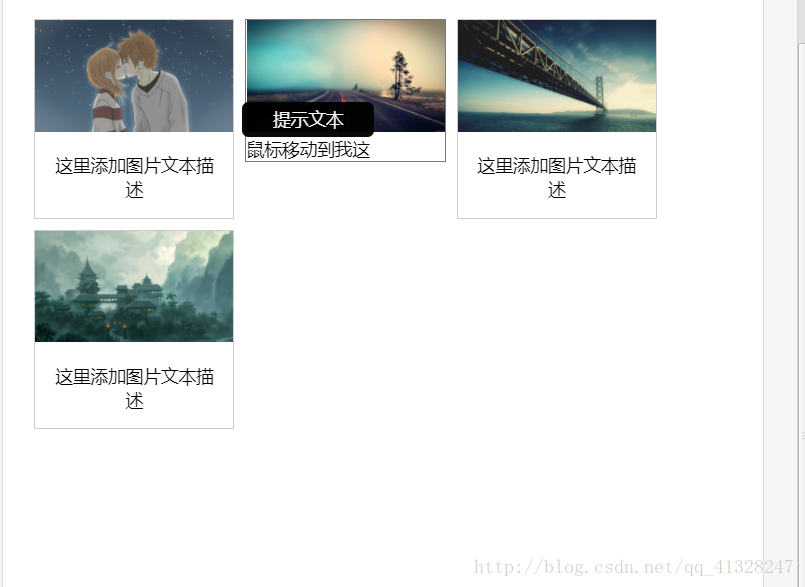
<div class="img">
<a target="_blank" href="http://static.runoob.com/images/demo/demo1.jpg">
<img src="http://static.runoob.com/images/demo/demo1.jpg" alt="图片文本描述" width="300" height="200">
</a>
<div class="desc">这里添加图片文本描述</div>
</div>
</div>
<div class="responsive">
<div class="img">
<a target="_blank" href="http://static.runoob.com/images/demo/demo2.jpg">
<img src="http://static.runoob.com/images/demo/demo2.jpg" alt="图片文本描述" width="300" height="200">
</a>
<div class="tooltip">鼠标移动到我这
<span class="tooltiptext">提示文本</span>
</div>
</div>
<div class="responsive">
<div class="img">
<a target="_blank" href="http://static.runoob.com/images/demo/demo3.jpg">
<img src="http://static.runoob.com/images/demo/demo3.jpg" alt="图片文本描述" width="300" height="200">
</a>
<div class="desc">这里添加图片文本描述</div>
</div>
</div>
<div class="responsive">
<div class="img">
<a target="_blank" href="http://static.runoob.com/images/demo/demo4.jpg">
<img src="http://static.runoob.com/images/demo/demo4.jpg" alt="图片文本描述" width="300" height="200">
</a>
<div class="desc">这里添加图片文本描述</div>
</div>
</div>
div.img {
border: 1px solid #ccc;
}
div.img:hover {
border: 1px solid #777;
}
div.img img {
width: 100%;
height: auto;
}
div.desc {
padding: 15px;
text-align: center;
}
* {
box-sizing: border-box;
}
.responsive {
padding: 0 6px;
float: left;
width: 24.99999%;
}
@media only screen and (max-width: 700px){
.responsive {
width: 49.99999%;
margin: 6px 0;
}
}
@media only screen and (max-width: 500px){
.responsive {
width: 100%;
}
}
.clearfix:after {
content: "";
display: table;
clear: both;
}
</style>
</head>
<body>
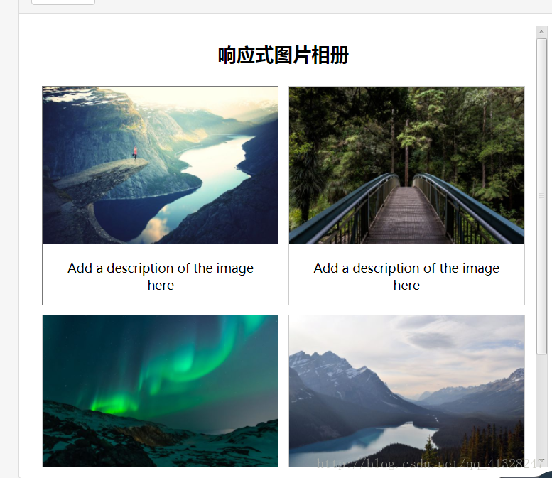
<h2 style="text-align:center">响应式图片相册</h2>
<div class="responsive">
<div class="img">
<a target="_blank" href="img_fjords.jpg">
<img src="http://www.runoob.com/wp-content/uploads/2016/04/img_fjords.jpg" alt="Trolltunga Norway" width="300" height="200">
</a>
<div class="desc">Add a description of the image here</div>
</div>
</div>
<div class="responsive">
<div class="img">
<a target="_blank" href="img_forest.jpg">
<img src="http://www.runoob.com/wp-content/uploads/2016/04/img_forest.jpg" alt="Forest" width="600" height="400">
</a>
<div class="desc">Add a description of the image here</div>
</div>
</div>
<div class="responsive">
<div class="img">
<a target="_blank" href="img_lights.jpg">
<img src="http://www.runoob.com/wp-content/uploads/2016/04/img_lights.jpg" alt="Northern Lights" width="600" height="400">
</a>
<div class="desc">Add a description of the image here</div>
</div>
</div>
<div class="responsive">
<div class="img">
<a target="_blank" href="img_mountains.jpg">
<img src="http://www.runoob.com/wp-content/uploads/2016/04/img_mountains.jpg" alt="Mountains" width="600" height="400">
</a>
<div class="desc">Add a description of the image here</div>
</div>
</div>
<div class="clearfix"></div>
<div style="padding:6px;">
<h4>重置浏览器大小查看效果</h4>
</div>


 1655
1655


 被折叠的 条评论
为什么被折叠?
被折叠的 条评论
为什么被折叠?
 到【灌水乐园】发言


